Cartographic Design
Tips and Tricks
Ben Hickson
January 24, 2018
Tips
1. Keep your purpose in mind
- Reference Map - Atlas
- Thematic Map - Demographics
- Special Purpose Map - Building Footprints
2. Pick the right projection
- Don't use WGS 84 or Mercator unless you are actually looking at the entire world, and even then...
- For smaller extents, there is a better, more accurate projection
- Area? Equal Area
- Distance? Equiditant
- Direction? Azimuthal or Conformal
4. Use neat lines to delineate major features
- Draws out contrast
5. Use appropriate symbology
- E.g. At regional, national, or continental scales, cities should be identified as points
6. Don't settle for standard pastels
- Anyone who has made a map before will recognize that standard green and yellow
7. Consider Color
- Chloropleth or Isopleth? Political or Environmental?
- Quantitative or Continuous
- Quantitative: this or this
- Continuous: a range of values (e.g. 0 to 100)
-
Make sure your colors make intuitive sense
Chloropleth
- Use if you have distinctive boundaries (watersheds, counties, etc)
- Not great for total values, but good for ratios (e.g. per)
- If you do have a range of data (e.g. 0-100) and you don’t want a gradient, don’t use more than 8 bins
- Can the reader differentiate between bins?
Source: http://www.caliper.com/featured-maps/maptitude-brexit-map.jpg
Isopleth
- Ideal for continuous data like elevation or rainfall
- Good for gradually changing data
Source: https://i0.wp.com/www.harappadna.org/wp-content/uploads/2011/03/Harrapa-SouthAsia-Participant-Map-C1-1.jpg
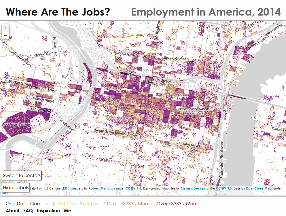
8. Don't render too many features
- Keep clutter down
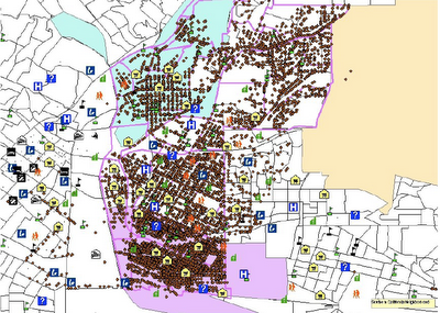
Unless clutter (density) is the point
9. Obscure your basemap
- Basemaps are there for general context, they shouldn’t be your map.
- Use an semi-transparent overlay or alter layer saturation levels to obscure content
10. Beware of too many labels
- They'll clutter up the map and make it illegible
- How big will the map be?
- Printed or Online?
11. Pay attention to your labels
- Use Maplex Engine in ArcMap
- Text halo’s are often a good idea
- Orientation is important – labels for rivers typically follow the river
- Do you need duplicates? How often?
12. Make sure your legend or your map styles identify all features
- Don't leave the reader guessing
13. Your legend doesn't
make itself
- Got big numbers? Use commas
- Don’t use your field names as your feature names in your legend
- Is it big enough? Don’t make me squint
- Does it really need a title?
14. Always include a scale bar
- If your reader is unfamiliar with area, they need to know what they're looking at
15. Always include a north arrow
- Orient your page toward the top of the earth unless you’re creating a map for navigation, then use true north
- If you’re not using the top of your page as north, make the north arrow conspicuous
16. Include a date
- In the age of the internet, this is especially imporant
17. Include metadata
- Got a basemap? Where did your data come from?
- Sources are important
18. Consider your typeface
- Avoid Comic Sans and Arial if you want it to look like you tried
19. Check it out in grayscale
- Remember who your map is for. If it’s going to be printed or photocopied and distributed widely, check to make sure that your design choices aren’t entirely color dependent
20. Small Scale?
- Use an inset map
Tricks
1. Control Raster Contrast and Brightness
- Appearance tab in ArcGIS Pro, Image Analysis Window in ArcMap
2. Play with histograms
- Change the distribution of colors to values for rasters
3. Smooth Lines/Simplify Features
- Do you need all the geometric detail? Smooth it out for a prettier product
4. Burning DEMs and Hillshades in QGIS
Text
5. ColorBrewer2
- Options for colorblind safe, print friendly, and photocopy safe as well
6. Add Graticules
- Particularly useful for navigation maps
... almost exclusively, actually
7. Point Clustering
- Available in ArcGIS Online
- Soon to be in QGIS 3.0
Resources
http://uxblog.idvsolutions.com/2013/10/20-unrequested-map-tips-part-1.html
http://www.jratcliffe.net/blog/ten-crime-mapping-tips/
https://www.azavea.com/blog/2014/10/20/4-cartography-color-tips-hue-should-know/
https://www.e-education.psu.edu/geog486/node/1848
Look around for inspiration
https://gis.stackexchange.com/questions/3083/what-makes-a-map-beautiful
6. Point Clustering
- Available in ArcGIS Online
- Soon to be in QGIS 3.0
- Soon to be in QGIS 3.0
Cartographic Design
By Benjamin Hickson


