Welcome
Slides Instructions (try them out, in left corner) :
Move to forward/back through the slides
use the left & right arrows
View my notes by using the down arrow and return to the slide by using up arrow
Use escape key to view and move through slides
Use ALT+Click to zoom in/out
This is my five minute
presentation seen
@ PePcon 2015 - Ignite!
esc
Top Ten Tips for (VDP) Designers
by Deb Haines, Senior Trainer & Solution Specialist
Recently I was able to attend PePcon 2015 – the PRINT and ePUBLISHING conference, in Philadelphia, PA. (http://www.pepcon.com/) For those of you that do not know, PePcon is one of the best conferences for learning and gaining valuable insight on using InDesign and (some) Photoshop for creating a variety of items, including books, eBooks, interactive documents, developing iPad/Tablet apps, to meet many experts and trainers, and to network with fellow designers. Beside that, there are panel sessions with Adobe Developers.
Each year this conference hosts an evening event called Ignite InDesign! (Tips and Stories from the Front Lines). Basically this event allows any attendee to get up and present something to everyone. Your presentation can be about any topic, so long as it is design- and not sales/product- related. The even is a lot of fun and the presentations from those selected were funny, informative, unexpected, and basically great! I was lucky enough to be choosen to give my 5-minute Ignite presentation, which is below.
If you were unable to go to PePcon, I have news!! All the sessions from conference (Tuesday, June 2nd and Wednesday, June 3rd) were recorded. You can still register for the event and watch the replays until September. There was a wealth of information presented by Design Industry Experts and Adobe Engineers. If you decide to register, you can use the code XMPIE to receive $50 off the PePcon 2015 registration fee.
Please understand, I don’t read from a script when I present. With that thought in mind, the text copy accompaning each slide is more or less what I said on stage. Plus, I added some slide notes, and a snippet of text just for XMPie VDP Designers at the end of each one of my tips.
From the XMPie Blog Post, where you likely came from to view these slides. (http://blog.xmpie.com)
Notes
Title Text

I was talking with David (Blatner) about presentations, and told him that I have many tips I share with my trainees (who are often not designers).
And so I signed up to give this presentation @ Ignite.
Hi !
I
am
Deb
Haines.
Hi, I'm Deb Haines
For those that don't know me, I've been teaching people to use computers and software for 25 years. Specifically, these past 11 years, I've been teaching how to use XMPie software and Adobe InDesign.
These tips have evolved from me helping XMPie users create design templates for Variable Data Publishing (VDP) for both print and web. Even so, the tips work all designers.
Notes
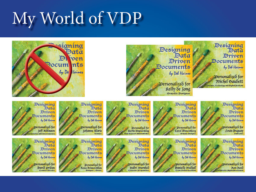
We, VDP Designers, generate anywhere from a few versions to hundreds of thousands of personalized documents, much like the examples on this slide.
Here are my top ten tip for designers...
In my world everyone gets their own version of a design.
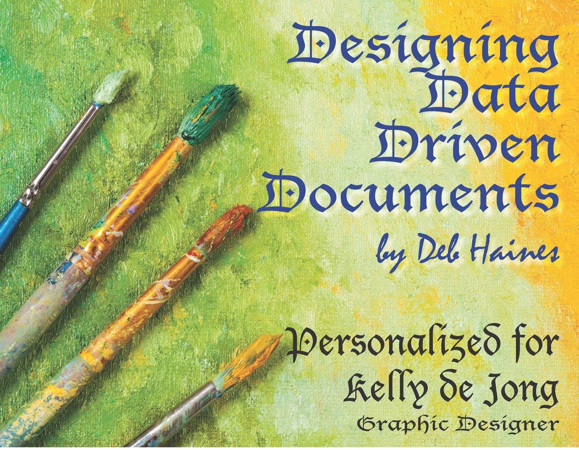
This slide shows book covers I generated by using the names and job titles for each of the Canadian attendees. This one is for Kelly.
All 12 covers are unique, they show the person's name and their title.
I met Kelly at this conference and she inspired this book cover. Kelly has been to every PePcon! The 2015 PePcon, made her sixth conference.
Hugs and hellos to Kelly, if you see this I hope you are doing well and thanks!
See the last slide for all the shortcuts in one place.
Notes
Title Text
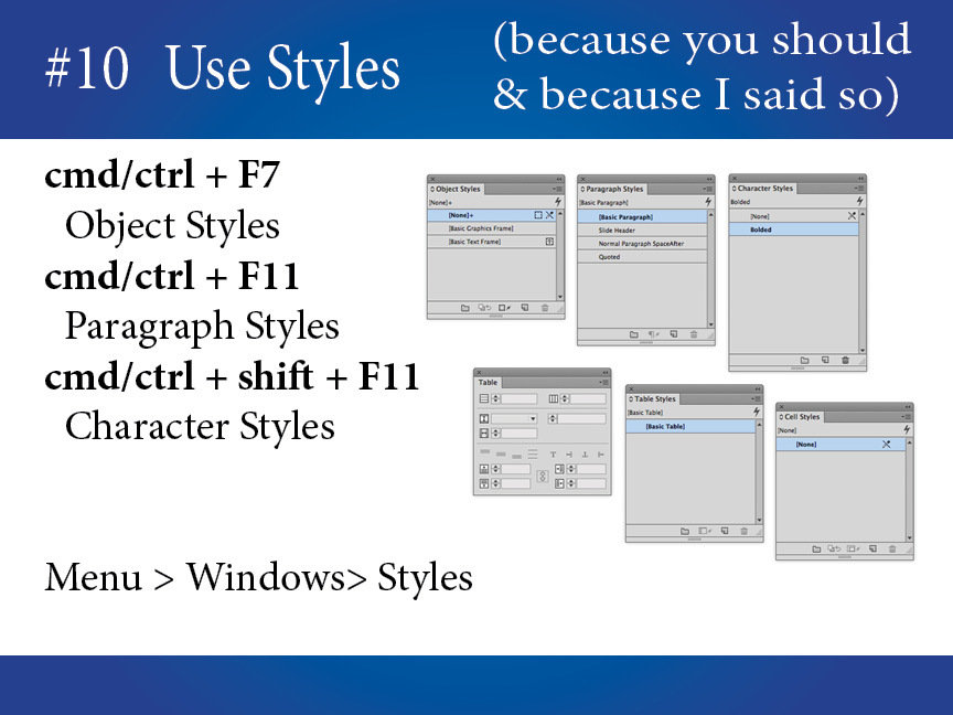
Using object styles, paragraph styles, character styles, even table and cell styles helps when making or fixing formatting changes and are easy to copy. They can take the guesswork out of branding standards and such.
Really, really you should use styles!
And
not just because
I say so.
Specific to XMPie users: Check out Style ADORs, which when applied to Objects and Characters can control which style is used dynamically.
This feature is supported when using InDesign (Dynamic Print) or InDesign Server (uProduce Process) to generate your output.
Notes
Title Text
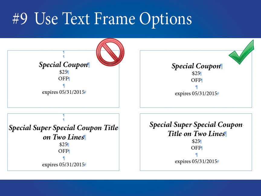
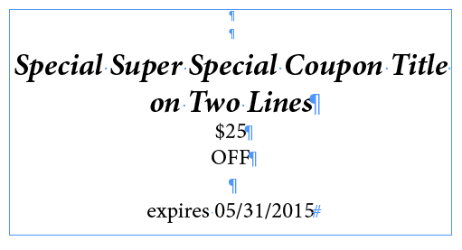
Usually those are the same users who tap the space bar to center or tab text (ekk). There are better ways to control where text sits within the text frame.
You've all seen it, the new user who hits
the return key to move text down in a frame.
Go to the InDesign menu, choose Type > Show Hidden Characters (at the end of this menu) to see paragraph marks ( ¶ ), spaces ( · ), tabs (››), etc.
Notes
Title Text
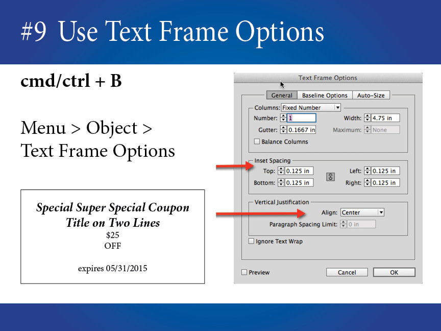
Use Vertical Justification to control where the text should sit in the box- top, center or bottom. Use Inset Spacing to keep the text from touching the edges of the box. Use Paragraph formatting to center within a line.
Text Frame Options gives you control.
You can even add these settings to your
Object Styles.
Specific to XMPie users:
Text Frame Options help tremendously with address story box, coupon format settings, and business cards. Can be used with Dynamic Object Styles to change formatting based on rules.
Some of these text frame options require output from InDesign desktop (Dynamic Print) or InDesign Server (uProduce Process).
Notes
Title Text
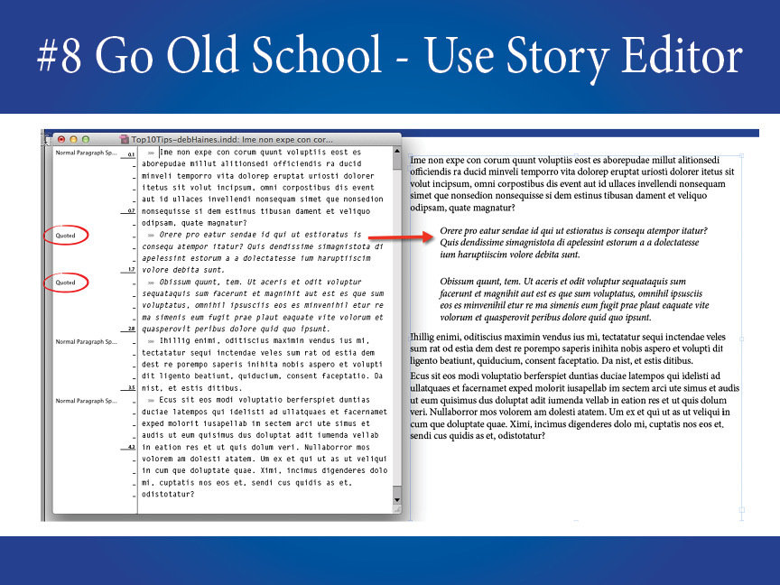
Did you know, you can still use the story editor? I use it when I'm typing lots of text, so I don't have to worry about the formatting until I'm ready or to quickly view what paragraph style is being applied.
Who remembers PageMaker?
Raise
your
hands!
I do!
(white text on blue) or classic screens (yellow text on blue). I must not be alone when in this mood; the Story Editor Preferences has Themes, that you can set in the Preference dialog.
:)
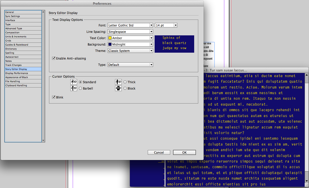
Sometimes when I am feeling nostalgic, I change the look of this story editor to resemble old CRT terminals (green text on black), Word Perfect/DOS
Notes
Title Text
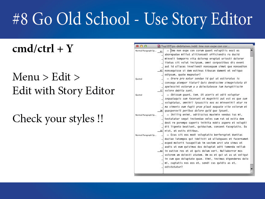
Just Command Y. Sometimes I use it without thinking about it, then I often need to go back and show someone what I was just doing.
It's quick!
It's easy!
Specific to XMPie users:
You can even place content objects into the Story Editor, and flip through records while using this feature. Really handy, when the ADOR/content object name is much longer than the actual content value, where overflows make your text frames appear empty.
Notes
Title Text
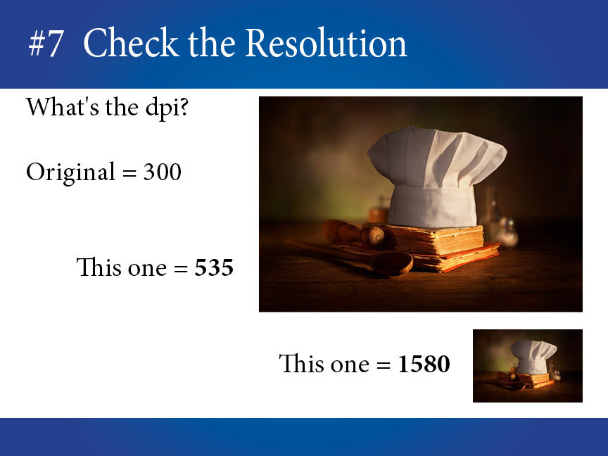
Sure lots of us place a large image and fit it to a smaller frame. But doing this changes the image's effective resolution. See here how much the DPI of my original image changed as I made it smaller.
Old
design
tricks
aren't
always
good
design.
DPI is dot per inch, and PPI is pixels per inch. InDesign will show you the effective PPI, and when I'm talking about digital printing, PPI is equal to the DPI. This is because Adobe InDesign is working behind the scenes to make it work that way.
Fact is that most images printed on a digital press don't need to be more than 240-300 dpi. The higher the resolution, the longer it will take to print.
In very special cases or if you are printing offset you might need higher resolutions, check with your print shop and base that on the project you are working on.
In reality, DPI and PPI are not always equal and you have to take into account what medium you are designing for. Here's some articles I found online that explain DPI vs PPI.
http://indesignsecrets.com/whats-my-resolution.php
http://www.translatorscafe.com/cafe/EN/units-converter/digital-image-resolution/3-4/
http://sebastien-gabriel.com/designers-guide-to-dpi/
http://www.fastcodesign.com/3039564/the-difference-between-ppi-vs-dpi-explained-by-a-google-designer
Notes
Title Text
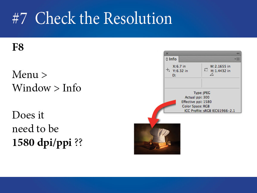
If the image doesn't need to be 1580ppi, and it probably doesn't, take the time to resize large images (in a image editor). Same goes for cropping, crop the image to size instead of cropping it with the frame.
Your designs
will process faster when you resize images.
Specific to XMPie users:
To reduce the amount of time it takes to generate VDP output, you might need to check the resolution of images, especially when those images are not reusable, or are affected by special effects.
Also, another design trick that makes VDP work harder is when a designer places a large image but crops the graphic frame to hide all but a small part of the image, you might need to fix those too.
Notes
Title Text
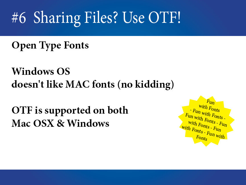
I think most of us have experienced sharing documents from Mac to Windows but unfortunately Mac Fonts won’t work on Windows. If you need to share InDesign documents, Open Type Fonts are the better choice since they work pretty much the same on either platform.
I call this
Fun
with
Fonts!!
Ah, a collective groan from the audience, you must know where I'm going with this.
There are many extension for fonts, some common ones are:
OTF - Open Type Font (http://www.adobe.com/products/type/opentype.html)
TTF - True Type Font, the files from Windows work on Macs
TTC - True Type Collection - these files seem OS specific (but I'm not certain of that)*
PFB/PFM - Windows Postscript Font, is PS font doesn't work on Mac
dfont - (data fork) this is a Mac Font, it won't work on Windows
ffil - is a font suitcase, it won't work on Windows
Notes
Title Text
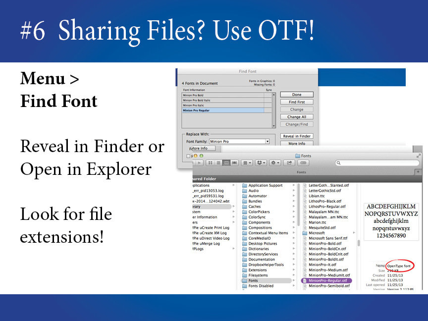
While you don't have to use Open Type, you do need to make sure the fonts will work on both systems. I suggest peeking at the font files with Finder. The common extension that will work on Mac and Windows are OTF and TTF.
Take a look at the file's extension.
First it must have one.
Some Links:
Specific to XMPie users:
If you use uProduce, which runs on Windows Server, you can only use OTF, TTF, and PC Type 1 (pfb/pfm) fonts.
If you are using a font management utility (like Suitcase), you might need to release the font to system in order to allow Adobe/XMPie to package these fonts.
If you run production from your MAC desktop, then you only need to worry about fonts if you are using uImage packages.
Notes
Title Text
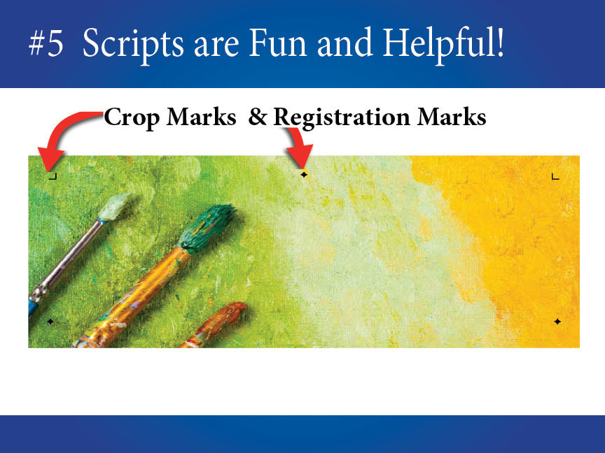
They are meant to be samples, but I use them for all kinds of tasks. One of my favorite scripts make cut and registration marks, which I often place on my InDesign templates.
I love
scripts!
Did you know that InDesign comes with many scripts?
Notes
Title Text
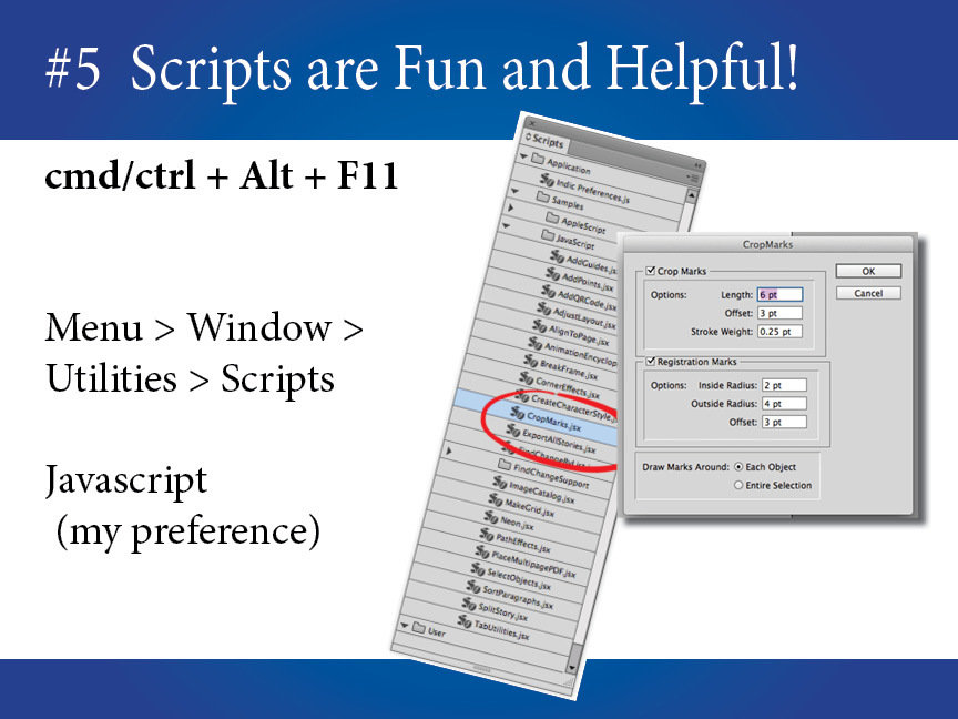
The script I use is called CropMarks, it's pretty handy and makes a new layer which I can show/hide, mark to print or not, and delete if I don't need it. You should check out all the scripts, you might find something that can help your day-to-day workflow!
I prefer Javascript, because I know a little bit of coding, but there are other options.
Specific to XMPie users:
This tip is for working with the initial template design. However, if you need to run scripts dynamically with XMPie server production, then contact an XMPie rep and discuss implementing a solution that will allow you to run these scripts on the InDesign Server(s).
Notes
Title Text
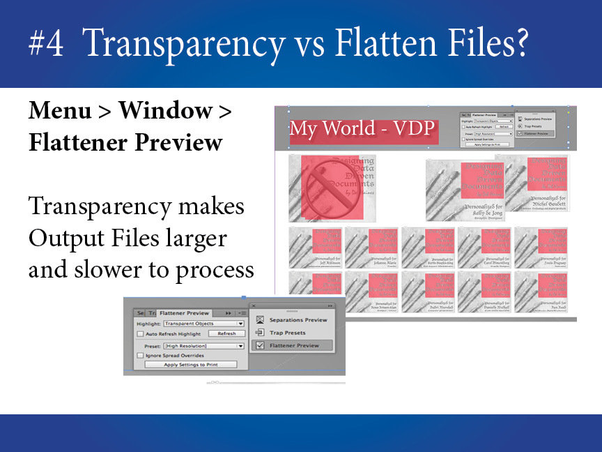
There are times when transparency effects can cause printing issues or increase production costs. Maybe you've seen white boxes, color shifts, or the print shop tells you it takes an hour to render your document (at the RIP). A quick way to see what is affected is highlighting objects using the Flattener Preview.
Designers love drop shadows!
( ... and
opacity, feathering,
transparency and other effects.)
Specific to XMPie users: We have supported using transparencies effects when producing your output from InDesign for many years. Today, PDF files can support transparency effects within them, therefore you shouldn’t need this tip as often as you did in the past. Even still, there may still be times* when the above tip will help you save time processing and/or RIP’ing your print output.
* Our legacy PDF formats do not support transparency effect and/or if you have an older RIP it might not process newer PDFs correctly.
Notes
Title Text
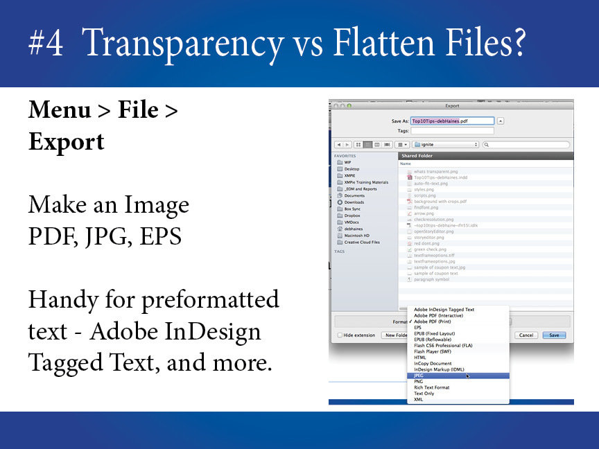
Remove the transparencies by taking off the options or by pre-flattening your images. Move everything you want to flatten to its own layer, turn off all the other layers, then use Adobe Export to make your image. Then use the new image to replace all the objects in the new layer.
Maybe pre-flatten your images?
Specific to XMPie users:
This old school tip of using Adobe Export to make pre-flatten images is handy for your production, but you can also use it to make InDesign Tagged-Text which can be use with Text File ADORs.
Also, if your output is PDF, PDF Assets are the preferred format. If you are using VIPP, VPS or PPML the preferred Asset format is EPS.
Notes
Title Text
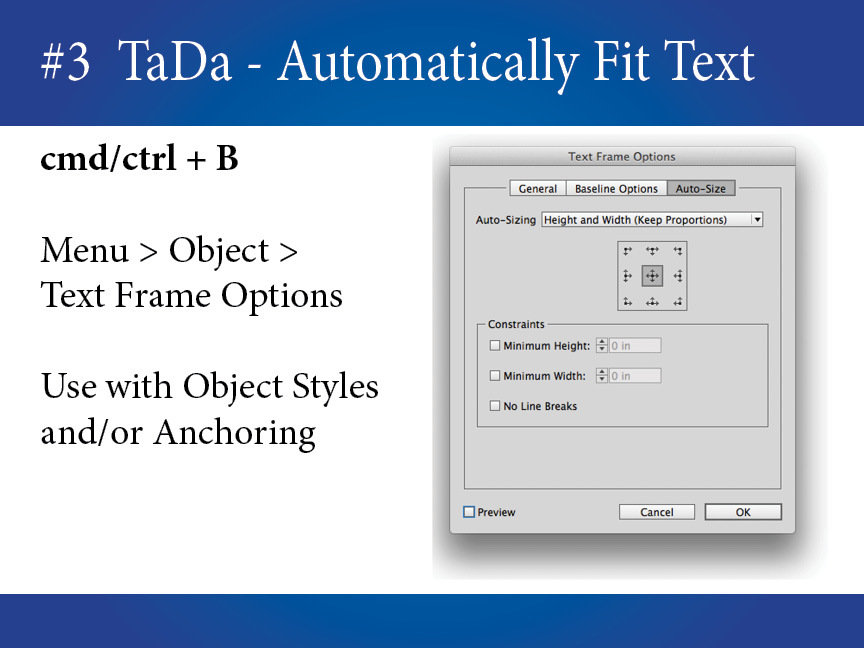
While this InDesign feature has been around awhile, I recently started using it in my projects. I like it because I don't have to fuss with text frame size, especially when typing in the story editor. Better yet, I can anchor it to other objects or other objects to it, and let the box grow and shrink as needed.
My new favorite tip!
Specific to XMPie users:
You have a choice, copyfit the text to a given size using our fitting options or use InDesign’s Auto-Fit to grow and shrink the actual story frame for your VDP output.
This feature is supported when using InDesign (Dynamic Print) or InDesign Server (uProduce Process) to generate your variable output.
Notes
Title Text
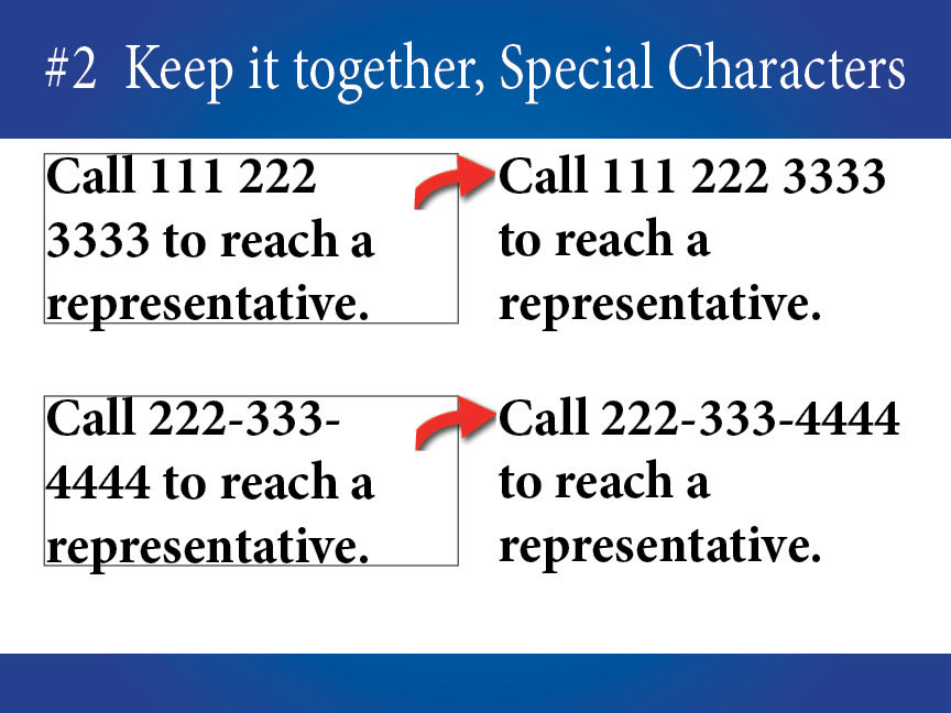
Often non-designers miss this, a phone number or company name breaks across lines, which is a design no-no. Some text must stay together. You can easily see here the phone number breaking, but often the issue is much more subtle with proper names and some locations.
Keep it together people!
I mean, of course, keep the text together.
Notes
Title Text
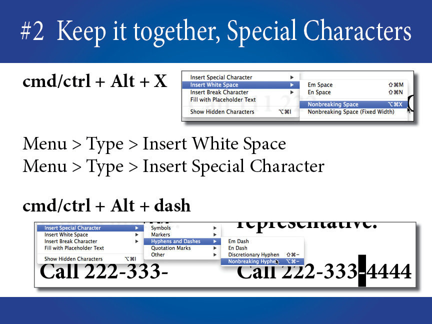
When you are typing text, use non-breaking spaces or non-breaking hyphens. Special Characters and White Space Characters can also be handy for placing different versions of hyphens and spaces when needed (like thin space).
Special Characters are here
to help!
Specific to XMPie users:
Use the tip above for static content, but for variable content, use the Dynamic Text Property “Auto Convert to non-breaking spaces and hyphens” feature.
Notes
Title Text
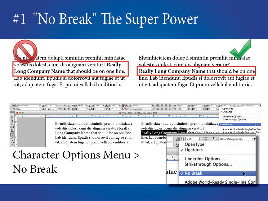
While non-breaking characters are handy, they don't fit everywhere. The No Break can! Turn off hyphenation, and highlight the text (like a really long company name or street address on a label), then use No Break to keep the text together in one line. This is my #1 trick and something I use all the time.
"No Break" to the rescue.
Keep the text together:
email & web addresses, names with special
symbols or characters,
and more.
Specific to XMPie users:
This feature is supported when using InDesign (Dynamic Print) or InDesign Server (uProduce Process) to generate your output. (Otherwise use Tip#2.)
Notes
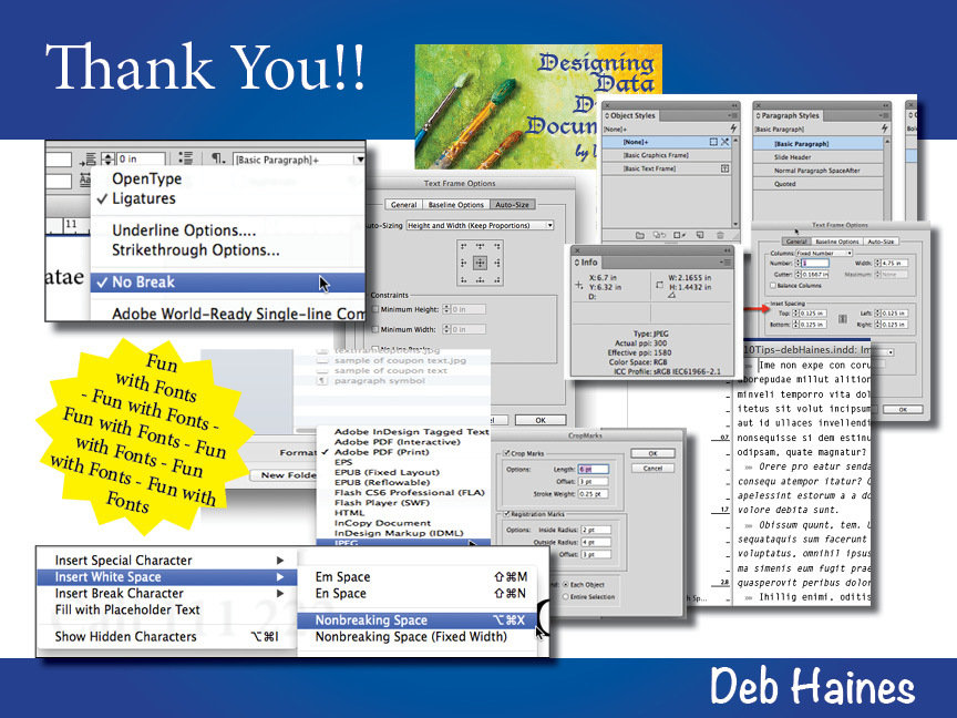
See sub-slide here for all the shortcuts mentioned here.
PePcon
2015
Ignite!
Shortcuts & Menus for Top Ten Tips
Nice PDFs I found - thank you Pariah
http://iampariah.com/projects/downloads/adobe-creative-cloud-cc-keyboard-shortcut-cheatsheets.php
CMD/CTRL - Command or Control
Menu > Windows > Styles >
Object Styles - cmd/ctrl + F7
Paragraph - cmd/ctrl + F11
Character - cmd/ctrl + shift + F11
#10 Use Styles
#9 Use Text Frame Options
Menu > Object > Text Frame Options
cmd/ctrl + B (General)
#8 Go Old School
Menu > Edit > Edit with Story Editor
cmd/ctrl + Y (to open and close)
#7 Check the Resolution
Menu > Window > Info
F8
#6 Sharing Files? Use OTF!
Menu > Type > Find Font
Reveal in Finder or Open in Explorer
#5 Scripts are Fun & Helpful
Menu > Window > Utilities > Scripts
cmd/ctrl + Alt + F11
#4 Transparency vs Flatten Files
Menu > Window > Output > Flattener Preview
choose Transparent Object / refresh
** or to flatten objects, export **
Menu > File > Export
choose the image type you need
#3 Automatically Fit Text
Menu > Object > Text Frame Options
cmd/ctrl + B (Auto Size)
#2 Keep it together (text that is)
Menu > Type > Insert > White Space > Nonbreaking Space or cmd/ctrl + Alt + X
Menu > Type > Insert > Special Characters >
Nonbreaking Hyphen or cmd/ctrl + Alt + -
#1 No Break
Highlight Text, then go to the character attribute/options panel's menu, choose No Break.
Top Ten Tips for (VDP) Designers
By Deb Haines
Top Ten Tips for (VDP) Designers
My presentation given at PePcon 2015 Ignite! - Deb Haines
- 3,650

