Animations with CSS
follow along at:
g-liu.com/css3
Hi, I'm Geoffrey
- CSE Major, Music minor, c/o 2016
- Second time TA'ing CSE 154!
- Past: CDK Global, ASUW, CSE TA
- Future: Groupon
- Front-end web dev enthusiast
Overview
- Animation sampler
- Concepts of animation
- Your first CSS animation
- Animation properties
- Multiple animations
- Possibilities of CSS animation
What you'll need
- Laptop
- Google Chrome (recommended), or Firefox
- CodePen.io
- Text editor of your choice (optional)
Follow along: g-liu.com/css3
What is animation?
The process of making the illusion of motion and change
— Wikipedia
We focus on CSS3 animations
CSS Animations in the wild
- Google "Do a barrel roll"
- creative-mob.com
- Ustream 2013
- PowerPoint presentations
Spin a website
// Copy+paste this into your JavaScript console
var sheet=(function() {
    var style=document.createElement("style");
    style.appendChild(document.createTextNode(""));
    document.head.appendChild(style);
    return style.sheet;
})();
sheet.insertRule("@keyframes spin{100%{transform:rotate(360deg);}}",0);
sheet.insertRule("p,li,a,img,div,table{animation:spin 3s linear infinite;}",0);
Animations in two steps
Step 1: Define the animation
- You define the waypoints
- Browser interpolates the rest
- CSS:
@keyframesrule
/* Example animation definition */

@keyframes blend-in {
    0% {
        background-color: red;
    }

    25%, 100% {
        background-color: black;
    }

    50% {
        background-color: yellow;
    }
}
Animations ❤️ Transforms
.teeter-totter {
    transform: rotate(30deg) translate(10px, -5px);
    transform-origin: left 2px;
}| Function | Effect | Example |
|---|---|---|
| translate(x, y) | Slides the element | translate(2px, -5px) |
| rotate(a) | Rotates the element | rotate(45deg) |
| scale(x, y) | Resizes the element | scale(4, 0.5) |
| skew(x, y) | Shears the element | skew(10deg, -10deg) |
Usage in CSS:
transform, transform-origin
Step 2: Apply the animation
CSS animation property — a shorthand (more later)
.zoo .chameleon {
    /* Animation "blend-in" lasts 5s */
    animation: blend-in 5s;
}
Side note: Vendor prefixes
Required by some browsers for compatibility.
(As of 2016, no prefixes required)
/* Chrome, Safari, Opera */
/* prepend "-webkit-" */

#myelement {
    -webkit-animation: flip 2s;
}

@-webkit-keyframes { ... }
/* Firefox, IE, Edge */
/* (no prefix needed) */
#myelement {
animation: flip 2s;
}
@keyframes { ... }Codepen: check "-prefix-free" in CSS
Complete example
Controlling animations
You know how to say:
- Which animation?
- How long?
Coming up:
- When to start?
- How many times to play?
- Which direction to play?
- ...and more!
Available properties
| Property | Example value(s) |
|---|---|
animation-name |
bobble |
animation-delay |
1.2s, 0 |
animation-direction |
alternate, reverse |
animation-duration |
5s |
animation-iteration-count |
infinite, 10 |
animation-timing-function* |
ease-in, linear |
animation-fill-mode |
forwards |
animation-play-state |
paused, running |
* see slide below
Timing functions
 |
 |
 |
| linear | ease (default) | ease-in |
 |
 |
 |
| ease-in-out | ease-out |
Others: step-start, step-end, steps()
http://codepen.io/g-liu/pen/XbrMzr?editors=110 (Chrome only)
Use cases
- Play state: hover effects
- Fill mode: trivia
- Timing function: animating a sprite (Chrome only)
- Iteration count: deep space exploration
Shorthand
animation:
    <name>
    <duration>
    <timing-function>
    <delay>
    <direction>
    <iteration-count>
    <fill-mode>
    <play-state>;
- Can be in any order*
- Can omit unneeded/default properties
*with a few exceptions
Self-exercise
Turn the use cases into shorthand
Multiple animations
- Define them one by one
- Apply them one by one
One element, many animations
/* Long form */
#myelement {
    animation-name: first,
      second, third;
    animation-duration: 0.25s,
      0.5s, 1s;

    animation-timing-function:
      ease-in-out;
}/* Shorthand */
#myelement {
animation: first 0.25s ease-in-out,
second 0.5s ease-in-out,
third 1s ease-in-out;
}Tired of writing your own?
Inspecting animations

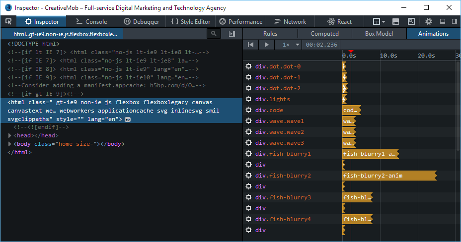
Surprisingly different between Chrome/Firefox
Chrome
Firefox Developer Edition
Infinite possibilities
Helpful resources
- caniuse.com: CSS3 browser compatibility charts
- codepen.io / jsfiddle.net: try out your animations
- cssanimation.rocks: cool animation examples
- developer.mozilla.org: CSS3 documentation
- css-tricks.com: cool things you can do with CSS3
- StackOverflow
Articles worth reading
Questions?
Animations with CSS
By Geoffrey Liu
Animations with CSS
CSS3 animation is a technique becoming increasingly popular in modern web design. Along with other cutting-edge CSS features, animations can breathe life into an otherwise static website, and dramatically better the user experience.


