RWD and beyond
follow along at:
g-liu.com/live
Hi, I'm Geoffrey
- UW Comp. Sci, c/o 2016
- 1st time TA for 154
- Previously: ASUW Webmaster
- I love front-end web dev!
Overview
- Responsive web design
- Website performance
- Cross-browser compatibility
- Add'l topics if time permits
Do it live!
Open up http://codepen.io
Responsive web design
responsive (adj.)
- reacting quickly and positively
- answering
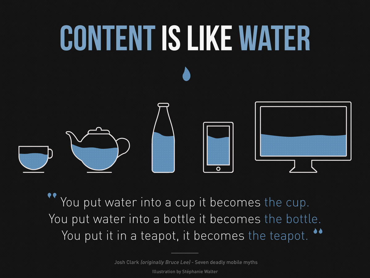
Examples
RWD techniques
- Media queries
- "Responsive" properties
- Reset/normalization
- JavaScript? yes, but cumbersome
The meta viewport tag
<meta name="viewport" content="width=device-width, initial-scale=1" />Media queries
Important media types
| Type | Description |
|---|---|
all |
All devices (default) |
handheld |
Handheld devices (typically small screen, monochrome, limited bandwidth). |
print |
Paged, opaque material and for documents viewed on screen in print preview mode. |
projection |
Projected presentations, for example projectors or print to transparencies. |
screen |
Color computer screens |
tv |
Television devices (low resolution, color, limited-scrollability screens, sound available). |
CSS3 properties
| Property | What it does |
|---|---|
min-height |
Sets the element's minimum displayed height |
min-width |
Sets the element's minimum displayed width |
max-height |
Sets the element's maximum displayed height |
max-width |
Sets the element's maximum displayed width |
CSS3 units
| Unit | Description |
|---|---|
vh |
% of viewport's height |
vw |
% of viewport's width |
vmin |
% of min(height, width) |
vmax |
% of max(height width) |
Try these queries
@media and ( :???) { }screen
projection
handheld
tv
braille
Resources
Website performance
Connecting to a server takes time!
How can we reduce this time?
Why do we care?
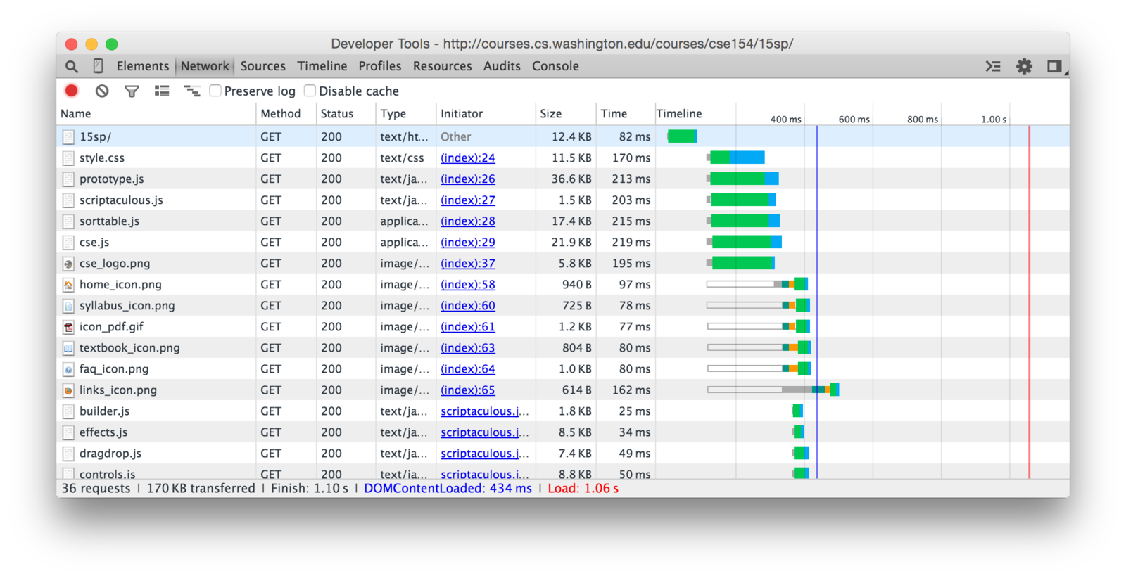
Survey of techniques
- Asset compression
- Image optimization
-
HTTP request reduction
- Caching
- Serving from a CDN
Asset compression
Purge unnecessary characters
#main p {
    font-size: 16pt;
    margin-bottom: 0px;
}
#main p{font-size:16pt;margin-bottom:0;}Works with JavaScript too
var mySuperCoolVariable = 3;
mySuperCoolVariable *= Math.random() * 10;

/* Set the value of the input form */
var userDisplayForm = document.getElementById("display");
userDisplayForm.value = mySuperCoolVariable;
var m=3;
m*=Math.random()*10;
var u=document.getElementById("display");
u.value=m;HTML?
Yes! (but less common. Why?)
<article id="post-3801">
    <h1>First post</h1>

    <p>Just setting up my blog</p>
</article>
<article id="post-3801"><h1>First post</h1><p>Just setting up my blog</p></article>PHP?
Don't need to. (Why?)
Optimize images


700 kB
250 kB
Can you tell the difference?
Reducing image weight
- Ensure right size (no bigger than displayed)
- Compress the image
Potentially HUGE performance improvements!
In the real world
- Done automatically
- Ruby on Rails
- WordPress thumbnails
- Preprocessors
- Development vs. production modes
- Caveat: can be affected by server, client connection, traffic, etc.
HTTP request reduction

header.css
main.css
footer.css
mobile.css
print.css
bigkahuna.css
Merge CSS assets
0.8kB
4.9kB
1.1kB
1.8kB
0.4kB
9.0kB
setup.js
keyboard.js
ie6-support.js
Merge JS assets
bigkahuna.js
2.1kB
5.6kB
82kB
89.7kB
Put images in one file
- ...and use CSS/JS to "split up"
- Also known as sprite sheets
- Good for UI controls, groups of related images
- Not as common in 2015
In the real world (again)
- Done automatically
- Development vs. production
- NB: Browsers can request assets async
Caching
Save expensive calculations
<li>
<?php
  $db = new PDO(...);
  $db->query("SELECT * FROM games
              WHERE ...");
  $rows = $db->fetchAll();

  foreach ($rows as $row) :
  ?>

  <li><?= $row['name']; ?></li>

<?php endforeach; ?>
</li>
<ul>
<li>Angry Birds</li>
<li>Minecraft</li>
<li>Halo 4</li>
<li>...</li>
</ul>First visit
Second visit
Third visit
Fourth visit
...
getGames.php
getGames-cached-201505110838.html
Many implementations
Content Delivery Networks (CDNs)
Client
Server
Linking from a CDN
<script src="//cdnjs.cloudflare.com/ajax/libs/backbone.js/1.2.0/backbone-min.js"></script><link href="https://maxcdn.bootstrapcdn.com/bootstrap/3.3.4/css/bootstrap.min.css"
type="text/css"
rel="stylesheet" />Cross-browser compatibility
Perfect world
- Well-written specs for:
- HTML
- CSS
- JavaScript
- SVG
- ...
- All browsers follow spec
- Developers are happy
- People are happy
Real world
- W3C makes standards
- Browsers:
- don't follow standard
- add/substitute
- have bugs in impl.
- Developers are unhappy
- People are unhappy
Case study: CSS3 filters
img {
  /* Remove one of these lines and
   * try on different browsers */
  -webkit-filter: hue-rotate(90deg);
  filter: hue-rotate(90deg);
}
CSS Gradients
/* Even worse! */
.foo {
  background-color: red; /* fallback */
  background-image: url(fallback-gradient.svg); /* IE9 */
  background-image:
    -webkit-gradient(linear, left top, right top, from(red), to(#f06d06)); /* old webkit */
  background-image:
    -webkit-linear-gradient(left, red, #f06d06); /* newer webkit */
  background-image:
    -moz-linear-gradient(left, red, #f06d06); /* old FF */
  background-image:
    -o-linear-gradient(left, red, #f06d06); /* old Opera */
  background-image:
    linear-gradient(to right, red, #f06d06); /* modern */

  /* Silly IE... */
  -ms-filter: "progid:DXImageTransform.Microsoft.gradient (GradientType=0, startColorstr=#1471da, endColorstr=#1C85FB)";
  filter: progid:DXImageTransform.Microsoft.gradient(GradientType=0, startColorstr=#1471da, endColorstr=#1C85FB);
}
Read and try
Specs
- CSS
- JavaScript/ECMAScript
- HTML5
- SVG
- Canvas
- Defaults
Environments
- Operating system
- OS Version
- Architecture
- Browser
- Browser version
×
=

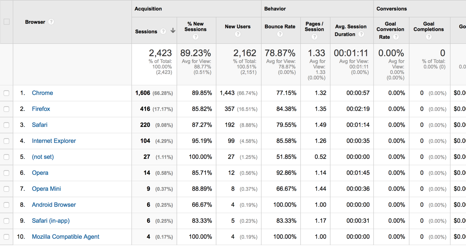
Which browsers to support?
- Entirely up to you
- Analytics for insight
Solutions
- JavaScript Polyfills
- CSS reset/normalization
- Autoprefixer
- jQuery
- HTML5 shim for old IE
Resources
- caniuse.com
- Google Analytics
Additional topics
- Localization and internationalization
- Accessibility
Questions?
Responsive web design and beyond
By Geoffrey Liu
Responsive web design and beyond
These days, people use all sorts of gizmos to access the Internet, from smartphones to smart TV's. How can we design websites that perform well across all browsers and devices? Topics covered will include responsive web design, website performance, and cross-browser compatibility.


