Data Visualization
Tuesday 7 november 2017
- Blogs
- Moretti: Graphs, Maps, Trees
- Visualizations: issues and purposes
Today
Text analysis tools: issues
"Voyant turned out to be useful to learn more about the main themes in the book, but not much about the details. Things like the relationships between certain characters or what they experience throughout the story don't become any clearer by using Voyant."
"It only gives you insights about the words and not the meaning behind the words. Nor the way the words have been used in a sentence. It’s rather a quick solution to see what may be the overall theme, based on trying to connect the dots. Though, what we have to understand, is that maybe we’re connecting the wrong dots."
"People might also take conclusions out of the analysis which could be misleading, and therefore, we could base our further research information on a wrong focus point."
"I see this programme from two sides; the first is that this could actually prove to be somewhat useless as I have so much valuable information yet no way of understanding how it is all connected.".
Text analysis tools: opportunities
"To get enough information, I have to read many texts, interviews and articles, that aren’t always useful. Sometimes they don’t cover my theme – populism – in a right way. Using tools like Voyant are useful to analyse the word use; are there certain words she uses very often? And can I link her language to populism?"
"Currently, I am writing a paper about Thierry Baudet for the course of Digital Media and Politics, and now that I know of these tools and I am able to use them, they will be really helpful if I have to, for example, analyse a speech of Baudet, or acquire insights on his Twitter account and the words he uses more often."
"[W]hen I was writing a paper about Trump and his lexical complexity and what he says about women on Twitter, certain tools like we used are quite helpful to see how difficult his language is and what kind of words he uses for women and even how often he addresses them."
"I am working on a paper about Marine Le Pen for the course Digital Media and Politics. In that paper I am going to analyze her usage of social media platforms and which message she tries to send across. A text analysis tool such a Voyant could come in handy, since it will reveal some of the words Le Pen uses often on social media."
"I think triangulation is key for our research field, which is a methodological framework combining multiple research methods. For instance by using big data sets and analysis and combining this with the interpretive approach. Because human experience cannot be adequately captured only with facts and figures alone."
Moretti: Graphs, Maps, Trees
"A more rational literary history. That is the idea."
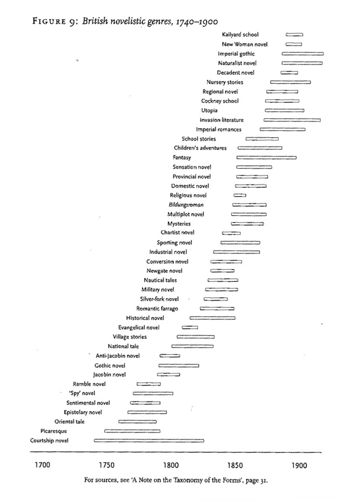
"Quantitative data are useful because they are independent of interpretation [...] They are challenging because they often demand an interpretation that transcends the quantitative realm [...] We see them falsify existing theoretical explanations, and ask for a theory, not so much of 'the' novel, but of a whole family of novelistic forms."
In journalism (data) visualization is incredibly important
I believe (data) visualization might be incredibly important for you too
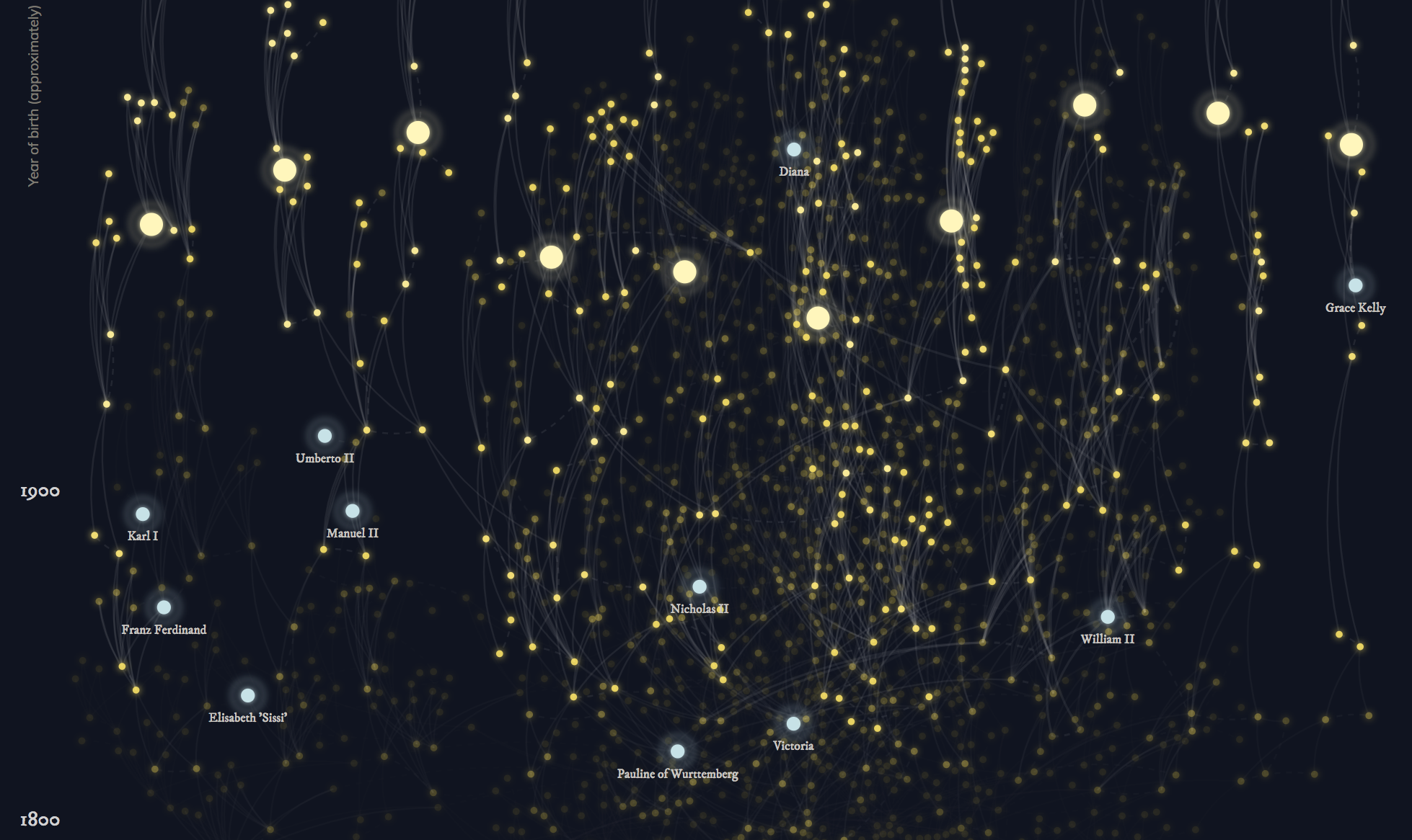
A good visualization
- Allows the audience to access the dataset and find a meaning within the data.
- Helps people to understand what you are trying to tell them.
- Attracts people towards a story.
Severino Ribecca (Dataviz Catalogue): "The audience can process and understand visual information much faster than written information. If you see a good visualization, you will understand the message right away. If that same message is in a text, you must read at least a few paragraphs before you understand the message."
De Haan, Kruikemeier, Lecheler, Smit & Van der Nat
-
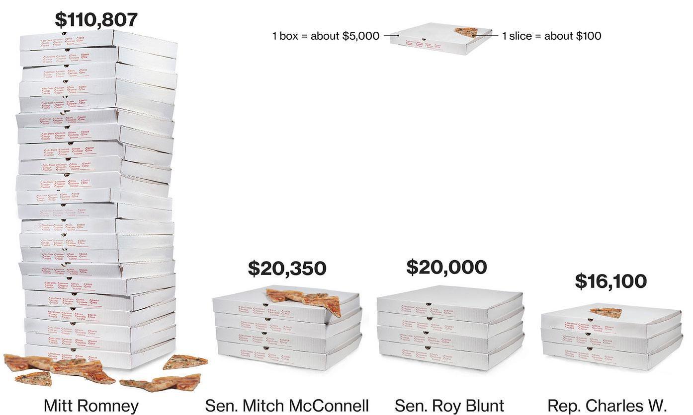
Infographics: graphic representation of information. This information might be a dataset, but it can also be
an abstract concept. -
Data visualizations: an infographic that uses at least one dataset as its
main source.
De Haan, Kruikemeier, Lecheler, Smit & Van der Nat
"While data visualizations are shown to be good entry points, they are less looked at compared to other visuals, such as drawings and pictures (Holmqvist and Wartenberg 2005)"
De Haan, Kruikemeier, Lecheler, Smit & Van der Nat
- "They are believed to have the ability both to attract news consumers to the news, and to enable the integration of “big data” into the news (Schroeder 2004; Smit, de Haan, and Buijs 2014).
- Additionally, researchers have suggested that visualizations may help news consumers to actually understand complex news topics (Bakker, de Haan, and Kuitenbrouwer 2013),
- and that they are positively related to political knowledge and news use (Lee and Kim 2016)."
Big Data?
De Haan, Kruikemeier, Lecheler, Smit & Van der Nat
"We can thus state that participants do use news visualization and that they do so not only because it is there, but also because they are interested in the topic it covers. Nevertheless, the look and feel of the visual influences its use, and visualizations that are deemed approachable or aesthetically pleasing are used more."
De Haan, Kruikemeier, Lecheler, Smit & Van der Nat
"... we can conclude that attractive visualizations help the reader to take the effort to look into an article that includes a visualization. However, the form should not be merely there to attract, but should have a purpose or function to clarify the text."
Back to Severino Ribecca and the 'purpose' of visualizations
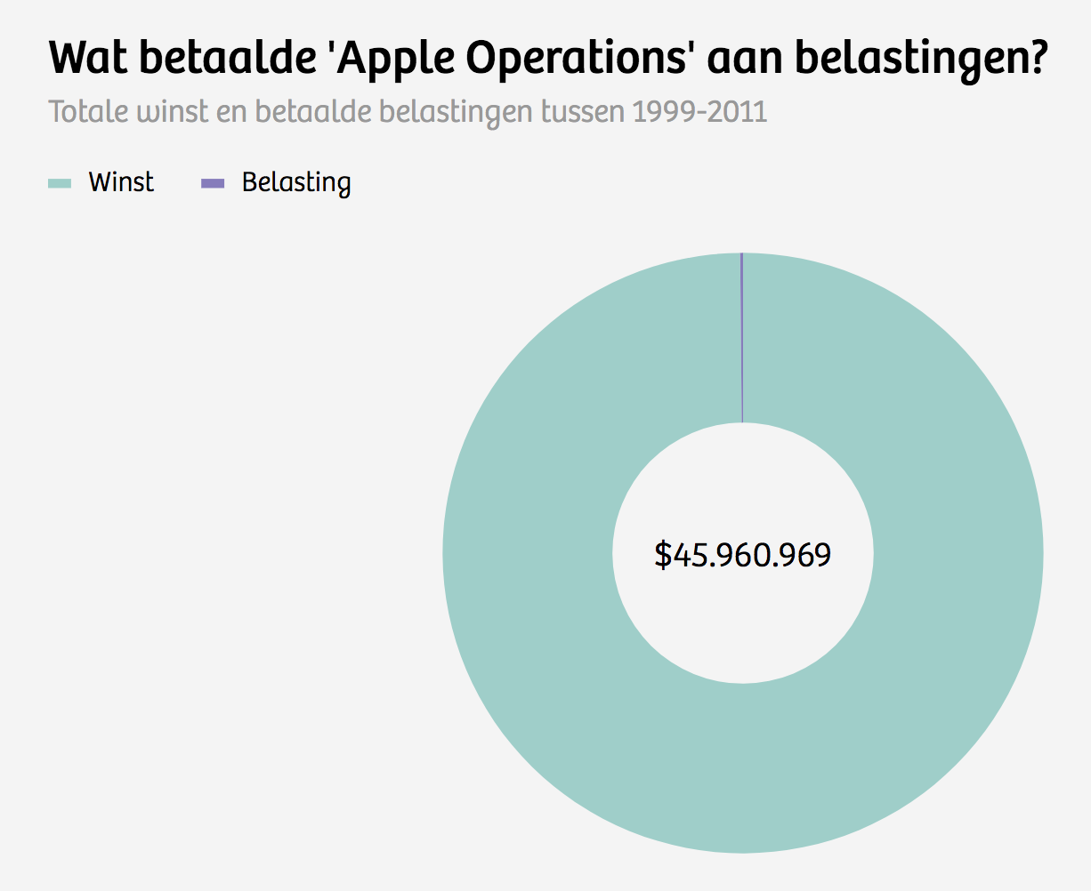
Ribecca believes that 'we' have the tendency to create visualizations that are TOO beautiful, TOO complex (and TOO interactive)
The form needs to fit the purpose ánd the audience.
Johanna Drucker (Digital Humanities)
Just like Ribecca, Drucker speaks about 'the purpose' of the visualization: "The challenge is to understand how the information visualization creates an argument and then make use of the graphical format whose features serve your purpose."
In journalism, this way of thinking results in an ethical issue:
The notion of a 'purpose' and an 'argument', might pose a danger. It might invite us to manipulate our data. However, if data is visualized ethically, it gives us the opportunity to be more transparent.
Drucker about the ethics of data visualization
More problems. We've only spoken about the visualization. But what about the audience?
-
People don't like complexity.
-
People don't like (too much) interaction.
Even more problems. What about the collection of the data?
-
You can collect your own data. But this is time consuming and not always possible.
-
Data-infrastructure is still developing.
-
Not all companies want to share their data (for free).
Lucky for you, we have collected some interesting datasets you can use next Thursday
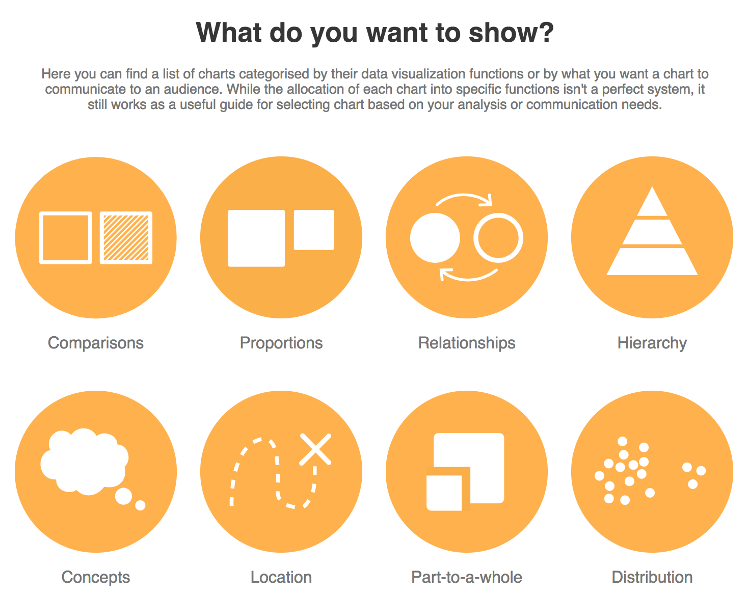
The purpose of your visualization
- Your data visualization allows the audience to access the dataset and find a meaning within the data.
- It helps people to understand what you are trying to tell them.
- Attracts people towards a story.
- The purpose is most important when you are selecting a form for your visualization.
Summarizing
Think about your
audience
-
Don't make your data visualization too complex.
-
Don't make your data visualization too interactive.
-
Don't use a data visualization just to attract your audience. There has to be a purpose and a meaning.
Summarizing
Think about (ethical) issues
-
Make sure you are not manipulating your data.
-
Be aware of data sets that are incomplete or not accurate.
-
Data visualizations might dehumanize your subject.
Summarizing
This Thursday...
Data Visualization
By ingebeek


