Data Visualization
Friday 17 november 2017
In journalism (data) visualization is incredibly important
A good visualization
- Allows the audience to access the dataset and find a meaning within the data.
- Helps people to understand what you are trying to tell them.
- Attracts people towards a story.
Severino Ribecca (Dataviz Catalogue): "The audience can process and understand visual information much faster than written information. If you see a good visualization, you will understand the message right away. If that same message is in a text, you must read at least a few paragraphs before you understand the message."
De Haan, Kruikemeier, Lecheler, Smit & Van der Nat
-
Infographics: graphic representation of information. This information might be a dataset, but it can also be
an abstract concept. -
Data visualizations: an infographic that uses at least one dataset as its
main source.
De Haan, Kruikemeier, Lecheler, Smit & Van der Nat
"While data visualizations are shown to be good entry points, they are less looked at compared to other visuals, such as drawings and pictures (Holmqvist and Wartenberg 2005)"
De Haan, Kruikemeier, Lecheler, Smit & Van der Nat
- "They are believed to have the ability both to attract news consumers to the news, and to enable the integration of “big data” into the news (Schroeder 2004; Smit, de Haan, and Buijs 2014).
- Additionally, researchers have suggested that visualizations may help news consumers to actually understand complex news topics (Bakker, de Haan, and Kuitenbrouwer 2013),
- and that they are positively related to political knowledge and news use (Lee and Kim 2016)."
Big Data?
De Haan, Kruikemeier, Lecheler, Smit & Van der Nat
"We can thus state that participants do use news visualization and that they do so not only because it is there, but also because they are interested in the topic it covers. Nevertheless, the look and feel of the visual influences its use, and visualizations that are deemed approachable or aesthetically pleasing are used more."
De Haan, Kruikemeier, Lecheler, Smit & Van der Nat
"... we can conclude that attractive visualizations help the reader to take the effort to look into an article that includes a visualization. However, the form should not be merely there to attract, but should have a purpose or function to clarify the text."
Back to Severino Ribecca and the 'purpose' of visualizations
Ribecca believes that 'we' have the tendency to create visualizations that are TOO beautiful, TOO complex (and TOO interactive)
The form needs to fit the purpose ánd the audience.
Johanna Drucker (Digital Humanities)
Just like Ribecca, Drucker speaks about 'the purpose' of the visualization: "The challenge is to understand how the information visualization creates an argument and then make use of the graphical format whose features serve your purpose."
In journalism, this way of thinking results in an ethical issue:
The notion of a 'purpose' and an 'argument', might pose a danger. It might invite us to manipulate our data. However, if data is visualized ethically, it gives us the opportunity to be more transparent.
Drucker about the ethics of data visualization
More problems. We've only spoken about the visualization. But what about the audience?
-
People don't like complexity.
-
People don't like (too much) interaction.
Even more problems. What about the collection of the data?
-
You can collect your own data. But this is time consuming and not always possible.
-
Data-infrastructure is still developing.
-
Not all companies want to share their data (for free).
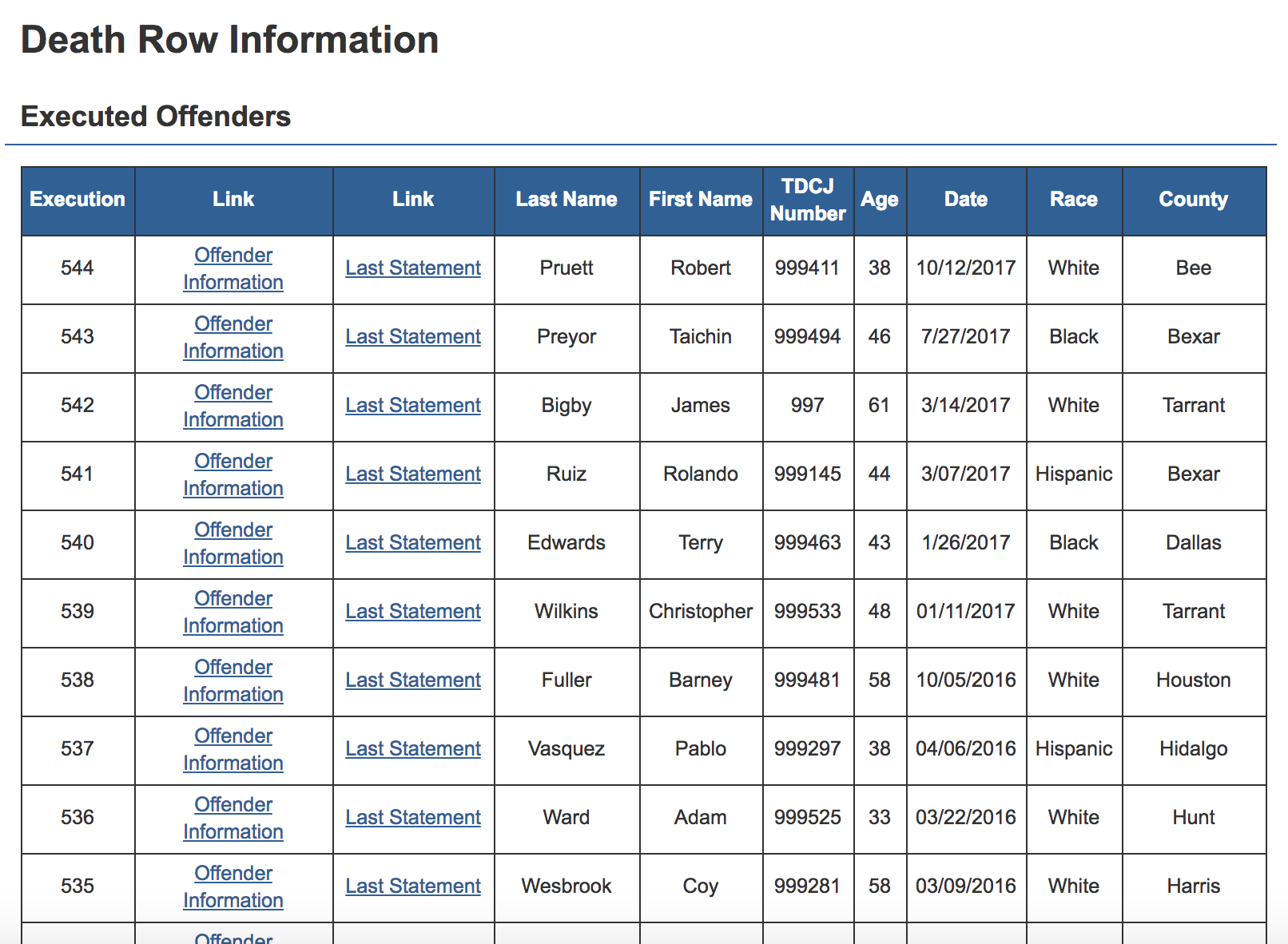
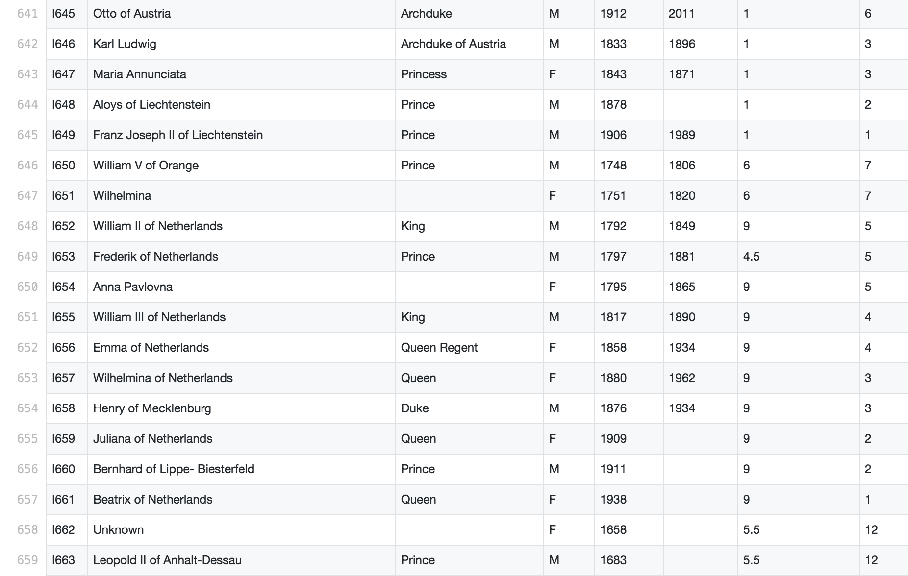
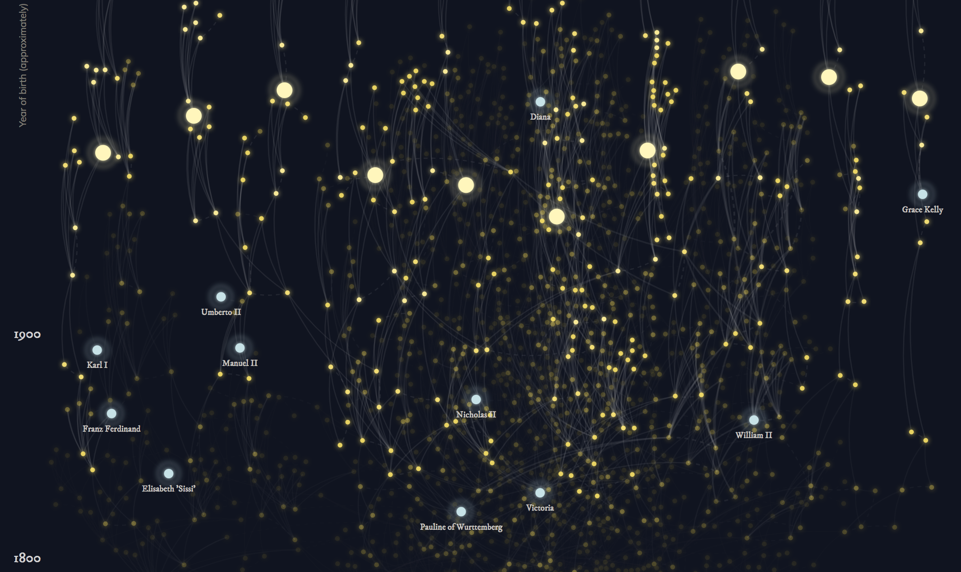
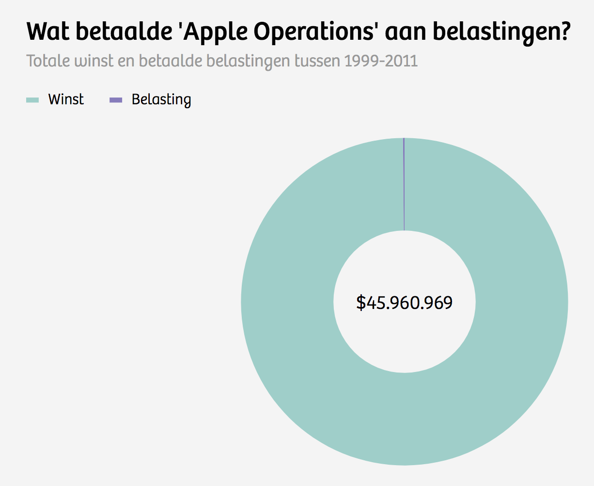
1. Pick a (part of a) dataset that you would like to visualize.
2. Decide what the purpose (/message) of your data visualization is going to be.
3. Create a data visualization. Use a data visualization tool.
Today
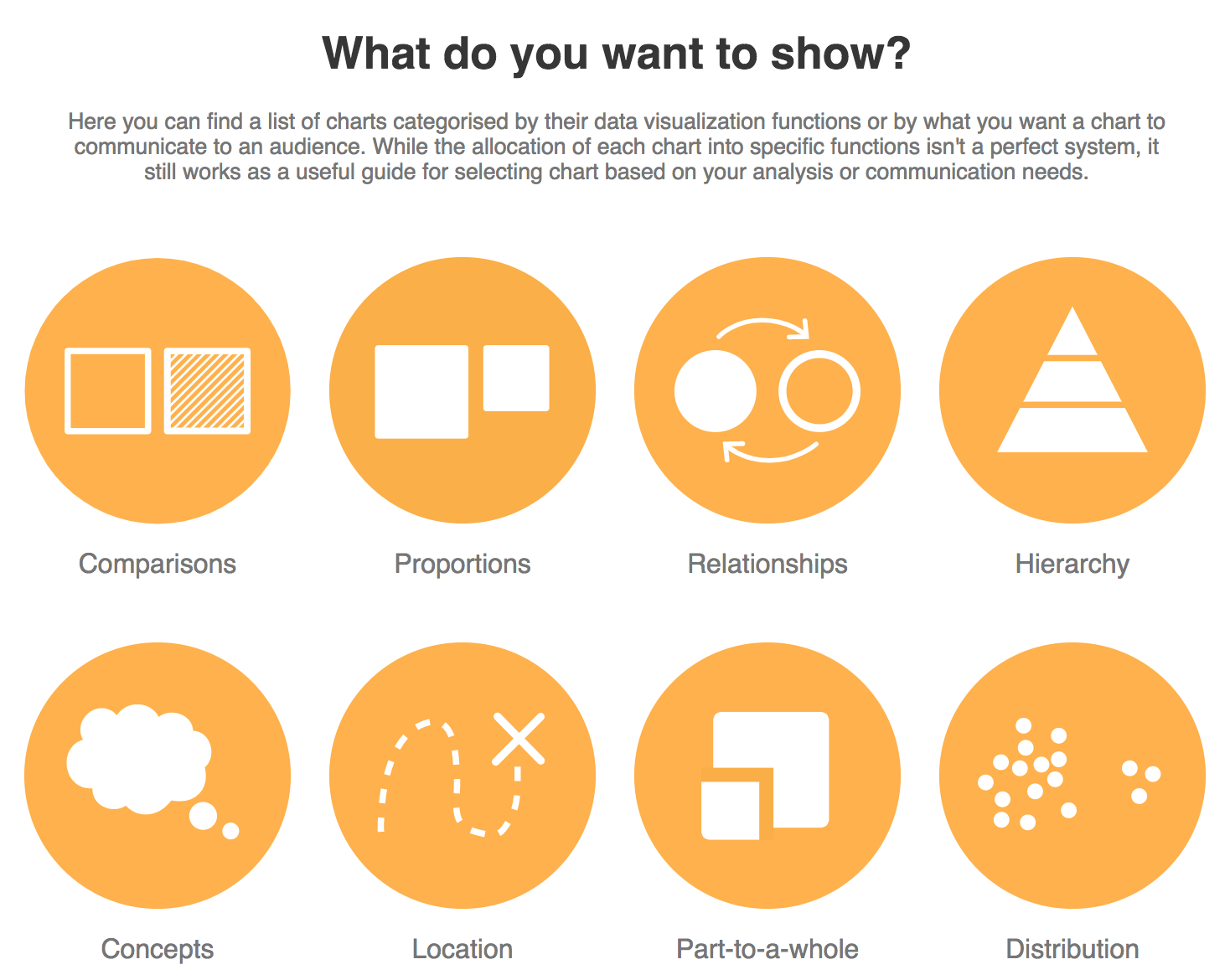
Visualization tools?
-
Tools are webbased
-
They are easy to use
-
They are free (?) to use
-
They are embeddable
Positive
-
Tools are webbased
-
They are free (?) to use
-
They are not always stable
-
You have to work within their frame and use the functionalities the tool has to offer
Negative
1. Pick a (part of a) dataset that you would like to visualize.
2. Decide what the purpose (/message) of your data visualization is going to be.
3. Create a data visualization. Use a data visualization tool.
4. 11:00: Reflections
Assignment
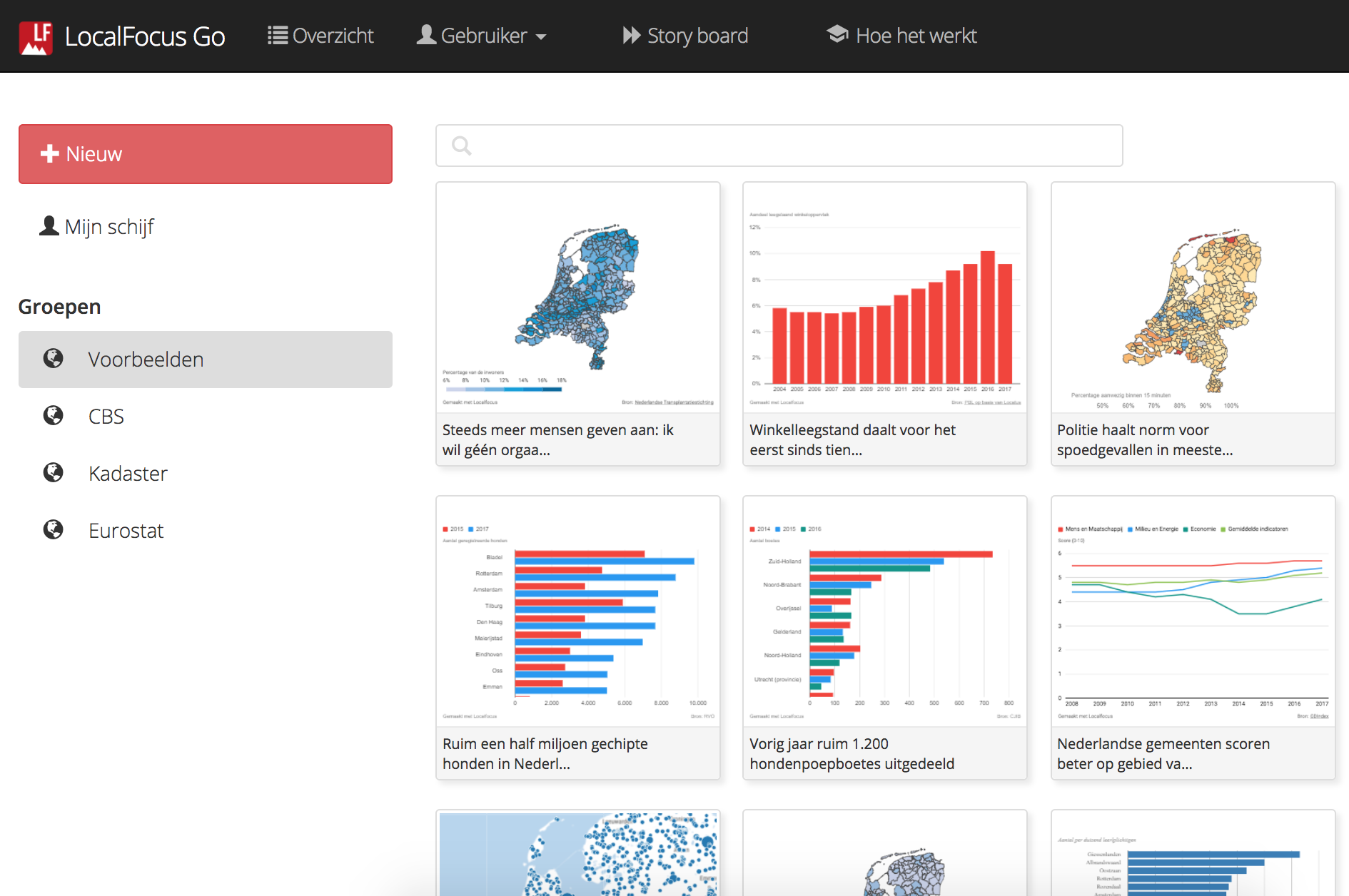
- LocalFocus
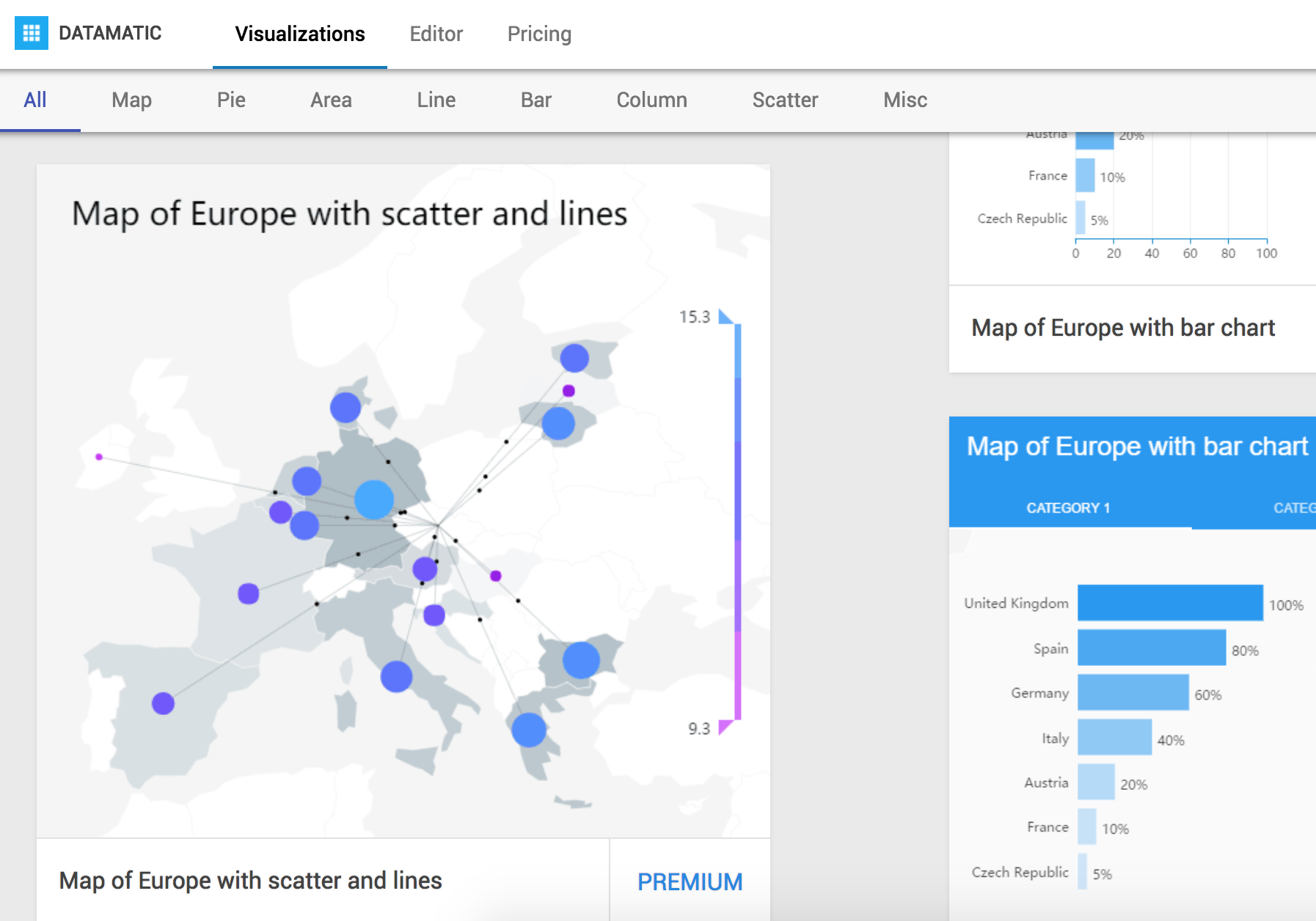
- Datamatic
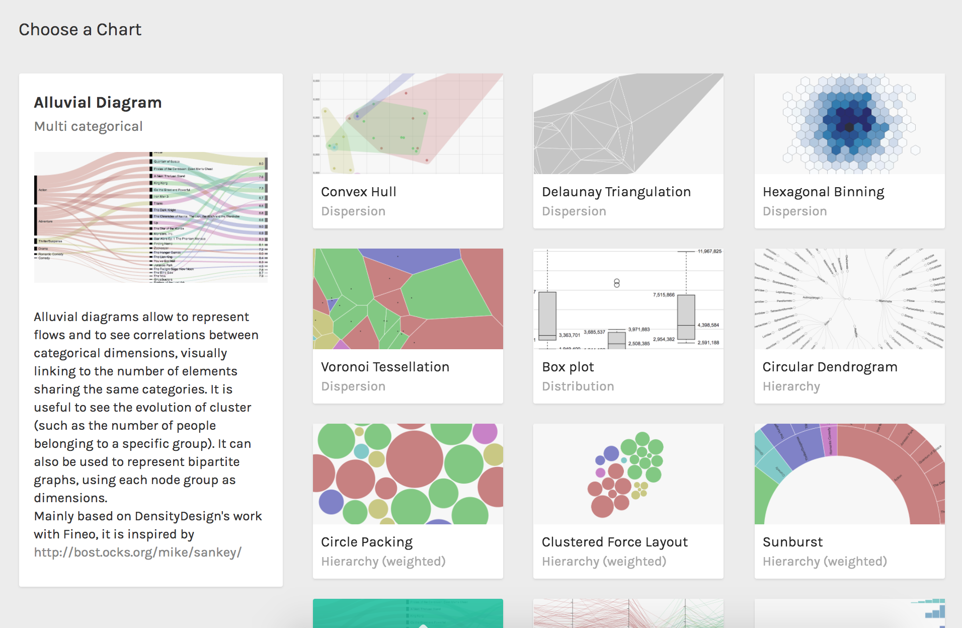
- Raw Density
Data Visualization voor Datajournalistiek
By ingebeek


