HTML recap
HTML Validator
https://validator.w3.org/
<!DOCTYPE html>
    <html lang="en-us">
        <head>
            <meta charset="UTF-8">
            <title>My Website</title>
            <meta name="description" content="Description Goes Here...!">
         </head>

        <body>
            <!-- body goes here-->
        </body>
</html>title your images
<a href="..." title="...">My Link</a>Convention: no space
<!-- no -->
<a href = "..." title = "...">My Link</a>

<!-- yes -->
<a href="..." title="...">My Link</a>
index.html
default page for a folder (aka "directory")
Your FTP directory strucutre might look like this:
mywebsite.com/public/my_projects/project1/index.html
Your browser url would then look like this:
http://mywebsite.com/my_projects/project1
CSS recap
Selector Types:
- Universal: *
- Element / Tag Name: li
- Class: .class-name
- Pseuo-Element: a:hover, li:first-child, li:before
- Pseudo-class: .class-name:hover
- ID: #id-name
- Child (direct descendant): li > a
- Descendant (any child): li a
Tag Selector
Apply style to all occurrences of a certain tag
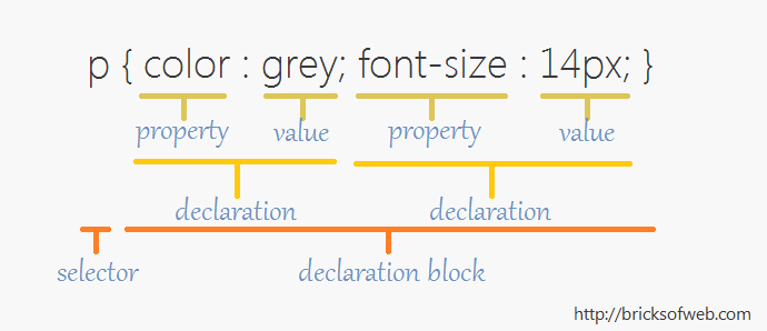
mark {
    color:purple;
    background-color:cyan;
}
This text should be <mark>highlighted</mark>
And <mark>this too</mark>ID Selector
Apply the style for only one element.
#once {
    color:purple;
    background-color:cyan;
}
This will be <mark id="once">special</mark>
But not <mark>this</mark>Class Selector
Apply the style for multiple occurrences of a certain tag,
--OR-- for more than one type of tags.
.some {
    color:purple;
    background-color:cyan;
}
This will be <span class="some">special</mark>
<div class="some">This, too!</div>Grouping
When several selectors share the same declarations. Separated by commas.
div, span {
    color:purple;
    background-color:cyan;
}
This will be <span>special</span>
<div>This, too!</div>Descendant
When several selectors share the same declarations. Separated by commas.
/* any child - separated by space */
.parent .child {
    color:purple;
    background-color:cyan;
}

/* direct child - separated by > */
li > a {
    text-decoration: none;
}
Universal
Apply the same style to all elements.
* {
    padding: 5px;
}
Grid
Grid
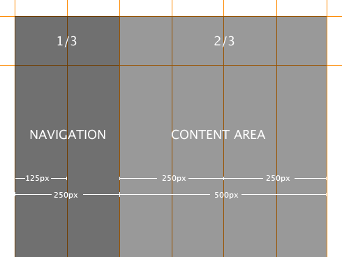
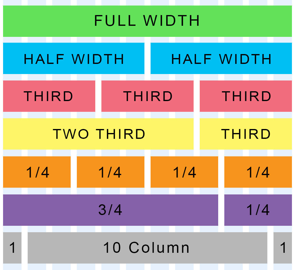
960 grid system
12 column
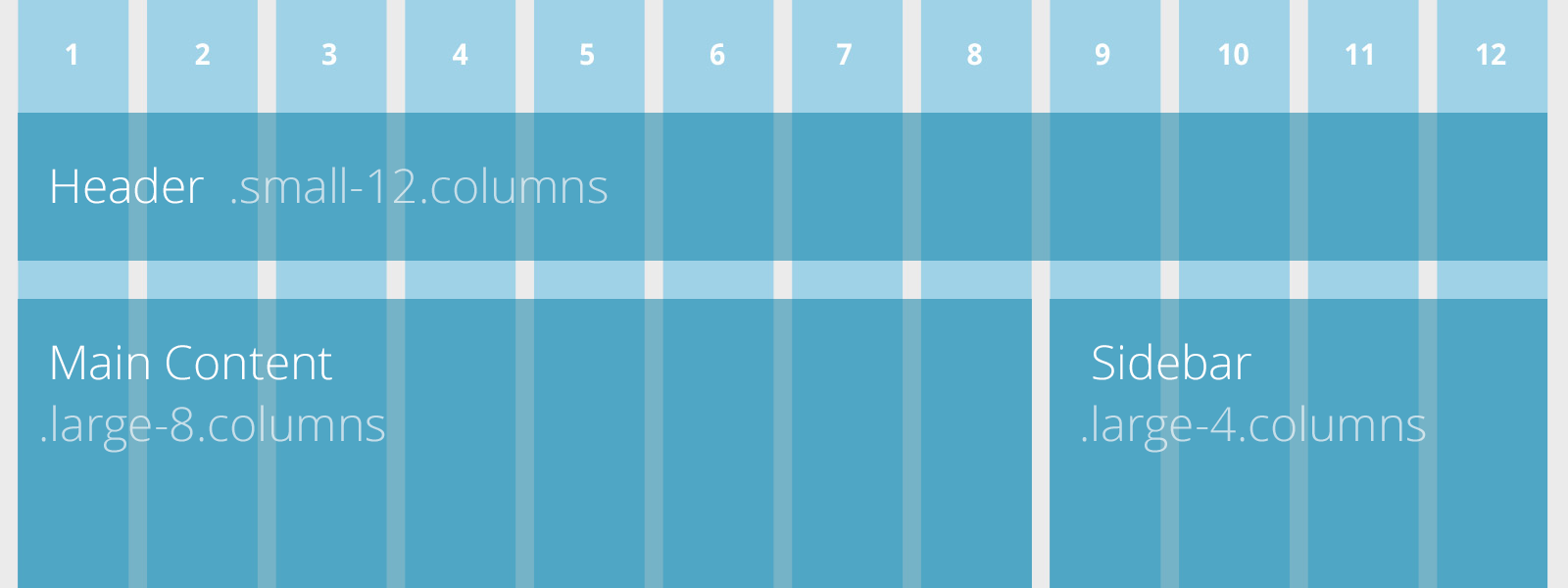
Foundation
Everything's a Box
in HTML / CSS
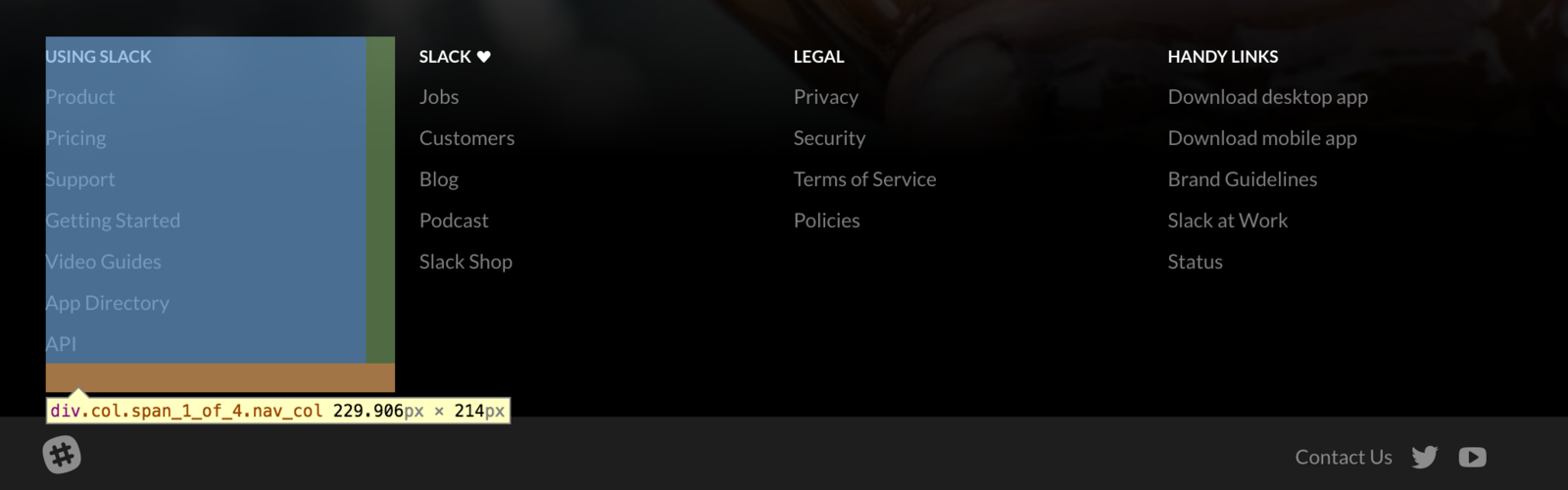
Nesting
Boxes inside of other boxes
Nesting
Example: slack.com footer
CSS Display Property
Display
display: block;
display: inline;
display: inline-block;
Block elements:
- <div>
- <h1> - <h6>
- <p>
Inline elements:
- <span>
- <a>
- <img>
CSS:
Positioning Boxes
Float
float: none|left|right|initial|inherit
Clear
clear: none|left|right|both|initial|inherit
The clear property specifies on which sides of an element floating elements are not allowed to float:
Overflow
overflow: visible|hidden|scroll|auto|initial|inherit;
What happens when content overflows bounding box?
CSS Box Model
Sizing Boxes
CSS:
box-sizing: content-box /* default */
content-box
width
height
padding
border
margin
CSS:
box-sizing: border-box
content
width
height
padding
border
margin
/* override via paulirish */
html {
  box-sizing: border-box;
}
*, *:before, *:after {
  box-sizing: inherit;
}
A method to override all box-sizing http://www.paulirish.com/2012/box-sizing-border-box-ftw/
Sizing Units
Sizing
px
Pixels
%
Percent (of parent element)
Sizing
em
Device's default font size is 1.0em.
em = size of the letter "m." Typically 16px or 100%.
rem
The root element's font size is 1.0rem.
Check caniuse.
/* em: */
h1 { font-size: 3em; margin-left: 0.333em }

/* rem: */
h1 { font-size: 3em; margin-left: 1rem }
Sizing
vw, vh, vmin, vmax
Viewport Units.
1 vw represents 1/100th of the view width.
1 vh represents 1/100th of the view height.
1 vmin/max represents 1/100th of whichever is min/max (if screen is rotated)
Good for mobile.
Check caniuse.
CSS Position Property
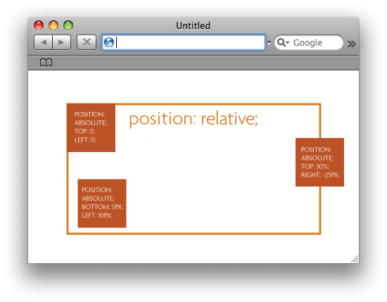
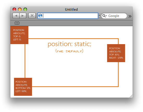
/* Keyword values */
position: static; /* default */
position: relative;
position: absolute;
position: fixed;
position: sticky;

/* Global values */
position: inherit;
position: initial;
position: unset;
height : <length> | <percentage> | inherit
width : <length> | <percentage> | inherit
When position is not static:
top : <length> | <percentage> | auto | inherit
right : <length> | <percentage> | auto | inherit
left : <length> | <percentage> | auto | inherit
bottom : <length> | <percentage> | auto | inherit
Position-related properties
Absolute inside Relative
"A page element with relative positioning gives you the control to absolutely position children elements inside of it." (read more)
The padding property is a shorthand property for the following individual padding properties:
- padding-top
- padding-right
- padding-bottom
- padding-left
Padding
If the padding property has three values:
-
padding: 25px 50px 75px;
- top padding is 25px
- right and left paddings are 50px
- bottom padding is 75px
If the padding property has two values:
-
padding: 25px 50px;
- top and bottom paddings are 25px
- right and left paddings are 50px
If the padding property has one value:
-
padding: 25px;
- all four paddings are 25px
Padding
The margin property is a shorthand property for the following individual margin properties:
- margin-top
- margin-right
- margin-bottom
- margin-left
auto - center the element within its container.
Margin
The border property is a shorthand property for the following individual border properties:
- border-width
- border-style (required)
- border-color
Read More:
Border
In-Class Exercise
Resources
CSS Positioning
By Jason Sigal


