Responsive / Mobile
Losing 80% of your screen space forces you to focus.
You need to know what matters most. In order to do that you need to really know your customers and your business. Which is good design 101.
-Luke Wroblewski, author of Mobile First
Mobile Website
Different set of code for different devices
ie. m.instructables.com, mobile.nytimes.com
This is not what we are doing.
vs
Responsive Website
Same set of code for all devices
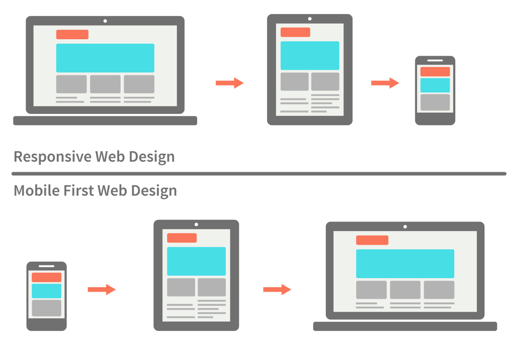
image via metamonks.com/mobile-first-vs-responsive
Graceful Degredation
Progressive Enhancement
Responsive
Liquid / Fluid Width (%)
Adaptive
Specific Layouts at Specific Breakpoints. Fixed Width (px)

GIF via CSS Tricks: "The Difference Between Responsive and Adaptive Design"
Viewport
Viewport
image via stackoverflow
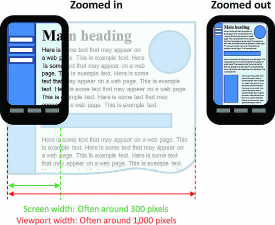
Viewport
<meta name="viewport" content="width=device-width, initial-scale=1.0">read more at w3schools
Media Queries
Media Queries
Separate Stylesheets
<!-- CSS media query on a link element -->
<link rel="stylesheet" media="(max-width: 800px)" href="small.css" />
<link rel="stylesheet" media="(min-width: 801px)" href="big.css" />
Media Queries
For a set of Style Declarations
<!-- CSS media query within a stylesheet -->

@media (max-width: 600px) {
  .sidebar {
    width: 0%;
  }

  .show-sidebar:hover .sidebar {
    width: 100%;
  }
}
Media Queries
media types and media features
More @ Mozilla
media_type: all | aural | braille | handheld | print |
  projection | screen | tty | tv | embossed

<!-- a few examples -->
media_feature: width | min-width | max-width
  | height | min-height | max-height

orientation: landscape | portrait
Media Queries
logic: and , not only
case insensitive, but conventionally lower case
More @ Mozilla
handheld and (min-width: 20em), screen and (min-width: 20em)Media Queries:
The Traditional Way: Device-Specific Breakpoints
Media Queries
The New Trend: Mobile First.
Design for the smallest screen first.
Increase the width.
When it looks bad, make it look good with a media query.
Best Practices
- Text: 70-80 characters (~10 words) per line.
- Images: Always big enough (but not excessively big on mobile) *see previous lecture / <picture> element
- If important content is not immediately visible, it should still be accessible.
RWD Patterns
Layout Patterns by Luke W
Responsive Patterns by Pete LePage / Google
Complex Patterns by Brad Frost
Collection of Example Links / Code by Brad Frost
*many of these use JavaScript and Frameworks that we have not covered yet.
Example
with JavaScript
Hamburger Menu
no JavaScript
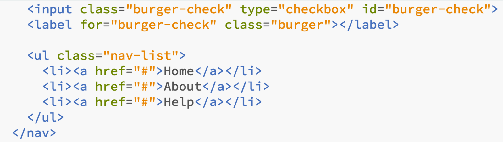
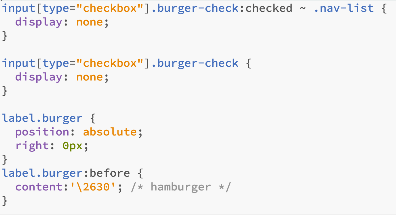
Responsive,
By Jason Sigal


