Speechify
User Research Insights
1. Step-by-step Insights
2. Onboarding notes
3. Moving Forward
Welcome Screen
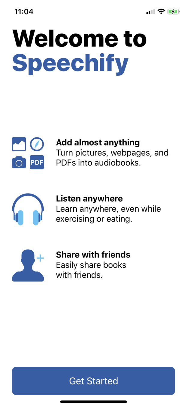
Welcome Screen
Consider a more visually interesting get started screen that showcases the capabilities of the app, instead of just lines of text that you can't listen to
This is going in the right direction, but could definitely use more work establishing a unique brand identity
Sign in/Sign up
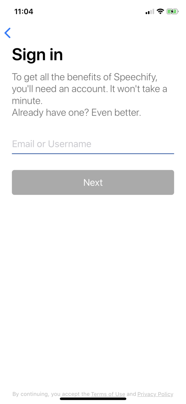
18% of new users are lost on the log in/sign up screen.
This is likely due to the welcome screen's inability to succinctly convey the abilities and purpose of the application.
Sign in/Sign up
Sign in/Sign up
- Design a more engaging immediate on-boarding experience that showcases some of the functionalities of the app instead of just listing generic bullet points
- Communicate to the user why they need to sign up in the first place. "I thought this was just a tool to convert text into audio, why do I need to make an account?"
Subscribe
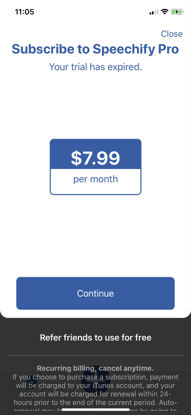
< This is illegible
< What is the difference between Pro and regular? Does it exist?
Subscribe
-
Only 25% of new users manage to reach the subscribe screen
-
Of this 25%, 28% quit immediately upon seeing the subscribe menu.
- This accounts for 7% of all new users, making it statistically significant.
- **This trend fluctuates between 5% and 10% between all versions.**
Subscribe
- In user interviews, it was found that half of the testers were unable to find the "trial" button immediately, or without assistance.
- In addition, testers found it strange that "Speechify Pro" was an option even though the entire app is "Speechify Pro"
Subscribe
-
Get users hooked on a free version of the app first.
Maybe in the free version, you can only access existing documents and collections, and to translate your own you must pay? -
Instead of "subscribe now" maybe it should be "learn more"
-
Do NOT display this screen immediately upon logging in. It feels user-hostile
"UGH at the payment thing. Try free? It should just be like…. Continue free. “Try?
Subscribe
"I haven't even started and it's already asking me to subscribe"
"There’s no way to not subscribe….oh ok try free for 7 days. That’s gross? I don’t want it to start by bombarding me with ‘spend money'
"What..am I paying for?"
Library
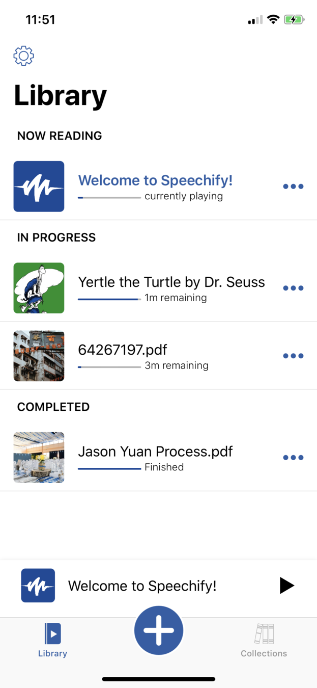
Library
- Participants generally did not go straight to welcome, rather, they went to the Dr. Seuss Book
- Confusion between Library and Collections
- Participants were confused regarding the nature of the app. "This feels more like a download audio book instead of add my own book"
Library
- Difference between library and collections, including how to access new collections, should be addressed in onboarding
- Add previews and summaries of the texts underneath so users know what they're getting into
- Connect with public user access points such as Google Docs and JSTOR
Playback
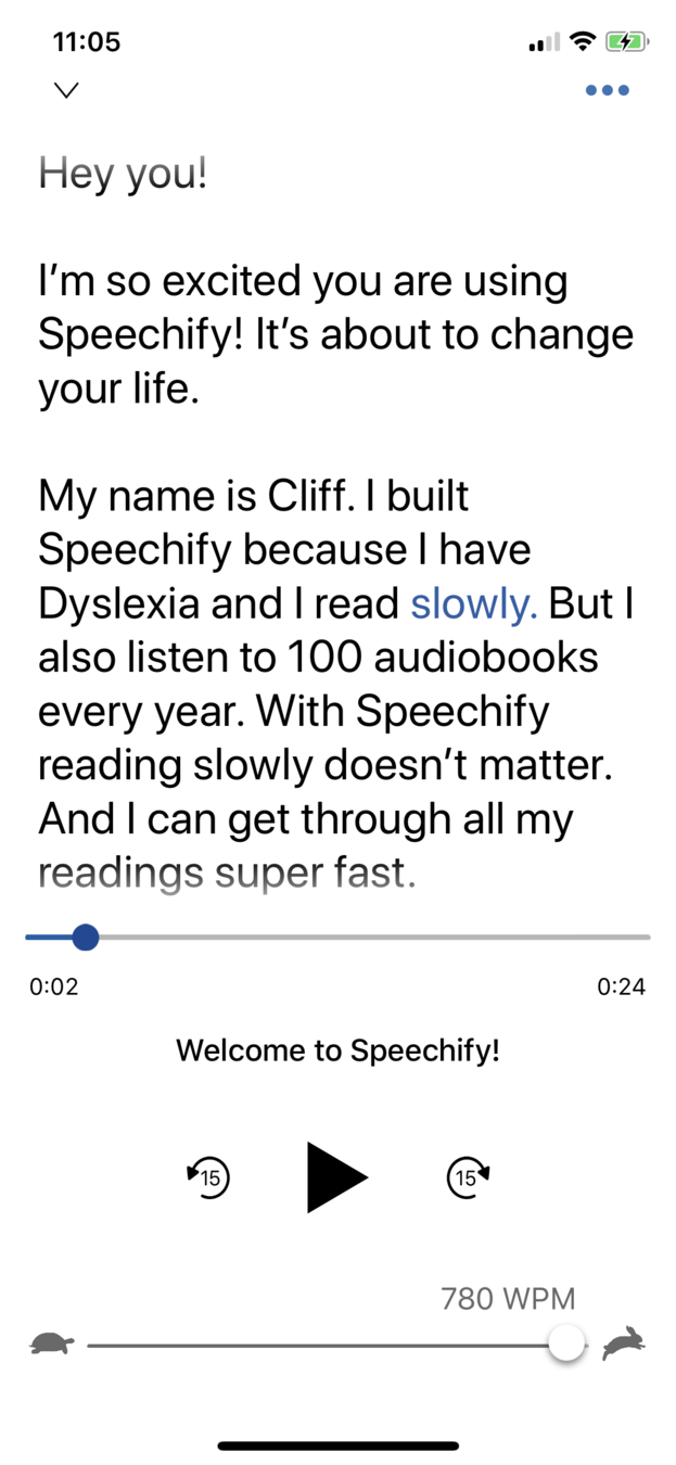
< Blue highlight hard to find
< Confusing placement. Who reads at 780 WPM?
< Connect the slider and the scrubbing
< Instead of skip 15 sec, maybe it should be skip a paragraph?
Playback
- Confusing interface that has conflicting elements of audiobooks, music, and ebook reading apps
- 60% of users wanted to scrub through the text and have the audio follow in real time
- Welcome ebook method of onboarding is a failure to visualize system status
Playback
- Simplify user interface. Bring back audio bar, merge the "time slider" and the text itself to create cohesion
- Give a tutorial on playback controls prior to letting users access it
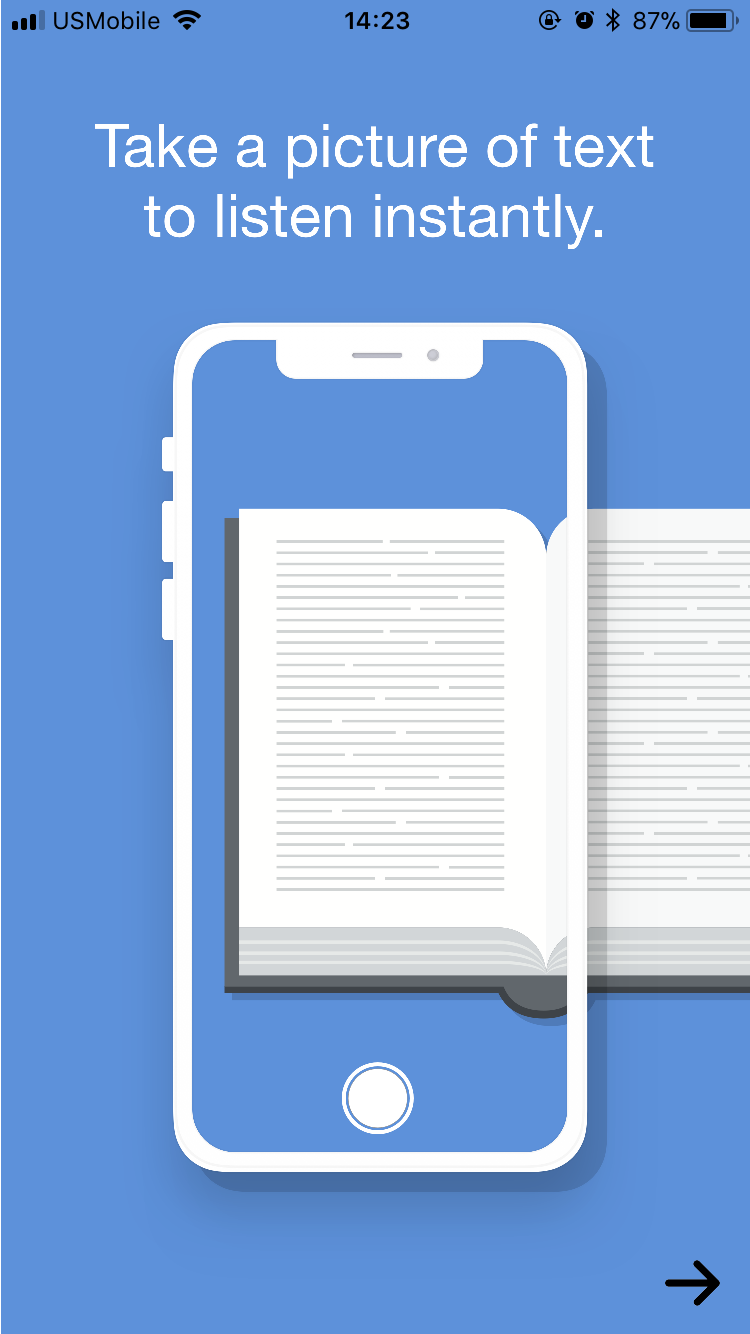
Onboarding Notes
-
Guided tour where features are spotlighted and the text is read aloud as the spotlight moves
-
A user tutorial on how to upload an image. Maybe a really simplified image so that they app educates the user on "this is how your text would be parsed by our technology." Being thrown into it is intimidating and explains the lower retention rate
-
"Try taking a picture of something!"
Moving forward
-
Subscription screen
-
Welcome screen
-
Playback controls
-
New-user tutorial
Machine learning... interpret images?
deck
By Jason Yuan