Responsive Design
to Maximize Your Blackbaud Internet Solutions Donation Experience
Who Was I?
- Failed High School Teacher
- Failed FM DJ at a Classic Rock Station
- Failed Writer*
- Failed Coffee Shop Manager
- Failed Stock Boy at a Liquor Store
- Failed Best Buy Service Plan Pusher
Who Am I?
- Real Name is Just the Letter J
- Older than you think*
- Married 18 years, 8 year old daughter
- 5 Years at Blackbaud
- Senior Interactive Web Developer IV
- Specialize in BBIS Front End Customizations
- Photoshop Narcissist.
What my mom thinks I do

What I think I do

What I Really Do

What It Is
Exploring responsive design and its implementation in Blackbaud Internet Solutions, hopefully sparking your creativity while instructing on pitfalls to avoid, choices to consider and granting you another tool to create a successful, engaging website for your BBIS installation.
What it also is
We will look at the practical application as well as overarching themes. So a bit of code a bit of philosophy, but not enough of either to fry your brains.

Why Responsive?
2008

We must make our website iPhone friendly
2009
We must make our website Android friendly!
2011
We must make our website iPad friendly!
2014
We must make our website ...
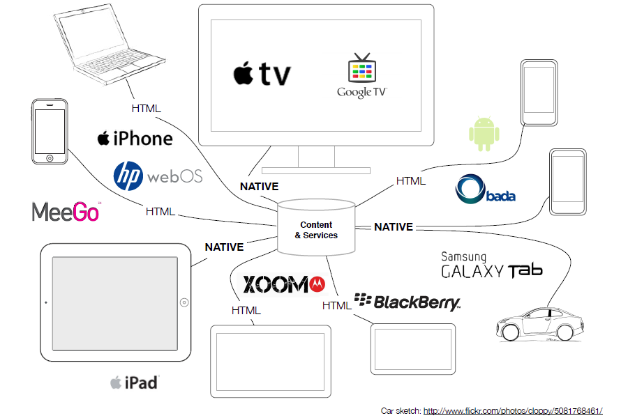
The Next Device is Coming!

2015
!!!!
Declaration of Terms

Fixed
A traditional website with fixed widths. Remains the same size regardless of device or screensize.
This is where your website probably began.
Fluid
Uses percentages instead of fixed pixel width. Everything remains the same relative size to the screen.
This is an important step in creating a website readable on any screensize, but doesn't address the problem with two columns squeezed onto a small device.

Adaptive
Uses media queries to alter the styles at different screen widths.
An example would be creating a mobile menu that is normally hidden, but when the screen size is below a certain width, it appears.
.mobileMenu ul {
    display:none;
}
@media (max-width: 380px) {
    .mobileMenu ul {
        display:block;
    }
}
Responsive
Combines the approach of Fluid and Adaptive design to create a website readable regardless of device and screensize.
Widths will fluidly adjust based on screen width, but in addition will have breakpoints to change the layout to something better suited to the screensize.


West Point
Mobile First
Starting with a mobile design and progressing to desktop.


Mobile
Tablet
Desktop
Mobile first is nice
But most organizations are starting with an existing website that needs a makeover

Mobile first is nice
But BBIS is built on an older markup that began as desktop first.

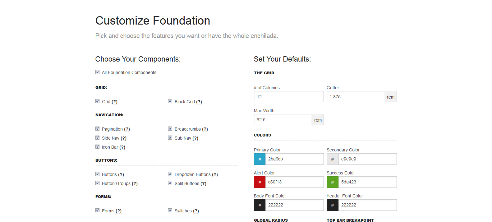
Responsive Frameworks
A Popular Shortcut
Responsive Frameworks
- Twitter Bootstrap
- Foundation
- Skeleton
Yes, Virginia, you can use a responsive framework with BBIS.*

*Considerations

Gremlins hiding in the code
Considerations
- Media Query format
- jQuery or other libraries used
- Choosing the right add-ons
- Styles overriding core HTML
elements - Responsive parts
- Copy, Copy, COPY
Media Query
BBIS uses a compression utility when it renders the CSS that doesn't like compound media queries.
@media only screen and (min-width: 40.0625em) {
    .stuffInHere {

    }
}
To have the compressor ignore this, we have to add the following.
@media only screen and /*!YUI Compressor */(min-width: 40.0625em) {
    .stuffInHere {

    }
}
Media Query
You may have noticed something odd about that width, too. It was using an odd unit of measure.
@media only screen and (min-width: 40.0625em) {
    .stuffInHere {

    }
}
Some responsive frameworks use EM instead of percentage. This makes widths dependent on the base font size (the default is 16px). In this way designers can better control horizontal scroll.
jQuery Compatibility
BBIS already loads a version of jQuery. Bootstrap attempts to load a newer version. This can cause odd things to happen.
<script type="text/javascript">var $ = jQuery.noConflict();</script>The No Conflict trick at the end of our page creates an alias, allowing us to use a newer version of jQuery.
Choosing the right Add-ons
Most frameworks will have additional components you can add à la carte. Don't be a glutton.
Styles overriding core HTML
elements
html, body, div, span, applet, object, iframe, h1, h2, h3, h4, h5, h6, p,
a, abbr, acronym, address, big, cite, code, del, dfn, em, font, img, ins,
small, strike, strong, sub, sup, tt, var, b, u, i, center, dl, dt, dd, form,
table, caption, tbody, tfoot, thead, tr, th, td {
    margin: 0;
    padding: 0;
    border: 0;
    outline: 0;
}

* {
    box-sizing: border-box;
}
*::before, *::after {
    box-sizing: border-box;
}
Items to be wary of
form, input, button, select, textarea, table, td, and ul
These styles could affect standard BBIS parts as well as elements in the Admin overlay when editing a page.
#siteWrapper * {
    box-sizing: border-box;
}
#siteWrapper *::before, *::after {
    box-sizing: border-box;
}
Using a more specific target I can avoid overriding base styles and still use the framework styles
Most Important Commandment of BBIS Design
Copy, Copy, Copy
Don't Gamble with your work or your site.
Create a copy of every file you touch, both locally (on your harddrive or a file repository) and inside BBIS

Responsive Parts
- User Login Form
- Password Reminder Form
- New User Registration Form
- Change User ID/Password Form
- User Profile Form
- User Profile Update Confirmation
- User Profile Display
- User Email Preferences Form
- Donation Form
- Payment Part
- Payment Summary
- Event Registration Form
- Event Calendar
Non-Responsive Parts
- User Photo Form
- Transaction Manager
- User Interest Form
- Common Form
- Directory Part*
- Job Board
- Personal Notes
Coming Soon
- COER Registration Form
Also, don't forget the parts that allow you to create your own HTML
- Advanced Donation Form
- Record Display Part
- Query Display Part
- Custom Content Part
- Unformatted Text Part
A Quick Primer on Placement
- CSS
- Grid HTML
- JavaScript, Fonts
- Images
- Header Includes
- JavaScript Includes
- Sites Explorer - Stylesheets
- Layouts
- Sites Explorer - Files
- Sites Explorer - Images
- Unformatted Text Part
- Unformatted Text Part
Considerations When Converting to Responsive Design
UI Interactions
Mice Don't Have Fingers
Another example to look out for would be your collapsing menus or hover states.
Fingers can't hover.
Only mice can hover.

Remember that mobile users are all thumbs
- Give them large, idiot proof buttons
- Make clickable areas forgiving
- space clickable areas to avoid misclicks
- This doubles for forms where misclicks mean missed opportunities.
http://www.core77.com/posts/27656/Mobile-Interface-Design-Thumb-Zones-for-the-new-iPhones
Put it within reach
Cross domain calls
Don't text all your friends before putting your pants on
Example (Name withheld to protect the innocent)
http://ads.adaptly.com/seg?add=X
http://s.amazon-adsystem.com/iui3?d=XXXXXXX
http://b.collective-media.net/seg/cm/uiao (called twice)
http://a.tribalfusion.com/i.cid?c=X&d=30&page=landingPage
http://leadback.advertising.com/adcedge/lb?site=XXX (called three times)
http://pixel.quantserve.com/pixel/p-d5N1L76OG6H12.gif?labels=X
http://ad.doubleclick.net/activity;src=XXX
That's 10 lookups on every page load.
Limit these, or ensure they are ASYNCHRONOUS
Optimize Images
No one cares about your trip to the Bahamas
Small images can still be large images.

An image not resized by an image editor is still the same size, regardless of how small you tried to make it in the browser.
Or as my grandfather said, 10 pounds of junk in a 5 pound bag.

Images should be responsive.
Set them to a max-width of 100%.
Don't Forget Tablet
It's always
Marsha, Marsha, Marsha!
Tablet is the middle child.

Some Tablet Love
- Desktop is too wide, mobile too small
- Optimal reading width is 60-75 characters
- Remember landscape and portrait
- More active space on the screen
- Still no hovers
Content
You talk too much
Says the guy who hasn't taken a breath this presentation.

Content Considerations
- Content should be creme, good should rise
- We all have ADD on our phones
- Get users a way to get to what they want
- Don't give everyone everything
- Mobile users scroll
acutually everone scrolls
(http://uxmyths.com/post/654047943/myth-people-dont-scroll)
Wait a minute
Why are those only Mobile considerations?
They Aren't.
If it's too complicated for mobile, it's too complicated.
If it's too wordy for mobile, it's too wordy.
If it's confusing for mobile, it's confusing.
That's not saying no content.
Put it where we can get to it.
But let us know what it is.
10 Things your mother never told you about responsive design.
She made a responsive design website, but what she did next blew my mind.
Which brings me to my last point...
Know your audience
Each one of us might be a brain...and an athlete...and a basket case...a princess...and a criminal.... But we all don't visit your site for the same reason.

As my grandfather would say...
Anecdotes are like garlic, we may all enjoy them, but they stink.
Content strategy and design is a whole new topic.
but I'm not one to balk at tangents.
Quick tips:
- Think of three groups that may visit your site. It could be less.
- Think of the three things those users want to accomplish. It could overlap.
- Make those easy to get to.
- "Pretend" you are that person, and test.

Quick Quiz
What page do you think this button will take me to?
Not Here

Pet Peeve
I'm looking at YOU Higher Ed

Pet Peeve
I'm looking at YOU Higher Ed
If you say Donate Now.
I better be able to donate NOW, on the very next screen.
Not three clicks in.
Not after reading about all the stocks I can bequeath.
I JUST told you I want to Donate NOW and you chose to confuse me.
Final Tip
Test.
In the devices.
Using your actions and audience.
From end to end.
What Questions do you have?
Besides
Do you always talk this much?
Did you even leave time for questions?
and, How did you get so awesome with Photoshop?
Responsive Design Session
By J Owen Schultz
Responsive Design Session
BBCON 2015


