


Liliana Kastilio
Technical Services Architect at @snyksec #typescript ♥ ❯ Organiser of @devs_london ❯ Polyglot ❯ dnb ♥ ❯ aerialist ❯ she/her #javascript #nodejs #python #django
nav ul {
  margin: 0;
  list-style: none;
}

nav li {
  display: inline-block;
}

nav {
  background: #fff;
}
<nav>
<ul>
<li>
<a href="/about.html">About</a>
</li>
<li>
<a href="/contact.html">Contact</a>
</li>
</ul>
</nav><nav>
<ul>
<li>
<a href="/about.html">About</a>
</li>
<li>
<a href="/contact.html">Contact</a>
</li>
</ul>
</nav>
<nav>
<ul>
<li>
<a href="/category/photography.html">Photography</a>
</li>
<li>
<a href="/category/weddings.html">Weddings</a>
</li>
</ul>
</nav>
<nav class="navigation">
  <h1 class="col-lg-4">
    <a href="/">
      <span class="visuallyhidden">Squarespace</span>
      <img src="/logo.svg">
    </a>
  </h1>
  <ul>
    <li class="col-lg-4>
      <a href="/about.html" class="uppercase">About</a>
    </li>
    <li class="col-lg-4>
      <a href="/contact.html" class="uppercase">Contact</a>
    </li>
  </ul>
  <a href="/login" class="button uppercase no-bg">Login</a>
</nav>
<nav class="navigation">
  <ul>
    <li class="col-lg-4>
      <a href="/category/photography.html" class="uppercase active-link">Overview</a>
    </li>
    <li class="col-lg-4>
      <a href="/category/photography.html" class="uppercase">Photography</a>
    </li>
    <li>
      <a href="/category/weddings.html" class="uppercase">Weddings</a>
    </li>
  </ul>
</nav>
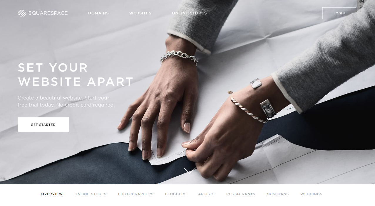
⇒ So we could actually use the code for both of the navigations under the .navigation class and then apply some classes to account for the variations.
⇒ For example see the button has a .no-bg class applied to indicate this button has no background, so we set it to transparent while the button on the hero has a white background and that may be the standard look for a button
<nav class="navigation">
  <h1 class="navigation__heading col-lg-2">
    <a href="/">
      <span class="visuallyhidden">Squarespace</span>
      <img class="navigation__logo" src="/logo.svg">
    </a>
  </h1>
  <ul class="navigation__list">
    <li class="navigation_item">
      <a href="/about.html" class="navigation__link color-white uppercase">About</a>
    </li>
    <li class="navigation_item">
      <a href="/contact.html" class="navigation__link color-white uppercase">Contact</a>
    </li>
  </ul>
  <a href="/login" class="button uppercase">Login</a>
</nav>
.navigation {

  background-color: #fff;

  .navigation__heading {
      color: #fff;
  }

  .navigation__logo {
      max-width: 100px;
  }

  .navigation__list {
      list-style: none;
  }

  .navigation__item {
      display: inline-block;
  }

  .navigation__link {
      color: #fff;
      text-decoration: none;
  }
}By Liliana Kastilio
Simple intro to what is Object Oriented CSS and how you can use BEM to keep styles tidy


