Ampersand Conference Summary
Matej Latin
November 13, 2015 — Brighton, UK
Bruno Maag
DESIGNING A TYPEFACE FOR AMAZON KINDLE
Typeface Designer — Dalton Maag
Dalton Maag is a type foundry known for it's work for Nokia and Intel.
Amazon Kindles have been using Caecilia and Berthold typefaces. Both were designed for print in the 1990s.
Amazon asked Dalton Maag to design a typeface for Kindle screens.
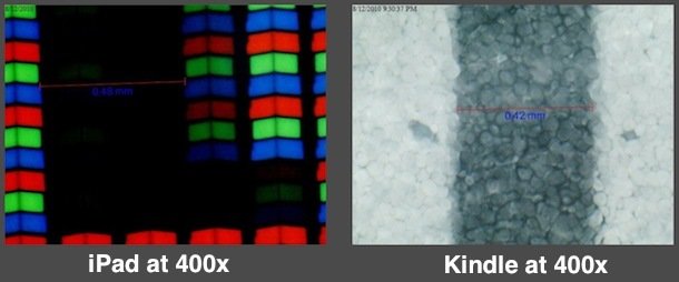
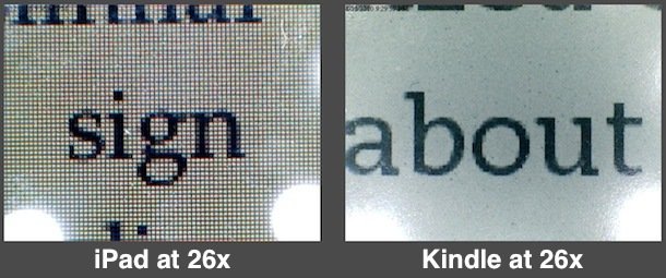
Comparing the iPad and Kindle Screens
The Kindle screen has a higher resolution meaning the typefaces rendered on it are much sharper.
A close–up on Kindle screen crystals coloured by E-Ink.
Kindle screens are much better at rendering typefaces than LCD screens but because Amazon has been using old typefaces — meant for use in print — the screen hasn't been used to its' full potential.
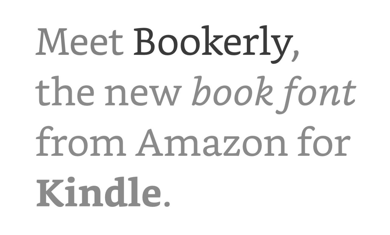
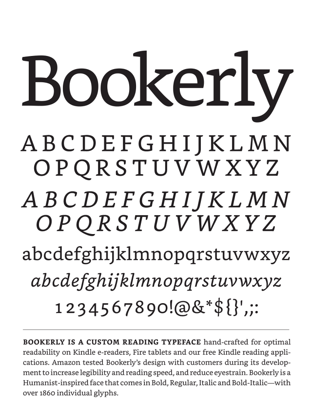
Bookerly is the first typeface designed for Kindle screens.
Kindle finally gets typography that doesn't suck.
According to Amazon's internal testing.

Bookerly is
easier on the eye.
Bookerly increases
reading speed by
Readers read
more books.
Bookerly sells
Small details make a
big difference.
Sarah Hyndman
THINKING OUTSIDE THE FONT
Founder — Type Tasting
Sarah Hyndman founded type tasting to study psychological effects of typefaces.
Her tests are renowned because of their fun side and conclusive results.
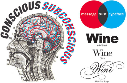
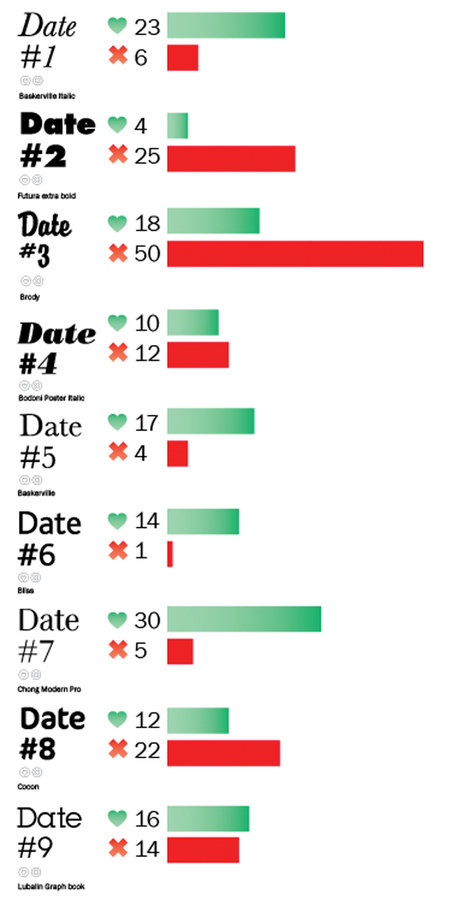
One of her famous tests is the Font Dating Test where participants decide wether to take a font to a date based on its' looks. The decision has to be made quickly so it's mostly based on subconscious response.
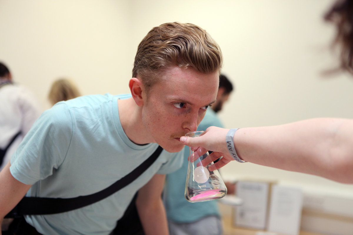
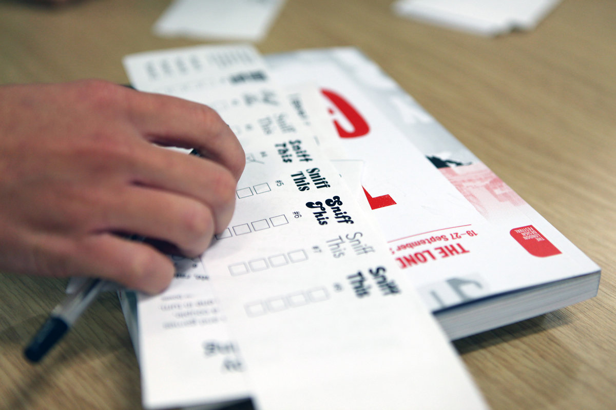
Font Smells Test
Smell.
Assign a font to it.
Probably Comic Sans?
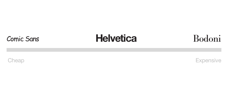
How people perceive fonts. Helvetica is always somewhere in the middle.
Take part in the Type Tasting tests at:
Ampersand Conference Summary
By Matej Latin


