Redesigning the Auto Trader search experience
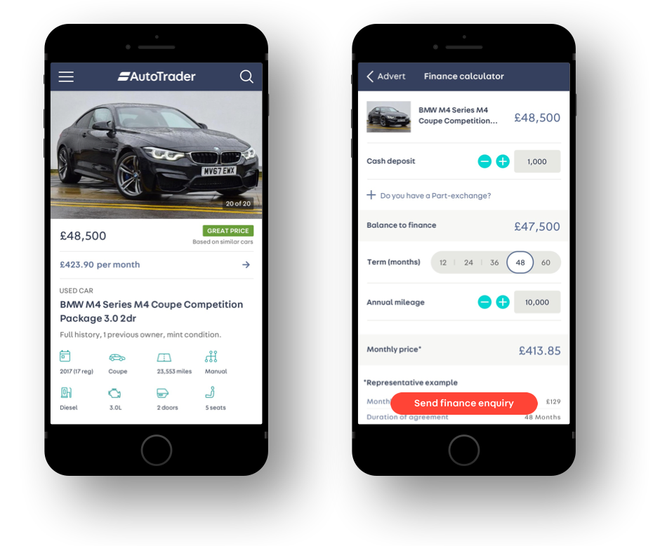
Auto Trader platforms receive more than 1 million visits per day. I joined the company as a Lead UX/UI Designer to help design better experiences across all platforms—mobile & desktop web and the native apps and to do that across four products (each owned by a dedicated squad): Search, Trust, Valuations and Finance.
This is an overview of how I led one of the projects by helping the squad towards understanding Auto Trader's users, identifying their problems, defining desired outcomes, finding solutions and validating them. For sake of simplicity of the presentation it focuses on mobile web only.
Understanding Auto Trader's users
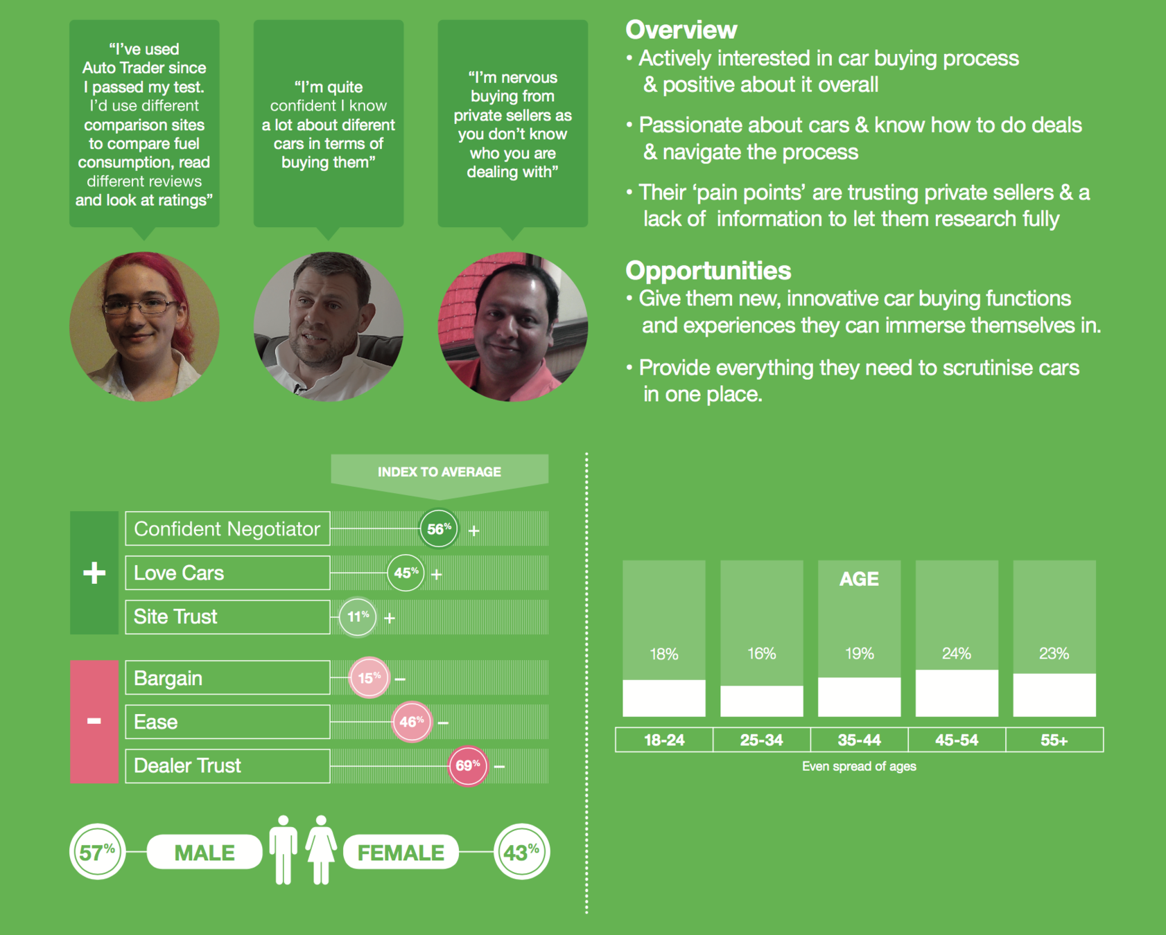
PERSONAS
Soon after joining I started noticing things that needed to be improved. But first, I needed to understand the types of users of Auto Trader and what their goals are.
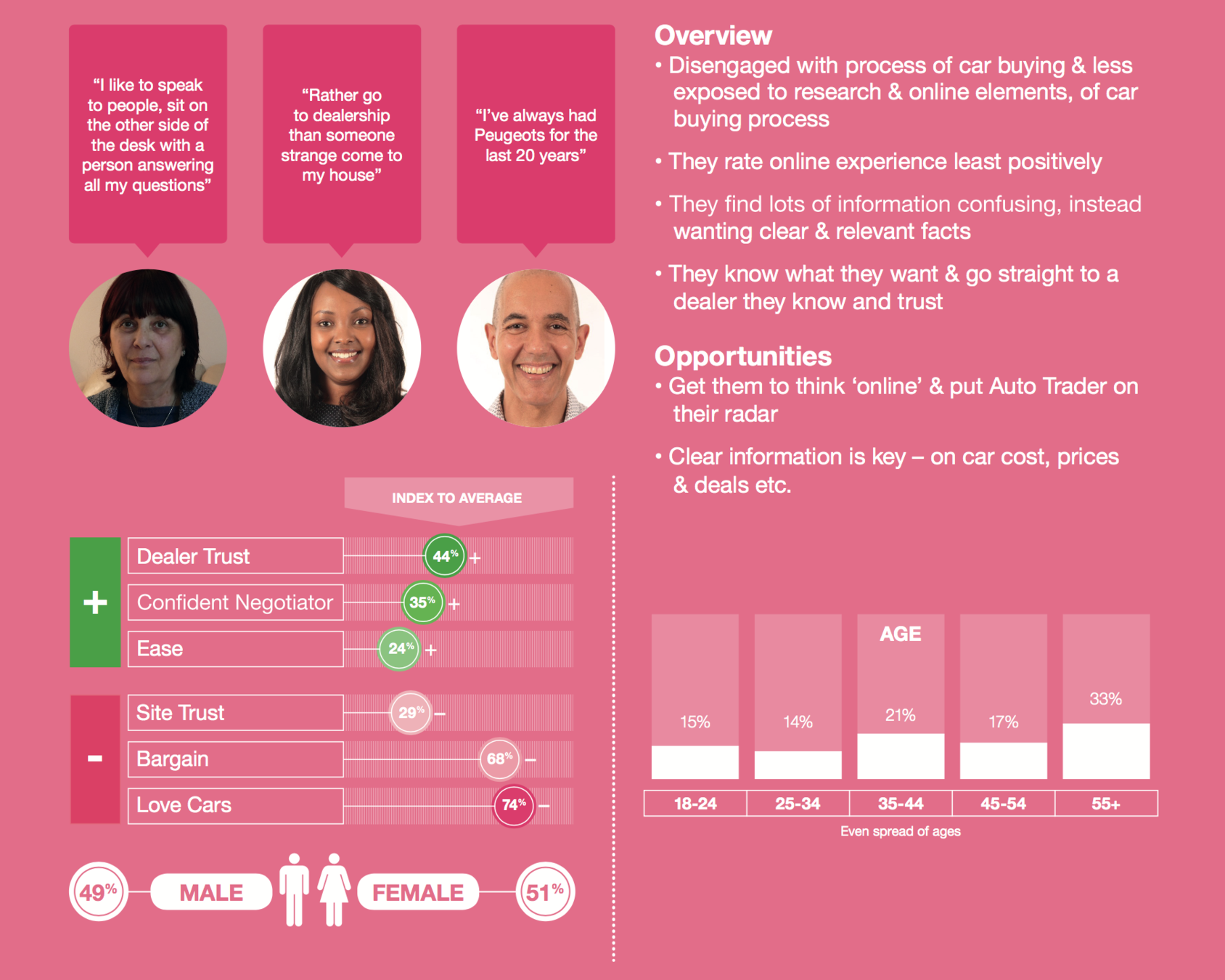
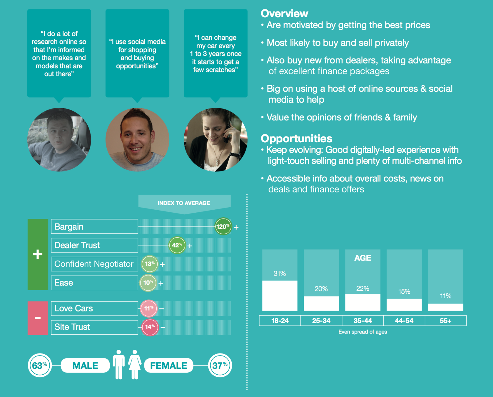
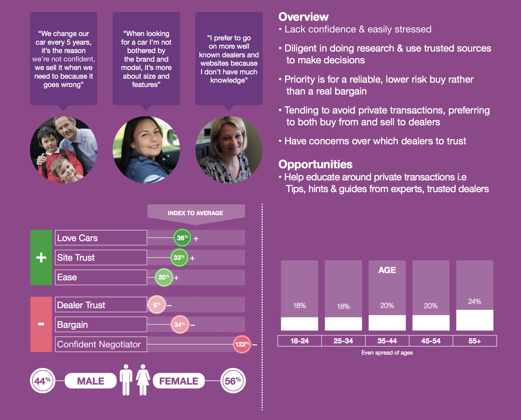
Auto Trader's users are divided into four groups, each represented by a persona because each of them comes with a different mental model and different goals.
The four personas are:
- Confident car lovers (CCL)
- Unconfident buyers & sellers (UBS)
- Modern deal hunters (MDH)
- Conventional showroom shoppers (CSS)
01
Understanding Auto Trader's users
USER TESTING
We ran a series of user interviews and user testing sessions to further understand their needs and goals and identify possible usability problems.
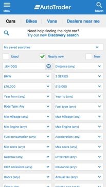
I noticed that most users had problems using the search form on the mobile website as they struggled to: 1) find the filters they wanted to use and 2) interact with the form as it wasn't optimised for mobile use. I decided to explore further so I designed a test.
Test task:
You are presented with a list of Ford Focus cars. How would you narrow down the list so it only shows you cars that are automatic with petrol engine, cost up to £14,000, are either new or used but shouldn't be older than 3 years and are being sold by car dealers.
When the user completed the task I asked them to rate their experience from 1 to 5 (1 being poor, 5 being great), so we had an easy way to quantify the results.
01
Actual user testing screen capture
Task time: 1 min 2 s
Average experience rating: 3.1
Other user feedback:
"I'm not sure yet what car I want to buy so I'd like to be able to search by multiple makes and models."
"This feels quite laborious, it's a simple task but it's taking a while to get through."
"There's a lot of noise on this page. I won't need most of these filters and the way they're presented means it's hard to find the ones I will use."
Understanding Auto Trader's users
EMPATHY MAPS
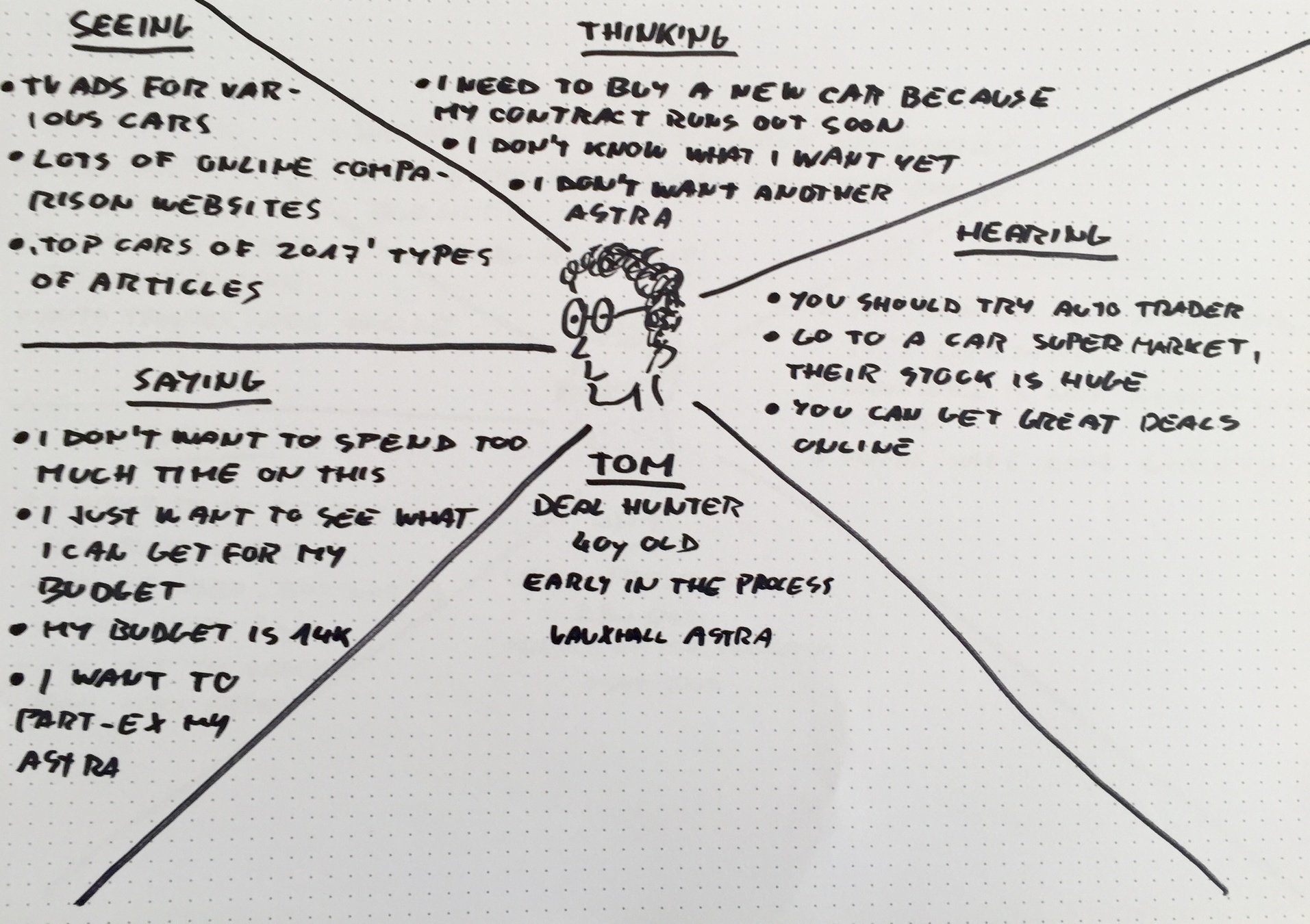
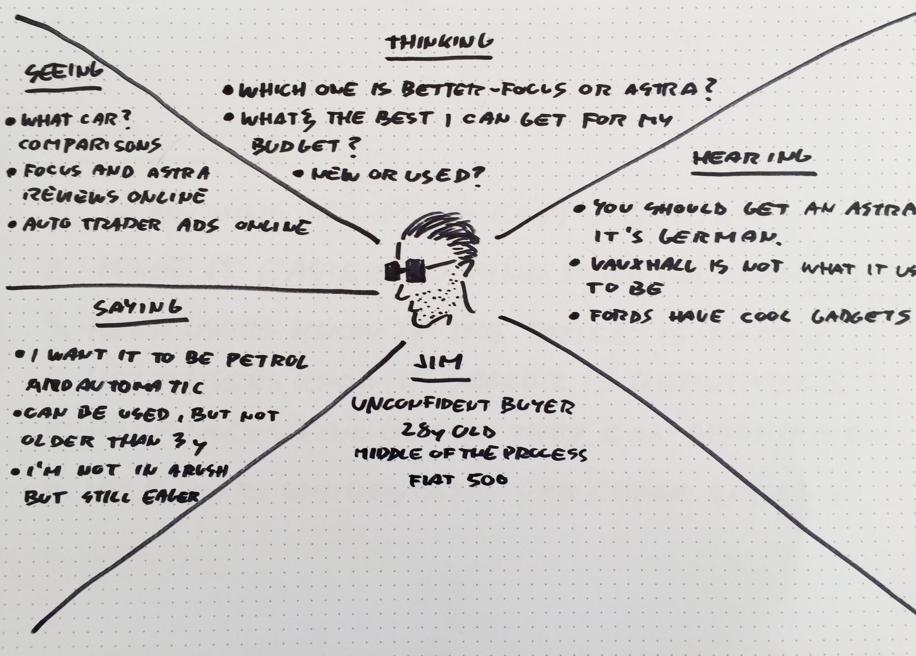
The personas and segments that were identified beforehand were great help in understanding the Auto Trader's users. But I felt we needed something that focuses more on user needs, goals and their circumstances. Who and what are they influenced by? What are they thinking? What are their fears and hopes? What do they hope to achieve by using Auto Trader?
We ended up with two types of users we wanted to focus on. Unconfident buyers that know what they're buying, have a budget and have already done their research. The other user was the modern deal hunter who was earlier in the car buying process, not knowing yet what car they want, but do know what specs they need.
01
Understanding Auto Trader's users
USER JOURNEYS
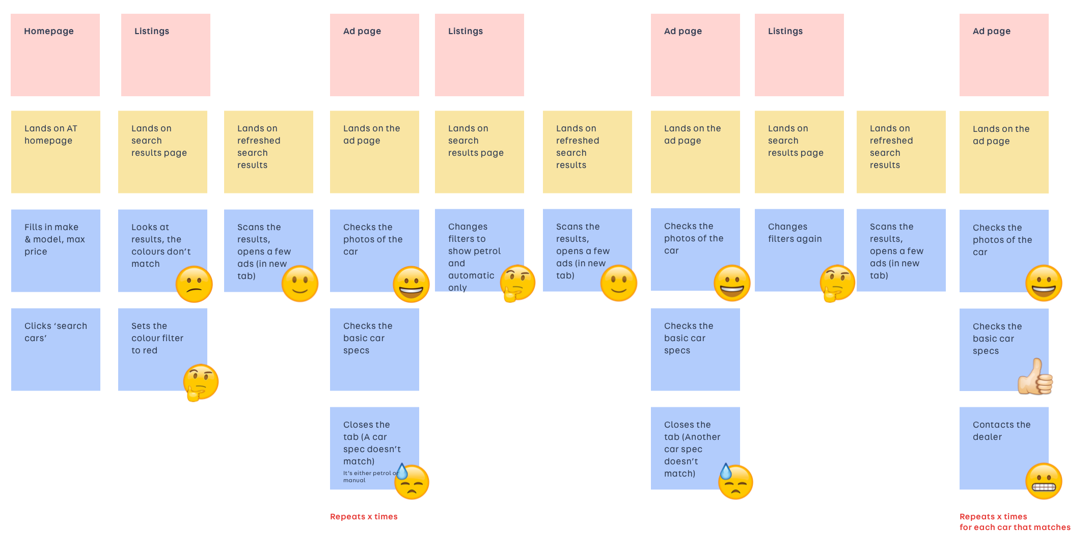
Other user research suggests that an average car buyer will spend 13 hours researching online before they make the purchase. Most of them describe it as stressful, daunting and even a waste of time.
At this stage, we felt we had enough information to put down as the first artefacts that came out of our research: the empathy maps and the user journeys.
Through user testing, we started to notice a pattern in how users performed searches on Auto Trader. They usually went through a process we nicknamed "elimination by frustration" as they kept adding search filters one by one, until they narrowed the list of cars down to match their needs. The frustration of seeing cars that didn't match these needs is what caused them to add the filter, hence the name.
The use of emojis helped us identify the pain points in the journey.
01
Understanding Auto Trader's users
PROBLEMS IDENTIFIED
The main problems we identified were:
- The search form has poor usability across all platforms but mostly on the mobile web.
- The search form is not designed to fit what the needs and goals of the majority of users are.
- The users are pushed into the search journey without a clear way to better refine the results.
- The users feel like searching and researching cars online is a waste of time.
- The users don't know if the price is fair.
- The users want to know if they can afford the costs of particular cars (monthly finance, running costs etc.
- Users don't understand the jargon used on Auto Trader.
- The pages/screens look cluttered and dated.
01
Looking for solutions
DESIGN STUDIO WORKSHOP (LEAN UX)
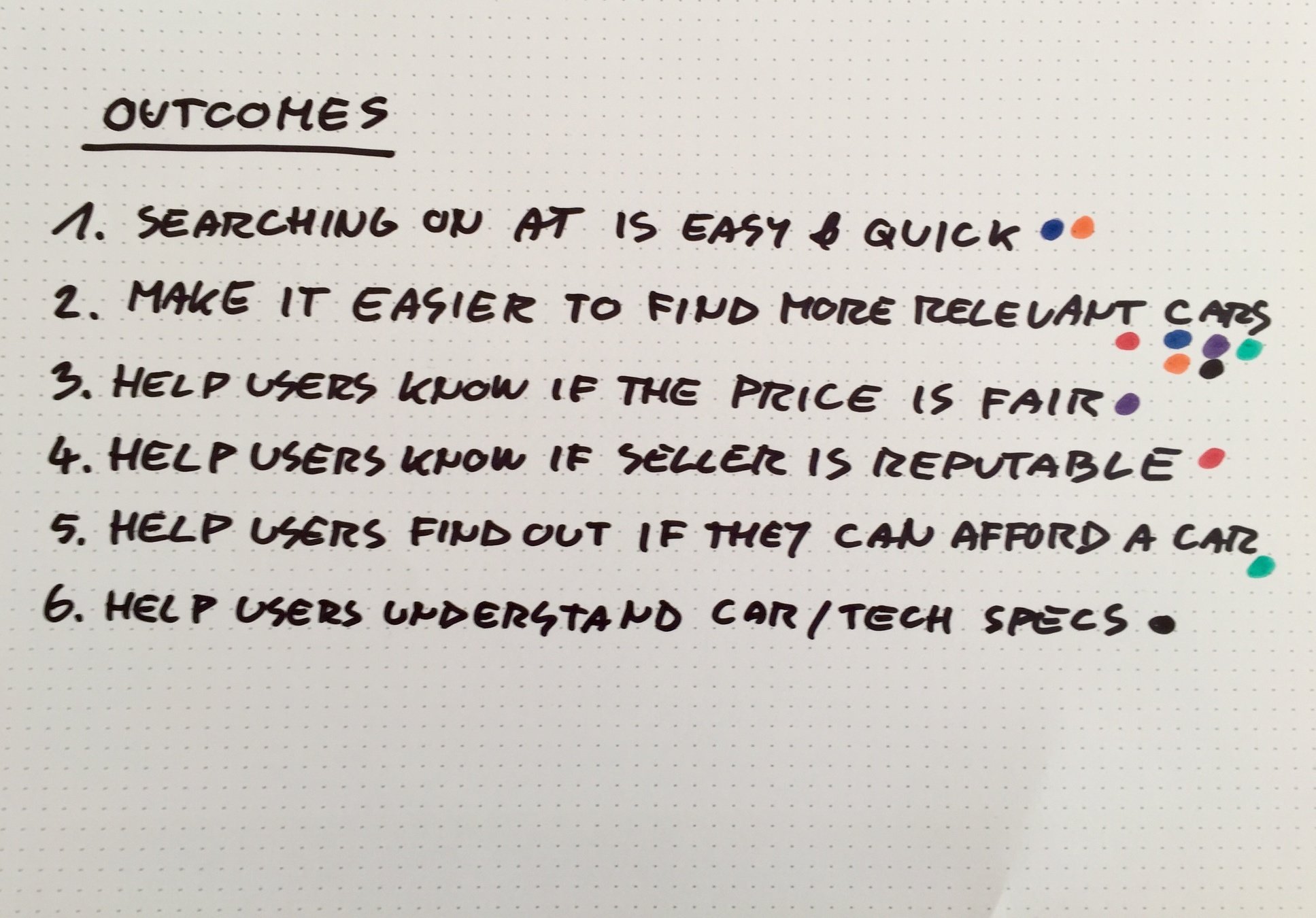
Outcomes
With the problems identified, we felt we were ready to start looking at what outcomes we wanted to achieve with our solutions. We wrote down all the outcomes we could come up with, grouped the similar ones and then dot voted for the ones we thought needed to be achieved first.
Hypothesis
When we decided on which outcomes we wanted to focus first we were ready to write down our hypothesis.
02
We believe that
making it easier to find more relevant cars
for deal hunters and unconfident buyers
will achieve an increased product satisfaction.
We will know this is true:
- when we'll see users spending less time on the search form and more exploring search results and ads (quantitative),
- when we'll see an increase in experience rating (quantified qualitative feedback)
- through qualitative feedback (user testing)
Looking for solutions
DESIGN STUDIO WORKSHOP (LEAN UX)
Solutions
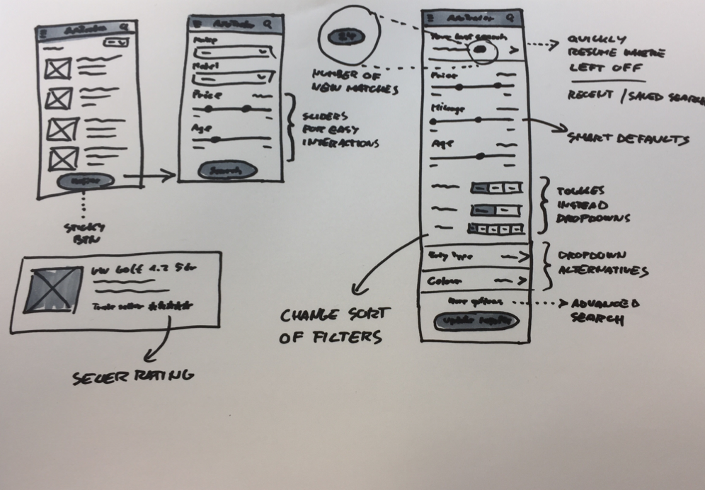
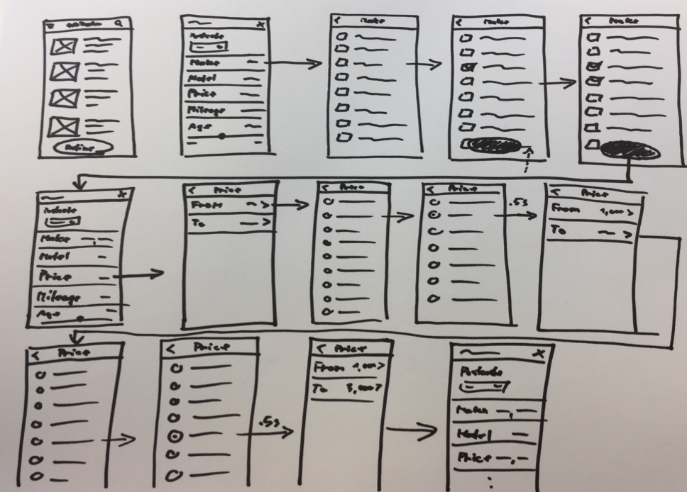
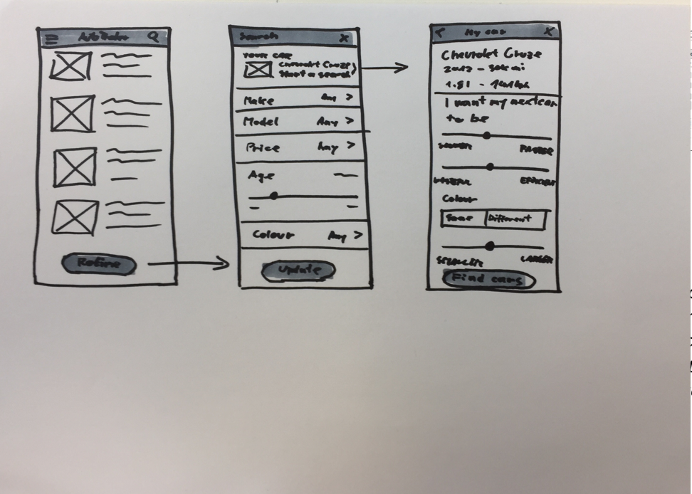
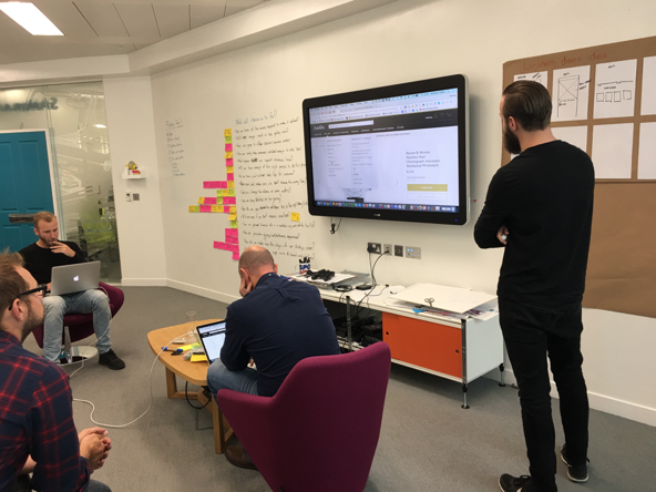
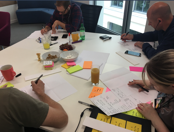
At this point we identified and chose two problems we wanted to solve. We knew what outcomes we wanted to achieve and we knew how to measure our success. Now, we were finally ready to start to come up with solutions as a group. We did a few rounds of sketching which helped us iterate on numerous different ideas and start to converge on a few of them.
02

Looking for solutions
WIREFRAMES
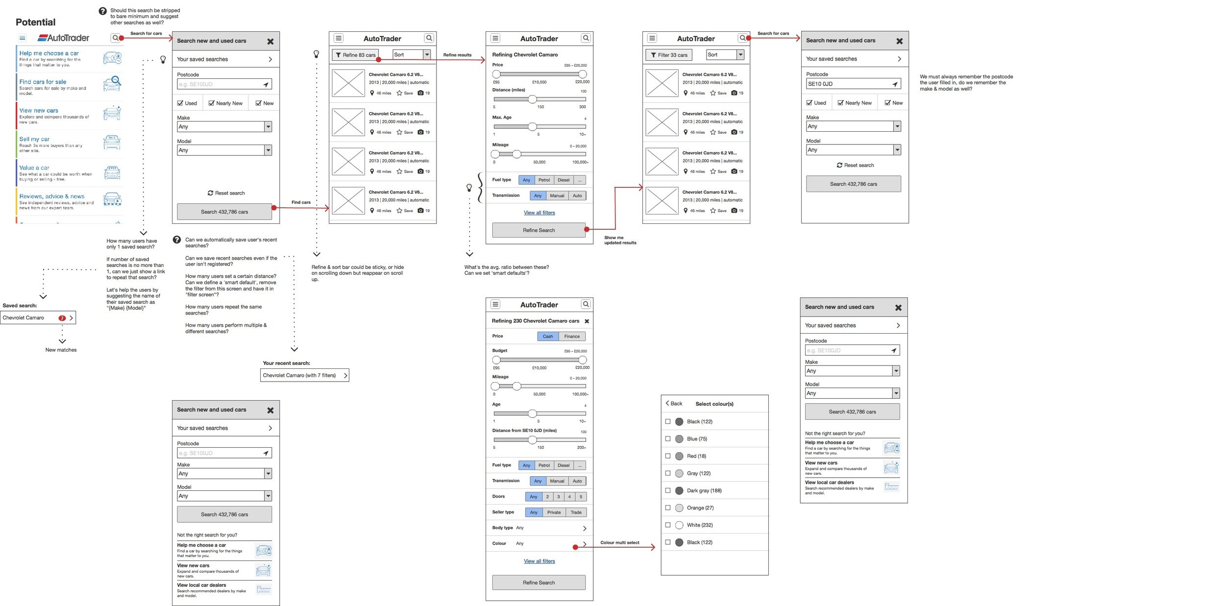
We ended up converging on two solutions for the "Simplifying the search" outcome and one solution for the "Reducing time required to research different options". At this stage, we concluded the workshop and I proceeded to create more detailed wireframes for the solutions.
These early wireframes were great for taking a closer look at the two solutions and add more detail to them.
02
Looking for solutions
DATA-DRIVEN DESIGN
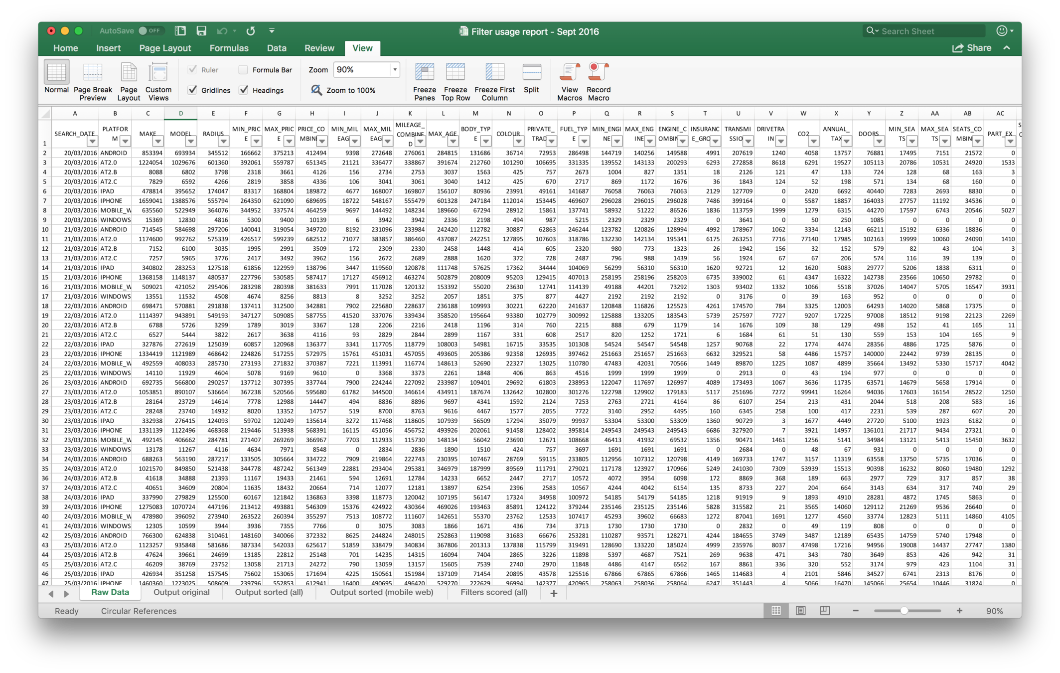
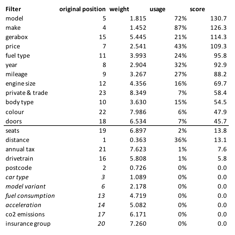
To make the search form more efficient for the majority of Auto Trader users I sat down with our Data Analyst to go through the filter usage data—how many users used a particular search filter. Until then, the search form had no prioritisation and zero focus on user needs and goals.
I came up with a weighting system based on filter usage and its position in the search form. For example, the colour filter was near the bottom of the search form so it had a higher weight than the filters preceding it. I then calculated the score by multiplying the weight and usage and sorted the filters from highest scored to the lowest.
I drew a line where the difference between two neighbouring scores was the highest (doors and seats). That line defined the division between basic and advanced search.
02
Prototyping and testing
SOLUTION ONE: PROTOTYPE
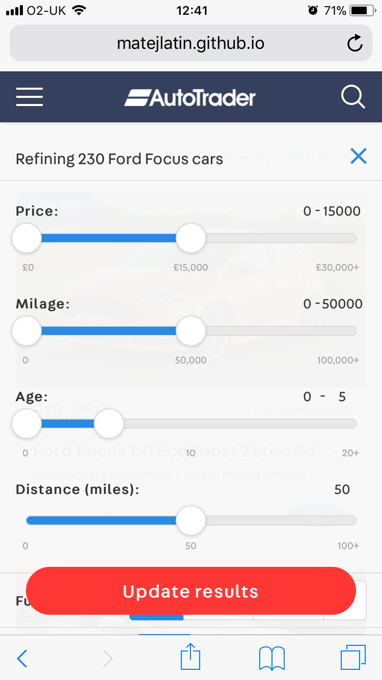
Solution one relied heavily on usage of sliders. Certain people in the group had strong feelings against using them as "most users find them hard to use". Other people in the group saw them as a great way of interacting with the interface and potentially saving time and number of interactions required to complete a task.
Sliders can't be prototyped so they seem like the real thing with any prototyping tool, so I decided to build an HTML, CSS and jQuery Mobile prototype. It didn't take long to build but it was a real thing that the users could interact with completely naturally. It didn't feel like a prototype at all.
And that was clear from the user testing as well. Participants enjoyed interacting with the interface and said it was much better than the live Auto Trader website at that moment.
03

Prototyping and testing
SOLUTION ONE: USER TESTING
Test task:
You are presented with a list of Ford Focus cars. How would you narrow down the list so it only shows you cars that are automatic with petrol engine, cost up to £14,000, are either new or used but shouldn't be older than 3 years and are being sold by car dealers.
When the user completed the task I asked them to rate their experience from 1 to 5 (1 being poor, 5 being great), so we had an easy way to quantify the results.
This solution was far more popular than the control as it outperformed it in both—time to complete task (by 36 seconds) and experience rating (by 0.8).
Something we noticed with this solution was that older people and people with certain medical conditions had problems being precise enough to use the sliders.
03
Actual user testing screen capture
Task time: 26 s -58%
Average experience rating: 3.9 / 5 +0.8

Prototyping and testing
SOLUTION TWO: PROTOTYPE
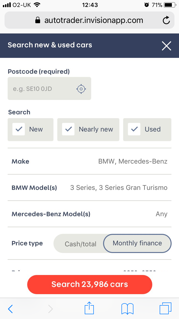
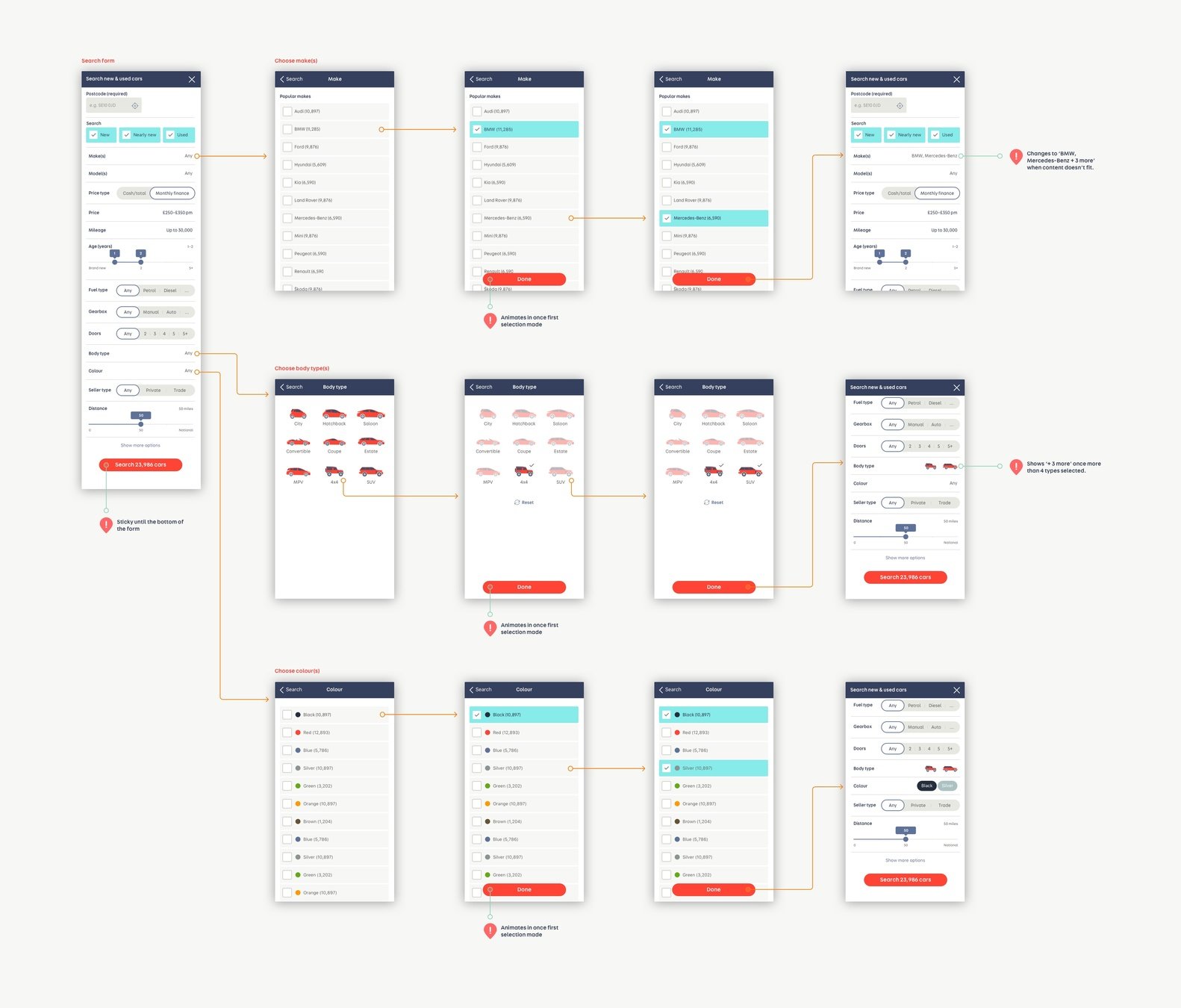
Solution two was designed to mimick the native apps interactions and patterns on the mobile web. Users are getting used to these patterns and are starting to expect them on mobile, regardless of platform. The web development technology is also at a good stage to support these so we wanted to give it a try.
Unlike the solution one, this one didn't require HTML, CSS and jQuery prototyping. The interactions were very simple to design and prototype with InVision.
The key to prototyping is to create what seems like a real and finished product with the minimum effort, resources and time, with the goal to get genuine user feedback. I feel comfortable to say that in both of these two cases succeeded in that.
03

Prototyping and testing
SOLUTION TWO: USER TESTING
Test task:
You are presented with a list of Ford Focus cars. How would you narrow down the list so it only shows you cars that are automatic with petrol engine, cost up to £14,000, are either new or used but shouldn't be older than 3 years and are being sold by car dealers.
When the user completed the task I asked them to rate their experience from 1 to 5 (1 being poor, 5 being great), so we had an easy way to quantify the results.
This solution was also far more popular than the control as it outperformed it in time to complete task (by 22 seconds) and experience rating (by 1.2).
Contrary to the solution one, nobody had issues with using this prototype. It took them slightly longer to set the filters but that didn't have a significant impact on their experience (which is clear from their ratings).
03
Screen capture from a later user testing session
Task time: 40 s -36%
Average experience rating: 4.3 / 5 +1.2

Prototyping and testing
RESULTS OVERVIEW
03
Even though the solution one performed the best in terms of metrics, we decided to proceed and further iterate with solution two as it also saw an improvement in


Control version
Time to complete task: 1 min 2 s
Experience rating: 3.1 / 5
Solution one
Time to complete task: 26 s -58%
Experience rating: 3.9 / 5 +0.8
Solution two
Time to complete task: 40 s -36%
Experience rating: 4.3 / 5 +1.2


metrics but generally received better feedback and had no accessibility issues (unlike solution one). We then proceeded to run quantitative tests and saw similar results.
Prototyping and testing
FINAL RESULT + VISUAL REDESIGN
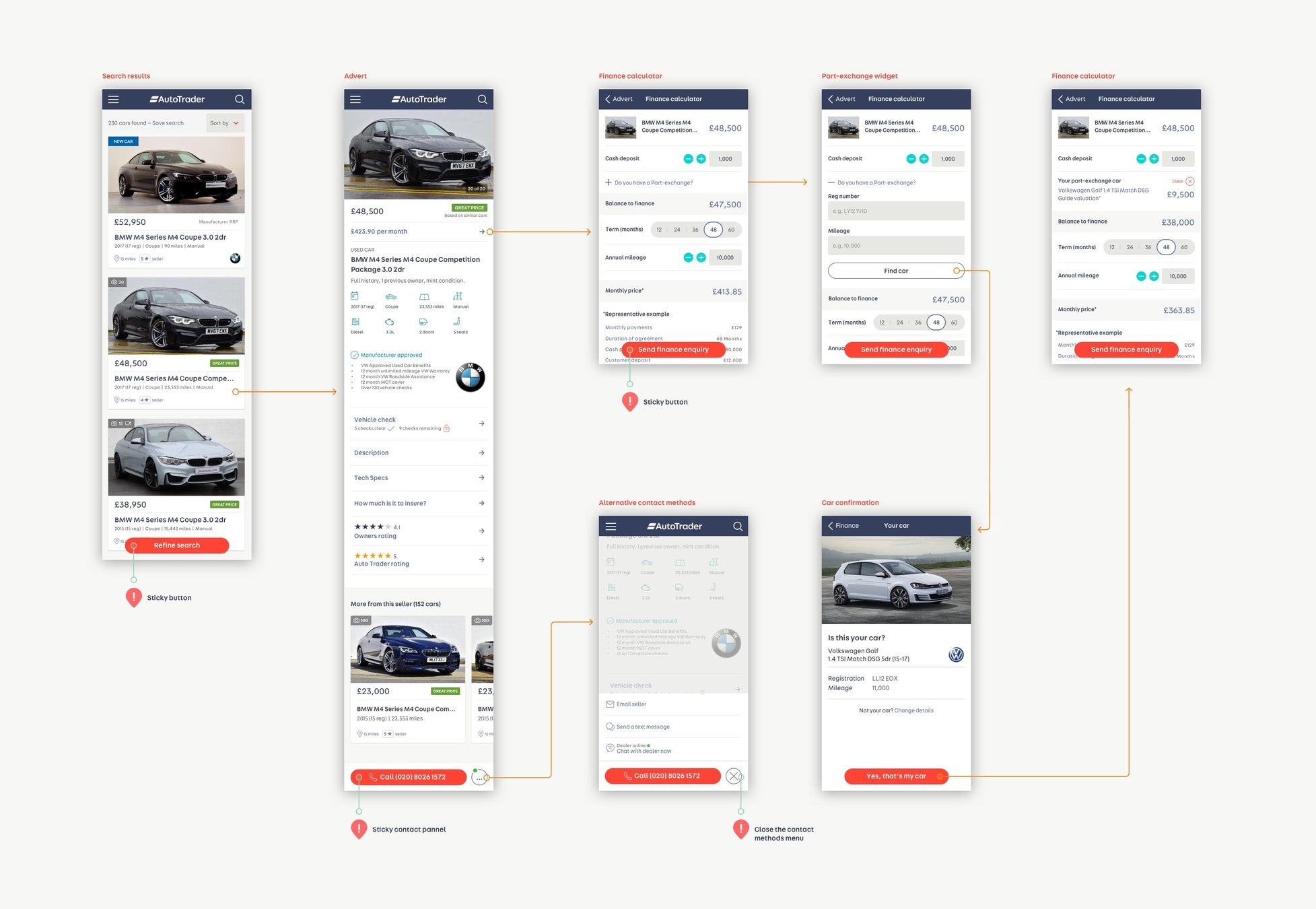
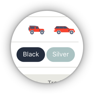
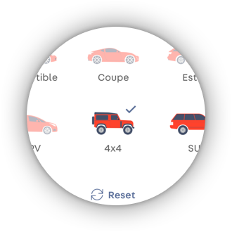
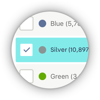
We further iterated the solution two based on the feedback we received. As part of improving the search experience I also did a visual redesign and addressed the issue of using jargon in interfaces by relying more on illustrations and icons (body type in example on the left). Since then, we also started looking for solutions for other problems we wanted to solve and outcomes we wanted to achieve.
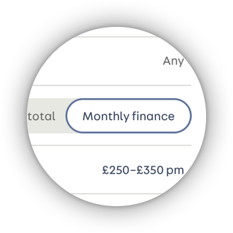
A new feature that tells the users whether a price is good or great has been added, the option for searching by monthly price is being tested at the moment.
03
Search by monthly price
Accessible
Jargon-free
Good price / great price

Moving forward
LEAN UX
Working on this project has helped me establish a new approach to doing things at Auto Trader. We fully adopted the Design Thinking, the Lean UX process and its principles. This was just the first iteration of the Build → Measure → Learn cycle. We built two prototypes, tested them (both qualitatively and quantitatively) and learned from both. Now we decided to move forward with one of the two, took the feedback and applied our learnings to future iterations.
Design is never finished.
04

Redesigning the Auto Trader search experience
By Matej Latin
Redesigning the Auto Trader search experience
- 1,541


