Evolution of Responsive Design
James Tettelbach-Whitehouse
What is Responsive Design?
Responsive web design (RWD) is an approach to web design aimed at crafting sites to provide an optimal viewing and interaction experience across a wide range of devices.

Why do we need it?
Mobile browsing needs to be great.


Early Solutions
Tools of the stone age of mobile web.

Viewport Meta Tag

<meta name="viewport" content="width=device-width, initial-scale=1">-
The width property controls the size of the viewport.
-
device-width means the width of the page at 100% scale.
-
- The initial-scale property controls the zoom level when the page is first loaded.
Early Solutions
Tools of the stone age of mobile web.
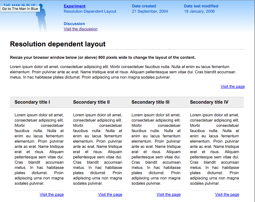
Adaptive Design
- Uses CSS media queries to adapt the layout to specific widths.
- Widths are based on common device sizes (320px, 480px, 768px, etc.)
- Problem: Too many device sizes!

Finally, Responsive Web Design
Coined by Ethan Marcotte in 2010
- Compared building websites to architecture
-
Three guiding principles
- CSS Media Queries
- Responsive Images
- Fluid Grids

Media Queries
Allow you to change CSS rules when certain conditions are met.

<link rel='stylesheet' media='screen and (min-width: 768px) and (max-width: 900px)' href='css/medium.css' />@media screen and (min-width: 768px) and (max-width: 900px) {
width: 100%;
}or, more commonly:
in HTML <link> tags
directly in the CSS
Media Queries
Media queries deal with more than just browser width!
@media screen and (min-width: 768px) and (max-width: 900px) {
    /* Conditional styles for this size */
}
@media print {
/* Conditional styles for printing */
}
@media screen and (min-device-width: 700px) {
/* Conditional styles for DEVICES over 700px */
}@media all and (orientation: landscape) {
/* Conditional styles for landscape orientation */
}
@media screen and (device-aspect-ratio: 16/9) {
/* Conditional styles for widescreen devices */
}Responsive Images
Images that never clip and are always the right size.
.my-image {
    width: 100%;
    height: auto;
}
Does that mean an iPhone 3G downloads the same file as the 4k desktop computer?
usually all you need!

363kb in 2010
1125kb in 2015
Responsive Images
The <picture> element is easy to read.
<picture>
  <source src="small.jpg">
  <source src="medium.jpg" media="(min-width: 400px)">
  <source src="large.jpg" media="(min-width: 800px)">
</picture>
Better: Stick with <img> and use the 'srcset' attribute.
<img sizes="(max-width: 500px) 100%,
            (max-width: 1000px) 50%,
            33.333%"
     srcset="pic-small.jpg 300w,
             pic-medium.jpg 600w,
             pic-large.jpg 1000w"
src="small.jpg">- 'src' is for browsers that don't support 'srcset' (IE 9,10,11)
- 'srcset' is a list of image sources and the widths of those pictures.
- 'sizes' describes the size to display them (in px/em/% units) and allows media query-like syntax.
The browser downloads the best image.
Fluid Grids
Basically, percentage-based layouts.

When you scale down the site, the content and its containers scale down accordingly.
Combine this idea with media queries, and you have fluid grid systems...
Fluid Grids

- Four breakpoints
- A different number of columns per breakpoint.
Fluid Grids

But wait!
We need to talk about fitting into boxes.


CSS 101
box-sizing: border-box
By default, CSS is stupid.


* {
    box-sizing: border-box;
}
/* extra strength version */
html {
  box-sizing: border-box;
}
*, *::before, *::after {
  box-sizing: inherit;
}
SVG
ENHANCE!

Vector graphics don't rely on pixels, so they scale well.
- Smaller files
- Resolution independent
- Fewer HTTP Requests
- No more icon fonts!
(Scalable Vector Graphics)
- Icons
- Logos
- Complex UI Shapes
Why?
What?
Does "Mobile First" === responsive?
Mobile First is a strategy for designing websites.
"Build for mobile, then gradually adjust the layout as the screen size increases."

Answer: Mobile First is usually responsive.
Takeaways
- "Design for Eternity"
- A small skillset that saves a lot of time.
- Make it part of your overall strategy.
Responsive web design (RWD) is an approach to web design aimed at crafting sites to provide an optimal viewing and interaction experience across a wide range of devices.
The Evolution of Responsive Design
By James TW

