Responsive Grids with Garden
Priyatam Mudivarti
Founder/Principal | Facjure, LLC
@priyatam
Clojure/West
Portland, OR, Mar 2015
Why Grids
Information Architecture
Typography
Graphic Design
Print Design
Web Design
The grid system is an aid, not a guarantee. It permits a number of possible uses and each designer can look for a solution appropriate to his personal style. But one must learn how to use the grid; it is an art that requires practice.
— JOSEF MULLER-BROCKMANN

But I'm not a web designer!
Do you know CSS?
Many choices
960px
Bootstrap
Foundation
Jeet
Susy
Skeleton
Skeljs
Flexbox
https://github.com/priyatam/thinking-grids
> 50 grid libraries
Real designers
design from scratch
they're hackers too
designer
Make the headings serifs and scale-types using four breakpoints (480 px increments). Use our brand settings on a 3-column grid
λgrammer
Let me write a higher order function
(defn create-minimal-grid [clazz pad]
  [[:* {:box-sizing "border-box"}]
   [clazz {:background "white"
           :margin [[0 0 pad 0]]}
    [:&:after {:content ""
               :display "table"
               :clear "both"}]
    ["[class*='col-']" {:float "left"
                        :padding-right pad }]
    [:.col-1-3 {:width "33.33%"}]
    [:.col-2-3 {:width "66.66%"}]
    [:.col-1-2 {:width "50.00%"}]
    [:.col-1-4 {:width "25.00%"}]
    [:.col-1-8 {:width "12.50%"}]
    [:.out-padding {:padding [[pad 0 pad pad pad]]}
     ["[class*='col-']:last-of-type"
         {:padding-right pad}]]]])
A grid in a single function
Can we make it better?
https://github.com/facjure/mesh
(def gutter (px 20))

(def typesetting
  (list
   (typo/typeset-body typo/defaults :golden)))

(def grids
  (list (typo/baseline (rgba 0 0 255 0.5) (px 2))
        (grid/create ".grid" gutter)
        (grid/wrap-widths 978)
        (grid/create-nested-units)
        (grid/nuke-gutters-and-padding)
        (grid/respond-small (:mobile breakpoints) gutter)
        (grid/respond-medium (:tablet breakpoints))))

(def styles
  (css (merge grids typesetting)))
How about responsive
typography?
calc(minFont +   (maxFont - minFont)
*   ((100vw - minWidth)
/ (maxWidth - minWidth))
based on viewport math
(defn calc [min-font max-font min-width max-width]
  (println "Viewport size:" (viewport-w))
  (let [(viewport-w .. js/document -documentElement -clientWidth)
        font-diff (+ min-font (- max-font min-font))
        vp-diff (- (px (viewport-w)) min-width)
        wid-diff (- max-width min-width)
        res (* font-diff (/ vp-diff wid-diff))]
    (println "Calculated Fontsize: " (:magnitude res))
    (swap! state assoc :font-size res)
    res))
a single function + media queries
http://madebymike.com.au/writing/precise-control-responsive-typography/
Demos
Bootstrap
container
row
column
is limiting
Susy
most popular layout engine
not based on calc
~3000 SLOC
depends on context
extension is hard
feels like "framework"
Why stop there
(copy print-design)
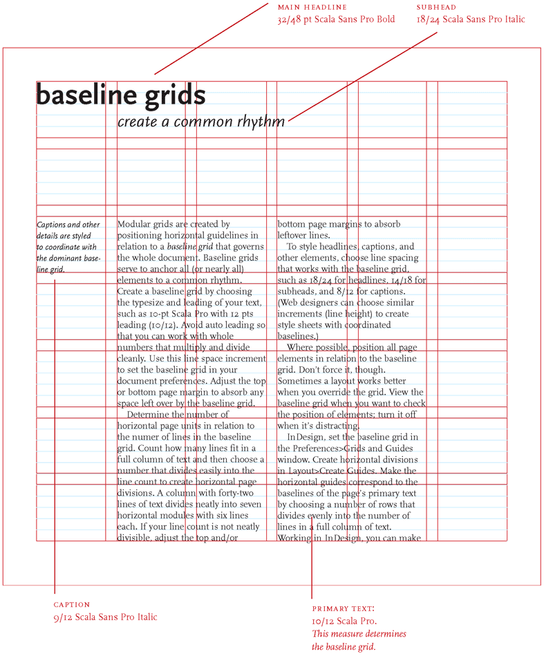
Baseline
Grid?
DIN Paper system
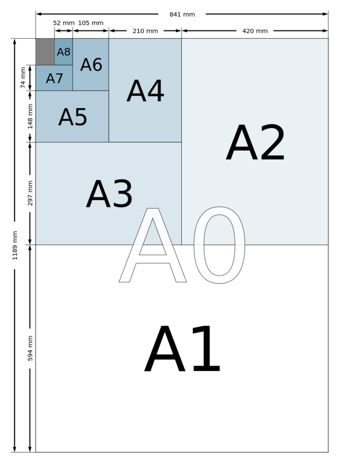
16 columns = desktops
8 columns = tablets
4 columns = mobile
render any screen from 240 up to 2560 px
*http://goldengridsystem.com
Demos
That's half
the truth
unsymmetrical grids need complex math
!browser issues
js framework integrations
perfection takes time
Foundations
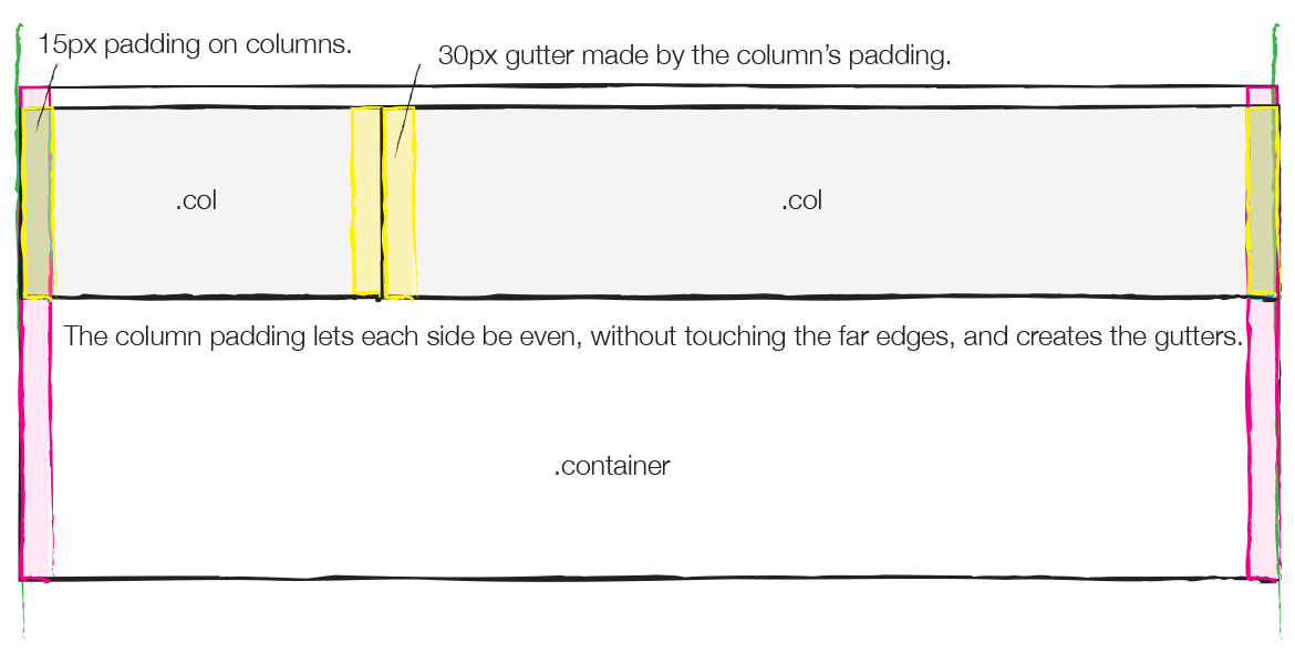
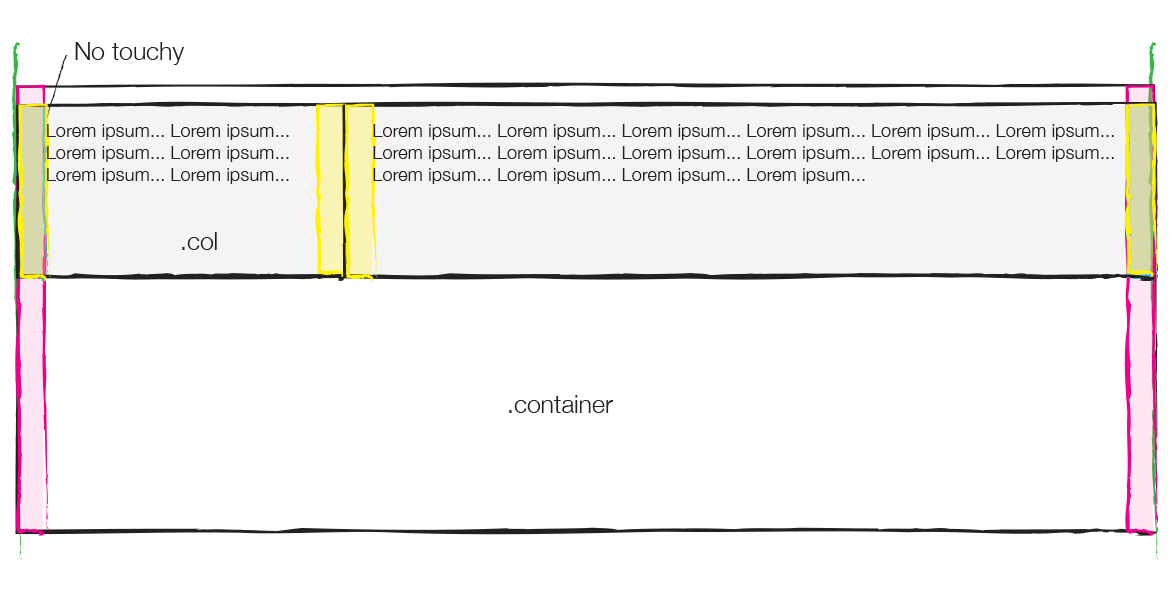
columns
gutters
baseline grid
simple, fluid, nested, hierarchical
typographic rythms
modular scale
layout math
media queries
CONCEPTS
TYPES
CORE
CSS/SASS
are great, but limited
css doesn’t “talk to dom”
math impl is hard
not modular
not content driven
not dynamic
mixins are not composable
constrained by limitations—not by choice
Most Grid libraries are limited
Can you create columns with just one wrapping element?
Are you stuck with a set number of columns?
Do you have to add several classes to your markup for the grid to function?
Are the gutters between columns created by padding or an actual space between them (margin) ?
Can you make vertical grids with it?
Can you pass other values to these gutters? For instance, 2rem *
* https://github.com/corysimmons/lost
Garden
written by Joel Holdbrooks
(author of a dozen clj/cljs libraries)
CSS as data
Vectors
= Selectors
Map
= Declarations
Rules
= Vector of Vectors
[:.grid {:*zoom 1}
  [:&:before :&:after {:display "table"
                       :content " "
                       :line-height 0}]
  [:&:after {:clear "both"}]]
Text
DRY Mixins & Functions
;; DRY "Mixins" return declarations
(def reset
  {:margin 0
   :padding 0})


;; Real Functions return values (Rules)
(defn clearfix [clazz]
  [clazz {:*zoom 1}
   [:&:before :&:after
       {:display "table"
        :content " "
        :line-height 0}]
   [:&:after {:clear "both"}]])
Text
Media Queries
(defn respond-medium [width]
  (at-media {:screen true :min-width width}
            [:.wider
             [:.grid {:max-width width
                      :margin "0 auto"}]]))
Abstraction is at the center of most work in
Computer Science &
User Interface Design.
Abstractions
Not in
CSS,
Less,
Sass, Stylus
namespaces
pass css as functions at runtime
compose HTML and CSS in the same syntax
simple & powerful units & arithmetic
rEPL-driven design
programming stylesheets
in FP
separate selectors and declarations
Ring-style middleware
Mesh,
a grid library—
early prototypes
http://github.com/facjure/mesh
Decouple
selectors * declarations
;; a bad example
(defn make-serifs [selector families]
  (fn [declarations]
    (let [styles (selector declarations)]
      (conj styles (font (:garamond families) 3 600 0.5 2)))))

;; slightly better
(defn scale-type [selector params]
  (fn [declarations]
    (let [styles (selector declarations)]
      (conj styles
            (at-media {:min-width (get-in params [:breakpoints :mobile])}
                      [:& {:font-size (* 1.5 (:min-font params))}])
            (at-media {:min-width (get-in params [:breakpoints :tablet])}
                      [:& {:font-size (* 1.75 (:min-font params))}])
            (at-media {:min-width (get-in params [:breakpoints :laptop])}
                      [:& {:font-size (* 2.25 (:min-font params))}])))))
Compose Declarations
and Selectors, with HoF
(defn headings [declarations]
  [:h1 :h2])

(-> headings
    (scale-type settings)
    (make-serifs brand-fonts)
    (make-sans-brand-fonts)
    (grid/create {:columns 3})
Create your own DSLs
Integrate with Om
store styles in app-state
store content in app-state
components mount their own styles and content as data on IWillMount, as values
unmount (if necessary)
Issues with Garden
learning clojurescript
low-level, no libraries
integration with sass or postcss (@import "susy")
compile errors, spell checks
tools and gui
need a engineer who is a designer
Demo
let's create a storyboard-style magazine layout
Initial Content
(swap! app-state assoc-in [:content :logo] "/img/logo.png")

(css (merge
        (images/photos)
        grid-styles
        typography-base))

(reset! app-state new-content)
iterate: grid gutters, ratios, typesetting, edit content
There is no
perfect Grid

a great Grid toolkit can provide tools to help designers create their own layout engine
Thanks, Joel Holdbrooks and David Nolen for creating Garden and Om.
don't overthink it: https://css-tricks.com/dont-overthink-it-grids/
bootstrap grid overview: http://www.helloerik.com/the-subtle-magic-
   behind-why-the-bootstrap-3-grid-works
last "poster": joseph-mueller-brockmann
baselingrid example: http://goldengridsystem.com
movie poster: http://themanyfacesof.com/sigourney-weaver/

illustrations and logos: matt martini
Credits
References
slides
http://slides.com/priyatam/responsive-grids-with-cljs

garden
https://github.com/noprompt/garden
grid toolkit with garden (early stage)
http://github.com/facjure/mesh
live coding
https://github.com/bhauman/lein-figwheel
lein templates
https://github.com/priyatam/mala
https://github.com/swannodette/mies-om
Responsive-Grids-with-Garden
By Priyatam Mudivarti
Responsive-Grids-with-Garden
Clojurescript community has been slow to embrace Garden, a simple library for rendering CSS in Clojure/ClojureScript. Conceptually similar to Hiccup, Garden allows you to design pages and layouts like a functional programmer: plain-old data structures, functions, and abstractions.