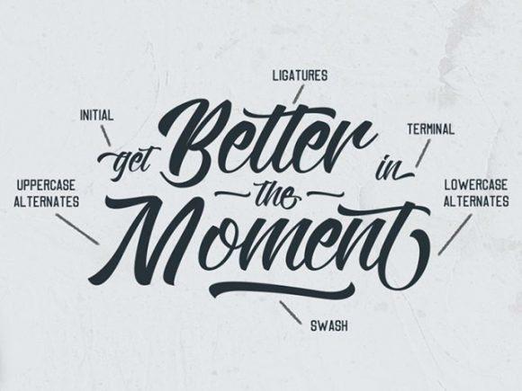
Typography
Priyatam Mudivarti
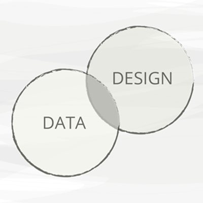
is Design
Why
information architecture
content strategy
graphic design
web design
data visualization
ux
anti-fraud security
how we read
Reading is a very intricate and, in some ways, not fully understood process. When we are taught to read, what is it exactly that we learn there?
What, exactly, our eyes take in, what our brain does with that, how we extract meaning from it ...

Type is mechanized writing as opposed to writing by hand
it carries emotion

Bank Note Design
fraud & security circa 1784
The Free Banking Era
mid 19th century
Anyone who got permission from the state legislature could open a bank and start printing money.
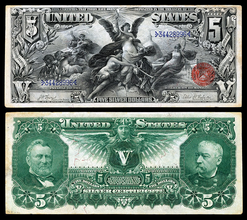
source: wikimedia

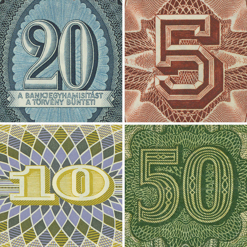
20 Forint, Hungary 1969; 5 Pesos, Mexico 1912; 10 Kroner,
Denmark 1972; 50 Mark, German Democratic Republic 1948
http://blog.extensis.com/interviews/tobias-frere-jones-on-banknote-typefaces-and-forgery-resistant-fonts.php?doing_wp_cron=1475244053.6756360530853271484375
But I'm a web designer!
Many choices
960px
Bootstrap
Foundation
Jeet
Susy
Skeleton
Skeljs
Flexbox
https://github.com/priyatam/thinking-grids
> 50 grid libraries
Do you know CSS?
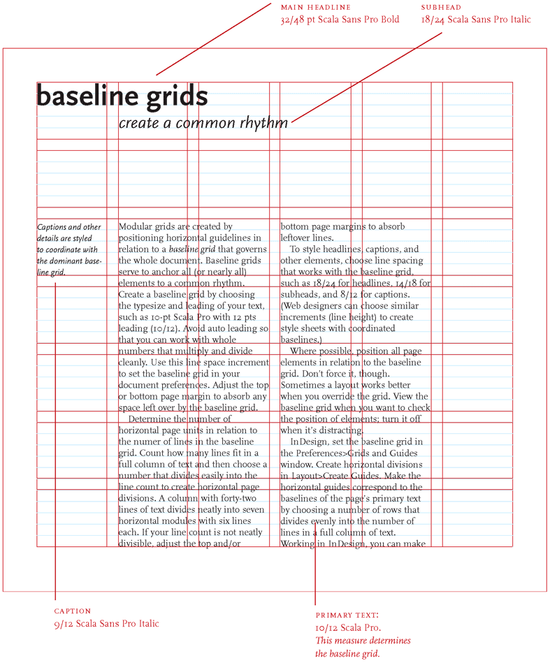
Baseline
Grid?
DIN Paper system
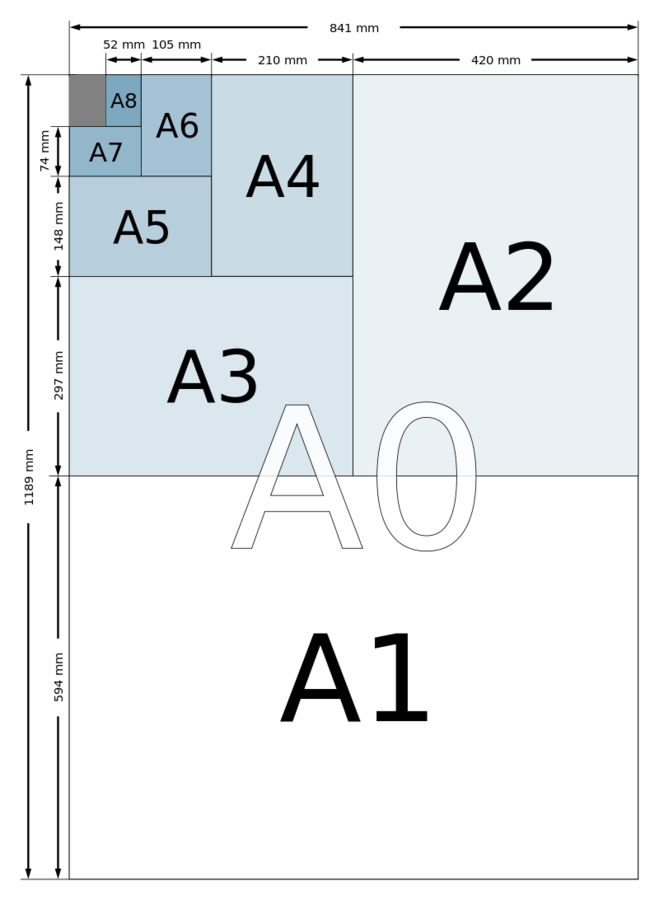
16 columns = desktops
8 columns = tablets
4 columns = mobile
render any screen from 240 up to 2560 px
*http://goldengridsystem.com
Foundations
columns
gutters
baseline grid
simple, fluid, nested, hierarchical
typographic rythms
modular scale
layout math
media queries
CONCEPTS
TYPES
CORE
CSS/SASS
are great, but limited
css doesn’t “talk to dom”
math impl is hard
not modular
not content driven
not dynamic
mixins are not composable
constrained by limitations—not by choice
What about
user interface
The best interface is no interface
http://www.nointerface.com/book/
Typography
in 10 minutes
Body Text
- Point Size
- Line Height
- Line Spacing
- Font choice
Contrast
- Sans Serif
- Serif
- Monospace
- Font weights
Grids & Layout
Typographic Rhythm
Good typography is measured by how well it reinforces the meaning of the text, not by some abstract scale of merit.
— Matthew Butterick
don't use stock fonts
professional designers don't copy paste web fonts
Responsive Grids
on the browser
CSS as data
designer
Make the headings serifs and scale-types using four breakpoints (480 px increments). Use our brand settings on a 3-column grid
λgrammer
Let me write a higher order function


(defn create-minimal-grid [clazz pad]
  [[:* {:box-sizing "border-box"}]
   [clazz {:background "white"
           :margin [[0 0 pad 0]]}
    [:&:after {:content ""
               :display "table"
               :clear "both"}]
    ["[class*='col-']" {:float "left"
                        :padding-right pad }]
    [:.col-1-3 {:width "33.33%"}]
    [:.col-2-3 {:width "66.66%"}]
    [:.col-1-2 {:width "50.00%"}]
    [:.col-1-4 {:width "25.00%"}]
    [:.col-1-8 {:width "12.50%"}]
    [:.out-padding {:padding [[pad 0 pad pad pad]]}
     ["[class*='col-']:last-of-type"
         {:padding-right pad}]]]])
A grid in a single function
Can we make it better?
https://github.com/facjure/mesh
(def gutter (px 20))

(def typesetting
  (list
   (typo/typeset-body typo/defaults :golden)))

(def grids
  (list (typo/baseline (rgba 0 0 255 0.5) (px 2))
        (grid/create ".grid" gutter)
        (grid/wrap-widths 978)
        (grid/create-nested-units)
        (grid/nuke-gutters-and-padding)
        (grid/respond-small (:mobile breakpoints) gutter)
        (grid/respond-medium (:tablet breakpoints))))

(def styles
  (css (merge grids typesetting)))
Text
Media Queries
(defn respond-medium [width]
  (at-media {:screen true :min-width width}
            [:.wider
             [:.grid {:max-width width
                      :margin "0 auto"}]]))
Not in
CSS,
Less,
Sass, Stylus
Postcss
namespaces
pass css as functions at runtime
compose HTML and CSS in the same syntax
simple & powerful units & arithmetic
rEPL-driven design
How about responsive
typography?
calc(minFont +   (maxFont - minFont)
*   ((100vw - minWidth)
/ (maxWidth - minWidth))
based on viewport math
(defn calc [min-font max-font min-width max-width]
  (println "Viewport size:" (viewport-w))
  (let [(viewport-w .. js/document -documentElement -clientWidth)
        font-diff (+ min-font (- max-font min-font))
        vp-diff (- (px (viewport-w)) min-width)
        wid-diff (- max-width min-width)
        res (* font-diff (/ vp-diff wid-diff))]
    (println "Calculated Fontsize: " (:magnitude res))
    (swap! state assoc :font-size res)
    res))
a single function + media queries
http://madebymike.com.au/writing/precise-control-responsive-typography/
typesetting on the browser
in functional programming
separate selectors and declarations
dynamic stylesheets
compose stylesheets with data
prototype, design, build, deploy in a single step
Mesh,
a rendering engine
built on React
http://github.com/facjure/mesh
(defn headings [declarations]
  [:h1 :h2])

(-> headings
    (scale-type settings)
    (make-serifs brand-fonts)
    (make-sans-brand-fonts)
    (grid/create {:columns 3})
Create your own DSLs
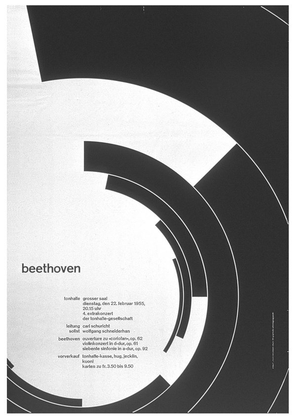
The grid system is an aid, not a guarantee. It permits a number of possible uses and each designer can look for a solution appropriate to his personal style. But one must learn how to use the grid; it is an art that requires practice.
— JOSEF MULLER-BROCKMANN

Demos
priyatam.com/talks
"responsive grids with clojurescript"
"poem as value"
good design is invisible

There is no
perfect Grid
a great Grid toolkit can provide tools to help designers create their own layout engine
References
slides
http://slides.com/priyatam/typography-is-design

credits:
- http://www.creattor.com/files/13691/4903/web-ui-elements-screenshots-3.jpg
- http://www.designersinsights.com/designer-resources/anatomy-of-typography

last "poster": joseph-mueller-brockmann
baselingrid example: http://goldengridsystem.com
movie poster: http://themanyfacesof.com/sigourney-weaver/
Typography is Design
By Priyatam Mudivarti