GETTING DOWN with
CSS TRANSITIONS ANIMATIONS
&

OVERVIEW
Transitions
Animations
are lateral changes between a beginning and end state of a property
- A sticky header re-sizes on scroll
- A link background color fades in/out
- Padding and margins re-size on mobile
change between numerous states (or steps) for greater complexity
- Add life and visual accents to content
- Elaborate user interaction
- Game-like functionality
CSS TRANSITIONS
CSS3 Transitions are a presentational effect which allow property changes in CSS values to occur smoothly over a specified duration
CSS TRANSITIONS
Cool transition, bro.
But why should I use them?
CSS TRANSITIONS
- Subtle transitions can help appease the clients that want more 'wow' and 'pop'
- Transitions can help draw attention to elements
- Speaking of - think about the :focus state and accessibility
- Elements transitioning into new positions and states when rotating a device gives a clean, stylistic appearance *
- Great browser support with working degradation in IE 8 & 9
* Totally subjective opinion
CSS TRANSITIONS
CSS Transitions can be built using the following properties:
- transition-property
- transition-delay
- transition-duration
- transition-timing-function
CSS TRANSITIONS
transition-property
Specifies the name or names of the CSS properties to which transitions should be applied.
Transition properties can also be applied to :before and :after psuedo-classes.
transition-property: width;

transition-property: margin;

transition-property: all;
CSS TRANSITIONS
transition-delay
Defines how long to wait between the time a property is changed and the transition actually begins.
transition-delay: 1s; transition-delay: 1.25s; transition-delay: 1200ms;
CSS TRANSITIONS
transition-duration
Specifies the duration in seconds or milliseconds over which transitions should occur.
transition-duration: 1s;

transition-duration: 120ms;

transition-duration: 3.25s;
CSS TRANSITIONS
transition-timing-function
Specifies a function to define how intermediate values for properties are computed. This in essence lets you establish an acceleration curve, so that the speed of the transition can vary over its duration.
transition-timing-function: ease; /* Default Value */ transition-timing-function: ease-in-out; transition-timing-function: linear;
CSS TRANSITIONS

There's more...
CSS TRANSITIONS
transition-timing-function
The steps() function allows you to specify intervals for the timing function. It takes one or two parameters, separated by a comma: a positive integer and an optional value of either start or end. If no second parameter is included, it will default to end.
transition-timing-function: steps(4); transition-timing-function: steps(4, start);
CSS TRANSITIONS
CSS TRANSITIONS
.box, .box2 {
 background: goldenrod;
 &:hover {
  background: lightblue;
}
.box {
  transition-timing-function: steps(4, start);
}
.box2 {
  transition-timing-function: steps(4, end);
}
CSS TRANSITIONS
CSS TRANSITIONS
.cartoon {
  background: url(http://tangledindesign.com/codepen/sprite.jpg);
  transition: 2s steps(16);
}

#go:target .cartoon {
  background-position: -4000px 0;
}
CSS TRANSITIONS
transition-timing-function
The cubic-bezier() function allows you to create custom pacing for the transition by specifying the four (4) required values.
transition-timing-function: cubic-bezier(0.1, 0.7, 1.0, 0.1);
Create and visualize a bezier curve here:
CSS TRANSITIONS
CSS TRANSITIONS
transition
The transition property is a shorthand property used to represent up to four transition-related longhand properties.
transition: [transition-property] [transition-duration] [transition-timing-function] [transition-delay];
CSS TRANSITIONS
transition: opacity 1s ease, height 1s linear .5s;
Multiple properties in one shorthand style.
CSS TRANSITIONS
CSS TRANSITIONS
CSS TRANSITIONS
CSS TRANSITIONS
Transitions can go further
CSS TRANSITIONS
Transitioning SVG Styles
Many properties are shared between CSS and SVG
Properties that can be styled with CSS can also be transitioned
This helps keep all styles together and out of the content of the page
Basic SVG animations can be achieved without JavaScript
CSS TRANSITIONS
Transitioning SVG Styles
Common Shared Properties:
fill
cx / cy / r
stroke
stroke-width
stroke-dasharray
stroke-dashoffset
CSS TRANSITIONS
Transitioning SVG Styles
CSS TRANSITIONS
JavaScript Transition Detection
JavaScript (jQuery) can be used to detect when a CSS transition completes allowing the inclusion of various callbacks to occur in sync.
CSS TRANSITIONS
JavaScript Transition Detection
CSS
.container {
  background: red;
  color: white;
  height: 25px;
  transition: all 1.5s ease;

  &.active {
    height: 55px;
    background: black;
  }
}
CSS TRANSITIONS
JavaScript Transition Detection
JavaScript
var theButton = $('button'),
theBox = $('.container');
theButton.click(function() {
theBox.toggleClass('active');
theBox.one('transitionend', function() {
theBox.append('<span>Transition complete</span>');
});
});
CSS TRANSITIONS
JavaScript Transition Detection
CSS ANIMATIONS
Like CSS3 Transitions, Animations allow the change of style properties but with the use of keyframes allowing greater complexity.

CSS ANIMATIONS
Nowadays, more and more websites are using animations, whether that be in the form of GIFs, SVGs, WebGL, background videos and so on. When used properly, animation on the web brings life and interactivity, adding an extra layer of feedback and experience for users.
CSS ANIMATIONS
Cool animation, bro.
But how do I make them?
CSS ANIMATIONS
Most CSS properties can be animated including an element's dimensions, colors, box model, and position. But other properties such as clip-path, flex properties, and filters can also be animated. A full list of available properties can be found here:
CSS ANIMATIONS
Animations are comprised of two parts:
- @keyframes
- animation property
CSS ANIMATIONS
The main component of CSS animations is @keyframes, the CSS rule where animation is created. Think of @keyframes as being stages along a timeline. Inside @keyframes, you can define these stages, each having a different style declaration.
CSS ANIMATIONS
The @keyframes are comprised of three parts
- A name of our choosing
- Stages: 0%-100%; from (equal to 0%) and to (equal to 100%).
- CSS styles: the style that you would like to apply for each stage.
CSS ANIMATIONS
@keyframes bounceIn {
  0% {
    transform: scale(0.1);
    opacity: 0;
  }
  60% {
    transform: scale(1.2);
    opacity: 1;
  }
  100% {
    transform: scale(1);
  }
}
CSS ANIMATIONS
Keyframes can be built with different values
CSS ANIMATIONS
@keyframes bounceIn {
  0% {
    transform: scale(0.1);
    opacity: 0;
  }
  25%, 90% {
    transform: scale(1.2);
    opacity: 1;
  }
  100% {
    transform: scale(1);
  }
}
CSS ANIMATIONS
@keyframes toggleOpacity {
  50% { opacity: 1; } /* Turn off */
  50.001% { opacity: 0.4; }

  /* Keep off state for a short period */

  52.999% { opacity: 0.4; } /* Turn back on */
  53% { opacity: 1; }
}
CSS ANIMATIONS
CSS ANIMATIONS
@keyframes toggle {
  to {
    opacity: 1;
  }
}
@keyframes toggle {
  from {
    opacity: 0;
  }
  to {
    opacity: 1;
  }
}
CSS ANIMATIONS
Calling @Keyframes with the animation property
CSS ANIMATIONS
The animation property is used to call @keyframes inside a CSS selector. Animation can have multiple properties:
Animation Property
- animation-name
- animation-duration
- animation-delay
- animation-timing-function
- animation-iteration-count
- animation-direction
- animation-fill-mode
- animation-play-state
CSS ANIMATIONS
References the name that was used when creating the @keyframes styles.
@keyframes bounceIn { ... }
animation-name: bounceIn;
CSS ANIMATIONS
The total duration of the animation from start to the end.
animation-duration: 1s;
animation-duration: 150ms;
animation-duration: 2.25s;
CSS ANIMATIONS
The delay before our animation will start.
animation-delay: 1s;
animation-delay: 150ms;
animation-delay: 2.25s;
CSS ANIMATIONS
The animation-timing-function property works in the same way as transition-timing-function by letting you establish an acceleration curve so that the speed of the animation can vary over its duration.
animation-timing-function: ease; /* Default Value */ animation-timing-function: ease-in-out; animation-timing-function: linear;
Reference the transition-timing-function slides for further details on steps() and cubic-bezier functions.
CSS ANIMATIONS
Define the amount of times an animation should play.
animation-iteration-count: infinite;
animation-iteration-count: 3;
Note:
Any animation-delay value will be applied at the beginning of the first iteration only when paired with animation-iteration-count.
CSS ANIMATIONS
CSS ANIMATIONS
.heart {
  ...
  @include animation(heartBeat 1s #{$delay});
  @include animation-iteration-count(#{$iteration-count});
}
CSS ANIMATIONS
Specifies whether the animation should play from start to end, end to start, or alternate between both.
animation-direction:
normal|reverse|alternate|alternate-reverse
CSS ANIMATIONS
CSS ANIMATIONS
Specifies which styles will be applied to the element at the end of the animation(s).
animation-fill-mode:
normal|forwards|backwards|both
CSS ANIMATIONS
After the animation ends (determined by animation-iteration-count), the animation will apply the property values for the time the animation ended
Similar to forwards only the styles from the first keyframe will be applied.
The animation will follow the rules for both forwards and backwards. That is, it will extend the animation properties in both directions
Forwards:
Backwards:
Both:
CSS ANIMATIONS
CSS ANIMATIONS
Specifies whether the animation is playing or is paused.
animation-play-state: paused|running;
CSS ANIMATIONS
Shorthand to the rescue.
CSS ANIMATIONS
A shorthand CSS property that covers the other individual animation properties.
animation: [name] [duration] [timing-function] [delay] [iteration-count] [direction] [fill-mode] [play-state];
CSS ANIMATIONS
CSS ANIMATIONS
Animating in Circles

CSS ANIMATIONS
CSS ANIMATIONS
@include keyframes(rotate) {
  from {
        transform: rotate(0deg) translate(350px) rotate(0deg);
    }
    to {
        transform: rotate(360deg) translate(350px) rotate(-360deg);
    }
}
CSS ANIMATIONS
.moon {
   @include animation(rotate 10s 5s linear infinite);
}

.sun {
  @include animation(rotate 10s linear infinite);
}
CSS ANIMATIONS
Animation Events & JavaScript
In JavaScript, the following event listeners can be added to an element to run functions at their time of execution:
-
animationstart / webkitAnimationStart
-
animationiteration / webkitAnimationIteration
-
animationend / webkitAnimationEnd
CSS ANIMATIONS
CSS ANIMATIONS
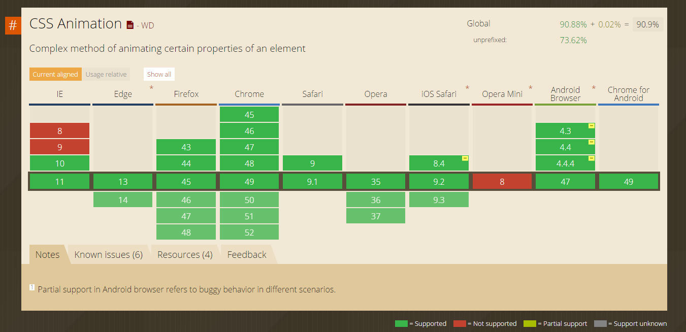
Browser Support
PERFORMANCE & NOTES
How to ensure your animations render consistently, cleanly, and efficiently.
PERFORMANCE & NOTES
CSS Transitions and Animations do have some limits, best practices, and challenges.
PERFORMANCE & NOTES
While animations render consistently and smoothly across modern browsers, Firefox does have the tendency of showing jagged edges on animated elements.
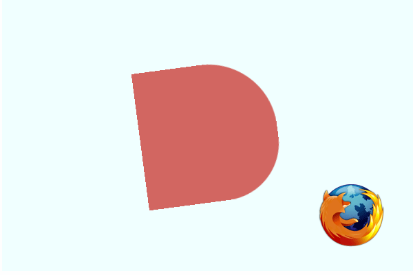
PERFORMANCE & NOTES
Luckily, there's a workaround the clean up those edges.
outline: 1px solid transparent;
Apply the outline style to the animated elements to clean up their edges in Firefox.
PERFORMANCE & NOTES
Moving Elements
Transitioning Z-Index values can cause inconsistent behavior.
For better performance, transition:
- Translate values instead of top/left position values
- Scale values instead of height and width values
For more information:
PERFORMANCE & NOTES
The most efficient properties to transition are:
- opacity
- transform
- filter (depending on complexity)
Other properties require additional re-paints and stress to the browser.
Efficient Properties
PERFORMANCE & NOTES
The basic rule is that you can only transition between absolute values. For example, you can’t transition between a height of 0px to auto. The browser can’t calculate the intermediate transition values, so the property change is instant.
This also includes background gradients. Transitioning between solid colors is fine but gradients are not supported.
Values / Units
PERFORMANCE & NOTES
CSS transitions, keyframes, and animations can still require the use of vendor prefixes. Leverage Sass mixin libraries such as Bourbon to streamline this process.
Vendor Prefixes
PERFORMANCE & NOTES
Always consider your audience and mobile performance
RESOURCES
Because who remembers everything?

RESOURCES
http://cubic-bezier.com - Create cubic-bezier transitions
Bourbon.io - Sass Mixin Library
Animate.css - CSS Animation Library
Intro to CSS Animations - CSS-Tricks Video
Thank You!
CSS Transitions & Animations (2016)
By yuschick
CSS Transitions & Animations (2016)
A Drake-themed overview guide of using CSS transitions and animations covering the markup, syntax, some performance notes, and SVG properties.