The use and abuse of data graphics in politics

Attila Bátorfy

ELTE Department of Communication and Media Studies

"Any chart, no matter how well designed, will mislead us if we don't pay attention to it."
Alberto Cario
manipulative graphics are also made by people who know the rules


-
main actor
-
attribute
-
element
roles of data graphics in political communication
-
research shows data graphics can be more effective in persuading people
-
can give the impression that decisions are based on facts and expertise
-
relatively easy to establish a counter-narrative with them
-
can replace long, complicated arguments
-
because of the low graphicacy, they make easy to mislead people
why political communication uses data graphics?
visual rhetoric tool
why we lie with data graphics?
cognition
perception
praxis
visual rhetoric
biases
reasoning errors
logical fallacies
Gestalt-principles
"graphicacy"
bad traditions
bad conventions
bad design
graphic errors
The manipulation is done before the graphic is created
Many times the manipulation is not intentional, the graphic is not intended to mislead. The creator is simply unaware of what the rules are.
William Playfair
1759–1823
"the inventor of statistical graphics"

Howard Gray Funkhouser
1898–1984

Florence Nightingale's coxcomb, 1858
Francis Bicknell Carpenter, 1864
Hergesheimer and Leonhard's map on the proportion of slaves in the US bases on the census of 1860


Communist propaganda


Right wing propaganda


Truman


Reagan
Truman
Clinton


Obama


Trump


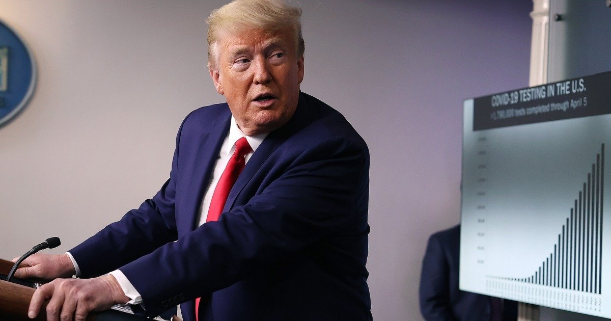


Trump


Karim Douieb's version
Trump's misinterpretation


Alberto Cairo's explanation
Biden


FloorCharts Twitter

?


?
?


?
?
?

?
simple comparisons
simple and short trends
no context
loud
missing scale
missing years
y axis cut
pictograms
suspicious clues
Thank you!
batorfy.attila@btk.elte.hu
The use and abuse of data graphics in politics
By Attila Bátorfy


