PHC6194 SPATIAL EPIDEMIOLOGY

Spatial Data Visulization
Hui Hu Ph.D.
Department of Epidemiology
College of Public Health and Health Professions & College of Medicine
February 13, 2019
Spatial Data Visualization
Lab 1: Visualization Using QGIS
Lab 2: Visualization Using Carto
Lab 3: Visualization Using R
Spatial Data Visualization
Map
- Map provides a powerful way to visualize spatial data
- However, sometimes it can be misleading, like many other visualization tools
Cartography
- The art and science of mapmaking
- Decisions about:
- what data to display
- how to display them
Types of Maps in Spatial Epidemiology
- Methods of display:
- static map: to show static spatial pattern
- animated map: to present spatial pattern over time
- Features to display:
- maps for points
- maps for polygons
Maps for Points
- Point map
- delineate the locations of point features
- visualization of the spatial pattern of point features
- Contour map
- made from point features with some attribute values
- e.g. air pollution level from stationary monitors
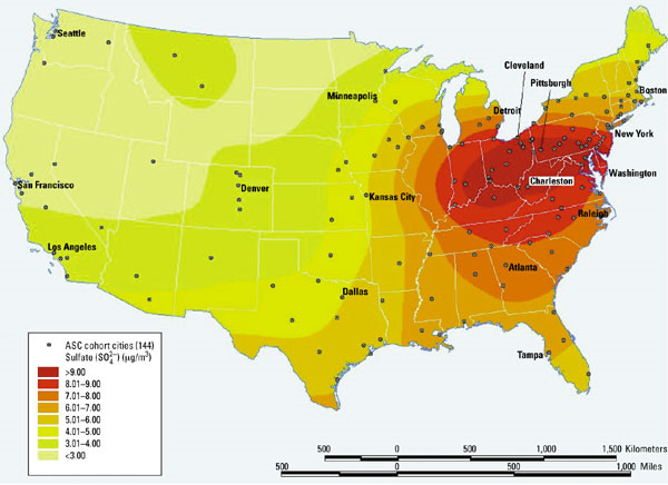
Spatial distribution of sulfate concentrations based on 1980-1981 average values in 144 metropolitan statistical areas
Source: Environmental Health Perspectives Supplements Volume 109, Number S3, June 2001
Maps for Polygons
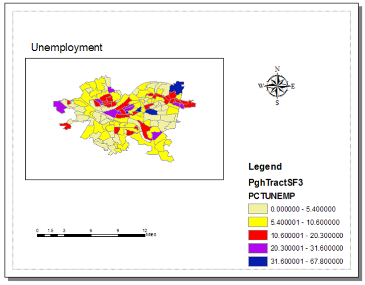
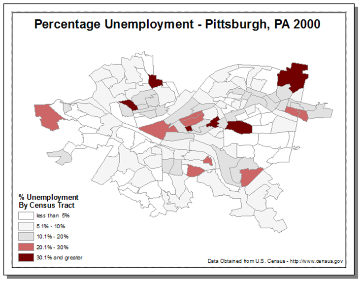
- Graduated color map (choropleth map)
- the most common maps to display polygons
- Symbol map
- a symbol is located in the centroid of each polygon and attribute values are indicated by the choice of symbol
Maps for Polygons (cont'd)
- Dot densities map
- show the amount of an attribute within an area
- each dot represents a specified number of features (e.g. each dot represents 1,000 people within an area)
- the dots are distributed randomly within each area
- the closer together the dots are, the higher the density of features in that area
Maps for Polygons (cont'd)
- Chart map
- bar/column charts, stacked bar charts, and pie charts can present large amounts of categorical data in an eye catching fashion
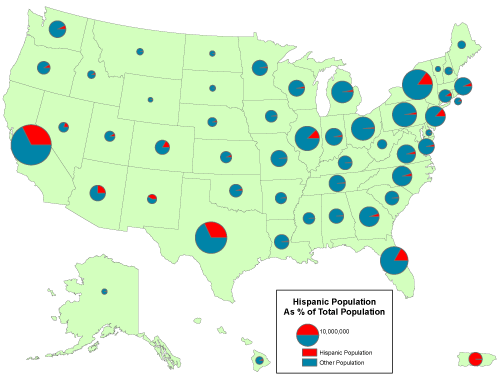
Source: https://www.e-education.psu.edu/natureofgeoinfo/sites/www.e-education.psu.edu.natureofgeoinfo/files/image/hisp_pies.gif
Symbolization
- Location
- provide the spatial structure and support of the geographic data
- Size
- size of points can indicate some attribute values
- Shape
- different shapes can be used to indicate different types of features
- Orientation
- Texture and color
Color
Color
Lab 1: Visualization Using QGIS
git pull
Lab 2: Visualization Using Carto
Lab 3: Visualization Using R
PHC6194-Spring2019-Lecture6
By Hui Hu
PHC6194-Spring2019-Lecture6
Slides for Lecture 6, Spring 2019, PHC6194 Spatial Epidemiology


