


Cassie Evans
Brighton based front-end dev & designer. disOrganiser @GeneratorBtn. Has a particular fondness for web animation.
gsap.to(".ball", {
 y: 150,
 duration: 3,
 yoyo: true,
 repeat: -1,
 ease: "sine.inOut"
});
gsap.to(".ball", {
keyframes: {
"0%": { yPercent: 0, scaleX: 1, scaleY: 1 },
"7%": { yPercent: 5, scaleY: 0.9, scaleX: 1.1 },
"25%": { yPercent: 100, scaleX: 0.9},
"50%": { yPercent: 500, scaleX: 1, scaleY: 1},
"60%": { scaleX: 1.6, scaleY: 0.4},
"65%": { yPercent: 500, scaleX: 1, scaleY: 1},
"100%": { yPercent: 0, scaleX: 1, scaleY: 1},
easeEach: "sine.out"
},
duration: 0.8,
repeat: -1,
transformOrigin: "center bottom"
});@keyframes nope {
from {background-image: url("candles.jpg")}
to {background-image: url("moon.jpg")}
}.container {
height: 20px;
transition: height 2s ease-in-out;
}
.container:hover {
height: calc-size(auto);
}Coming soon?...
let tl = gsap.timeline()

tl.to("#lightning", {
  morphSVG:  "#circle"
})
.to("#lightning", {
  morphSVG:  "#star",
  scale: 0.6,
  rotation: 360,
  transformOrigin: "center center"
})
- Miriam Suzanne
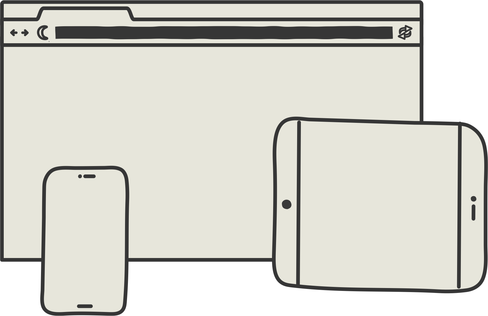
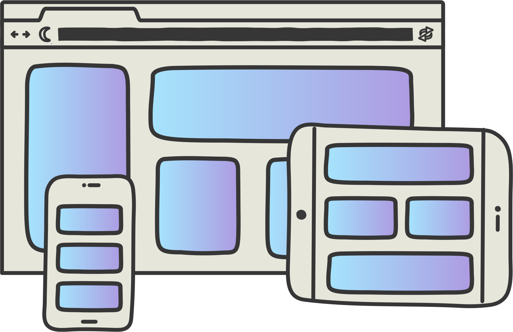
100vw
100lvh
700px
FIXED
relative
flexbox
absolute
- people with better stuff to be doing
central
peripheral
peripheral
central
peripheral
peripheral
sneaky stuff
sneaky stuff
I am a website
I am a new page
Exit
Entrance
Persistent
Vanishing
Appearing
Levitating
with a little bit of...
with
irst
ast
nvert
lay
{
  top: 300,
  left: 900,
  width: 200,
  height: 500,
}
width
height
top
left
el.getBoundingClientRect(){
top: 10,
left: 200,
width: 500,
height: 1000,
}Where the magic happens
translate(200px, 100px) scale(2.5)translate(0px, 0px) scale(1)const first = box.getBoundingClientRect();
switchItUp()
const last = box.getBoundingClientRect();
let delta = {
x: -1 * (last.left - first.left),
y: -1 * (last.top - first.top),
};
box.style.transform = `translate(${delta.x}px, ${delta.y}px)`;
requestAnimationFrame(function () {
el.classList.add("animate");
el.style.transform = "none";
});.animate {
transition: transform 1s ease-in-out;
}let state = Flip.getState(card);
switchItUp()
Flip.from(state)irst
ast
nvert
lay
irst
ast
ffset
arent
Any sufficiently advanced technology is indistinguishable from magic.
https://codepen.io/hexagoncircle
.card {
 view-transition-name: card;
}

::view-transition-group(card) {
 animation-duration: 2s;
}
document.startViewTransition(() => reparentCard());#card1 {
view-transition-name: card1;
}
#card2 {
view-transition-name: card2;
}
#card3 {
view-transition-name: card3;
}
#card4 {
view-transition-name: card4;
}
::view-transition-group(card1),
::view-transition-group(card2),
::view-transition-group(card3),
::view-transition-group(card4),{
animation-duration: 2s;
animation-timing-function: ease-out
}#card1 {
view-transition-name: card1;
}
#card2 {
view-transition-name: card2;
}
#card3 {
view-transition-name: card3;
}
#card4 {
view-transition-name: card4;
}
.card {
view-transition-class: card;
}
::view-transition-group(.card) {
animation-duration: 2s;
animation-timing-function: ease-out
}
@keyframes animate-out {
  0% {
    opacity: 1;
    translate: 0 0;
  }
  100% {
    opacity: 0;
    translate: 0 -200px;
  }
}

@keyframes animate-in {
	0% {
    opacity: 0;
    translate: 0 -200px;
  }
	100% {
    opacity: 1;
    translate: 0 0;
  }
}
/* Card was added */
::view-transition-new(targeted-card):only-child {
animation: animate-in ease-in 0.25s;
}
/* Card is getting deleted */
::view-transition-old(targeted-card):only-child {
animation: animate-out ease-out 0.5s;
}@view-transition {
navigation: auto;
}@media (prefers-reduced-motion: no-preference) {
/* safe to animate */
}use your magical powers responsibly
use your magical powers responsibly
let mm = gsap.matchMedia()

mm.add("(prefers-reduced-motion: no-preference)", (context) => {
   ...
);
By Cassie Evans


