





👣
👻
🛸




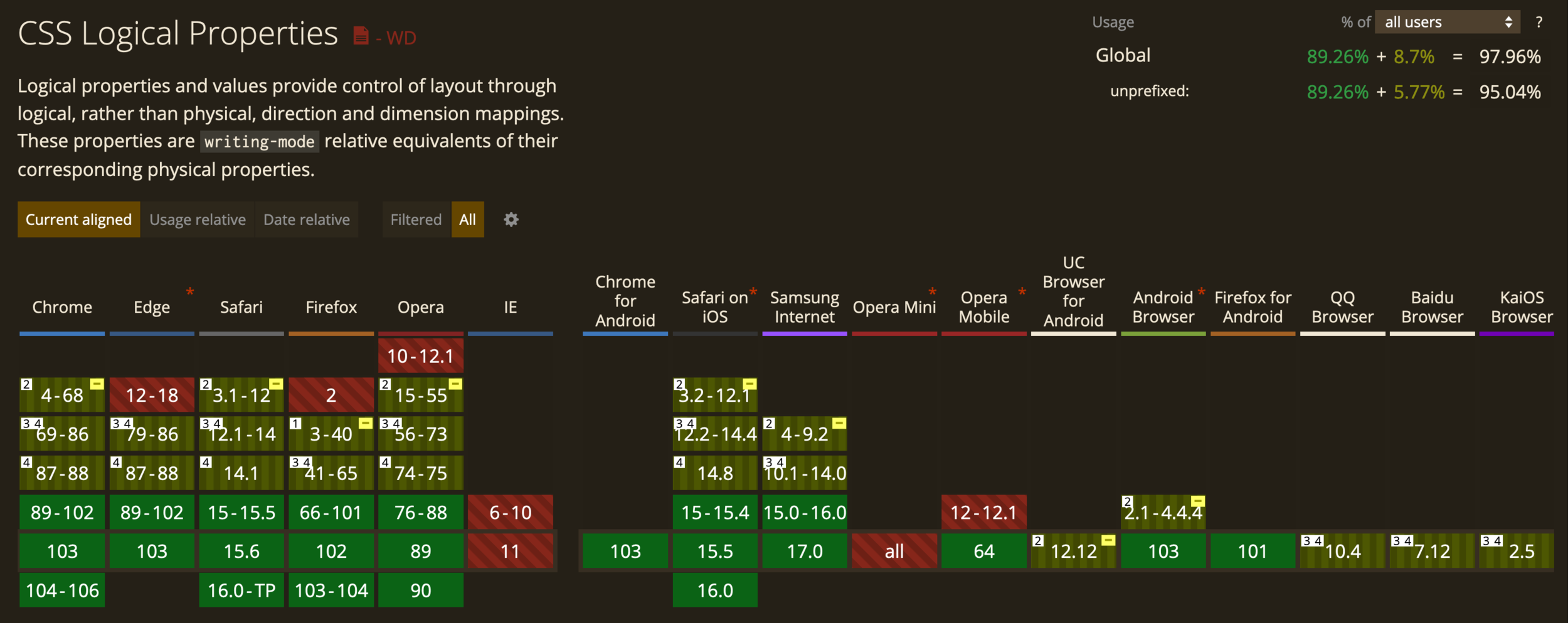

The dimension perpendicular to the flow of text within a line, i.e., the vertical dimension in horizontal writing modes, and the horizontal dimension in vertical writing modes. For standard English text, it is the vertical dimension.
https://developer.mozilla.org/en-US/docs/Web/CSS/CSS_Logical_Properties
.block-size-test {
  block-size: 200px;
  display: grid;
  place-items: center;
}

The dimension parallel to the flow of text within a line, i.e., the horizontal dimension in horizontal writing modes, and the vertical dimension in vertical writing modes. For standard English text, it is the horizontal dimension.
https://developer.mozilla.org/en-US/docs/Web/CSS/CSS_Logical_Properties
.inline-size-test {
  inline-size: 50px;
  background-color: purple;
  display: grid;
  place-items: center;
}
A way to tint certain elements of your UI with ONE line of css!
Only 4 available elements to tint 😢
checkbox
radio
range
progress
Works with dark and light themes as well!

accent-color: hotpink;https://codepen.io/web-dot-dev/pen/PomBZdy
Sets a preferred aspect ratio for the box, which will be used in the calculation of auto sizes and some other layout functions.
https://developer.mozilla.org/en-US/docs/Web/CSS/aspect-ratio
WTF DOES THAT MEAN CHRIS?!
The property helps to size consistently.
🙌🏼
How handy is it?
👀
- Responsive iFrames
- Hero images
- Grid layouts
https://css-tricks.com/almanac/properties/a/aspect-ratio/

/* Keyword values */
aspect-ratio: auto; /* default */

/* Ratio values */
aspect-ratio: 1 / 1; /* width and height are equal proportion */
aspect-ratio: 2 / 1; /* width is twice the height*/
aspect-ratio: 1 / 2; /* width is half the height */
aspect-ratio: 16 / 9  /* typical video aspect ratio */
aspect-ratio: auto 4 / 3; /* width:height, unless it's a replaced element */

/* Global values */
aspect-ratio: inherit;
aspect-ratio: initial;
aspect-ratio: unset;
https://css-tricks.com/almanac/properties/a/aspect-ratio/
https://codepen.io/seyedi/pen/gOLVQoO
Customize the marker of your ordered and unordered list items

li::marker {
  content: "👻 ";
}
https://developer.mozilla.org/en-US/docs/Web/CSS/:where
:where()
Pseudo-class function takes a selector list as its argument, and selects any element that can be selected by one of the selectors in that list.

https://developer.mozilla.org/en-US/docs/Web/CSS/:where
:where(header, main, footer) p:hover {
  color: hotpink;
  font-weight: bold;
  cursor: pointer;
}
header p:hover,
main p:hover,
footer p:hover {
color: red;
cursor: pointer;
}:where()
https://developer.mozilla.org/en-US/docs/Web/CSS/:where
https://developer.mozilla.org/en-US/docs/Web/CSS/:where
:is()
Pseudo-class function takes a selector list as its argument, and selects any element that can be selected by one of the selectors in that list. This is useful for writing large selectors in a more compact form.
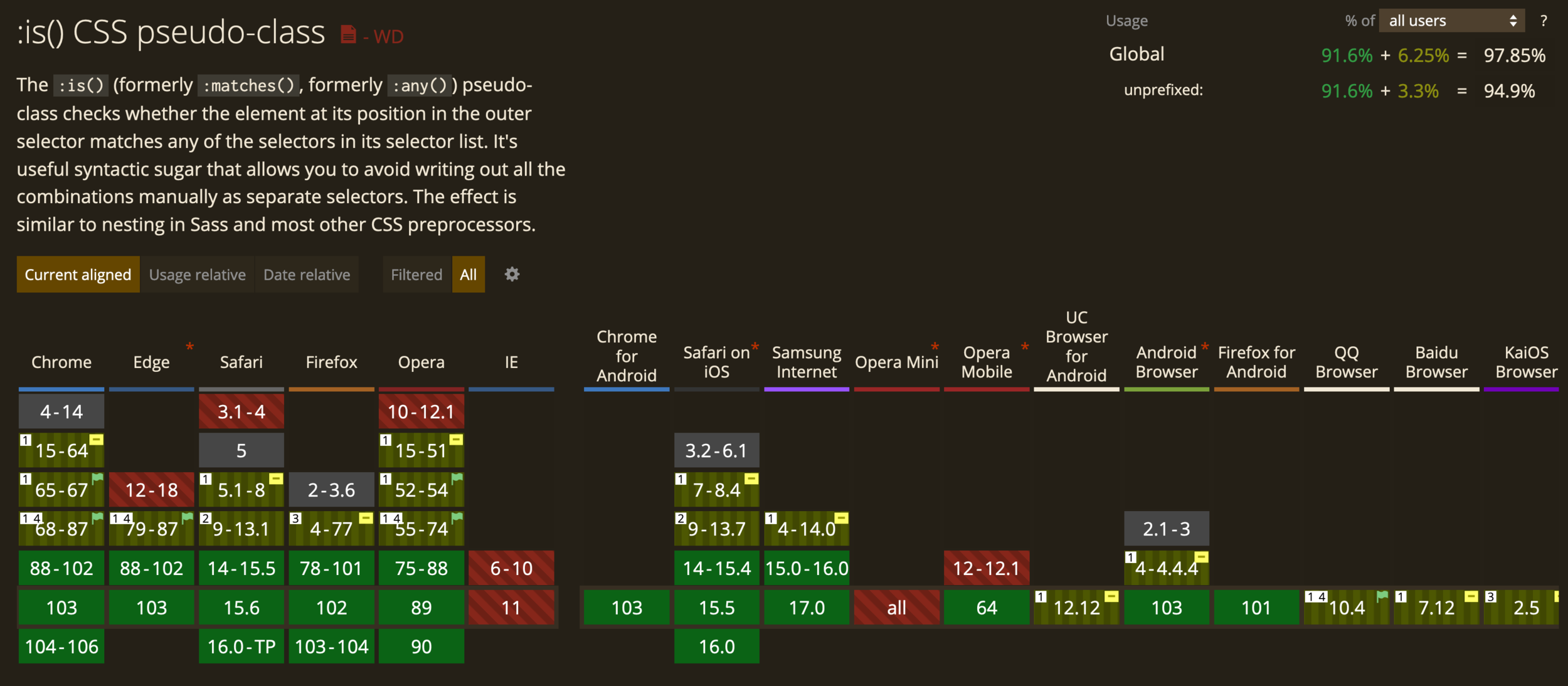
https://developer.mozilla.org/en-US/docs/Web/CSS/:is
:is(header, main, footer) p:hover {
  color: red;
  cursor: pointer;
}
header p:hover,
main p:hover,
footer p:hover {
color: red;
cursor: pointer;
}:is()
https://developer.mozilla.org/en-US/docs/Web/CSS/:is
But...but...But...BuT
WHY THE SAME?!?!?
They are different!
They are different!
I'ts true yo!
:is( ) is based on specificity
:where( ) is not
https://developer.mozilla.org/en-US/docs/Web/CSS/:is
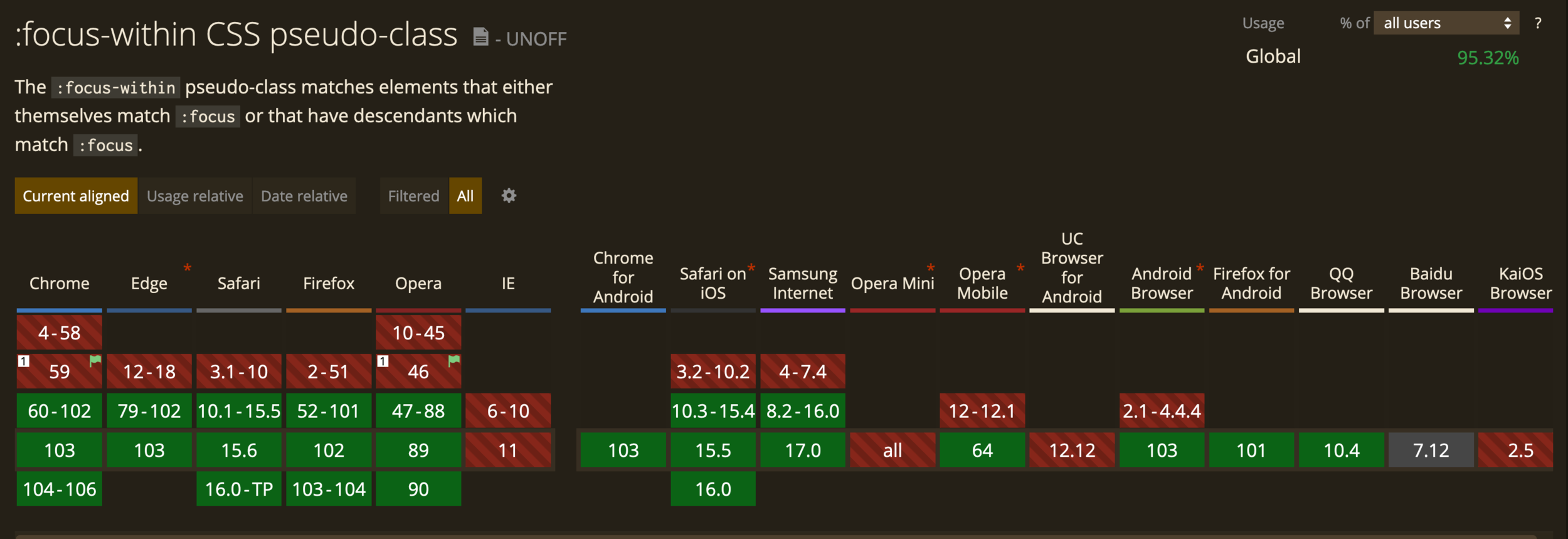
form:focus-within {
  background: #f7b731;
  color: black;
}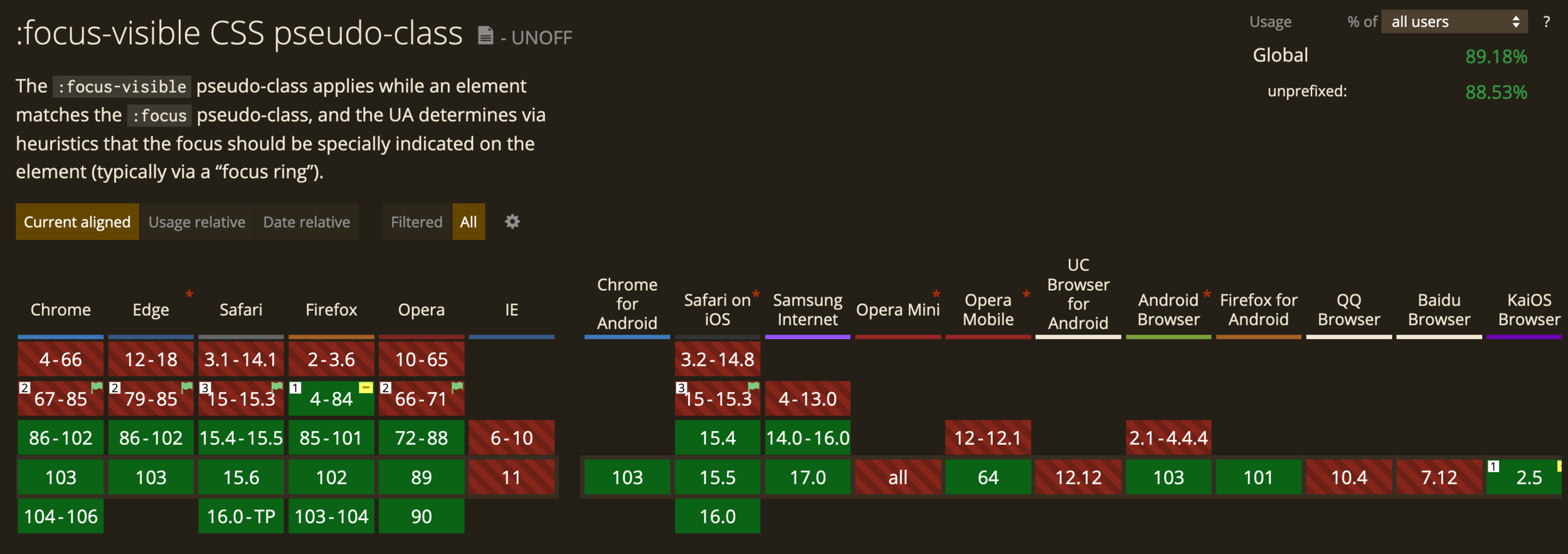
button:focus-visible {
  outline: 2px dashed limegreen;
  outline-offset: 2px;
}
https://codepen.io/web-dot-dev/pen/qBRXRdW


.instructors {
  grid-template-columns: repeat(2, 380px);

  & .instructor {
    padding: 0 40px;
  }
}
.instructors {
grid-template-columns: repeat(2, 380px);
}
.instructors .instructor {
padding: 0 40px;
}NESTING
🔥
🔥
.sample {
  inline-size: 50vmin;
  block-size: 35vmin;
  background: linear-gradient(
    to bottom right,
    hsl(150 100% 50%),
    hsl(190 100% 60%)
  );
  border-radius: 1rem;
  position: relative;
}

.sample::before {
  content: '';
  position: absolute;
  inset: 0;
  background: linear-gradient(
    to right,
    hsl(150 100% 50%),
    hsl(190 100% 60%)
  );
  z-index: -1;
  transform: translateY(15%) scale(.85);
  filter: blur(30px);
}
Logical props replacing
height and width!
https://codepen.io/argyleink/pen/WNxeBKa

background: conic-gradient(
	from 90deg at 50% 125%,
	#20b2aa,
	#135da5,
	#0d0895,
	#4b0082,
	#4b0082,
	#0d0895,
	#135da5,
	#20b2aa);
https://codepen.io/argyleink/pen/pogZxaZ
.card {
  inline-size: 50vmin;
  block-size: 50vmin;

  border: 5vmin solid hsl(100 100% 60%);
  border-image-slice: 1;

  /*  leverage cascade for cross-browser gradients  */
  border-image-source: linear-gradient(
    hsl(100 100% 60%),
    50%,
    hsl(200 100% 60%)
  );
  border-image-source: radial-gradient(
    hsl(100 100% 60%),
    75%,
    hsl(200 100% 60%)
  );
  border-image-source: conic-gradient(
    hsl(100 100% 60%),
    hsl(200 100% 60%),
    hsl(100 100% 60%)
  );

  display: grid;
  place-content: center;
  padding: 4ch;
  box-sizing: border-box;
  font-size: 10vmin;
}
https://codepen.io/argyleink/pen/pogZxaZ

NESTING A GRID WITHIN A GRID!
🔥
🔥
COLUMNS
.grid {
  display: grid;
  grid-template-columns: repeat(9, 1fr);
  grid-template-rows: repeat(4, minmax(100px, auto));
}

.item {
  display: grid;
  grid-column: 2 / 7;
  grid-row: 2 / 4;
  grid-template-columns: subgrid;
  grid-template-rows: repeat(3, 80px);
}

.subitem {
  grid-column: 3 / 6;
  grid-row: 1 / 3;
}
https://developer.mozilla.org/en-US/docs/Web/CSS/CSS_Grid_Layout/Subgrid
https://developer.mozilla.org/en-US/docs/Web/CSS/CSS_Grid_Layout/Subgrid
ROWS
.grid {
  display: grid;
  grid-template-columns: repeat(9, 1fr);
  grid-template-rows: repeat(4, minmax(100px, auto));
}

.item {
  display: grid;
  grid-column: 2 / 7;
  grid-row: 2 / 4;
  grid-template-columns: repeat(3, 1fr);
  grid-template-rows: subgrid;
}

.subitem {
  grid-column: 2 / 4;
  grid-row: 1 / 3;
}
https://developer.mozilla.org/en-US/docs/Web/CSS/CSS_Grid_Layout/Subgrid
https://developer.mozilla.org/en-US/docs/Web/CSS/CSS_Grid_Layout/Subgrid

https://bit.ly/it-came-from-the-browser

Adam Argyle
Miriam Suzanne
Jen Simmons
Rachel Andrew
Una Kravets
Mojtaba Seyedi


It Came From the Browser
By Chris DeMars
It Came From the Browser
- 390


