FLIPping out about
Animated Layouts
@davidkpiano · CSS Dev Conf 2017
#flipanim
FLIP

Peel pressure 🍌
Uncertainty
Surprise User Experience (SUX)
JUMP
CUTS
CUTS ARE
ANNOYING
X
CSS
IS
AWESOME
HTML
IS
AWESOME
How can we improve the
user experience
on the web?
Flexbox
Grid
  <body>
    <main>
      <section>
        <article>
          <header>
            <h1>
              Put a rest to nesting.
            </h1>
          </header>
        </article>
      </section>
    </main>
  </body>
Animation brings
to life.
user interfaces
you shouldn't be seeing this
- Quick: efficient, yet meaningful
- Clear: simple, coherent
-
Cohesive: unified by speed, responsiveness, intention
Google: What Makes a Good Transition
Layout transitions in
Android and iOS
Layout transitions in
Frame-based layout
Constraint-based auto layout
iOS
Constraint-based auto layout
var heightConstraint: NSLayoutConstraint!

// ...

heightConstraint.constant = 100
UIView.animate(withDuration: 0.25) {
    self.view.layoutIfNeeded()
}Layout transitions in
iOS
Layout transitions in
iOS
Layout transitions in Android
Shared-element activity transitions

<android.support.v7.widget.CardView
  ...>
      <ImageView
          android:id="@+id/ivProfile"
          android:transitionName="profile"
          android:scaleType="centerCrop"
          android:layout_width="match_parent"
          android:layout_height="160dp" />
      ...
</android.support.v7.widget.CardView>
<LinearLayout
...>
<ImageView
android:id="@+id/ivProfile"
android:transitionName="profile"
android:scaleType="centerCrop"
android:layout_width="match_parent"
android:layout_height="380dp" />
...
</LinearLayout>android:transitionName="profile"

Let's get
animating
What do we want?
Performant web animations!
When do we want it?
The next available animation frame
60 FPS
opacity & transform

FLIP
Invert
Last
First
Play
First
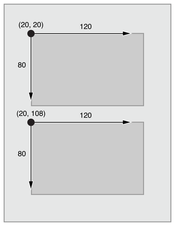
const box = document.querySelector('#box');

const first = getBoundingClientRect(box);

// {
//   top: 400,
//   left: 100,
//   width: 200,
//   height: 200,
//   ...
// }
A
First
A
Rect
angle
getBoundingClient
😌
⁉️
Last
// ... execute change

const bigBox = document
  .querySelector('#big-box');

const last = getBoundingClientRect(bigBox);

// {
//   top: 0,
//   left: 0,
//   width: 500,
//   height: 500,
//   ...
// }
B
Invert
100px
400px
- deltaX = last.left - first.left = 100
- deltaY = last.top - first.top = 400
- deltaW = first.width / last.width = 0.4
- deltaH = first.height / last.height = 0.4
0.4
0.4
const deltaX = first.left - last.left;
const deltaY = first.top - last.top;
const deltaW = first.width / last.width;
const deltaH = first.height / last.height;
B
Play
// WAAPI

bigBox.animate([
  {
    transformOrigin: 'top left',
    transform: `
      scale(deltaW, deltaH)
      translate(deltaX, deltaY)
    `
  },
  {
    transformOrigin: 'top left',
    transform: 'none'
  }
], {
  duration: 300,
  easing: 'ease-in-out',
  fill: 'both'
});
// GSAP
TweenLite.fromTo(bigBox, .3, {
transformOrigin: 'top left',
transform: `
scale(deltaW, deltaH)
translate(deltaX, deltaY)
`
}, {
transformOrigin: 'top left',
transform: 'none'
});Let's review.
Let's review.
First:
size & position before action
Let's review.
First:
size & position before action
Last:
size & position after action
Let's review.
First:
size & position before action
Last:
size & position after action
Invert:
delta of sizes & positions
Let's review.
First:
size & position before action
Last:
size & position after action
Invert:
delta of sizes & positions
Play:
from delta to zero
const first = getBoundingClientRect(elm);

doSomething();

const last = getBoundingClientRect(elm);

const deltaX = first.left - last.left;
const deltaY = first.top - last.top;
const deltaW = first.width / last.width;
const deltaH = first.height / last.height;

elm.animate([{
  transformOrigin: 'top left',
  transform: `
    translate(${deltaX}px, ${deltaY}px)
    scale(${deltaW}, ${deltaH})
  `
}, {
  transformOrigin: 'top left',
  transform: 'none'
}], {
  duration: 300,
  easing: 'ease-in-out',
  fill: 'both'
});
First
Last
Invert
Play
Expand & collapse 🤔
Advanced FLIP

Attempt 0
Animate height & width
Just don't. Please.
Attempt 1
Animate clip-path
- PROS
- Doesn't trigger layout
- Single element
- Non-rectangular clipping
- CONS
- Triggers paint
- Not supported in IE/Edge/Opera Mini

Attempt 2
Animate scale
- PROS
- Performant!
- That's about it.
- CONS
- Requires container
- Need to calculate inverse easing
- Can't scale to/from 0
Attempt 3
Animate "clipped" translation
- PROS
- Performant!
- Compatible with any easing
- Can transition to/from 0
- CONS
- Requires container
- Calculations can be tricky
- Box shadow/border radius clipped
it'll load, I promise
what the flip
Relative FLIPping
Advanced FLIP
const parentBounds = // ...

const childBounds = // ...

const relativeBounds = {
  top: childBounds.top - parentBounds.top,
  left: childBounds.left - parentBounds.left
}
FLIP can be used
recursively
(and position: relative is your friend)
More ideas
Advanced FLIP

Choreography + staggering
Curved motion paths
Physics
Interruptible animations
(╯°□°)╯︵ ┻━┻
Is there an easier FLIPping way?
Announcing Flipping
<section class="gallery">
  <div class="photo-1" data-flip-key="photo-1">
    <img src="/photo-1"/>
  </div>
  <div class="photo-2" data-flip-key="photo-2">
    <img src="/photo-2"/>
  </div>
  <div class="photo-3" data-flip-key="photo-3">
    <img src="/photo-3"/>
  </div>
</section>
npm install flipping --save
<section class="details">
  <div class="photo" data-flip-key="photo-1">
    <img src="/photo-1"/>
  </div>
  <p class="description">
    Lorem ipsum dolor sit amet...
  </p>
</section>
data-flip-key="..."
Announcing Flipping
npm install flipping --save
const flipping = new Flipping();

// ...

photo1.addEventListener('click', () => {
  // read the shared elements
  flipping.read();

  // change the UI state
  viewPhotoDetail(1);

  // FLIP the shared elements
  flipping.flip();
});
const flipping = new Flipping();
// ...
photo1.addEventListener('click',
flipping.wrap(() => {
// change the UI state
viewPhotoDetail(1);
}));Announcing Flipping
npm install flipping --save
- flipping.js - build your own FLIPementation
- flipping.web.js - Web Animations API
- flipping.gsap.js - GreenSock
- flipping.???.js - More coming soon!
{
  node: /* active node */,
  delta: {
    top: -100,
    left: 300,
    width: 0.5,
    height: 2
  }
}
const flipping = new Flipping({
onFlip: (state) => {
// create your own animations
animate(state.node, state.delta);
}
});JAVASCRIPT
FLIP STATE
oh my god conference wifi
actually I'm on the hotel wifi but still
FLIP.js

const flip = new FLIP({
  element: target,
  duration: 2000
});

// First position & opacity.
flip.first();

// Apply the 'end' class and
// snapshot last position/opacity
flip.last('end');

// Move and fade the element
// back to the original position.
flip.invert();

// Play it forwards.
flip.play();
- requestAnimationFrame or GSAP
- Doesn't work with shared elements
- Made by Paul Lewis himself
React Flip Move
import FlipMove from 'react-flip-move';

class TopArticles extends Component {
  renderTopArticles() {
    return this.props.articles
      .map(article =>
        <Article
          {...article}
          key={article.id}
        />
      );
  }

  render() {
    return (
      <div className="top-articles">
        <FlipMove easing="...">
          { this.renderTopArticles() }
        </FlipMove>
      </div>
    );
  }
}BarbaJS


Why are we OK with the user feeling like they are being teleported every time the page changes?
Can be used with FLIP technique
Transitions between pages
Can reduce HTTP requests
Can use JS or CSS animations
Resources
- Animating the Unanimatable - Joshua Comeau
- FLIP your Animations - Paul Lewis
- Pixels are Expensive - Paul Lewis
- Improving User Flow Through Page Transitions - Luigi de Rosa
- Smart Transitions in User Experience Design - Adrian Zumbrunnen
- What Makes a Good Transition? - Nick Babich
- Motion Guidelines in Google's Material Design
- Shared Element Transition with React Native
Let's FLIPping animate the web!
@davidkpiano · CSS Dev Conf 2017
#flipanim 5 flipping awesome!
#asdfasdf 1 what the flip is this
FLIPping out about Animated Layouts
By David Khourshid
FLIPping out about Animated Layouts
CSS Dev Conf 2017 - New Orleans


