Implement a custom Design System on top of Angular Material 🏡

Sylvain DEDIEU
Senior Software Development Engineer - #ui-foundations
Agenda
1
2
4
What is and why a DS ?
How to implement a DS ?
Tips & Tricks
3
Our trade-offs
s.dedieu@criteo.com


Sylvain DEDIEU
Senior Software Development Engineer - #ui-foundations
@sdedieu.bsky.social
s.dedieu@criteo.com


Sylvain Dedieu
Get the presentation slides
🤳


What is & why a DS ?
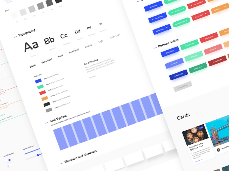
What is a Design System ?
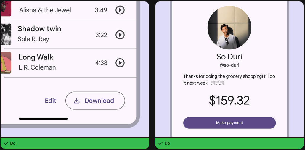
At its core, a design system is a set of building blocks and standards that help keep the look and feel of products and experiences consistent. Think of it as a blueprint, offering a unified language and structured framework that guides teams through the complex process of creating digital products
What is a Design System ?
What is a Design System ?
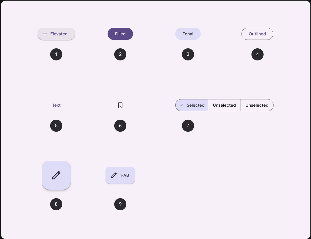
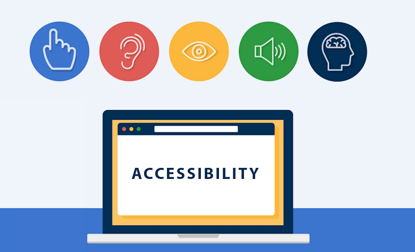
Why a Design System ?

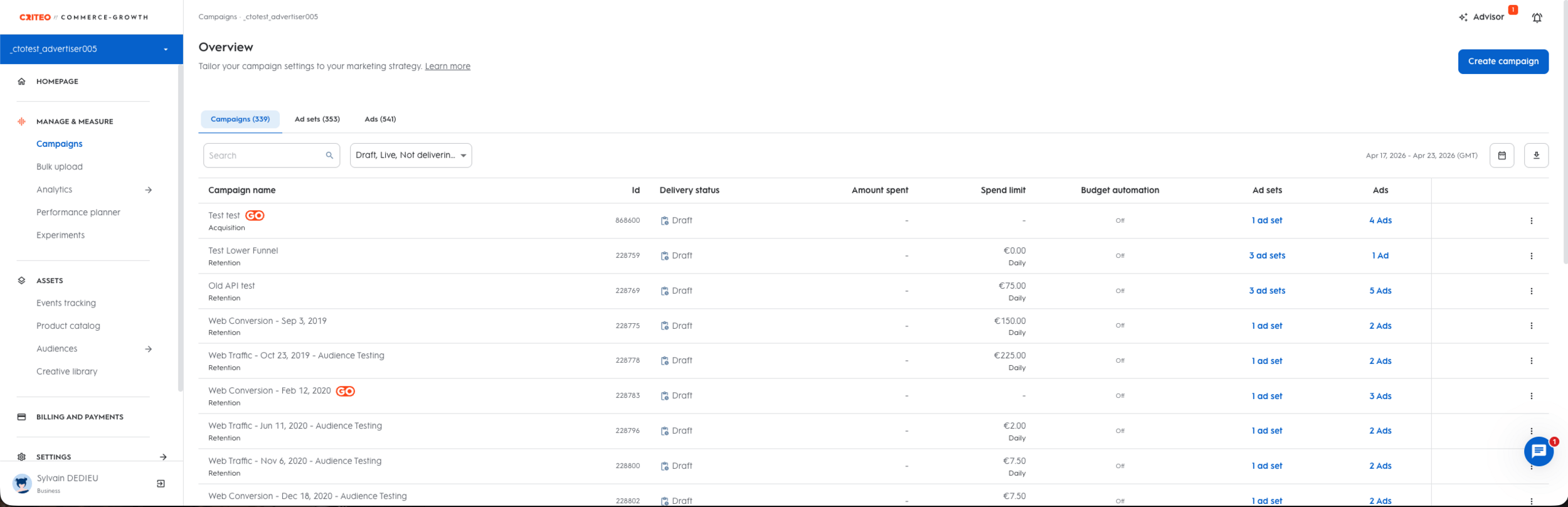
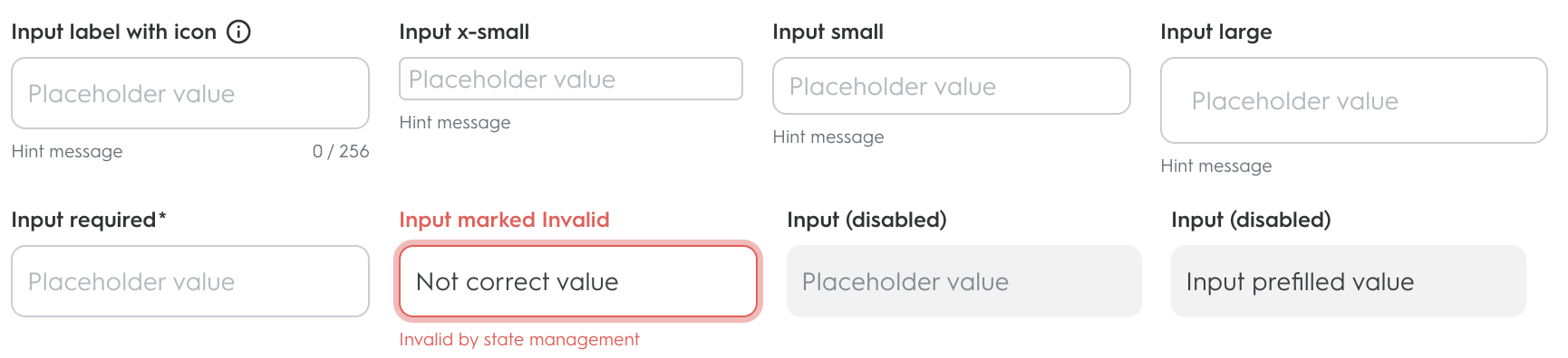
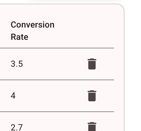
Demo time !
Why a Design System ?


Context: Our trade-offs

How "deep" should we build it ?


423 Applications
155 Applications (most internals)
16 Applications (internals)
Cdk
Material
How "deep" should we build it ?

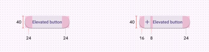
The customization

Material

The (bad) customization
button,
a {
  &.mat-button, &.mat-flat-button, &.mat-icon-button, &.mat-stroked-button {
    line-height: 40px;
    border-radius: 24px;
    &.small {
      line-height: 32px;
    }

    &.large {
      line-height: 48px;
    }
  }
  &.mat-button:hover .mat-button-focus-overlay, &.mat-stroked-button:hover .mat-button-focus-overlay,
  &.mat-icon-button:hover .mat-button-focus-overlay {
    opacity: 0.12;
  }
  &.mat-button, &.mat-raised-button, &.mat-flat-button, &.mat-stroked-button {
    .mat-button-wrapper {
      display: flex;
      flex-direction: row;
      align-items: center;
      justify-content: center;
    }
  }
}

// removing the pure circle on icon button ripple
.mat-icon-button .mat-button-ripple-round {
  border-radius: initial;
}
The issue
Theming

Customization
Customization
Theming
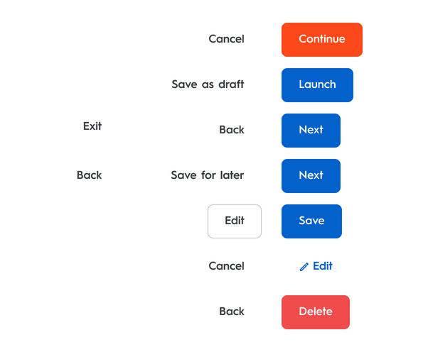
We suffer the Angular Material Components HTML changes
v15
v14
<button mat-button
  color="primary">
  Primary
</button>
<button mat-button
  color="primary">
  Primary
</button>
v14
<span class="mat-button-wrapper"><ng-content></ng-content></span>
<span matRipple class="mat-button-ripple"
      [class.mat-button-ripple-round]="isRoundButton || isIconButton"
      [matRippleDisabled]="_isRippleDisabled()"
      [matRippleCentered]="isIconButton"
      [matRippleTrigger]="_getHostElement()"></span>
<span class="mat-button-focus-overlay"></span>
<span
class="mat-mdc-button-persistent-ripple"
[class.mdc-button__ripple]="!_isFab"
[class.mdc-fab__ripple]="_isFab"></span>
<ng-content select=".material-icons:not([iconPositionEnd]),
mat-icon:not([iconPositionEnd]), [matButtonIcon]:not([iconPositionEnd])">
</ng-content>
<span class="mdc-button__label"><ng-content></ng-content></span>
<ng-content select=".material-icons[iconPositionEnd],
mat-icon[iconPositionEnd], [matButtonIcon][iconPositionEnd]">
</ng-content>
<!--
The indicator can't be directly on the button, because MDC uses ::before for high contrast
indication and it can't be on the ripple, because it has a border radius and overflow: hidden.
-->
<span class="mat-mdc-focus-indicator"></span>
<span matRipple class="mat-mdc-button-ripple"
[matRippleDisabled]="_isRippleDisabled()"
[matRippleTrigger]="_elementRef.nativeElement"></span>
<span class="mat-mdc-button-touch-target"></span>v15
Gains
- Cost saving
- API Implementation
- API Documentation
- Accessibility "ensured"

The way

Material 3 expects tonal palettes, not a legacy 0..9 scale. Adapt CDS CSS variables into the M3 map, add the neutral surface tones, then feed primary and tertiary into mat.define-theme().
// palette level
:root,
:host {
  --palette-sky-50: #f5faff;
  --palette-sky-100: #e5f0fb;
  ...
  --palette-sky-900: #00162b;
  --palette-sky-0: #ffffff;
}

// semantic level
:root,
:host {
  --primary-1: var(--palette-sky-100);
  ...
  --primary-9: var(--palette-sky-900);
  --primary-0: var(--palette-sky-0);
}

// theme level
$material-palette-primary: (
  0: var(--primary-9),
  10: var(--primary-9),
  ...
  100: var(--primary-0),
);
@use 'sass:map';
@use '@angular/material' as mat;
@use './colors/palettes/palette' as palette;
@forward './variables.scss';
$nani-light-theme: mat.define-theme(
(
color: (
theme-type: light,
primary: palette.$material-palette-primary,
tertiary: palette.$material-palette-tertiary,
),
density: (
scale: 0,
),
)
);Custom theme/palette color
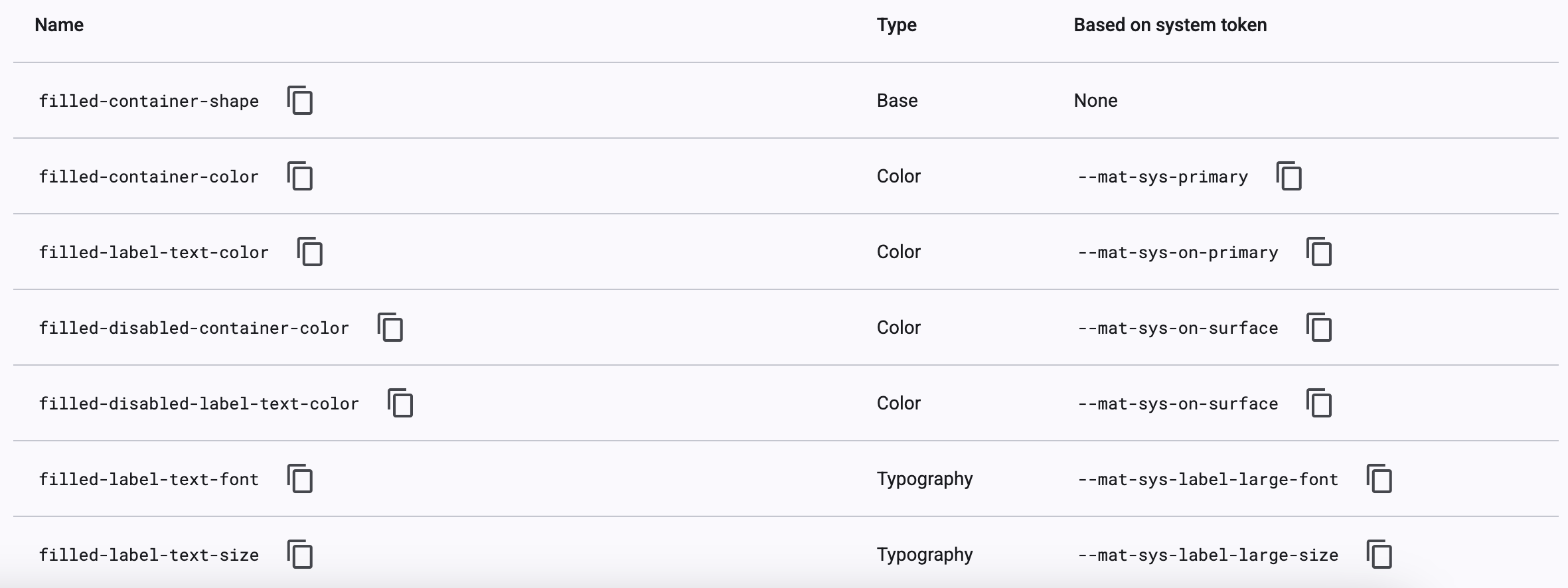
Angular Material typography defines the component text styles: font family, size, weight, line height, and letter spacing. The mat.theme mixin emits those values as
--mat-sys-* tokens.
@use 'sass:map';
@use '@angular/material' as mat;
$nani-typography-plain-family: var(--font-level-p1-reg-font-family); // the font family value
$nani-typography-brand-family: var(--font-level-title-font-family); // the font family value
// Material 3: theme definition
$nani-light-theme: mat.define-theme((
typography: (
plain-family: $nani-typography-plain-family,
brand-family: $nani-typography-brand-family,
),
));
// CDS levels stay in our own Sass map.
@function _level($name) {
@return (
font-family: var(--font-level-#{$name}-font-family),
font-weight: var(--font-level-#{$name}-font-weight),
font-size: var(--font-level-#{$name}-font-size),
line-height: var(--font-level-#{$name}-line-height),
);
}
$nani-typography-config: (
'button': _level('btn-medium'),
'p1-reg': _level('p1-reg'),
);
// Component overrides consume the level.
$_button-typo: map.get($nani-typography-config, 'button');
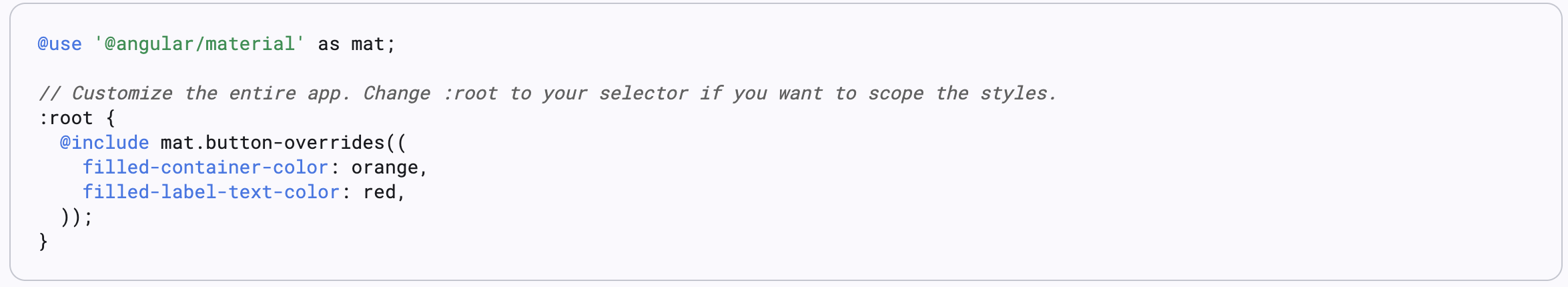
@include mat.button-overrides((
filled-label-text-font: map.get($_button-typo, font-family),
filled-label-text-size: map.get($_button-typo, font-size),
filled-label-text-weight: map.get($_button-typo, font-weight),
));Custom typography
However it's an ongoing process
An internal negociation
@mixin main() {
  .mat-mdc-form-field {
    // medium is the default size
    .mdc-text-field {
      overflow: visible;
      padding: 0;
      margin-bottom: var(--spacing-0-5);
      display: flex;
      align-items: center;
      position: relative;

      &--filled {
        .mdc-floating-label--float-above {
          display: flex;
          align-items: center;
          transform: translateY(-100%) scale(1);

          mat-label {
            display: flex;
            align-items: center;

            .mat-icon {
              margin-left: var(--spacing-0-5);
            }
          }
        }
      }

      &--disabled {
        .mat-mdc-form-field-flex {
          border: none !important;
        }
      }

      &:not(.mdc-text-field--no-label) {
        padding: var(--form-field-padding-top) 0 0 0;
      }

      .mat-mdc-form-field-flex {
        display: flex;
        align-items: center;
        border: var(--form-field-border);
        padding: var(--spacing-1) var(--spacing-2);
        border-radius: var(--form-field-border-radius);
        height: var(--height-5);
        min-height: var(--height-5);

        transition: var(--animation-duration-common) border;

        .mdc-text-field__input[type='search']::-webkit-search-decoration,
        .mdc-text-field__input[type='search']::-webkit-search-cancel-button,
        .mdc-text-field__input[type='search']::-webkit-search-results-button,
        .mdc-text-field__input[type='search']::-webkit-search-results-decoration {
          display: none;
        }

        .mat-mdc-form-field-icon-prefix {
          padding-right: var(--spacing-1);

          .mat-icon {
            padding: var(--spacing-none);
          }
        }

        .mat-mdc-form-field-icon-suffix {
          display: flex;
          padding-left: var(--spacing-1);

          .mat-icon {
            padding: var(--spacing-none);
          }
          .cds-icon-color-picker {
            border-radius: var(--radius-sm);
            border: 1px solid var(--color-border-neutral-field-default);
          }
          .cds-password-visibility-icon,
          .cds-search-remove-icon {
            cursor: pointer;
          }
        }

        .mat-mdc-form-field-infix {
          position: initial;
          display: flex;
          padding: var(--spacing-none);
          min-height: auto;

          .mat-mdc-floating-label {
            top: var(--spacing-2);
            left: var(--spacing-none);
          }
        }

        .mdc-notched-outline__notch,
        .mdc-notched-outline__leading,
        .mdc-notched-outline__trailing {
          border: none;
        }
      }

      .mdc-line-ripple {
        &:before,
        &:after {
          border: none;
        }
      }

      &.mat-mdc-text-field-wrapper {
        flex: none;
      }
    }

    &[cds-label-hidden='true'] {
      .mat-mdc-form-field-required-marker {
        display: none;
      }

      .mdc-text-field {
        padding-top: 0;
      }
    }

    .mat-mdc-form-field-subscript-wrapper {
      // permit the browser to calculate to align with other components
      height: var(--height-2);
    }

    &.no-hint,
    &[cds-subscript-sizing='dynamic'] {
      .mat-mdc-form-field-subscript-wrapper {
        height: auto;
        &::before {
          content: unset;
        }
      }

      .mdc-text-field {
        margin-bottom: 0 !important;
      }
    }

    .mat-mdc-form-field-hint-wrapper,
    .mat-mdc-form-field-error-wrapper {
      padding: var(--spacing-none);

      .mat-mdc-form-field-hint,
      .mat-mdc-form-field-error {
        display: flex;
      }
    }

    &[cds-field-type='textarea'] {
      .mat-mdc-text-field-wrapper {
        .mat-mdc-form-field-flex {
          height: auto !important;
        }
      }

      textarea {
        &.cdk-textarea-autosize {
          // In case cdkAutosizeMinRows is not defined
          min-height: 17px;
        }

        &[cdkautosizeminrows='1'] {
          min-height: 17px !important;
        }
      }
    }

    &[cds-field-type='select'] {
      .mat-mdc-text-field-wrapper {
        .mat-mdc-form-field-flex {
          cursor: pointer;

          mat-label {
            cursor: pointer;
          }
        }
      }
    }
  }
}
Demo time !
Writing a full native library
Cdk
Material
Writing a full native library
@customElement(elementName)
export class Button extends LitElement {

  static override styles = css`
      :host {
        display: block;
        height: fit-content;
      }

      a, button {
        --_color: var(--color, #212121);
        --_background-color: var(--background-color, #1DE9B6);
        --_border-color: var(--border-color, #1DE9B6);
     }`;

  render() {
      const { ariaLabel, ariaHasPopup, ariaExpanded } = this as ARIAMixin;
      return html`
        <button part="button"
          type=${<'button' | 'submit' | 'reset' | 'menu'>this.elementType}
          ?disabled="${this.disabled}"
          ?ripple=${this.ripple}
          ?color=${this.color}
          ?size=${this.size}
          fill=${this.fill}
          aria-label="${ariaLabel || nothing}"
          aria-haspopup="${ariaHasPopup || nothing}"
          aria-expanded="${ariaExpanded || nothing}">
          <slot></slot>
        </button>
      `;
    }
}
🤔
Add Wrappers
import { Button as _CoreButton, Props } from '@chameleon/core';
import { ProxyCmp } from '../../utils/utils';

const BUTTON_INPUTS = [ 'color', 'disabled', 'download', ...];

export const BUTTON_PROPS: Props = _CoreButton.props;

@ProxyCmp({
  inputs: BUTTON_INPUTS,
})
@Component({
  selector: `cha-button`,
  standalone: true,
  changeDetection: ChangeDetectionStrategy.OnPush,
  template: ` <ng-content></ng-content> `,
  schemas: [CUSTOM_ELEMENTS_SCHEMA],
  inputs: BUTTON_INPUTS,
})
export class Button {
  protected el: HTMLElement;

  constructor(
    private readonly _cdr: ChangeDetectorRef,
    private readonly _ref: ElementRef,
    protected zone: NgZone
  ) {
    this._cdr.detach();
    this.el = this._ref.nativeElement;
  }
}
Add Wrappers
export function ProxyCmp(opts: { defineCustomElementFn?: () => void; inputs?: any; methods?: any }) {
  const decorator = function (cls: any) {
    const { defineCustomElementFn, inputs, methods } = opts;

    if (defineCustomElementFn !== undefined) {
      defineCustomElementFn();
    }

    if (inputs) {
      proxyInputs(cls, inputs);
    }
    if (methods) {
      proxyMethods(cls, methods);
    }
    return cls;
  };
  return decorator;
}
export const proxyOutputs = (instance: any, el: any, events: string[]) => {
events.forEach((eventName) => (instance[eventName] = fromEvent(el, eventName)));
};
export const defineCustomElement = (tagName: string, customElement: any) => {
if (customElement !== undefined
&& typeof customElements !== 'undefined'
&& !customElements.get(tagName)) {
customElements.define(tagName, customElement);
}
};Add Wrappers
export const proxyMethods = (Cmp: any, methods: string[]) => {
  const Prototype = Cmp.prototype;
  methods.forEach((methodName) => {
    Prototype[methodName] = function () {
      const args = arguments;
      return this.zone.runOutsideAngular(() => this.el[methodName].apply(this.el, args));
    };
  });
};
export const proxyInputs = (Cmp: any, inputs: string[]) => {
const Prototype = Cmp.prototype;
inputs.forEach((item) => {
Object.defineProperty(Prototype, item, {
get() {
return this.el[item];
},
set(val: any) {
this.zone.runOutsideAngular(() => (this.el[item] = val));
},
/**
* In the event that proxyInputs is called
* multiple times re-defining these inputs
* will cause an error to be thrown. As a result
* we set configurable: true to indicate these
* properties can be changed.
*/
configurable: true,
});
});
};Demo time !
Tips & Tricks
Using Angular power for a better DX
export const CDS_BUTTON_HOST = {
  '[attr.cds-size]': 'size() || null',
  '[attr.cds-type]': 'type() || null',
  '[class]': 'color() ? "cds-button cds-" + color() : "cds-button"',
};

@Directive({
  selector: `button[mat-button], button[mat-raised-button],
   button[mat-flat-button], button[mat-stroked-button],
   button[mat-icon-button], a[mat-button], a[mat-raised-button],
   a[mat-flat-button], a[mat-stroked-button], a[mat-icon-button]`,
  host: CDS_BUTTON_HOST,
})
export class CdsButtonDirective {
  private _defaultOptions = inject(CDS_BUTTON_DEFAULT_OPTIONS, {
    optional: true,
  });

  color = input<CdsButtonColor>(this._defaultOptions?.color ?? 'primary');
  size = input<CdsSize>(this._defaultOptions?.size ?? 'medium', { alias: 'cds-size' });
  type = input<CdsType>(this._defaultOptions?.type ?? 'very-strong', { alias: 'cds-type' });
}
.mdc-button.mat-mdc-button-base {
  &[cds-size='small'] {
    @include mat.button-overrides(
      (
        filled-container-height: var(--height-4),
      )
    );

    @include mat.icon-button-overrides(
      (
        icon-size: var(--height-2),
        state-layer-size: var(--height-4),
      )
    );
  }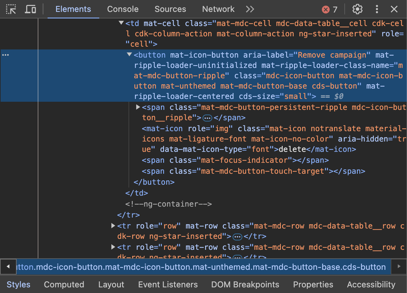
}Demo time !
Using Angular DI power for a better DX
import { Directive } from '@angular/core';

@Directive({
  selector: `table[mat-table], mat-table`,
  providers: [{
    provide: CDS_BUTTON_DEFAULT_OPTIONS,
    useValue: { size: 'small' },
  }],
})
export class CdsTableDirective {}
CdkOverlay management with ShadowDom encapsulation
@Injectable({ providedIn: 'root' })
export class WebComponentOverlayContainer extends OverlayContainer {
  public constructor(
    @Inject(DOCUMENT)
    private readonly document: Document,
    platform: Platform,
    @Inject(SAT_APP_ENTRY_COMPONENT_NAME) private readonly entryComponentName: string
  ) {
    super(document, platform);
  }

  public override getContainerElement(): HTMLElement {
    if (!this._containerElement || !this.getRootElement().querySelector(`.${this._containerElement.className}`)) {
      this._createContainer();
    }
    return this._containerElement!;
  }

  protected override _createContainer(): void {
    super._createContainer();
    this._appendToRootComponent();
  }

  private _appendToRootComponent(): void {
    if (!this._containerElement) {
      return;
    }
    const rootElement = this.getRootElement();
    rootElement.appendChild(this._containerElement);
  }

  private getRootElement(): ShadowRoot | HTMLElement {
    const shellRootComponentSelector = 'ds-shl-root';
    const shellShadowRoot = this.document.querySelector(shellRootComponentSelector)?.shadowRoot;
    return (
      this.document.querySelector(this.entryComponentName)?.shadowRoot ??
      shellShadowRoot?.querySelector(this.entryComponentName)?.shadowRoot ??
      shellShadowRoot ??
      this.document.body
    );
  }
}
Demo time !
Provide Tailwind layout class helpers through your design system library
/** @type {import('tailwindcss').Config} */
const plugin = require('tailwindcss/plugin');

module.exports = {
  corePlugins: [
    'textAlign',
    'display',
    'padding',
    'margin',
    'gap',
    'flex',
    'flexBasis',
    'flexDirection',
    'flexGrow',
    'flexShrink',
    'flexWrap',
    'gridTemplateColumns',
    'alignItems',
    'justifyContent',
    'position',
    'placeSelf',
    'inset',
    'zIndex',
  ],
  theme: {
    extend: {},
  },
  prefix: 'cds-',
  important: true,
};// ng-packagr
{
"$schema": "../../node_modules/ng-packagr/ng-package.schema.json",
"dest": "../../dist/libs/cds-styles",
"lib": {
"styleIncludePaths": [
"src"
]
},
"assets": [
"src/nani-light.scss",
"tailwind.config.js"
]
}// satellite application tailwind.config
const config = require('node_modules/cds-styles/tailwind.config');
/** @type {import('tailwindcss').Config} */
module.exports = {
...config,
};
Demo time !
Thank You !
Get the demo code
👩💻🧑💻


Opened positions

Give feedbacks !
Implement a custom Design System on top of Angular Material.
By Dedieu Sylvain


