Fresh Hot CSS Features!
(AKA things you may have missed
in the last 5 years)
Alex Riviere
Senior Web Developer at Traina
https://alex.party


Slides:
https://slides.com/fimion/that-conf-tx-2023/
This talk will cover:
- Custom Properties
- CSS Grid
- min(), max(), clamp()
- Logical Properties
- :is() and :where()
- :has()
- @layer
- @container
Custom Properties
(AKA CSS Variables)
body {
  color: #000000;
  background-color: #ffffff;
}

.invert {
  color: #ffffff;
  background-color: #000000;
}
Custom Properties
The Original Way
// _vars.scss
$color-ink: #000000;
$color-paper: #ffffff;

// _style.scss
body{
  color: $color-ink;
  background-color: $color-paper;
}

.invert{
  color: $color-paper;
  background-color: $color-ink;
}
Custom Properties
Preprocessed Variables (SCSS)
:root{
  --color-ink: #000000;
  --color-paper: #ffffff;
}

body{
  color: var(--color-ink);
  background-color: var(--color-paper);
}

.invert{
  color: var(--color-paper);
  background-color: var(--color-ink);
}
Custom Properties
Modern CSS
Custom Properties
Support:

Custom Properties
More Info:
CSS Grid
(AKA Better layout tools)
CSS Grid
CSS Grid
Bootstrap 5 Example
CSS Grid
Using Grid
CSS Grid
Example: Bar charts
(Credit: Miriam Suzanne)
CSS Grid
Example: Mondrian Art
(Credit: Jen Simmons)
CSS Grid
Example: Center Things
CSS Grid
Support

CSS Grid
More Information:
- MDN: https://developer.mozilla.org/en-US/docs/Learn/CSS/CSS_layout/Grids
- CSS-Tricks: https://css-tricks.com/snippets/css/complete-guide-grid/
- Grid By Example: https://gridbyexample.com/
- Layout Breakouts with CSS Grid: https://ryanmulligan.dev/blog/layout-breakouts/
min(), max(), clamp()
(AKA write fewer media queries)
Definitions
- min(): Give me the minimum value from a list of number values
- max(): Give me the maximum value from a list of number values
- clamp(): Give me a number value based on a dynamic measurement, but stop at the minimum and maximum sizes given.
min() Example
max() Example
clamp() Example
min(), max(), clamp()
Support

min(), max(), clamp()
More Information:
- MDN:
- Stephanie Eckles: https://moderncss.dev/practical-uses-of-css-math-functions-calc-clamp-min-max/
- Ryan Mulligan: https://ryanmulligan.dev/blog/layout-breakouts/
Logical Properties
(AKA It's Okay to forget Left and Right)
Let's talk about margin...
.my-style{
  margin:10px;
}
/* Is equivalent to... */
.my-style{
  margin-top: 10px;
  margin-right: 10px;
  margin-bottom: 10px;
  margin-left: 10px;
}
.my-style{
margin: 0 10px;
}
/* Is equivalent to... */
.my-style{
margin-top: 0;
margin-right: 10px;
margin-bottom: 0;
margin-left: 10px;
}.my-style{
margin: 0 10px 10px;
}
/* Is equivalent to... */
.my-style{
margin-top: 0;
margin-right: 10px;
margin-bottom: 10px;
margin-left: 10px;
}.my-style{
margin: 2px 4px 6px 8px;
}
/* Is equivalent to... */
.my-style{
margin-top: 2px;
margin-right: 4px;
margin-bottom: 6px;
margin-left: 8px;
}.my-style{
margin: 10px;
}
/* adds to... */
.my-style.extraaaaa{
margin-left: 20px;
margin-right: 20px;
}Block properties
- *-block
- *-block-start (*-top)
- *-block-end (*-bottom)
Inline properties
- *-inline
- *-inline-start (*-left)
- *-inline-end (*-right)
.my-style{
  margin: 10px;
}
/* adds to... */
.my-style.extraaaaa{
  margin-inline: 20px;
}
Logical Properties
Support:

Logical Properties
More Information:
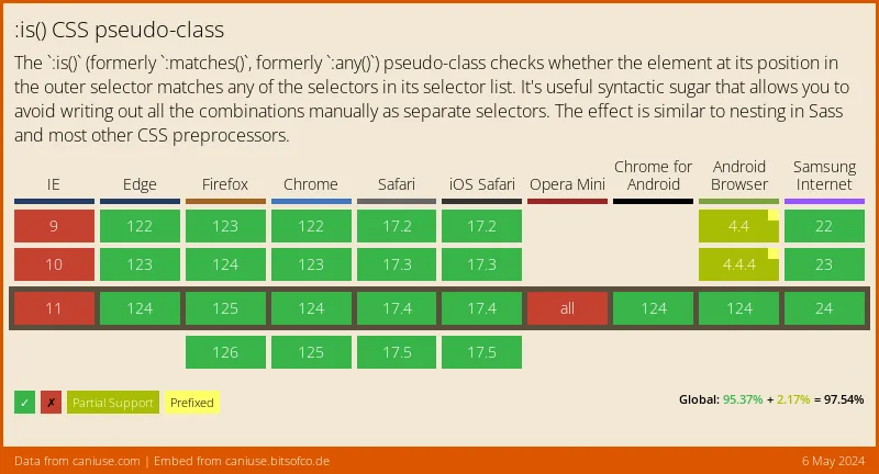
:is() and :where()
(AKA Write fewer selectors)
.container a strong,
.container p strong,
.container button strong,
.container code strong,
.container section strong{
  font-weight: 900;
}
.container :is(a, p, button, section) strong{
font-weight: 900;
}nav.nav-bar ul li a.nav-link{
color:blue;
}
:is(#\!important, a.nav-link){
color:red;
}body{
background-color: black;
}
:where(body){
background-color: white;
}:is() and :where()
Support:
:is() and :where()
More Information:
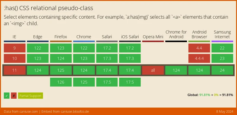
:has()
(AKA "The Parent Selector")
A Common Problem
.input-wrapper:has(input:invalid)
<div class="input-wrapper">
<input type="email" value="alex" />
</div>
:has()
This:has(a.solution)
:has()
Support:
:has()
More Information:
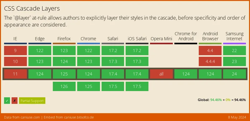
@layer
(AKA Stop using !important)
@layer
.text-red{
  color:red;
}

.my-class{
  color:blue;
}
@layer
.text-red{
  color:red !important;
}

.my-class{
  color:blue;
}
@layer
.my-class{
  color:blue;
}

.text-red{
  color:red;
}
@layer
.my-wrapper .my-class{
  color:blue;
}

.text-red{
  color:red;
}
@layer
@layer style, utility;

@layer style {
  .my-wrapper .my-class{
    color:blue;
  }
}

@layer utility{
  .text-red{
    color:red;
  }
}
@layer
@layer style, utility;

@layer utility{
  .text-red{
    color:red;
  }
}

@layer style {
  .my-wrapper .my-class{
    color:blue;
  }
}
@layer
@layer framework, style, utility;

@import url('framework.css') layer(framework);

@layer utility{
  .text-red{
    color:red;
  }
}

@layer style {
  .my-wrapper .my-class{
    color:blue;
  }
}
@layer
Support:
@layer
More Information:
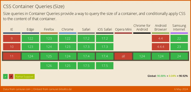
@container
(AKA box-size media queries)
@container
@container
@container
@container
@container
@container
@container
.blue-box{
  display:grid;
  grid-template-columns: 1fr;
}

@media screen and (min-width: 450px) and (max-width: 1023px){
  .blue-box{
    grid-template-columns: 1fr 1fr;
  }
}

@media screen and (min-width: 1024px) and (max-width: 1439px){
  .blue-box{
    grid-template-columns: 1fr;
  }
}

@media screen and (min-width: 1440px){
  .blue-box{
    grid-template-columns: 1fr 1fr;
  }
}
@container
.blue-box-wrapper{
  container-type: inline-size;
  container-name: blue-box;
}
.blue-box{
  display:grid;
  grid-template-columns: 1fr;
}

@container blue-box (min-width: 450px) {
  .blue-box {
    grid-template-columns: 1fr 1fr;
  }
}
@container
@container
Support:
@container
More Information:
Thank You!
Jon Neal - For making an app that says the date when features were added to the browser
Slides:
https://slides.com/fimion/that-conf-tx-2023/
Deets:
Alex Riviere
- @fimion on GitHub, Twitter, CodePen
- @fimion@notacult.social
- alex.party
CodePens:
https://codepen.io/collection/aMZPPq

Fresh Hot CSS Features - THAT Conf TX 2023
By Alex Riviere


