


James Sherry
Web Development Tutor and Co-Founder of { The Jump } Digital School
Some advanced features are not implemented the same way by every browser maker, so to get their version of it you use a 'vendor prefix'.
You can get programs called 'auto-prefixers' to assist you, so that you don't have to remember.
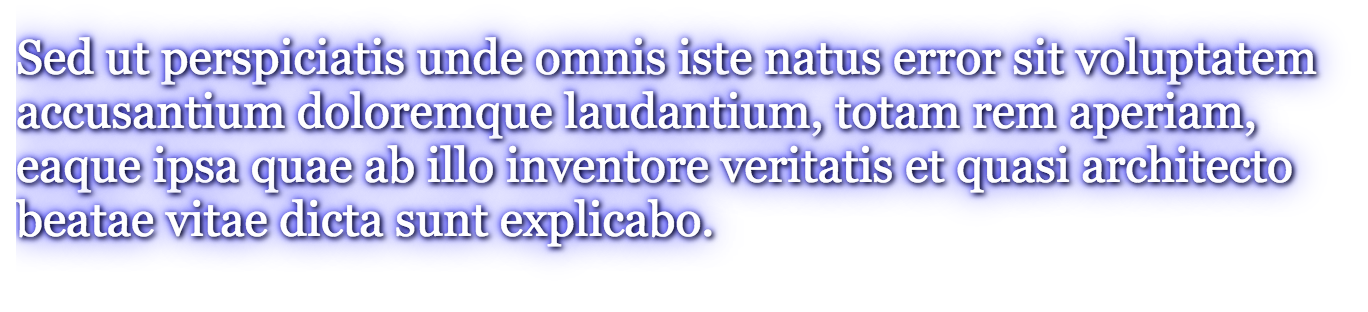
Adds a drop shadow to text. (Multiple shadows in comma separated list)
Requires:
.white-with-blue-shadow {
   text-shadow: 1px 1px 2px black,
        0 0 1em blue;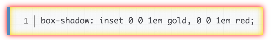
}Same as text shadow, except:
.white-with-blue-shadow {
   box-shadow: 1px 1px 2px 5px black;
}The properties go in the same order as margins for 1,2,3 & 4 values.
Think of it as 45 degrees back, so instead of 'top', it's 'top left'.
1 property will make an equal circle, 2 make an elepsis (e.g. border-radius: <horizontal> / <vertical>)
Allows multiple images in your backgrounds. Just declare the backgrounds with a comma separated list.
div {
    background: url(./images/img1.jpg) top left no-repeat,
        url(./images/img2.jpg) top right no-repeat #f00;
}Makes a background-image of a colour gradient
div {
  background: linear-gradient(135deg, red, blue);
}
/* A gradient on 45deg axis starting blue and finishing red */
linear-gradient( 45deg, blue, red );
/* A gradient going from the bottom right to the top left
starting blue and finishing red */
linear-gradient( to left top, blue, red);
/* A gradient going from the bottom to top, starting blue,
being green after 40% and finishing red */
linear-gradient( 0deg, blue, green 40%, red ); When a linear gradient is painted in rotation around a point
div {
  background-image: radial-gradient(ellipse farthest-corner at 45px 45px ,
    #00FFFF 0%, rgba(0, 0, 255, 0) 50%, #0000FF 95%);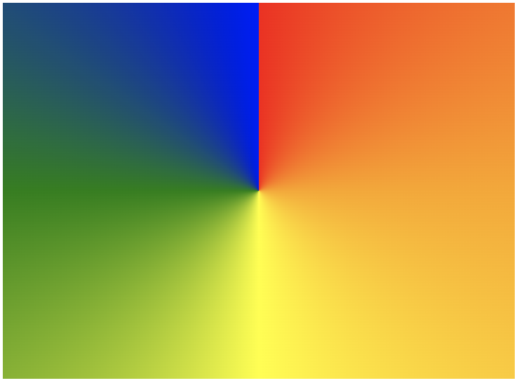
}div {
background-image: conic-gradient(red, orange, yellow, green, blue);
}div {
transform: scale(2) translateX(15px);
}/* transition single properties */
a {
transition: margin-left 4s ease-in-out 1s;
margin-left: 0;
}
a:hover {
margin-left: 50px;
}
/* transition all properties */
div {
transition: all 6s ease-out 5s;
}
https://matthewlein.com/ceaser/
&
Like transitions, but more control-able.
/* Target the element 8 */
.element {
  width: 100%;
  height: 100%;
  animation: pulse 5s infinite;
}

/* Set up and control your animation in % keyframes */
@keyframes pulse {
  0% {
    background-color: #001F3F;
  }
  100% {
    background-color: #FF4136;
  }
}
This is a cycle. It attempts to reach a stage by certain point. Point 0 is where it starts and unless you specify otherwise each property will head back there by the end of the animation. You must specify the state you wish it to reach by each stage of the animation.
is a library of pre-made CSS classes that you can either manually or programmatically attach to an element with JavaScript.
By James Sherry
CSS3 Introduction


