MCA Website Redesign
All rights reserved Aylor Brands Co LLC
Executive Summary
Current Status
-
The existing MCA website contains ~65 separate pages, spread across 7 main navigation categories. (Download current sitemap in .docx format)
-
Content is highly fragmented: many pages hold only a paragraph, a list, or a single PDF.
-
Users (especially prospective families) encounter a “junk drawer” experience with scattered details, repeated content (e.g., multiple “Contact” or “Staff Directory” entries), and unclear hierarchy.
-
The site attempts to serve both prospective families and current families in the same structure, creating noise and confusion.
All rights reserved Aylor Brands Co LLC
Key Problems Identified
-
Navigation Overload – Too many top-level items (About, Admissions, Academics, Student Life, Athletics, Resources, Connect), each with deep subpages.
-
Thin Content Pages – Dozens of one-off pages (e.g., Poems, Supply Lists, Honors Credit) dilute clarity.
-
Audience Conflict – Prospective families need a compelling story; current families need quick logistics. Both are jammed into the same nav.
-
Redundancy – Multiple Contact pages, duplicate directories, repeated strategy content.
-
Cluttered User Experience – The most important actions (Apply, Visit, Request Info) get lost in the noise.
All rights reserved Aylor Brands Co LLC
Recommended Approach
-
Consolidate content into hubs: Merge scattered pages into thematic hub pages (e.g., Grammar School, Upper School, Student Life).
-
Flatten navigation: Reduce 65 pages into ~22 strong pages with expandable sections.
-
Separate audiences:
-
Top Nav (Prospective): Why MCA · Academics · Student Life · Apply Now
-
Utility Nav (Current Families): Parent Resources · Calendar · Media · Connect/Login
-
-
Use progressive disclosure: Keep overview pages clean, with details tucked into accordions, downloads, or PDFs.
-
Strengthen storytelling: Position “Why MCA” and “Apply Now” as primary entry points for prospects.
All rights reserved Aylor Brands Co LLC
Efficiency Outcome
-
65+ pages → ~22 streamlined pages.
-
Top-line nav reduced for clarity.
-
Audience split ensures prospects get clarity and parents get convenience.
-
Critical calls-to-action (Apply Now, Schedule a Visit) elevated and visible.
-
Redundant/low-value pages retired without losing content depth (moved into expandable sections or downloads).
All rights reserved Aylor Brands Co LLC

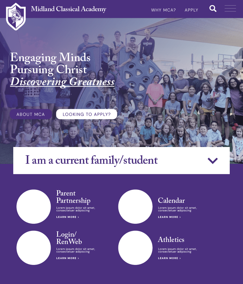
Example Updated Landing Page (simplify top level nav)
All rights reserved Aylor Brands Co LLC
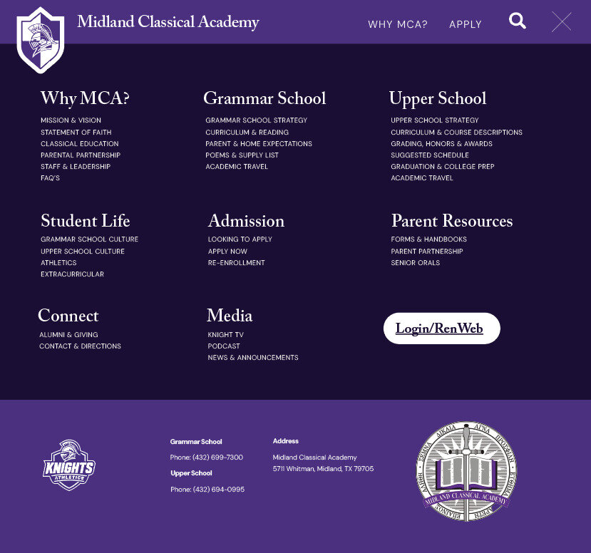
Full Screen Menu (second level nav more detailed)
All rights reserved Aylor Brands Co LLC
Sitemaps
All rights reserved Aylor Brands Co LLC
MCA Website Redesign
All rights reserved Aylor Brands Co LLC
Executive Summary
MCA Website Redesign
By joeaylor


