Data Visualization
with ggplot2
Joel Ross
Winter 2017
INFO 201
https://slides.com/joelross/info201w17-ggplot2/live
Today's Objectives
By the end of class, you should be able to
- Describe visualizations using the Grammar of Graphics
- Use ggplot2 to draw beautiful data charts
- Organize data in the proper shape
Why create graphical visualizations of data?
What's wrong with tables?

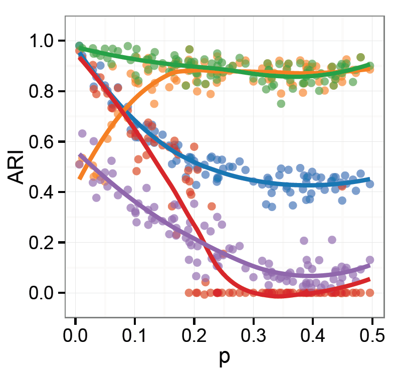
How would you describe this chart?
Grammar of Data Manipulation
Words (verbs) used to describe ways to manipulate data:
- Select the columns of interest
- Filter out irrelevant data to keep rows of interest
- Mutate a data set by adding more columns
- Arrange the rows in a data set
- Summarize the data (e.g., mean, median, max)
- Group the data by category
- Join multiple data sets together

Grammar of Graphics
Words used to describe the visual components and aspects of a graphic.
- Data shown in the plot
- Geometric objects (geoms) that appear on the plot
- Aesthetic mappings from the data to the geoms
- Statistical transformation used to calculate the data
- Scales (range of values) for each aesthetic
- Coordinate system to organize the geoms
- Facets or groups of data shown in different plots
Layers
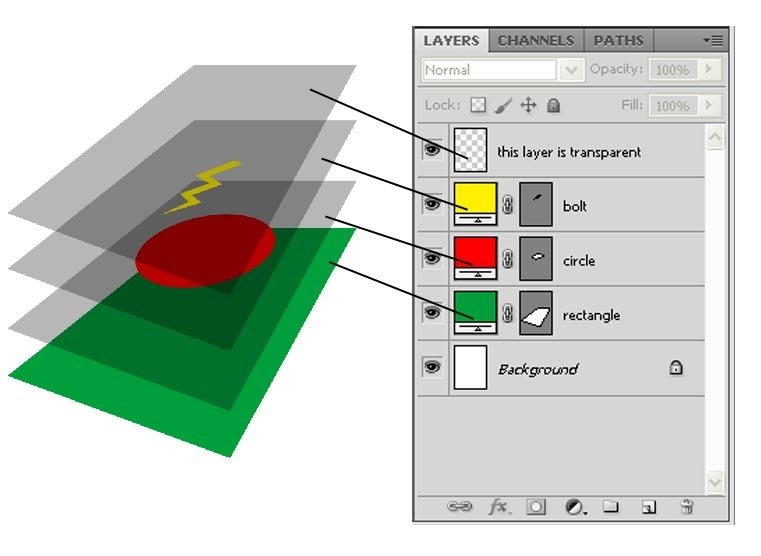
Organize plots into layers, where each layer has:
- A geometric object
- A set of aesthetic mappings
- A statistical transformation
- A position adjustment
How to describe with Grammar of Graphics?

ggplot2
ggplot2 is an R package (library) that implements this Grammar of Graphics.
It provides declarative functions for specifying plots in terms of the grammar.
install.packages("ggplot2")  # once per machine
library("ggplot2")  # load the package
Plotting with ggplot2
Use the
ggplot() function to draw a plot, specifying plot elements via the grammar.
# plot the `mpg` data set, with highway milage
# on the x axis and engine displacement (power)
# on the y axis:


ggplot(data = mpg) +
  geom_point(mapping = aes(x = displ, y = hwy))
data to plot
add geometry
geometric objects (points)
aesthetic mappings
property = column
Aesthetics
The
aes() function specifies
aesthetic mappings from data values to
visual channels.
# color the data by car type
ggplot(data = mpg) +
  geom_point(mapping = aes(x = displ, y = hwy, color = class))
x-location based on
displ column
(continuous)
color based on class column (discrete)
Can also set visual channels without mapping
# blue points!
ggplot(data = mpg) +
  geom_point(aes(x = displ, y = hwy), color = "blue")
Geoms
ggplot2 supports many different geoms, each created with a function. Each geom requires/supports different aesthetics.
# line chart of milage by engine power
ggplot(data = mpg) +
  geom_line(mapping = aes(x = displ, y = hwy))

# bar chart of car type
ggplot(data = mpg) +
  geom_bar(mapping = aes(x = class))
no y mapping,
automatically aggregated
Each plot can include multiple geoms, which inherit data and aesthetics unless specified otherwise.
ggplot(data = mpg) +
  geom_point(mapping = aes(x = displ, y = hwy)) +
  geom_smooth(mapping = aes(x = displ, y = hwy), se=FALSE)
ggplot(data = mpg, mapping = aes(x = displ, y = hwy)) +
geom_point() +
geom_smooth(se=FALSE)
FORK and clone the repo
to turn in for participation
Grammar of Graphics
Words used to describe the visual components and aspects of a graphic.
- Data shown in the plot
- Geometric objects (geoms) that appear on the plot
- Aesthetic mappings from the data to the geoms
- Statistical transformation used to calculate the data
- Scales (range of values) for each aesthetic
- Coordinate system to organize the geoms
- Facets or groups of data shown in different plots

Statistical Transformation
Many geoms have a default statistical transformation used to calculate new data to plot (e.g., for bar graphs).
# bar chart of car type
ggplot(data = mpg) +
  geom_bar(mapping = aes(x = class), stat="count")
explicit "count"
for y
Each geom is associated with a stat_ function, and can be used interchangeably.
# these two charts are identical
ggplot(data = mpg) +
  geom_bar(mapping = aes(x = class))

ggplot(data = mpg) +
  stat_count(mapping = aes(x = class))
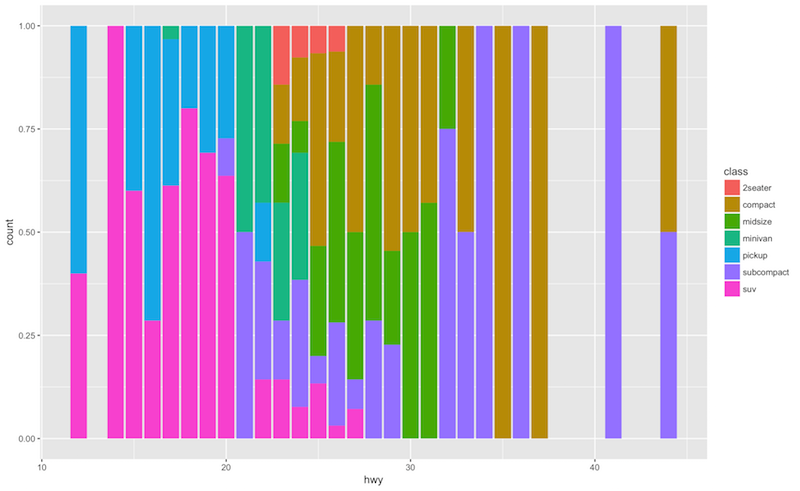
Position Adjustment
Many geoms have a default position adjustment use to lay out the plot separate from the aesthetic mappings
# bar chart of milage, colored by car type
ggplot(data = mpg) +
  geom_bar(mapping = aes(x = hwy, fill = class))
# bar chart of milage, colored by car type
ggplot(data = mpg) +
geom_bar(aes(x=hwy, fill=class), position="fill")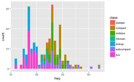
Scales
Add scales to a plot to determine the range of (aesthetic) values data should map to (replacing the default)
# city/highway milage relationship
ggplot(data = mpg) +
  geom_point(mapping = aes(x = cty, y = hwy, color = class)) +
  scale_x_reverse() +  # reverse x axis
  scale_color_hue(l = 70, c = 30)  # custom color scale
aesthetic
to scale
scale to use
1
2
3
4
5
"red"
"yellow"
"blue"
"green"
"purple"
Data
Aesthetic
ColorBrewer Scales
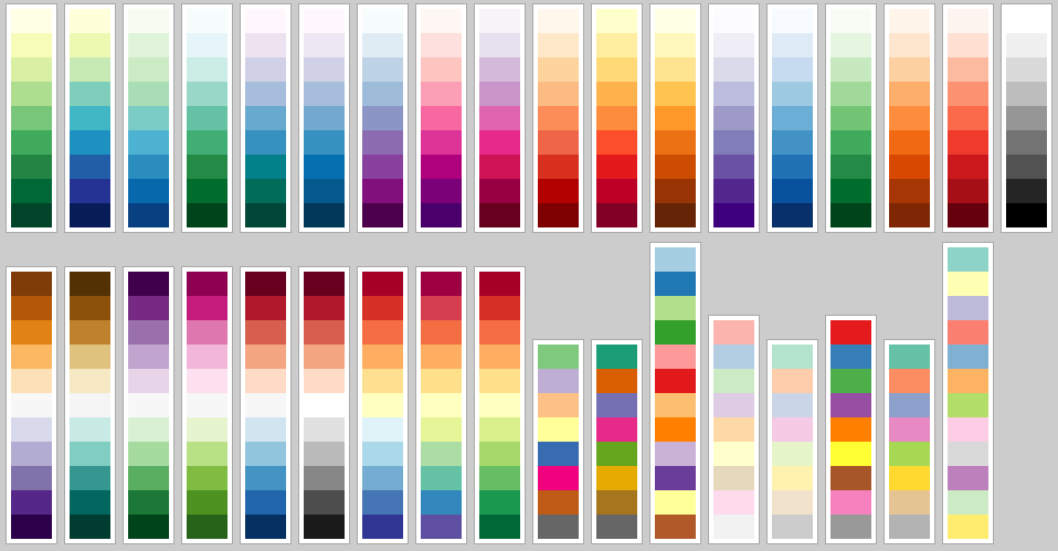
Use palettes from colorbrewer.org to specify color schemes that are color-bind safe.
# efficiency by engine size, colored nicely
ggplot(data = mpg) +
  geom_point(aes(x = displ, y = hwy, color = class), size=4) +
  scale_color_brewer(palette = "Set3")
Coordinate System
You can also add a specific coordinate system to a plot.
# horizontal bar chart of milage, colored by car type
ggplot(data = mpg) +
  geom_bar(mapping = aes(x = hwy, fill = class)) +
  coord_flip()
# A pie chart = stacked bar chart + polar coordinates
ggplot(mpg, aes(x = factor(1), fill = factor(cyl))) +
geom_bar(width = 1) +
coord_polar(theta = "y")make numeric vector into factor
angle based on (aggregate) "y"
Facets
Break a plot into parts with
facets (similar to
group_by() in
dplyr). Each facet acts like a "level" in a factor, with a plot for each level.
# a plot with facets based on vehicle type.
ggplot(data = mpg) +
  geom_point(mapping = aes(x = displ, y = hwy)) +
  facet_wrap(~class)
A formula , read as
"as a function of"

What if we want to
facet by exam?
Consider a data set...
Data Shape
Wide Data
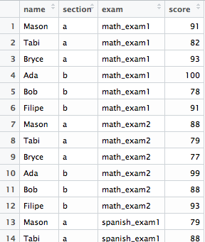

Long Data
6 rows x 4 cols
= 24 scores
24 rows x 1 col
= 24 scores
Data Shape
We can convert between
wide and
long data (and vice versa) using the
tidyr package.
# Alternatively, install "tidyverse"
install.packages("tidyr")  # once per machine
library("tidyr")


# Make a data.frame (example)
students <- data.frame(
  name = c('Mason', 'Tabi', 'Bryce', 'Ada', 'Bob','Filipe'),
  section = c('a','a','a','b','b','b'),
  math_exam1 = c(91, 82, 93, 100, 78, 91),
  math_exam2 = c(88, 79, 77, 99, 88, 93),
  spanish_exam1 = c(79, 88, 92, 83, 87, 77),
  spanish_exam2 = c(99, 92, 92, 82, 85, 95)
)
Data Shape
students.long <- gather(students.wide,
                        key = exam,
                        value = score,
                        math_exam1, math_exam2,
                        spanish_exam1, spanish_exam2
                       )
Convert from
wide to
long using
gather(). The
key is a new column containing
gathered colnames, and
value is a new column with their values.
# spread by column "exam"
stu.wide <- spread(students.long, key = exam, value = score)

# spread by column "name"
stu.wide.name <-
         spread(students.long, key = name, value = score)
Convert from
long to
wide using
spread(). The
key is where to get the
new colnames, and
value is where to get the values
names for new columns
col data to populate with
Questions on anything so far?
Action Items!
-
Be comfortable with module 13
-
Assignment 5 due Thursday before class
-
(Assignment 6 online soon)
-
Thursday: What makes a good visualization?
Also maps.
info201w17-ggplot2
By Joel Ross
info201w17-ggplot2
- 2,470
