Joel Ross
Spring 2026
CSS Selectors
View of the Day
-
Quiz 1!
-
Admin (quick)
-
CSS Selectors (lecture + PollEv)
-
CSS Class Semantics (lecture - if time)
Quiz 1
This quiz is closed book, closed note.
Each question is worth 1 point.
Mark your chosen answers clearly, such as by circling
the letter.
You have 20 minutes, good luck!
Admin Reminder
When submitting problem sets, do two things:
-
push your code to Github (to the main branch)
-
Submit a link to Canvas
If you fix something later, just resubmit to Canvas and we'll re-score it!
AI Policy (Summary)
While the task maybe to implement a program, the work you need to do for this class is to learn the material. AI is not good at that.
The policy for this course:
- ❌ Don't use AI tools for problem sets
- ✅ You can use AI tools for projects:
- ⚠️ AI can do the "first pass", but you do the debugging part
- Don't put code into the generator!
- ⚠️ You need to distinguish what work is the AI and what work is yours
- AI-supported code committed separately through git
- Written explanation of your human work (assignment with project deliverables)
- ⚠️ AI can do the "first pass", but you do the debugging part
For full details, see the syllabus and the Gen AI in Projects Guidelines
Q&A & Review
CSS Selectors
/* type selector */
p { } /* applied to <p> */

/* class selector */
.alert { } /* applied to elements with `class="alert"` */

/* id selector -- avoid this */
#navbar { } /* applied to elements with `id="navbar"` */

/* grouping selector */
h2, .alert, #navbar { } /* applied to <h2> OR .alert OR #navbar */

/* compound selector */
p.alert { } /* applied to <p> AND .alert */
.alert.success {} /* applied to .alert AND .success */

/* descendant selector */
header p { } /* applied to <p> anywhere INSIDE of <header>

/* child selector */
header > p { } /* applied to <p> DIRECTLY INSIDE of <header>

/* Pseudo-class selectors */
li:focus, li:hover { } /* applied to element on focus or hover */
CSS Specificity
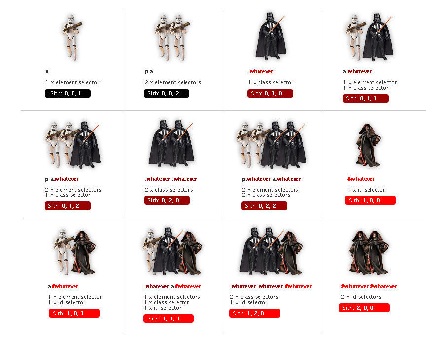
If two rules apply, the more specific rule wins.
How to pick a selector
Some heuristics
- Main rule: be as general as you can, but as specific as you need to be
- "Will this rule apply to all elements of this type?" if not, add a meaningful class to the element
- Are the elements in this part of the page different from others? Use a descendant selector
- Do you want to "call out" an element with style? Add a class
- Rules usually don't have more than 2-3 selectors
- Primarily use class names for styling, not id attributes
- You never need to add more specificity to an id selector
CSS Class Names
There are only two hard problems in computer science: cache invalidation and naming things - Phil Karlton
CSS Class Names
Goals when naming classes (or anything):
-
Understandability: explain what kind of styling is being applied
-
Modifiability: make it easier to change styling later
Semantic Class Names
Name CSS classes based on the semantic meaning (purpose) of the element they are styling.
<div class="forum-post">...</div>

<nav class="side-nav">...</div>

<img class="avatar-icon">...</div>

<article class="breaking-news">...</article>/* can use descendant selectors for more detail */
.forum-post img { ... }
.side-nav ul a { ... }Modular Class Names
Name CSS classes based on the (single) styling they apply. Combine multiple classes to style elements.
<div class="font-large text-red bg-secondary">...</div>

<img class="small rounded shadow">...</div>
.font-large {
font-size: 2em;
line-height: 1.4em;
}
.bg-secondary { background: #bbb; }
img.small { width: 140px; }
.rounded { border-radius: 50%; }
A Naming Schema: BEM
<div class="block__element--modifier"><form class="form form--theme-xmas form--simple">
<input class="form__input" type="text">
<input
class="form__submit form__submit--disabled"
type="submit" />
</form>The "part" of the page
navbar
An element in that block
tab
Flags or types; differentiators
selected
<div class="navbar">
  <div class="navbar__tab">A tab</div>
  <div class="navbar__tab--selected">Selected Tab</div>
</div>Action Items!
-
Complete task list for Week 2 (all items)
-
Problem Set 02 due yesterday
-
Project Proposal due Friday
-
Finish Problem Set 03-a this week!
-
-
Pre-read Chapter 7 for next week
Next time: CSS Properties & Flexbox
Fonts
Fonts are installed "per computer", so not every computer has the same fonts (which is why you set a default with font-family).
Fonts are installed "per computer", so not every computer has the same fonts (which is why you set a default with font-family).
p {
  font-family: 'Helvetica', 'Arial', sans-serif;
}
Use this font
If first isn't available,
use this
If nothing else,
use this style of font-face
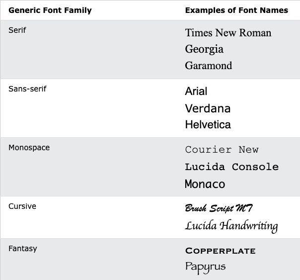
Generic Fonts
All fonts are categories in 1 of 5 different "categories", each of which has a generic style.
Serif vs. Sans-Serif
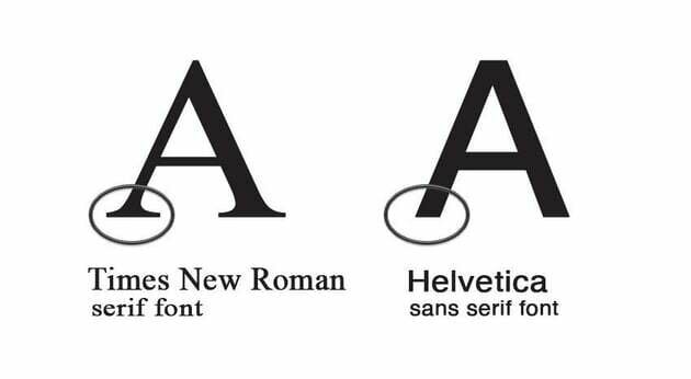
Research (roughly) suggests that sans-serif fonts are easier to read on screens, as well as more accessible for users with e.g., dyslexia.
Font Units
All browsers have a "default" font size--generally 16px. We use relative font sizing in case of variations.
Note that units are "measurement units" (think: inches)
| em | relative to the parent font size | By default 2em = 32px But if the parent's font-size was 20px, then 2em = 40px |
| rem | relative to the root (body's) font size of 16px | 2rem = 32px usually |
| % | relative to parent font size or dimension, can use for width or height | if parent width is 300px, then 50% = 150px |
| px | absolute measurement (do not use for fonts) | 16px = 16px |
It is also possible to specify an online font that the browser will download and display.
Fonts
Fonts are installed "per computer", so not every computer has the same fonts (which is why you set a default with font-family).
Fonts are installed "per computer", so not every computer has the same fonts (which is why you set a default with font-family).
p {
  font-family: 'Helvetica', 'Arial', sans-serif;
}
Use this font
If first isn't available,
use this
If nothing else,
use this style of font-face
Box Model
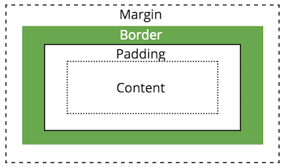
All HTML elements take up space on a page based on their "box size". You can manipulate the box model to change the size and appearance of the element
Display Property
You can customize whether an element is displayed as a block or inline element using the display property.
Choose elements based on their semantics, not their appearance!
/* <li> elements will be inline (an inline list!) */
li {
  display: inline;
}
display: inline-block
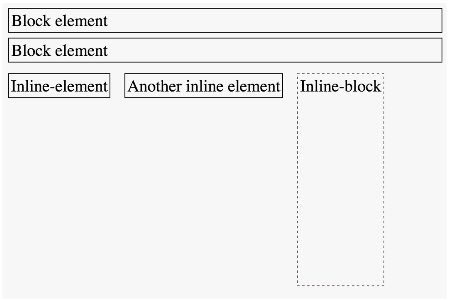
You cannot set the width or height of an inline element, but you can adjust the size of an inline-block element.
Position
You can use the position property to adjust where an element appears on the page from its normal layout. You will also need to set position adjustment values top, left, bottom, and/or right
/* position element 20px up and to the right
 * of where it "normally" would be */
img.badge {
  position: relative;
  top: 20px;
  right: 20px;
}
LIMIT USE OF THE
position AND float
PROPERTIES!
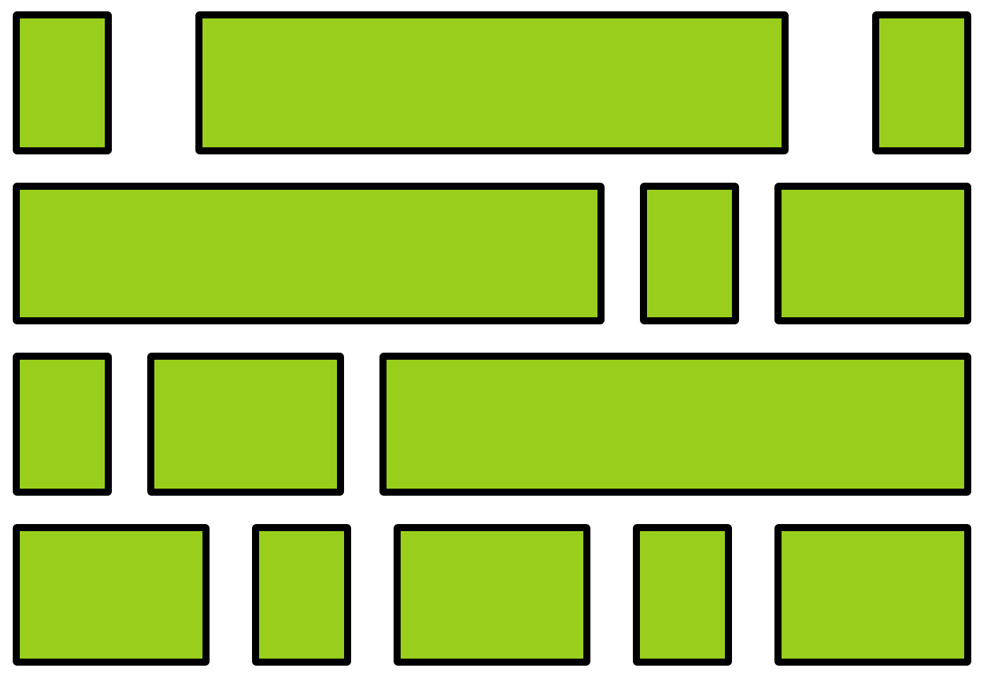
Flexbox
A flexbox is an element that allows you to flexibly customize the layout of its children.
An element is made into a flexbox by giving it the display: flex CSS property.
flexbox
child elements
Flexbox Properties
Customize the layout of the flexbox's children by given the flexbox additional CSS properties. For example:


flex-wrap
justify-content
Child Properties
You can also customize the children of the flexbox (the elements that are inside the box) by giving them additional CSS properties. For example:
flex-grow

Flexbox vs. Children
Don't get the flexbox (sometimes called the flex container) mixed up with the child elements (sometimes called the flex items) that are inside of it!
- The flexbox specifies how its children are positioned.
- The child elements specify how much space they should take up.
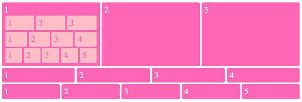
Nesting Flexboxes
A flexbox can contain other flexboxes inside of it!
That is: a child of a flexbox can itself be a flexbox (specifying how its children are positioned).
But a flexbox only influences its children, not its grandchildren! A flexbox lays out its child boxes; what happens inside those boxes is their own business.
Using Flexboxes
Flexboxes are great solutions for:
- Centering block elements (use justify-content)
- Creating "columns" for a page"
- Making an element fill a space larger than its content (use flex-grow)
- ... and more!
Flexboxes are not great solutions for:
- Having block elements stack on top of each other (just use normal elements!)
- Adding specific spacing between elements (use margin/padding)
- ... doing anything else that the browser does by default!
info340sp26-css-selectors
By Joel Ross


