More CSS
Joel Ross
Winter 2025
View of the Day
Today we're going to try and wrap up CSS!
-
Q&A: What do we review?
-
Review Flexbox ?
-
Media Queries Demo (code together!)
-
Bootstrap Demo (code together!) - if time
- Utility Classes
- Responsive Bootstrap
- Interactive Widgets
What to review?
Updating Lecture Code
# switch to starter branch to get new starter code
git checkout starter

# download new starter code
git pull

# switch back to main branch for coding
git checkout main

# merge in new starter code (use default msg)
git merge starter --no-edit

# code and enjoy!
Get the starter code from the starter branch, but do all of your work on main.
Flexbox
A flexbox is an element that allows you to flexibly customize the layout of its children.
An element is made into a flexbox by giving it the display: flex CSS property.
flexbox
child elements
Flexbox Properties
Customize the layout of the flexbox's children by given the flexbox additional CSS properties. For example:


flex-wrap
justify-content
Child Properties
You can also customize the children of the flexbox (the elements that are inside the box) by giving them additional CSS properties. For example:
flex-grow

Flexbox vs. Children
Don't get the flexbox (sometimes called the flex container) mixed up with the child elements (sometimes called the flex items) that are inside of it!
- The flexbox specifies how its children are positioned.
- The child elements specify how much space they should take up.
Nesting Flexboxes
A flexbox can contain other flexboxes inside of it!
That is: a child of a flexbox can itself be a flexbox (specifying how its children are positioned).
But a flexbox only influences its children, not its grandchildren! A flexbox lays out its child boxes; what happens inside those boxes is their own business.
Using Flexboxes
Flexboxes are great solutions for:
- Centering block elements (use justify-content)
- Creating "columns" for a page"
- Making an element fill a space larger than its content (use flex-grow)
- ... and more!
Flexboxes are not great solutions for:
- Having block elements stack on top of each other (just use normal elements!)
- Adding specific spacing between elements (use margin/padding)
- ... doing anything else that the browser does by default!

Responsive CSS
Viewport <meta>
Include the viewport meta element to allow your code to control responsive appearances (rather than the browser).
<head>
  <meta charset="utf-8"> <!-- always need this -->
  <meta name="viewport" content="width=device-width, initial-scale=1, shrink-to-fit=no">

  <!-- more head elements, including <link> ... -->
</head>
Media Queries
/* A Media Query */
@media (min-width: 768px) {
   /* these rules apply ONLY on screens 768px and wider */

   /* a normal CSS rule */
   body {
      font-size: 1.5em;
      background-color: beige;
   }

   /* another CSS rule */
   .mobile-call-icon {
      display: none; /* don't show on large displays */
   }
}
CSS Frameworks
A CSS Framework is a collection of CSS rules published and made available for you to use. So rather than writing your own rules, you just use the ones provided to you.
Bootstrap is the oldest and most popular CSS framework. Created by Twitter in 2011.
Link the Framework
<head>
  <!--... other elements here...-->

  <!-- link Bootstrap -->
  <link rel="stylesheet"
        href="https://cdn.jsdelivr.net/npm/bootstrap@5.3.3/dist/css/bootstrap.min.css">

  <!-- link own stylesheets AFTER framework -->
  <link rel="stylesheet" href="css/my-style.css">
</head>
minified CSS file!
Add Bootstrap to your page by including a <link> to the CSS file. This is usually loaded from a Content Delivery Network (CDN) site.
CDN
Utility Classes
Bootstrap provides rules that apply to particular classes. Give an element that class in order to style it in a certain way.


Utility Classes
For more utility classes, check the Bootstrap Documentation
Responsive Utilities
Bootstrap has responsive versions of most utility classes. These class names include a infix indicating at which size (or larger) the styling should apply.

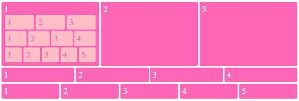
Bootstrap Grids

row
row
column
column
column
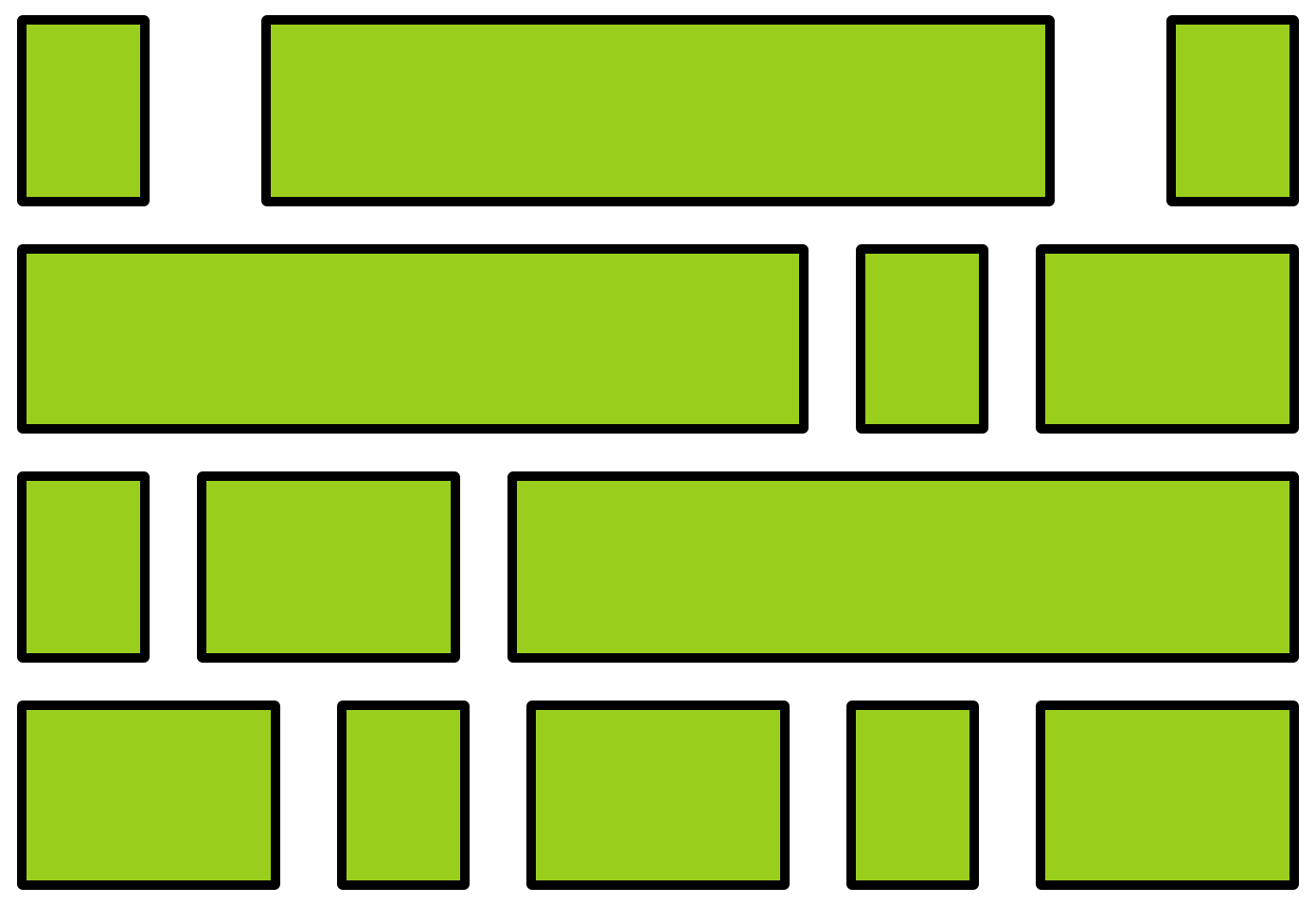
Grid Columns
There are 12 columns in the grid
Elements can take up many columns
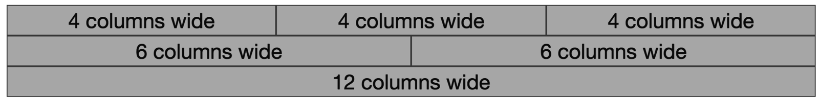
Row 1:

Row 2:
Row 3:
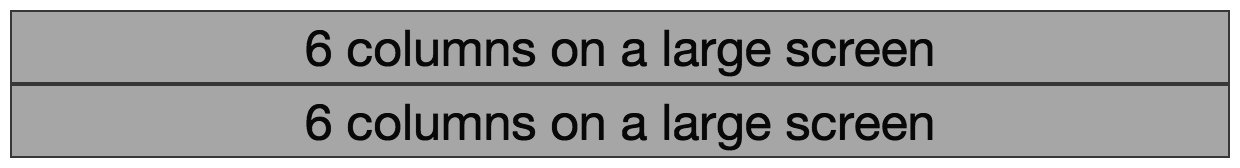
Specify columns based on screen-size

Smaller screen display
A Row:
Interactive Widgets
The Bootstrap framework provides some interactive "widgets" you can use without writing separate JavaScript code, just by using specific HTML attributes.
https://getbootstrap.com/docs/5.3/components
You will need to add Bootstrap's JavaScript code to your page by including a <script> tag in your <head>
<head>
  <!-- include Bootstrap library (before your script!) -->
  <!-- copy script tag from the Bootstrap home page -->
  <script src="https://cdn.jsdelivr.net/npm/bootstrap@5.3.3/dist/js/bootstrap.bundle.min.js"></script>
</head>
Example: Collapsables
As a simple example, you can make an element "collapsable" so that it disappears with a button click!
<button class="btn btn-primary"
        data-bs-toggle="collapse"
        data-bs-target="#collapseExample"
        aria-expanded="false" aria-controls="collapseExample">
   Button with data-bs-target
</button>


<div class="collapse" id="collapseExample">
    Some placeholder content for the collapse component. This panel is
    hidden by default but revealed when the user clicks the toggler.
</div>
aria for screen-readers
Example: NavBar
See https://getbootstrap.com/docs/5.3/components/
navbar/#toggler for an example of a NavBar with a collapsible "hamburger menu"
Action Items!
-
Complete task list for Week 3 (all items)
You may need to catch up with videos!
There is a lot this week again...
Read: Chapter 10
Problem Set 03 due Wednesday (tonight!)
Problem Set 04 due Sunday
Next: JavaScript!
info340wi25-css-ii
By Joel Ross


