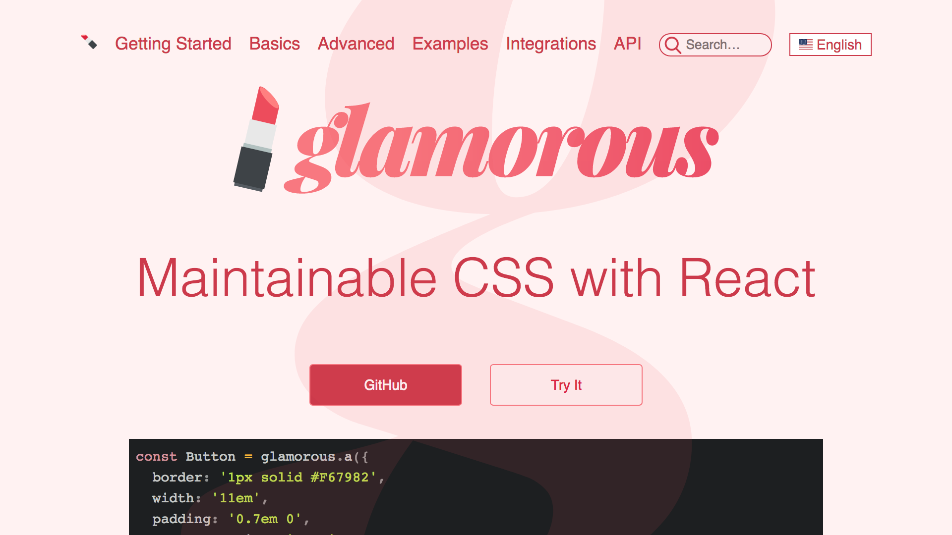
Maintainable CSS in React
with glamorous 💄
Kent C. Dodds
Utah


1 wife, 3 kids
PayPal, Inc.
@kentcdodds


Please Stand...
if you are able

What this talk is
- The "why" of glamorous
- Some "whats"
- Some "hows"

What this talk is not
- A library you can use without React... (mostly...)

Let's
Get
STARTED!


PayPal's most popular Open Source Project
Let's talk about CSS in JS for a sec
Our Component:
JavaScript + HTML = JSX
class Toggle extends Component {
  state = { toggledOn: false };

  handleToggleClick = () => {
    this.setState(
      ({ toggledOn }) => ({ toggledOn: !toggledOn }),
      (...args) => {
        this.props.onToggle(this.state.toggledOn);
      },
    );
  };

  render() {
    const { children } = this.props;
    const { toggledOn } = this.state;
    const active = toggledOn ? 'active' : '';
    return (
      <button
        className={`btn btn-primary ${active}`}
        onClick={this.handleToggleClick}
      >
        {children}
      </button>
    );
  }
}

export default Toggle;
Components!
import { PrimaryButton } from './css-buttons';

class Toggle extends Component {
  state = { toggledOn: false };

  handleToggleClick = () => {
    this.setState(
      ({ toggledOn }) => ({ toggledOn: !toggledOn }),
      (...args) => {
        this.props.onToggle(this.state.toggledOn);
      },
    );
  };

  render() {
    const { children } = this.props;
    const { toggledOn } = this.state;
    const active = toggledOn ? 'active' : '';
    return (
      <PrimaryButton
        active={active}
        onClick={this.handleToggleClick}
      >
        {children}
      </PrimaryButton>
    );
  }
}

export default Toggle;
Components!
function AppButton({ className = '', active, ...props }) {
  return (
    <button
      className={`btn ${className} ${active ? 'active' : ''}`}
      {...props}
    />
  );
}

function PrimaryButton({ className = '', ...props }) {
  return <AppButton className={`btn-primary ${className}`} {...props} />;
}

export default AppButton;
export { PrimaryButton };
CSS? Where are the styles?
CSS? 🤔
.btn {
  display: inline-block;
  font-weight: 400;
  line-height: 1.25;
  text-align: center;
  white-space: nowrap;
  vertical-align: middle;
  user-select: none;
  border: 1px solid transparent;
  padding: .5rem 1rem;
  font-size: 1rem;
  border-radius: .25rem;
  transition: all .2s ease-in-out;
}
.btn.btn-primary {
  color: #fff;
  background-color: #0275d8;
  border-color: #0275d8;
}
.btn-primary:hover, .btn-primary.active {
  background-color: #025aa5;
  border-color: #01549b;
}- Conventions?
- Who's using these styles?
- Can I change these styles?
- Can I delete these styles?
CSS?
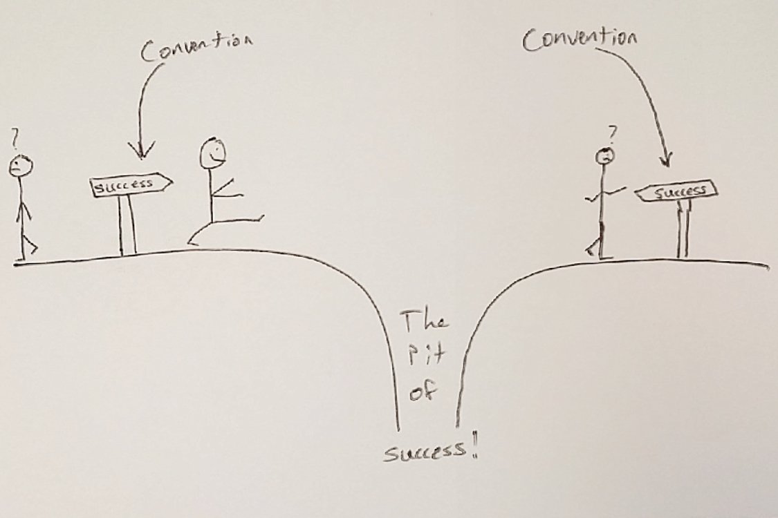
Pit of Success
a well-designed system makes it easy to do the right things and annoying (but not impossible) to do the wrong things.
Convention
Using conventions is just us compensating for not having a wide enough pit of success.

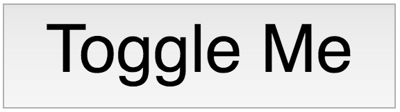
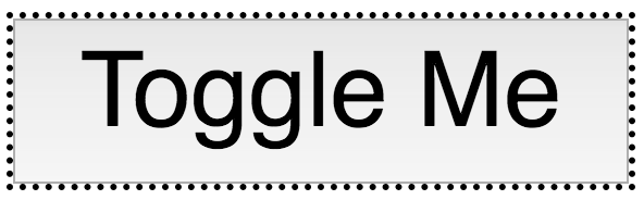
Components


Default
Styled
Unstyled

Focus
Toggled
Components
What is a UI component made of?
HTML
CSS
JS
Component
Remember our CSS?
<style>
.btn {
display: inline-block;
font-weight: 400;
line-height: 1.25;
text-align: center;
white-space: nowrap;
vertical-align: middle;
user-select: none;
border: 1px solid transparent;
padding: .5rem 1rem;
font-size: 1rem;
border-radius: .25rem;
transition: all .2s ease-in-out;
}
.btn.btn-primary {
color: #fff;
background-color: #0275d8;
border-color: #0275d8;
}
.btn-primary:hover, .btn-primary.active {
background-color: #025aa5;
border-color: #01549b;
}
</style>
<script>
function AppButton({ className = '', active, ...props }) {
return (
<button
className={`btn ${className} ${active ? 'active' : ''}`}
{...props}
/>
);
}
function PrimaryButton({ className = '', ...props }) {
return <AppButton className={`btn-primary ${className}`} {...props} />;
}
export default AppButton;
export { PrimaryButton };
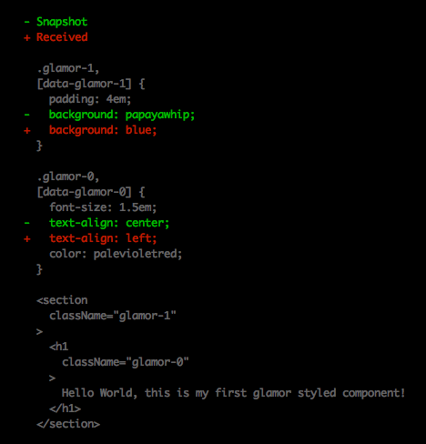
</script>Glamor!
import { css } from 'glamor';

const appButtonClassName = css({
  display: 'inline-block',
  fontWeight: '400',
  lineHeight: '1.25',
  textAlign: 'center',
  whiteSpace: 'nowrap',
  verticalAlign: 'middle',
  userSelect: 'none',
  border: '1px solid transparent',
  padding: '.5rem 1rem',
  fontSize: '1rem',
  borderRadius: '.25rem',
  transition: 'all .2s ease-in-out',
});

const highlightStyles = {
  backgroundColor: '#025aa5',
  borderColor: '#01549b',
};

const primaryButtonClassName = css({
  color: '#fff',
  backgroundColor: '#0275d8',
  borderColor: '#0275d8',
  ':hover': highlightStyles,
});

const activeClassName = css(highlightStyles);

function AppButton({ className = '', active, ...props }) {
  return (
    <button
      className={`${appButtonClassName} ${className} ${active ? activeClassName : ''}`}
      {...props}
    />
  );
}

function PrimaryButton({ className = '', ...props }) {
  return (
    <AppButton
      className={`${primaryButtonClassName} ${className}`}
      {...props}
    />
  );
}

export default AppButton;
export { PrimaryButton };
Enter glamorous 💄
import glamorous from 'glamorous';

const AppButton = glamorous.button({
  display: 'inline-block',
  fontWeight: '400',
  lineHeight: '1.25',
  textAlign: 'center',
  whiteSpace: 'nowrap',
  verticalAlign: 'middle',
  userSelect: 'none',
  border: '1px solid transparent',
  padding: '.5rem 1rem',
  fontSize: '1rem',
  borderRadius: '.25rem',
  transition: 'all .2s ease-in-out',
});

const highlightStyles = {
  backgroundColor: '#025aa5',
  borderColor: '#01549b',
};

const PrimaryButton = glamorous(AppButton)(
  {
    color: '#fff',
    backgroundColor: '#0275d8',
    borderColor: '#0275d8',
    ':hover': highlightStyles,
  },
  ({ active }) => (active ? highlightStyles : null),
);

export default AppButton;
export { PrimaryButton };
Existing CSS
A Nicer API
Media Queries
Animations
Theming
Server Side Rendering
Testing
jest-glamor-react
📸
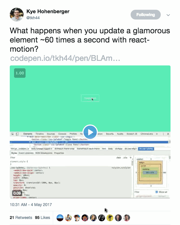
Performance
Resources
- CSS in JS - Vjeux - "The original"
- glamor - Sunil Pai - css in your javascript
- glamorous - PayPal - React component Styling Solved 💄
- jest-glamor-react - Kent C. Dodds - Jest utilities for Glamor and React
- A Unified Styling Language - Mark Dalgleish - Why you should care about CSS in JS

Thank you!

Maintainable CSS with React
By Kent C. Dodds
Maintainable CSS with React
TODO


