Styling React Components
with glamorous 💄
Kent C. Dodds
Utah


1 wife, 3 kids
PayPal, Inc.
@kentcdodds


Please Stand...
if you are able

What this talk is
- Brief intro to CSS-in-JS
- Story of why glamorous is a thing
- Elicit feedback from you all

What this talk is not
- An attempt to get you to use glamorous

Let's
Get
STARTED!


Our Component:
JavaScript + HTML = JSX
class Toggle extends Component {
  state = { toggledOn: false };

  handleToggleClick = () => {
    this.setState(
      ({ toggledOn }) => ({ toggledOn: !toggledOn }),
      (...args) => {
        this.props.onToggle(this.state.toggledOn);
      },
    );
  };

  render() {
    const { children } = this.props;
    const { toggledOn } = this.state;
    const active = toggledOn ? 'active' : '';
    return (
      <button
        className={`btn btn-primary ${active}`}
        onClick={this.handleToggleClick}
      >
        {children}
      </button>
    );
  }
}

export default Toggle;
Components!
import { PrimaryButton } from './css-buttons';

class Toggle extends Component {
  state = { toggledOn: false };

  handleToggleClick = () => {
    this.setState(
      ({ toggledOn }) => ({ toggledOn: !toggledOn }),
      (...args) => {
        this.props.onToggle(this.state.toggledOn);
      },
    );
  };

  render() {
    const { children } = this.props;
    const { toggledOn } = this.state;
    const active = toggledOn ? 'active' : '';
    return (
      <PrimaryButton
        active={active}
        onClick={this.handleToggleClick}
      >
        {children}
      </PrimaryButton>
    );
  }
}

export default Toggle;
Components!
function AppButton({ className = '', active, ...props }) {
  return (
    <button
      className={`btn ${className} ${active ? 'active' : ''}`}
      {...props}
    />
  );
}

function PrimaryButton({ className = '', ...props }) {
  return <AppButton className={`btn-primary ${className}`} {...props} />;
}

export default AppButton;
export { PrimaryButton };
CSS? Where are the styles?
CSS? 🤔
.btn {
  display: inline-block;
  font-weight: 400;
  line-height: 1.25;
  text-align: center;
  white-space: nowrap;
  vertical-align: middle;
  user-select: none;
  border: 1px solid transparent;
  padding: .5rem 1rem;
  font-size: 1rem;
  border-radius: .25rem;
  transition: all .2s ease-in-out;
}
.btn.btn-primary {
  color: #fff;
  background-color: #0275d8;
  border-color: #0275d8;
}
.btn-primary:hover, .btn-primary.active {
  background-color: #025aa5;
  border-color: #01549b;
}- Conventions?
- Who's using these styles?
- Can I delete these styles?
- Can I change these styles?
CSS?
The P2P Funnel Page


Our CSS...
// import styles for funnel pages control, T2, T3, T4 and T5
.funnel_control,
.funnel_2A,
.funnel_2B,
.funnel_3,
.funnel_4,
.funnel_5_2dot5,
.funnel_5_xb,
.funnel_overseas {
	@import "./funnel";
}

// import styles for funnel page T6 and variants
.funnel_6_2dot5,
.funnel_6_xb,
.funnel_7_xb,
.funnel_8_xb,
.funnel_9_xb,
.funnel_10_xb,
.funnel_11_xb,
.funnel_12_xb,
.funnel_7_gb {
	@import "./funnelT6";
}

// import styles for ppme entry on funnel pages T5, T6, T7 and T8
.funnel_5_2dot5,
.funnel_5_xb,
.funnel_6_2dot5,
.funnel_6_xb,
.funnel_7_xb,
.funnel_8_xb,
.funnel_9_xb,
.funnel_10_xb,
.funnel_11_xb,
.funnel_12_xb,
.funnel_7_gb {
	@import './block-group-entry';
	@import './ppme-entry/ppme-entry';
	@import './ppme-entry/ppme-entry-buttons';
	@import './ppme-entry/ppme-entry-interaction';
}

// ...etc
What impact will my change have elsewhere?
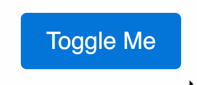
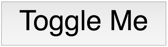
Components


Default
Styled
Unstyled

Focus
Toggled

Components
What is a UI component made of?
HTML
CSS
JS
Component
Enter CSS-in-JS

Remember our CSS?
<style>
  .btn {
    display: inline-block;
    font-weight: 400;
    line-height: 1.25;
    text-align: center;
    white-space: nowrap;
    vertical-align: middle;
    user-select: none;
    border: 1px solid transparent;
    padding: .5rem 1rem;
    font-size: 1rem;
    border-radius: .25rem;
    transition: all .2s ease-in-out;
  }
  .btn.btn-primary {
    color: #fff;
    background-color: #0275d8;
    border-color: #0275d8;
  }
  .btn-primary:hover, .btn-primary.active {
    background-color: #025aa5;
    border-color: #01549b;
  }
</style>
<script>
  function AppButton({ className = '', active, ...props }) {
    return (
      <button
        className={`btn ${className} ${active ? 'active' : ''}`}
        {...props}
      />
    );
  }

  function PrimaryButton({ className = '', ...props }) {
    return <AppButton className={`btn-primary ${className}`} {...props} />;
  }

  export default AppButton;
  export { PrimaryButton };
</script>import { css } from 'glamor';
const appButtonClassName = css({
display: 'inline-block',
fontWeight: '400',
lineHeight: '1.25',
textAlign: 'center',
whiteSpace: 'nowrap',
verticalAlign: 'middle',
userSelect: 'none',
border: '1px solid transparent',
padding: '.5rem 1rem',
fontSize: '1rem',
borderRadius: '.25rem',
transition: 'all .2s ease-in-out',
});
const highlightStyles = {
backgroundColor: '#025aa5',
borderColor: '#01549b',
};
const primaryButtonClassName = css({
color: '#fff',
backgroundColor: '#0275d8',
borderColor: '#0275d8',
':hover': highlightStyles,
});
const activeClassName = css(highlightStyles);
function AppButton({ className = '', active, ...props }) {
return (
<button
className={`${appButtonClassName} ${className} ${active ? activeClassName : ''}`}
{...props}
/>
);
}
function PrimaryButton({ className = '', ...props }) {
return (
<AppButton
className={`${primaryButtonClassName} ${className}`}
{...props}
/>
);
}
export default AppButton;
export { PrimaryButton };
Enter glamorous 💄
import glamorous from 'glamorous';

const AppButton = glamorous.button({
  display: 'inline-block',
  fontWeight: '400',
  lineHeight: '1.25',
  textAlign: 'center',
  whiteSpace: 'nowrap',
  verticalAlign: 'middle',
  userSelect: 'none',
  border: '1px solid transparent',
  padding: '.5rem 1rem',
  fontSize: '1rem',
  borderRadius: '.25rem',
  transition: 'all .2s ease-in-out',
});

const highlightStyles = {
  backgroundColor: '#025aa5',
  borderColor: '#01549b',
};

const PrimaryButton = glamorous(AppButton)(
  {
    color: '#fff',
    backgroundColor: '#0275d8',
    borderColor: '#0275d8',
    ':hover': highlightStyles,
  },
  ({ active }) => (active ? highlightStyles : null),
);

export default AppButton;
export { PrimaryButton };
Solving CSS problems
- Global Namespace ✅
- Dependencies ✅
- Dead Code Elimination ✅
- Minification ✅
- Sharing Constants ✅
- Non-deterministic Resolution ✅
- Isolation ✅
jest-glamor-react
📸

+ Our codebase now
function Consumer(props) {
  return (
    <FunnelPage>
      <FunnelLinkGroup title={i18n('flexible.group.send')}>
        <ConsumerFunnelLink {...funnelProps.buyLink(props)} />
        <ConsumerFunnelLink {...funnelProps.sendLink(props)} />
        <ConsumerFunnelLink {...funnelProps.xbLink(props)} />
        <ConsumerFunnelLink {...funnelProps.giftLink(props)} />
        <ConsumerFunnelLink {...funnelProps.massPaymentLink(props)} />
      </FunnelLinkGroup>
      <FunnelLinkGroup {...funnelProps.requestGroup(props)}>
        <ConsumerFunnelLink {...funnelProps.requestLink(props)} />
        <ConsumerFunnelLink {...funnelProps.invoiceLink(props)} />
        <ConsumerFunnelLink {...funnelProps.poolsLink(props)} />
        <ConsumerFunnelLink {...funnelProps.ppmeLink(props)} />
      </FunnelLinkGroup>
    </FunnelPage>
  )
}

// funnelProps are pretty neat-o, here's the buy.js one
import { canSendMoney } from './utils'

const staticProps = {
  id: 'nemo_buyLink',
  icon: 'register',
  descriptionKey: 'flexible.buy.description',
  badgeHTMLKey: 'flexible.buy.protectionBadge',
}

export default buy

function buy(props: FunnelProps): {} {
  const { country, paymentTypes, redirectToClassicInfo: { shouldRedirectToClassic, classicSendUrl } } = props
  const shouldRender = canSendMoney(props) && paymentTypes.includes('PURCHASE')
  if (!shouldRender) {
    return { shouldRender }
  }
  const titleKey = country === 'DE' ? 'iWantTo.payDE' : 'flexible.buy.title'
  const dynamicProps = shouldRedirectToClassic ? ({
    titleKey,
    href: classicSendUrl,
    name: '',
    'data-pagename': '',
    'data-pagename2': '',
  }) : ({
    titleKey,
    to: '/myaccount/transfer/buy',
    name: 'goodsStart',
    'data-pagename': 'main:walletweb:transfer:buy:start',
    'data-pagename2': 'main:walletweb:transfer:buy:start:::',
  })
  return { ...staticProps, ...dynamicProps }
}

// and tests are pretty cool:
import { propsTester } from './helpers/utils'
import buyLink from '../buy'

const defaults = {
  input: {
    businessAccountInfo: { isSecondaryUser: false, privileges: [] },
    paymentTypes: ['PURCHASE'],
    redirectToClassicInfo: {
      shouldRedirectToClassic: false,
    },
  },
  result: {
    id: 'nemo_buyLink',
    icon: 'register',
    descriptionKey: 'flexible.buy.description',
    badgeHTMLKey: 'flexible.buy.protectionBadge',
  },
}

propsTester({
  fn: buyLink,
  fnTests: [
    {
      input: { ...defaults.input },
      result: {
        ...defaults.result,
        titleKey: 'flexible.buy.title',
        to: '/myaccount/transfer/buy',
        name: 'goodsStart',
        'data-pagename': 'main:walletweb:transfer:buy:start',
        'data-pagename2': 'main:walletweb:transfer:buy:start:::',
      },
    },
    {
      input: {
        ...defaults.input,
        businessAccountInfo: {
          isSecondaryUser: true,
          privileges: ['send_money'],
        },
      },
      result: {
        ...defaults.result,
        titleKey: 'flexible.buy.title',
        to: '/myaccount/transfer/buy',
        name: 'goodsStart',
        'data-pagename': 'main:walletweb:transfer:buy:start',
        'data-pagename2': 'main:walletweb:transfer:buy:start:::',
      },
    },
  ]
})


// glossing over some details...
function ConsumerFunnelLink() {
  return (
    <FunnelLink shouldRender={shouldRender}>
      <Anchor verticalSpacing={verticalSpacing} {...anchorProps}>
        <Icon icon={icon} svg={svg} />
        <Title>{title}</Title>
        <ConditionalDescription shouldRender={renderDescription}>
          {description}
        </ConditionalDescription>
      </Anchor>
      <DesktopBadge filler={!subtext}>{badge}</DesktopBadge>
      <ConsumerSubtext>{subtext}</ConsumerSubtext>
    </FunnelLink>
  )
}

// and here's the Anchor component:
import glamorousLink from '../../component-factories/glamorous-link'
import { mediaQueries } from '../../../../styles'
import {
  spaceChildrenVertically,
  spaceChildrenHorizontally,
} from '../../css-utils'

const { phoneLandscapeMin: desktop, phoneLandscapeMax: mobile } = mediaQueries
const onAttention = '&:hover, &:focus, &:active'

const Anchor = glamorousLink(
  {
    display: 'flex',
    '& > *:last-child': {
      flex: '0 1 auto',
    },
    minHeight: 0, // firefox weirdness
    [onAttention]: {
      textDecoration: 'none',
      '& .funnel-description': {
        color: '#333333',
      },
    },
    [mobile]: {
      padding: '22px 12px 20px 12px',
      flexDirection: 'row',
      '& > *:last-child': {
        flex: 1,
      },
      ...spaceChildrenHorizontally(30),
    },
    [desktop]: {
      marginTop: 12,
      flex: 1,
      flexDirection: 'column',
      justifyContent: 'flex-start',
      [onAttention]: {
        '& .icon, & .icon-svg': {
          color: '#ffffff',
          backgroundColor: '#0070ba',
        },
      },
    },
  },
  ({ verticalSpacing = 10 }) => ({
    [desktop]: {
      ...spaceChildrenVertically(verticalSpacing),
    },
  }),
)

export default Anchor
Now it's a funnel


And code reuse is 👌
const dataPagenameOverrides = {
  'data-pagename': 'main:p2p:send::funnel',
  'data-pagename2': 'main:p2p:send::funnel:node::',
}

function SendMoney(props) {
  return (
    <NewUserFunnelPage>
      <BackLink />
      <glamorous.Div display="flex" justifyContent="space-between">
        <div>
          <PageTitle>{i18n('newUser.sendMoney.title')}</PageTitle>
          <PageSubtitle />
        </div>
        <SendSVG />
      </glamorous.Div>
      <LinkContainer>
        <LinkCard
          {...funnelProps.buyLink(props)}
          descriptionHTMLKey="newUser.sendMoney.goodsAndServices.description"
          {...dataPagenameOverrides}
        />
        <LinkCard {...funnelProps.sendLink(props)} {...dataPagenameOverrides} />
        <LinkCard {...funnelProps.xbLink(props)} {...dataPagenameOverrides} />
        <LinkCard {...funnelProps.giftLink(props)} {...dataPagenameOverrides} />
        <Protection>
          <div
            dangerouslySetInnerHTML={{
              __html: i18n('newUser.sendMoney.purchaseProtection'),
            }}
          />
        </Protection>
      </LinkContainer>
    </NewUserFunnelPage>
  )
}
Resources
- CSS in JS - Vjeux - "The original"
- glamor - Sunil Pai - css in your javascript
- glamorous - PayPal - React component Styling Solved 💄
- jest-glamor-react - Kent C. Dodds - Jest utilities for Glamor and React
- Code Sandbox - the examples from these slides in an interactive code editor in your browser.

Thank you!

Styling React Components
By Kent C. Dodds
Styling React Components
The CSS-in-JS movement is strong in the community and we're still figuring things out. But one thing is clear: keeping your UI logic, markup, and styles together to make a single component is a great way to build applications.


