Ionic Tutorial
Lesson 5: Side menu and the others
Revised on 2019/5/6
Ionic v4.12.0
Angular v7.2.2
What can you learn
- Side Menu App
- Slides元件
- Ionic Storage (Ionic Native元件)
Side Menu App
Sidemenu版型(1/3)
❶ 建立Ionic 專案
ionic start SidemenuExample sidemenu
cd SidemenuExample
ionic serve
1個頁面
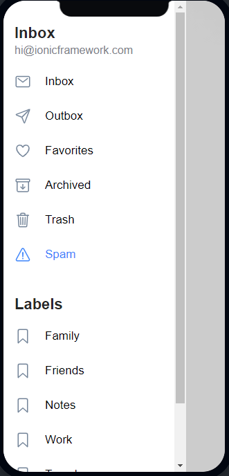
選單頁面
選單定義
Sidemenu版型(2/3)
app.component.html
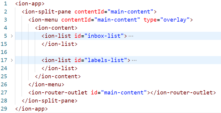
要修改的部份
Sidemenu版型(3/3)
app.component.ts
// ...[略]
export class AppComponent {
  public appPages = [
    { title: 'Inbox', url: '/folder/Inbox', icon: 'mail' },
    { title: 'Outbox', url: '/folder/Outbox', icon: 'paper-plane' },
    { title: 'Favorites', url: '/folder/Favorites', icon: 'heart' },
    { title: 'Archived', url: '/folder/Archived', icon: 'archive' },
    { title: 'Trash', url: '/folder/Trash', icon: 'trash' },
    { title: 'Spam', url: '/folder/Spam', icon: 'warning' },
  ];
  // ...[略]
}
項目名稱
圖示名稱
超連結
// ...[略]
const routes: Routes = [
  {
    path: '',
    redirectTo: 'folder/Inbox',
    pathMatch: 'full'
  },
  {
    path: 'folder/:id',
    loadChildren: () => import('./folder/folder.module').then( m => m.FolderPageModule)
  }
];
// ...[略]
app-routing.module.ts
圖示名稱參考: https://ionicons.com/
❷ 設定選單項目(app.component.ts)
設定於此
Sidemenu範例練習
範例練習建立專案
ionic start SMenuExample sidemenu
cd SMenuExample
ionic g page home
ionic g page chat
ionic g page about
❶ 新建sidemenu專案、建立home, chat, about頁面
❷ 刪除folder設定
const routes: Routes = [
  { path: '', redirectTo: 'home', pathMatch: 'full'}, // 修改首頁
  { path: 'home', loadChildren: './home/home.module#HomePageModule'},
  // 刪除 path: 'folder:id'那組設定
  { path: 'chat', loadChildren: './chat/chat.module#ChatPageModule' },
  { path: 'about', loadChildren: './about/about.module#AboutPageModule' }
];
app-routing.module.ts
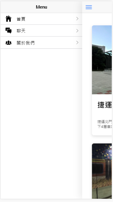
  public appPages = [
    { title: '首頁', url: '/home', icon: 'home'},
    { title: '聊天', url: '/chat', icon: 'chatboxes'},
    { title: '關於我們', url: '/about', icon: 'people'},
  ];
app.component.ts
Ⓐ 刪除folder資料夾
Ⓑ 加入'/home','/chat', '/about',刪除其他
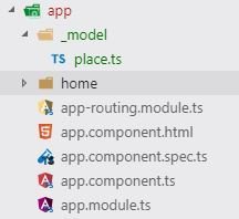
範例練習HomePage內容: 準備工作
Ⓒ 主頁(HomePage)
Ⓐ 加入選單(各個頁面)
Ⓑ 建立資料模型
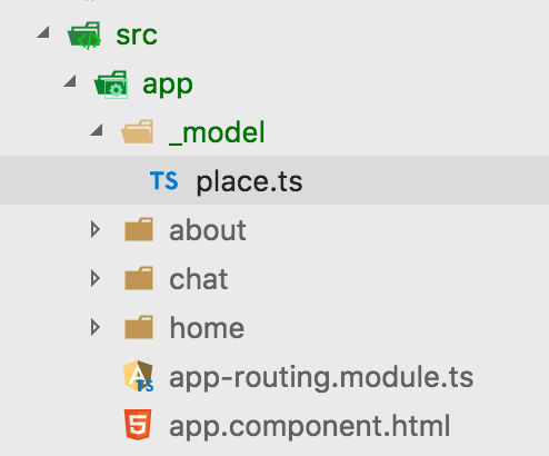
新增資料夾 _models
新增檔案 place.ts
卡片版型: ion-card
Ⓓ 關於我們(AboutPage)
清單: ion-list
項目: ion-item
Ⓔ 聊天(ChatPage)
ion-footer
表單輸入
[(ngModel)]
ion-grid
ion-toggle
ion-button
範例練習加入漢堡按鈕
<ion-header>
  <ion-toolbar>
    <ion-buttons slot="start">
      <ion-menu-button></ion-menu-button>
    </ion-buttons>
    <ion-title>
      {{ pageTitle }}
    </ion-title>
  </ion-toolbar>
</ion-header>
<!-- 略 -->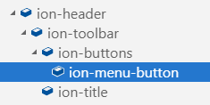
chat.page.html
❶ ion-buttons: 按鈕群組
❷ ion-menu-button: 選單按鈕(漢堡按鈕)
about.page.html
home.page.html
Ⓐ 加入選單
範例練習定義資料模型
export interface Place {
    title: string;      // 景點名稱
    photoURL?: string;  // 景點圖片
    intro?: string;     // 景點介紹
}
_model/place.ts
❶ 定義資料模型介面
陣列用法➩ 變數名稱: 型別[]
供頁面共用(相同資料規格)
?代表optional(可有可無)
Ⓑ 資料模型
import { Place } from '../_model/place';

// 也可定義陣列(const代表常數)
export const PLACES: Place[] = [
  {title: '幾米主題南港站', photoURL: 'g_me.jpg', intro: '受到各方...'},
  {title: '140高地公園', photoURL: 'high_land.jpg', intro: '140高...'},
  {title: '通化公園', photoURL: 'th_park.jpg', intro: '本公園位於 ...'},
  {title: '世貿公園', photoURL: 'wtc_park.jpg', intro: '公園面積約...'},
];

export class HomePage {
  poi: Place = {title:'名稱', photoURL: 'pic.jpg'};
  college: Place = {title:'學校名稱', photoURL: 'pic.jpg', '一所學校'};
  places: Place[] = PLACES;
}一般用法➩ 變數名稱: 型別
使用頁面.page.ts
❷ import模型介面
範例練習編輯主頁
❶ import模型介面
❸ 定義屬性places,值為上列常數PLACES
Ⓒ 編輯主頁
import { Component } from '@angular/core';
import { Place } from '../_model/place';
export const PLACES: Place[] = [
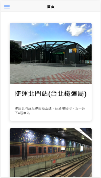
{title: '捷運北門站(台北鐵道局)', photoURL: 'north_gate.jpg', intro: '捷運北門站為捷運松山線,位於塔城街,為一地下4層車站'},
{title: '幾米主題南港站', photoURL: 'g_me.jpg', intro: '受到各方廣大喜愛的幾米主題裝置藝術'},
{title: '140高地公園', photoURL: 'high_land.jpg', intro: '140高地公園位於台北市文山區萬美里境內'},
{title: '通化公園', photoURL: 'th_park.jpg', intro: '本公園位於文昌街與通化街口,於民國76年建立'},
{title: '世貿公園', photoURL: 'wtc_park.jpg', intro: '公園面積約1.2公頃,位於南港區經貿二路106巷'},
];
@Component({
selector: 'app-home',
templateUrl: 'home.page.html',
styleUrls: ['home.page.scss'],
})
export class HomePage {
places: Place[] = PLACES;
constructor() {}
}home.page.ts
❷ 準備頁面資料(定義常數PLACES)
範例練習編輯主頁
Ⓒ 編輯主頁
卡片版型: ion-card
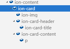
<ion-card>
    <ion-img src="/assets/myImg.png"></ion-img>
    <ion-card-header>
        <ion-card-title>Hello World</ion-card-title>
    </ion-card-header>
    <ion-card-content>
        <p>The content for this card</p>
    </ion-card-content>
</ion-card>
ion-card V.4: https://beta.ionicframework.com/docs/components/#card
範例練習編輯主頁
places陣列 (3個欄位)
❸ 內文
Ⓒ 編輯主頁
<!-- ion-header 略 -->

<ion-content padding>
  <ion-card *ngFor="let place of places">
    <ion-img src="/assets/images/{{ place.photoURL }}"></ion-img>
    <ion-card-header>
        <ion-card-title>{{ place.title }}</ion-card-title>
    </ion-card-header>
    <ion-card-content>
        <p>{{ place.intro }}</p>
    </ion-card-content>
</ion-card>
</ion-content>
home.page.html
❷ 標題
export const PLACES: Place[] = [
  {title: '捷運北門站', photoURL: 'north_gate.jpg', intro: '捷運北門站...'},
  //...略
export class HomePage {
  places: Place[] = PLACES;
  //... 略
}
home.page.ts
*ngFor: 迴圈指令
❶ 圖片
範例練習編輯關於我們
Ⓓ關於我們
import { Component, OnInit } from '@angular/core';
@Component({
selector: 'app-about',
templateUrl: './about.page.html',
styleUrls: ['./about.page.scss'],
})
export class AboutPage implements OnInit {
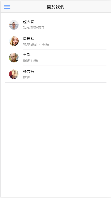
persons = [
{name: '趙大春', cv: '程式設計高手', photoURL: 'https://randomuser.me/api/portraits/thumb/men/18.jpg'},
{name: '周曉秋', cv: '視覺設計,美編', photoURL: 'https://randomuser.me/api/portraits/thumb/women/31.jpg'},
{name: '王武', cv: '網路行銷', photoURL: 'https://randomuser.me/api/portraits/thumb/men/8.jpg'},
{name: '張文慈', cv: '財務', photoURL: 'https://randomuser.me/api/portraits/thumb/women/25.jpg'},
];
constructor() { }
ngOnInit() {
}
}
about.page.ts
定義persons屬性陣列(3個欄位)
範例練習編輯關於我們
Ⓓ關於我們
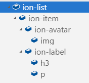
<ion-list>
  <ion-item>
    <ion-avatar slot="start">
      <img src="/docs/assets/img/avatar-finn.png"></img>
    </ion-avatar>
    <ion-label>
      <h3>I'm a big deal</h3>
      <p>Listen, I've had a pretty messed up day...</p>
    </ion-label>
  </ion-item>
</ion-list>
ion-list : https://ionicframework.com/docs/api/list
清單: ion-list
項目: ion-item
範例練習編輯關於我們
Ⓓ關於我們
places陣列 (3個欄位)
❸ 內文
<!-- ion-header 略 -->

<ion-content padding>
  <ion-list>
    <ion-item *ngFor="let p of persons">
      <ion-avatar slot="start">
        <img src="{{ p.photoURL }}" />
      </ion-avatar>
      <ion-label>
        <h3>{{ p.name }}</h3>
        <p>{{ p.cv }}</p>
      </ion-label>
    </ion-item>
  </ion-list>
</ion-content>
about.page.html
❷ 小標題
export class AboutPage implements OnInit {
  persons = [
    {name: '趙大春', cv: '程式設計高手', photoURL: 'https://rand.../18.jpg'},
    //...略
about.page.ts
*ngFor: 迴圈指令
❶ 頭像
範例練習聊天表單
Ⓔ 聊天表單
import { Component, OnInit } from '@angular/core';
@Component({
selector: 'app-chat',
templateUrl: './chat.page.html',
styleUrls: ['./chat.page.scss'],
})
export class ChatPage implements OnInit {
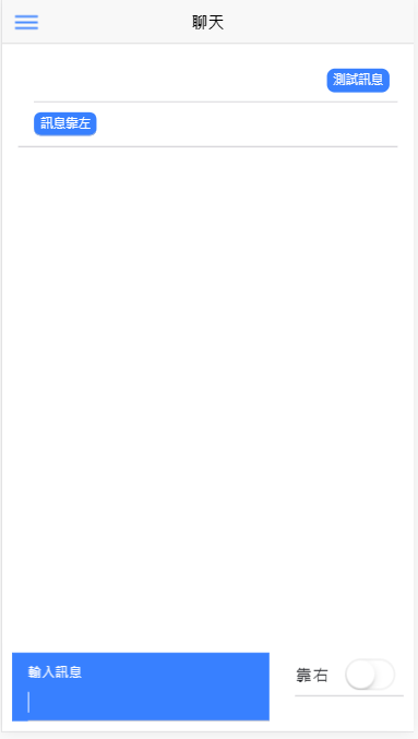
message: string;
messages = [];
align_right = true;
constructor() { }
ngOnInit() {}
onSubmit() {
if (!this.message) { return; }
const msg = { msg: this.message, align: 'button-left'};
if (this.align_right) {
msg.align = 'button-right';
}
this.messages.push(msg);
}
}
chat.page.ts
❶ 輸入值屬性
❷ 聊天內容屬性
❸ 開關切換屬性
❶ 輸入欄位
❷ 聊天內容
❸ 切換開關
❺ 訊息送出處理器(輸入欄位)
[(ngModel)] = "message"
❹ 雙向繫結(資料同步)
範例練習聊天表單
Ⓔ 聊天表單
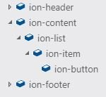
<ion-header><!--略--></ion-header>

<ion-content padding>
  <ion-list>
      <ion-item *ngFor="let msg of messages" >
        <ion-button></ion-button>
      </ion-item>
  </ion-list>
</ion-content>

<ion-footer>
  <form #myForm="ngForm">
    <ion-item>
      <ion-label position="floating">輸入訊息</ion-label>
      <ion-input [(ngModel)]="message" ....... required>
      </ion-input>
    </ion-item>
  </form>
</ion-footer>
ion-footer
表單輸入
[(ngModel)]
ion-grid
ion-toggle
ion-button
範例練習聊天表單
事件處理器
❸ 必要欄位
<!-- ion-header 略 -->
<!-- ion-content 略 -->
<ion-footer>
<form #myForm="ngForm">
  <ion-item>
    <ion-label position="floating">輸入訊息</ion-label>
    <ion-input [(ngModel)]="message" name="message"
               (keyup.enter)="onSubmit(); myForm.reset()"
               type="text" required>
    </ion-input>
  </ion-item>
</form>
</ion-footer>
chat.page.html
❷ keyup.enter: Enter鍵按下
  message: string;
  messages = [];
  align_right = true;

  onSubmit() {
    if (!this.message) { return; }
    // ...略
    this.messages.push(msg);
  }
chat.page.ts
#myForm: 定義區域變數myForm
❶ ngModel設定輸入儲存的屬性
Ⓔ 聊天表單
✪ 表單設計方式:ngForm + ngModel +ngSubmit
name必要欄位
reset(): 清除表單內容
範例練習聊天表單
Ⓔ 聊天表單
  <ion-grid fixed>
    <ion-row>
      <ion-col size="8">
        <form #myForm="ngForm">
          <!-- 略 -->
        </form>
      </ion-col>
      <ion-col size="4">
        <ion-item>
          <ion-label color="dark">靠右</ion-label>
          <ion-toggle [(ngModel)]="align_right"></ion-toggle>
        </ion-item>
      </ion-col>
    </ion-row>
  </ion-grid>
ion-grid: 可由很多ion-row組成
ion-toggle
ion-row: 由多個ion-col組成
每一個ion-row: 12等分, 此ion-col佔8等分
範例練習聊天表單
屬性
切換靠右設定
<ion-grid fixed>
  <ion-row>
    <ion-col size="8">
      <form #myForm="ngForm"> ... 略 ...</form>
    </ion-col>
    <ion-col size="4">
      <ion-item>
        <ion-label color="dark">靠右</ion-label>
        <ion-toggle [(ngModel)]="align_right"></ion-toggle>
      </ion-item>
    </ion-col>
  </ion-row>
</ion-grid>
chat.page.html
  align_right = true;
  onSubmit() {
    if (!this.message) { return; }
    const msg = { msg: this.message, align: 'button-left'};
    if (this.align_right) {
      msg.align = 'button-right';
    }
    this.messages.push(msg);
  }
chat.page.ts
Ⓔ 聊天表單
✪ ion-grid排版型 與 表單元素ion-toggle(開關)
繫結屬性
css設定: button-left為預設值
範例練習聊天表單
form {
    ion-item {
        --ion-item-background: #3880ff;
        --ion-item-color: #ffffff;
    }
}
.button-left {
    margin-right: auto;
}
.button-right {
    margin-left: auto;
}
chat.page.scss
Ⓔ 聊天表單
UI Components: Slides
Slides

適用範圍
- 教學步驟
- 分頁式版型
Ionic Slides
- 水平
- 垂直
Slides 基本指令
<ion-slides pager="true">
  <ion-slide>
    <h1>第1頁</h1>
  </ion-slide>

  <ion-slide>
    <h1>第2頁</h1>
  </ion-slide>

  <ion-slide>
    <h1>第3頁</h1>
  </ion-slide>
</ion-slides>
預設方向為水平
HTML
Slides 基本指令
<ion-slides [options]="opts">
  <ion-slide>
  ...[略]...
</ion-slides>
❶ 設定direction
HTML
...[略]...
export class SlidePage {
  opts = {
    direction: 'vertical'
  };

  constructor() { }
}
❷ 設定options參數(屬性繫結)
TS
如何改成垂直方向?
Slides 範例
ionic start SlideDemo blank
cd SlideDemo
ionic serve
建立專案
準備資料(DAO設計模式)
❶ 建立_model資料夾
新增界面檔
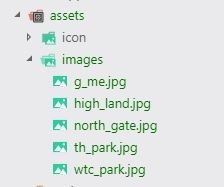
❷ 建立images資料夾
放入圖檔
Slides 範例
export interface Place {
    title: string;      // 景點名稱
    photoURL?: string;  // 景點圖片
    intro?: string;     // 景點介紹
}
place.ts
Slides 範例
import { Component } from '@angular/core';
import { Place } from '../_model/place';

export const PLACES: Place[] = [
  {title: '捷運北門站(台北鐵道局)', photoURL: 'north_gate.jpg', intro: '捷運北門站為捷運松山線,位於塔城街,為一地下4層車站'},
  {title: '幾米主題南港站', photoURL: 'g_me.jpg', intro: '受到各方廣大喜愛的幾米主題裝置藝術'},
  {title: '140高地公園', photoURL: 'high_land.jpg', intro: '140高地公園位於台北市文山區萬美里境內'},
  {title: '通化公園', photoURL: 'th_park.jpg', intro: '本公園位於文昌街與通化街口,於民國76年建立'},
  {title: '世貿公園', photoURL: 'wtc_park.jpg', intro: '公園面積約1.2公頃,位於南港區經貿二路106巷'},
];
...[略]...
export class HomePage {
  slides: Place[] = PLACES;
  slide_options = {
    direction: 'vertical'
  };
}
home.page.ts
Slides 範例
...[略]...
<ion-content padding>
  <ion-slides [options]="slide_options" style="height:100%;">
    <ion-slide *ngFor="let p of slides">
      <ion-card>
        <ion-img [src]="'/assets/images/' + p.photoURL"></ion-img>
        <ion-card-header>
          <ion-card-title>{{ p.title }}</ion-card-title>
        </ion-card-header>
        <ion-card-content>
          {{ p.intro }}
        </ion-card-content>
      </ion-card>
    </ion-slide>
  </ion-slides>
</ion-content>
home.page.html
Slides + Ionic Storage
Ionic Storage: 狀態紀錄
The Example (1/2)
Sliding Introduction(1 page 3 slides)
可略過、僅出現一次、前往首頁
以「Ionic Storage內存值」辨識是否出現
intro

The Example (2/2)
Tabs + Side menu:
tabs: 定義兩個tabs(產品, 聯繫)
side menu: 定義於home
另有一獨立頁面(不含tabs,但有選單)
tabs
home
連動
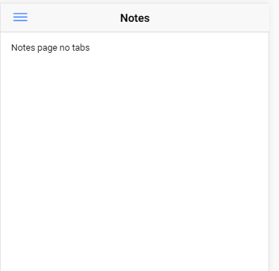
notes
product
contact
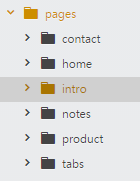
The Example 建立專案
cd SideTabApp
ionic g page intro
ionic g page tabs
ionic g page product
ionic g page contact
ionic g page notes
建立空白專案
因side menu, tabs兩者需連動, 自行撰寫為宜
ionic start SideTabApp blank新增所需頁面
side menu 寫於home
intro: 介紹頁面,3 slides
tabs: 頁籤主頁
product: product頁籤
contact: contact頁籤
notes: 獨立頁面
全部是lazy loading頁面!
注意如何修改appModule !
新增ionic storage所需[npm套件]與[cordova外掛]
ionic cordova plugin add cordova-sqlite-storage
npm install --save @ionic/storage
ionic storage需暫存空間
手機優先使用SQLite
SQLite: 手機內建資料庫
關於Ionic Native與Cordova
sqlite(cordova plugin)
ionic native (typescript wrapper)
ionic storage (typescript wrapper)


Ionic Native & Cordvoa (1/2)
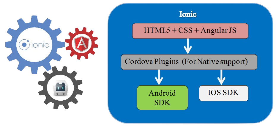
Ionic
Angular
Cordova
HTML5 + CSS + Angular
Ionic Native & Cordvoa (2/2)
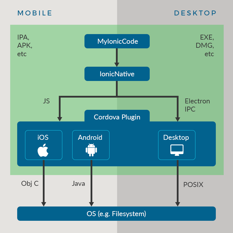
Ionic
Ionic Native
Cordova
O.S.
Ionic Native 使用(1/3)
npm install @ionic-native/camera --save- TypeScript wrapper for Cordova plugins
1. ionic start已自動安裝Ionic Native
2. 使用npm安裝想使用的ionic native外掛(以camera為例)
- 使用Ionic Natvie
3. 使用ionic cordova指令安裝對應之cordova外掛
ionic cordova plugin add cordova-plugin-cameraIonic Native 使用(2/3)
...
import { Camera } from '@ionic-native/camera';
...
@NgModule({
  ...
  providers: [
    ...
    Camera
    ...
  ]
  ...
})
export class AppModule { }- 使用Ionic Natvie
4. 將native外掛元件加到appModule
Ionic Native 使用(3/3)
...
import { Camera, CameraOptions } from '@ionic-native/camera';

constructor(private camera: Camera) { }
...
...
this.camera.getPicture(...- 使用Ionic Natvie
5. 各頁面使用時:於constructor建立元件引數
Ionic Storage
ionic cordova plugin add cordova-sqlite-storageimport { IonicStorageModule } from '@ionic/storage';
@NgModule({
...
imports: [
...
IonicStorageModule.forRoot(),
...
],
...
})
export class AppModule {}1.安裝SQLite外掛(cordova)
npm install --save @ionic/storage2.安裝Ionic Storage套件(typescript wrapper)
3.修改appModule,引入Ionic Stroage模組
The Example(續)
The Example 修改appModule(1/2)
1. 引入lazy loading模組
...
import { TabsPageModule } from '../pages/tabs/tabs.module';
import { ProductPageModule } from '../pages/product/product.module';
import { ContactPageModule } from '../pages/contact/contact.module';
import { NotesPageModule } from '../pages/notes/notes.module';
import { IntroPageModule } from '../pages/intro/intro.module';
...
@NgModule({
...
imports: [
...
IonicStorageModule.forRoot(),
TabsPageModule,
ProductPageModule,
ContactPageModule,
NotesPageModule,
IntroPageModule
],
...
The Example 修改appModule(2/2)
2.引入ionic storage模組
import { IonicStorageModule } from '@ionic/storage';

@NgModule({
  ...
  imports: [
    ...
    IonicStorageModule.forRoot(),
    ...
  ],
  ...
})
export class AppModule {}import { Storage } from '@ionic/storage';
export class MyApp {
constructor(private storage: Storage) { }
...
// set a key/value
storage.set('name', 'Max');
// Or to get a key/value pair
storage.get('age').then((val) => {
console.log('Your age is', val);
});
}The Example 修改app.component.ts!
...
import { Storage } from '@ionic/storage';

import { HomePage } from '../pages/home/home';
import { IntroPage } from '../pages/intro/intro';
...
export class MyApp {
  rootPage:any = IntroPage;

  constructor(platform: Platform,
              statusBar: StatusBar,
              splashScreen: SplashScreen,
              storage: Storage) {

    platform.ready().then(() => {
      storage.get('introShown').then((result)=>{
      if(result){ // storage中已設定顯示過了
          this.rootPage = HomePage;   // 前往首頁
          storage.set('introShown', false); // 重設
        } else {
          this.rootPage = IntroPage;  // 前往介紹頁面
          storage.set('introShown', true);  //設定已顯示過了
        }
    });
  ...
app.component.ts片段
1. 使用Storage暫存資料
storage.get(變數名稱).then(正常回傳).catch(錯誤狀況);
2. 讀取Storage暫存資料
The Example Sliding introduction頁面(1/3)
如何使用Slides元件,搭配@ViewChild()
import { ViewChild } from '@angular/core';
import { Slides } from 'ionic-angular';

class MyPage {
  @ViewChild(Slides) slides: Slides;

  goToSlide() {
    this.slides.slideTo(2, 500);
  }
}
<ion-slides>
<ion-slide>
<h1>Slide 1</h1>
</ion-slide>
<ion-slide>
<h1>Slide 2</h1>
</ion-slide>
<ion-slide>
<h1>Slide 3</h1>
</ion-slide>
</ion-slides>ts檔
html檔
@ViewChild(Slides):
找到符合Slides類型的元素(此處即html檔的ion-slides)
slideTo() 切換至第2個slide(內容為Slide 2的ion-slide)
The Example Sliding introduction頁面(2/3)
import { Component, ViewChild } from '@angular/core';
import { NavController, NavParams, Slides } from 'ionic-angular';

import { HomePage } from '../home/home';

@Component({
  selector: 'page-intro',
  templateUrl: 'intro.html',
})
export class IntroPage {
  @ViewChild(Slides) slides: Slides;  // ion-slides
  skip:boolean = true;  // 是否顯示「略過」

  constructor(public navCtrl: NavController, public navParams: NavParams) {
  }
  // 切換至首頁HomePage
  goToHome(){
    this.navCtrl.setRoot(HomePage);
  }
  // slide切換時,檢查是否已到最後一個slide
  slideChange(){
    if(this.slides.isEnd()) {
      this.skip = false;
    } else {
      this.skip = true;
    }
  }
}
intro.ts
1. 使用Slides,以便從程式切換slide
2. 透過ViewChild取得ion-slides
3. 重新設定頁面堆疊,首頁改為HomePage
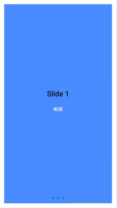
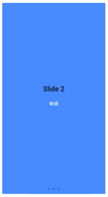
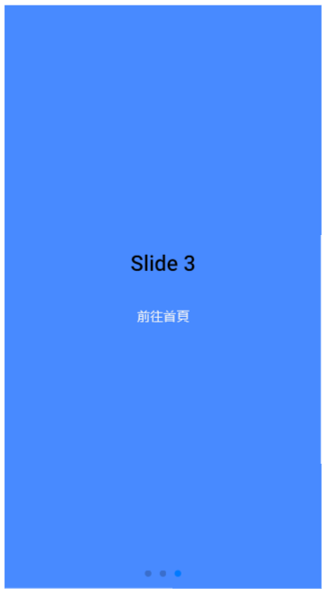
The Example Sliding introduction頁面(3/3)
<ion-content padding>
  <ion-slides pager="true" (ionSlideDidChange)="slideChange()">
    <ion-slide>
      <h1>Slide 1</h1>
      <button *ngIf="skip" ion-button clear color="light" (click)="goToHome()">
        略過
      </button>
    </ion-slide>
    <ion-slide>
      <h1>Slide 2</h1>
      <button *ngIf="skip" ion-button clear color="light" (click)="goToHome()">
        略過
      </button>
    </ion-slide>
    <ion-slide>
      <ion-row>
        <ion-col>
          <h1>Slide 3</h1>
        </ion-col>
      </ion-row>
      <ion-row>
        <ion-col>
          <button ion-button clear color="light" (click)="goToHome()">
            前往首頁
          </button>
        </ion-col>
      </ion-row>
    </ion-slide>
  </ion-slides>
</ion-content>
intro.html
2. 綁定事件(ionSlideDidChange)
1. *ngIf:檢查是否已到最後一頁
.ios, .md {
  page-intro {
    ion-slide {
      background-color: #488aff;
    }
    ion-slide img {
      height: 70vh !important;
      width: auto !important;
    }
  }
}
intro.scss
The Example side menu頁面(1/6)
<ion-menu [content]="mycontent">
  <ion-content>
    <ion-list>
      <p>some menu content, could be list items</p>
    </ion-list>
  </ion-content>
</ion-menu>

<ion-nav #mycontent [root]="rootPage"></ion-nav>
mypage.html
...
export class MyPage{
    rootPage:any = HomePage;
    // rootPage:any = TabsPage; ...
<button ion-button menuToggle>Toggle Menu</button>其他頁面加上此行也可用menu
mypage.ts
ion-menu
content屬性繫結
指向ion-nav變數
ion-nav
需訂區域變數名稱
The Example side menu頁面(2/6)
import { Component, ViewChild } from '@angular/core';
import { NavController, NavParams, Nav, Tabs } from 'ionic-angular';

import { TabsPage } from '../tabs/tabs';
import { ProductPage } from '../product/product';
import { ContactPage } from '../contact/contact';
import { NotesPage } from '../notes/notes';

export interface MenuItemInterface {
  name: string;         // 選單項目名稱
  page: any;            // 對應之page元件名
  tabComponent?: any;   // optional, page屬性如果是tabs元件, 則此處是tabs下所屬的頁籤元件名
  index?: number;       // optional, page屬性如果是tabs元件, 此處是tabs.html裡面ion-tab依序排列下來的順序
  icon: string;         // 選單項目圖示
}
@Component({
  selector: 'page-home',
  templateUrl: 'home.html'
})
export class HomePage {
  rootPage: any = TabsPage;

  @ViewChild(Nav) nav: Nav; //  Reference to current app's root

  menuItems: MenuItemInterface[] = [
    { name: '產品', page: TabsPage, tabComponent: ProductPage, index: 0, icon: 'list-box' },
    { name: '聯繫', page: TabsPage, tabComponent: ContactPage, index: 1, icon: 'contact' },
    { name: '關於', page: NotesPage, icon: 'information' }
  ]

  constructor(public navCtrl: NavController,
    public navParams: NavParams) {
  }
  // 選取某個選單項目
  openMenuItem(menuItem: MenuItemInterface) {
    if (menuItem.index != undefined) { // Tabs
      let currentNav = this.nav.getActiveChildNavs()[0];
      if (currentNav instanceof Tabs) {     // TabPages 頁籤切換
        currentNav.select(menuItem.index);
      } else {  // 從非TabPages切換回來
        this.nav.setRoot(menuItem.page,{
          myTabIndex: menuItem.index
        });
      }
    } else {  // 非Tabs
      this.nav.setRoot(menuItem.page);
    }
  }
  // 設定active item的顏色
  isActiveItem(menuItem: MenuItemInterface){
    let currentNav = this.nav.getActiveChildNavs()[0];
    if(currentNav) {
      if(currentNav.getSelected() && currentNav.getSelected().root === menuItem.tabComponent){
        return 'primary';
      }
      return;
    }

    if(this.nav.getActive() && this.nav.getActive().component===menuItem.page){
      return 'primary';
    }
    return;
  }

}
home.ts
The Example side menu頁面(3/6)
...
export interface MenuItemInterface {
  name: string;         // 選單項目名稱
  page: any;            // 對應之page元件名
  tabComponent?: any;   // optional, page屬性如果是tabs元件, 則此處是tabs下所屬的頁籤元件名
  index?: number;       // optional, page屬性如果是tabs元件, 此處是tabs.html裡面ion-tab依序排列下來的順序
  icon: string;         // 選單項目圖示
}
...
export class HomePage {
  ...
  menuItems: MenuItemInterface[] = [
    { name: '產品', page: TabsPage, tabComponent: ProductPage, index: 0, icon: 'list-box' },
    { name: '聯繫', page: TabsPage, tabComponent: ContactPage, index: 1, icon: 'contact' },
    { name: '關於', page: NotesPage, icon: 'information' }
  ]
  ...
home.ts片段
MenuItemInterface:選單項目介面(串連選單與tab頁籤)
"index?":問號代表index為選填屬性
menuItems有兩種類型的選單項目:tab頁籤/非tab頁籤(無index屬性者)
page屬性: page class name
tabComponent: 頁籤class name
The Example side menu頁面(4/6)
// 選取某個選單項目
  openMenuItem(menuItem: MenuItemInterface) {
    if (menuItem.index != undefined) { // Tabs
      let currentNav = this.nav.getActiveChildNavs()[0];
      if (currentNav instanceof Tabs) {     // TabPages 頁籤切換
        currentNav.select(menuItem.index);
      } else {  // 從非TabPages切換回來
        this.nav.setRoot(menuItem.page,{
          myTabIndex: menuItem.index
        });
      }
    } else {  // 非Tabs
      this.nav.setRoot(menuItem.page);
    }
  }
home.ts片段
openMenuItem(item)
1. 點選選單項目時,需分辨該項目屬於tabs/非tabs
2.屬於tabs時,再進一步區分是「頁籤互相切換」或是從「非tabs」切回來
The Example side menu頁面(5/6)
@ViewChild(Nav) nav: Nav; //  Reference to current app's root
...
// 設定active item的顏色
  isActiveItem(menuItem: MenuItemInterface){
    let currentNav = this.nav.getActiveChildNavs()[0];
    if(currentNav) {    // 頁籤
      if(currentNav.getSelected() && currentNav.getSelected().root === menuItem.tabComponent){
        return 'primary';
      }
      return;
    }
    // 非頁籤(即一般頁面)
    if(this.nav.getActive() && this.nav.getActive().component===menuItem.page){
      return 'primary';
    }
    return;
  }
home.ts片段
isActiveItem(item)
1. this.nav.getActiveChildNavs()[0]: 目前瀏覽的頁面,分為頁籤/非頁籤
2. 若是「頁籤」:檢查目前選單項目是否與tabComponent名稱相符
3. 若是「非頁籤」:檢查元件名稱與menuItem.page是否相符
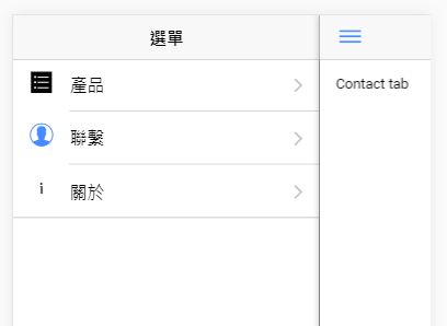
The Example side menu頁面(6/6)
<ion-menu [content] = "mycontent">
  <ion-header>
    <ion-toolbar>
      <ion-title>選單</ion-title>
    </ion-toolbar>
  </ion-header>
  <ion-content>
    <ion-list>
      <button ion-item menuClose *ngFor="let item of menuItems" (click)="openMenuItem(item)">
        <ion-icon item-start [name]="item.icon" [color]="isActiveItem(item)"></ion-icon>
        {{ item.name }}
      </button>
    </ion-list>
  </ion-content>
</ion-menu>

<ion-nav #mycontent [root] = "rootPage"></ion-nav>
home.html
export class HomePage {
  rootPage: any = TabsPage;
  ...
  menuItems: MenuItemInterface[] = [
    { name: '產品', page: TabsPage, tabComponent: ProductPage, index: 0, icon: 'list-box' },
    { name: '聯繫', page: TabsPage, tabComponent: ContactPage, index: 1, icon: 'contact' },
    { name: '關於', page: NotesPage, icon: 'information' }
  ]
  ...
home.ts片段
1. menuClose: 預設關閉選單
2. #mycontent: 定義名為mycontent的區域變數,供ion-menu使用
3. 屬性繫結: content屬性綁定區域變數mycontent
4. 屬性繫結: 綁定rootPage為頁面
5. rootPage定義指向TabsPage頁面
6. 屬性繫結: name為item.icon, color由函式決定
The Example TabsPage(1/2)
import { Component } from '@angular/core';
import { IonicPage, NavController, NavParams } from 'ionic-angular';
...

export class TabsPage {
  ...
  myTabIndex: number;

  constructor(public navCtrl: NavController, public navParams: NavParams) {
    this.myTabIndex = this.navParams.data.myTabIndex || 0;
  }
}
tabs.html
1. 使用selectedIndex屬性繫結:可由ts程式切換頁籤
<ion-tabs #myTabs [selectedIndex]="myTabIndex">
  <ion-tab [root]="tab1Root" tabTitle="產品" tabIcon="list-box"></ion-tab>
  <ion-tab [root]="tab2Root" tabTitle="聯繫" tabIcon="contact"></ion-tab>
</ion-tabs>
tabs.ts片段
2. 使用NavParams元件:接收side menu傳送過來的資料
3. selectedIndex綁定之屬性
4. 切換之頁籤編號:由side menu傳來,或是0
The Example TabsPage(1/2)
import { Component, ViewChild } from '@angular/core';
import { IonicPage, NavController, NavParams } from 'ionic-angular';

import { ProductPage } from '../product/product';
import { ContactPage } from '../contact/contact';

@IonicPage()
@Component({
  selector: 'page-tabs',
  templateUrl: 'tabs.html',
})
export class TabsPage {
  tab1Root = ProductPage;
  tab2Root = ContactPage;
  myTabIndex: number;

  constructor(public navCtrl: NavController, public navParams: NavParams) {
    this.myTabIndex = this.navParams.data.myTabIndex || 0;
  }
}
tabs.ts
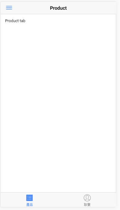
The Example ProductPage(1/2)
<ion-header>
  <ion-navbar text-center>
    <ion-buttons start>
      <button ion-button menuToggle>
      <ion-icon name="menu"></ion-icon>
    </button>
    </ion-buttons>
    <ion-title>Product</ion-title>
  </ion-navbar>
</ion-header>

<ion-content padding>
  Product tab
</ion-content>
prodcut.html
1. menuToggle指令:開/關選單
2. ion-icon name屬性:設定toggle選單圖示
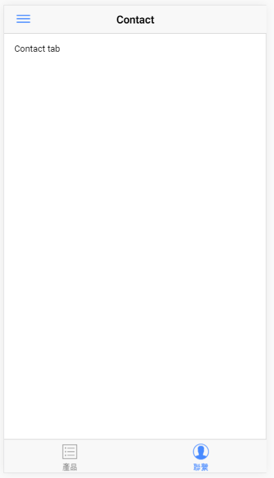
其他頁面如contactPage, notesPage可作同樣設定,在header加入選單toggle按鈕
(註:contact.html, notes.html程式碼亦類似此檔)
3. start, end屬性:控制按鈕出現的位置
The Example ProductPage(2/2)
import { Component } from '@angular/core';

import { IonicPage, NavController, NavParams } from 'ionic-angular';

@IonicPage()
@Component({
  selector: 'page-product',
  templateUrl: 'product.html',
})
export class ProductPage {

  constructor(public navCtrl: NavController, public navParams: NavParams) {
  }
}
product.ts
註:product.ts, contact.ts, notes.ts皆為自動生成之內容,未做更動
Ionic Tutorial
By Leuo-Hong Wang
Ionic Tutorial
Lesson 5: Side menu and the others


