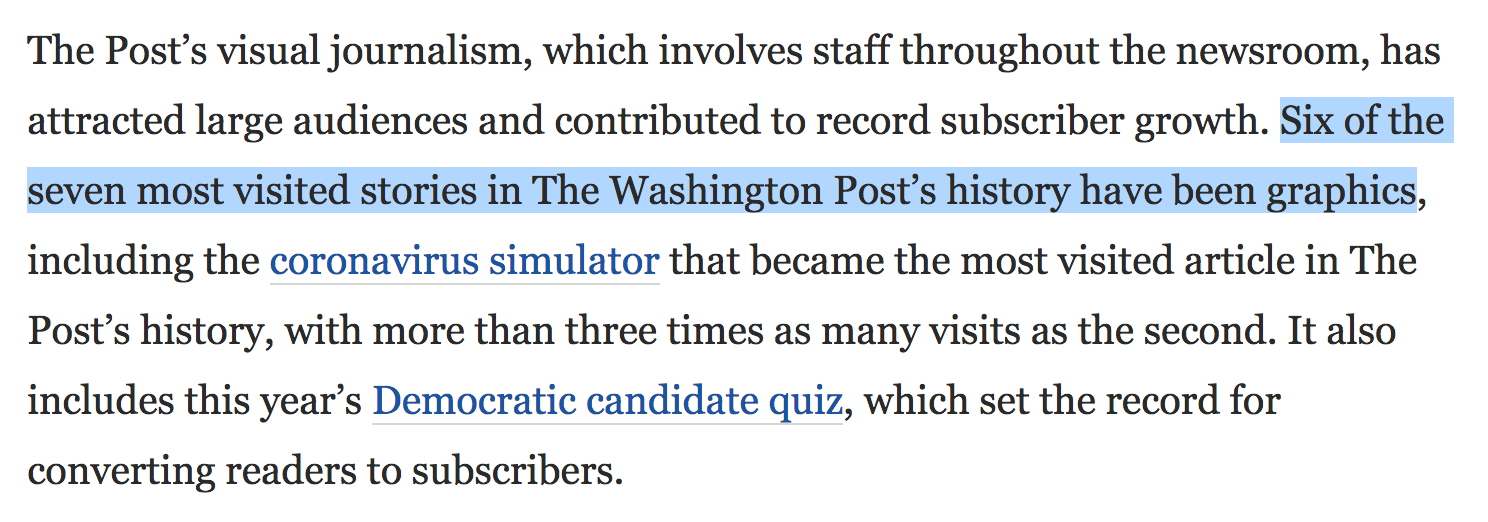
Dataviz in SciComm
17 November
2020
@maartenzam
Belgian SciComm
Meetup
Some lessons from COVID-19
& journalism


Dataviz is a lens for data
The dataviz designer chooses the filter, the lens shape, the focus, the magnification
The filter
The lens: chart types

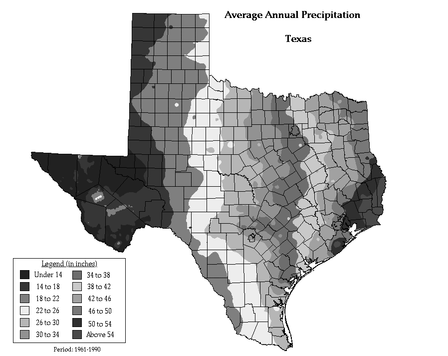
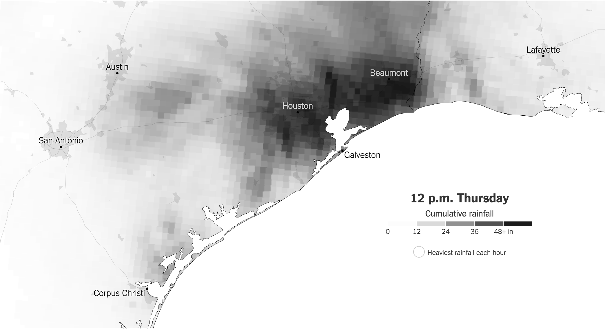
The right measures

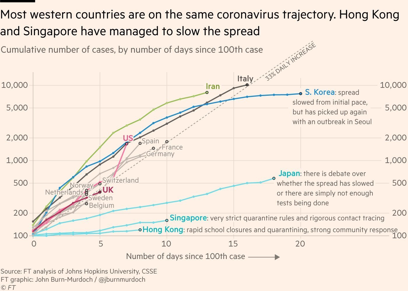
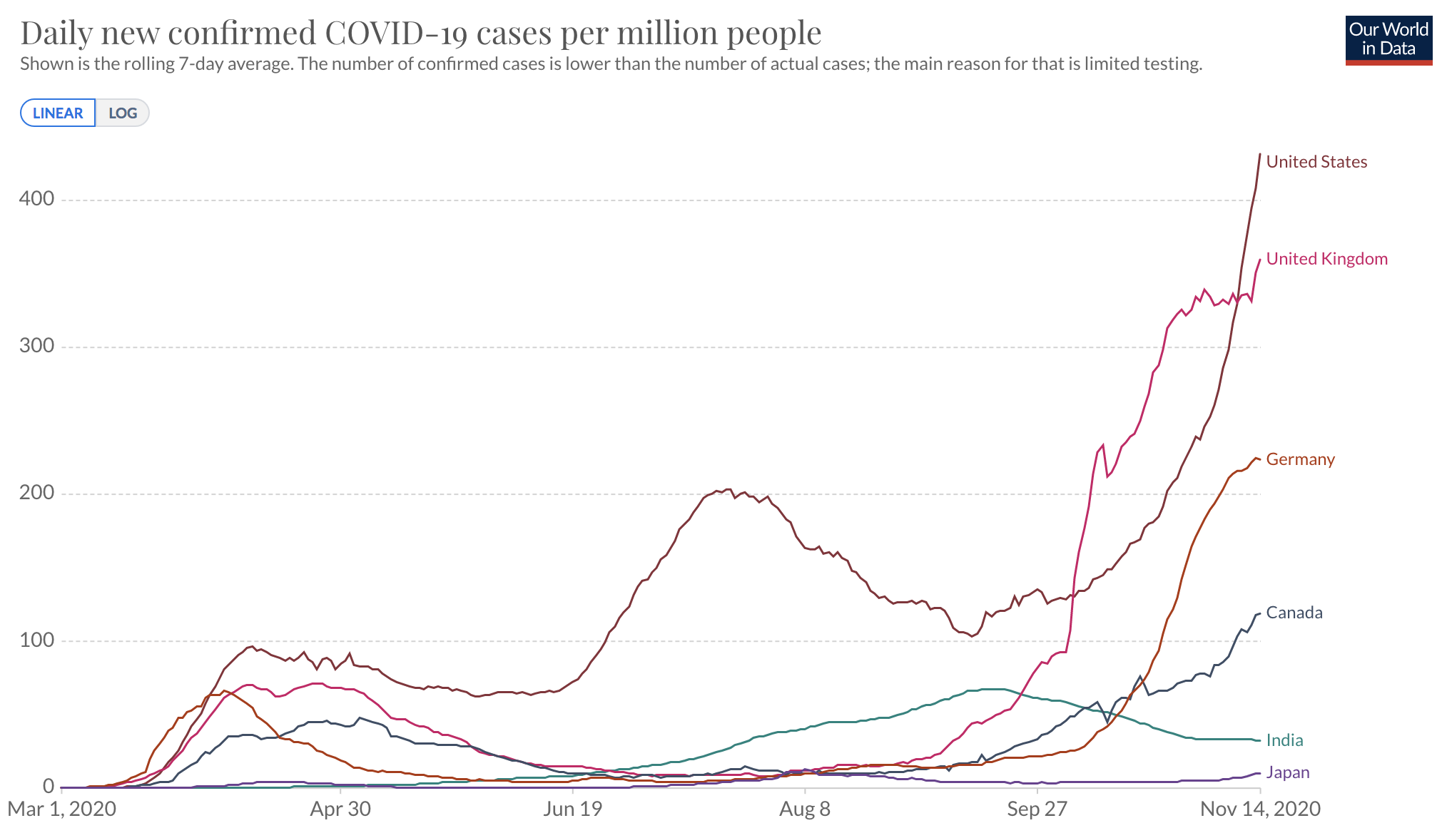
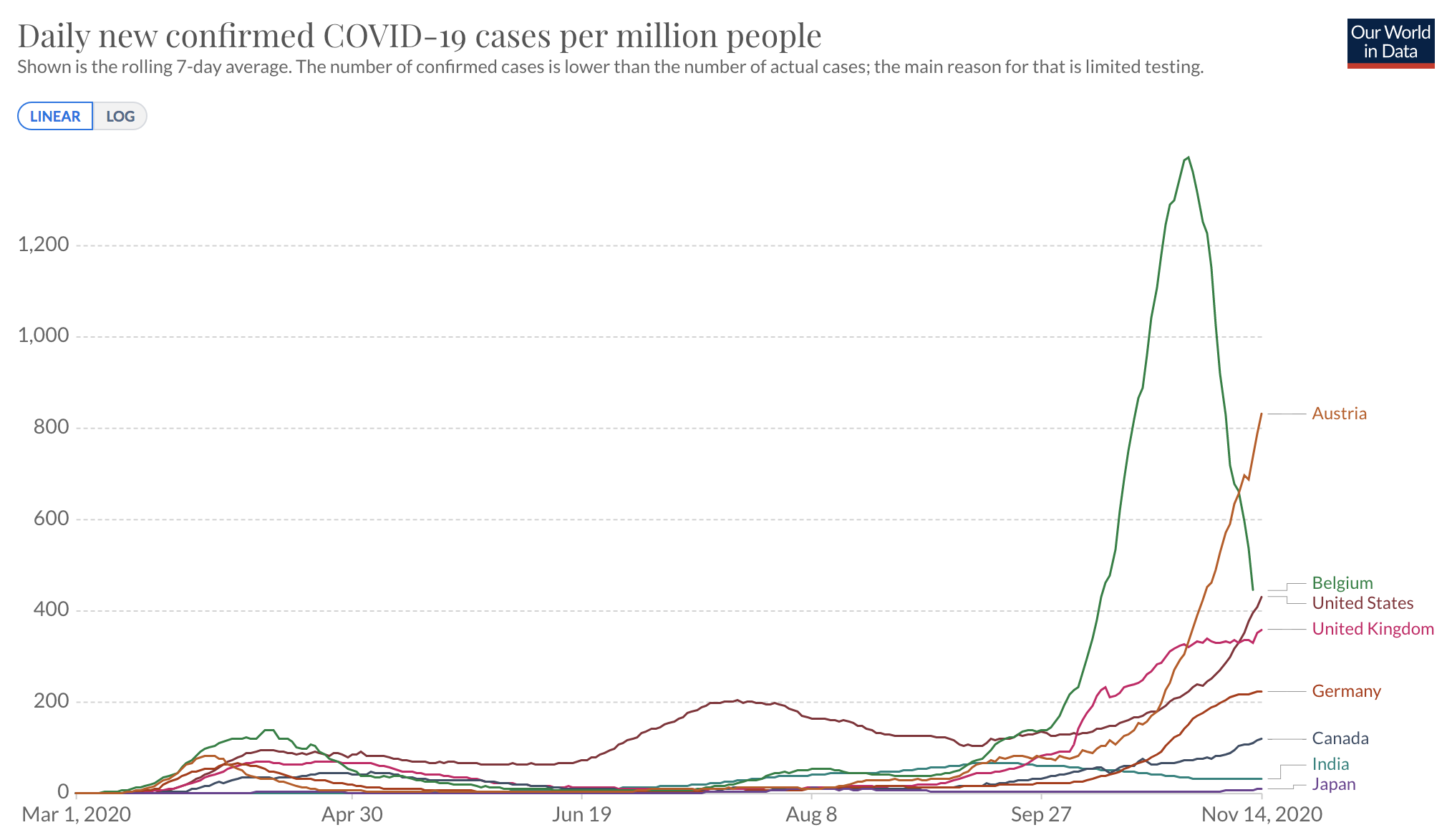
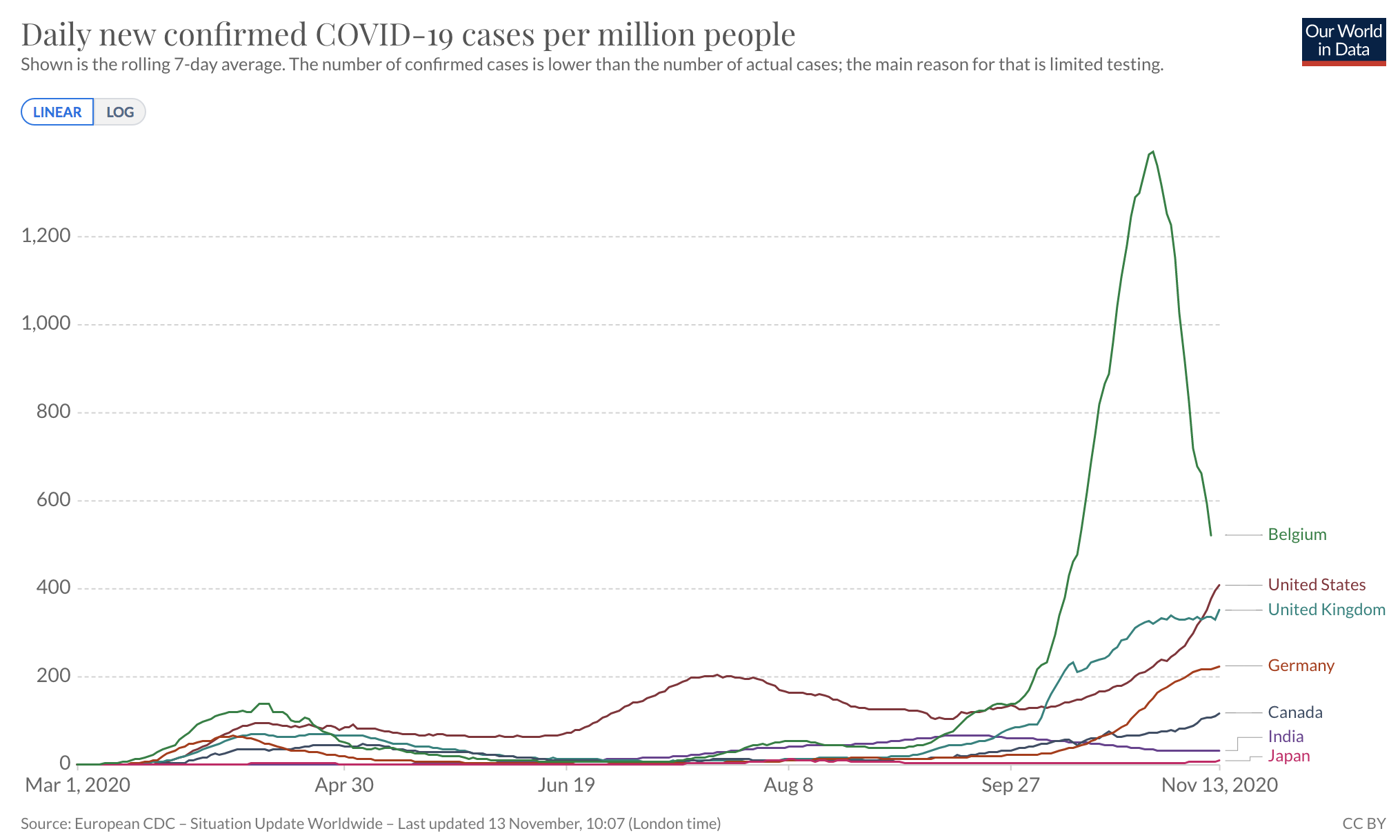
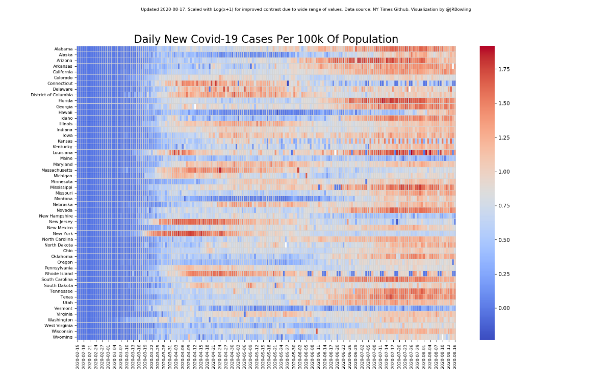
imo much concern over "reader don’t understand log scales" is misplaced. When a reader ponders this chart, they’re asking "are these two countries on the same course", or "how many days til country X is at Y cases", not "how many pixels represent 100 cases"

Dataviz 101:
How not to scratch the lens


Save pies for dessert

Don't cut bars

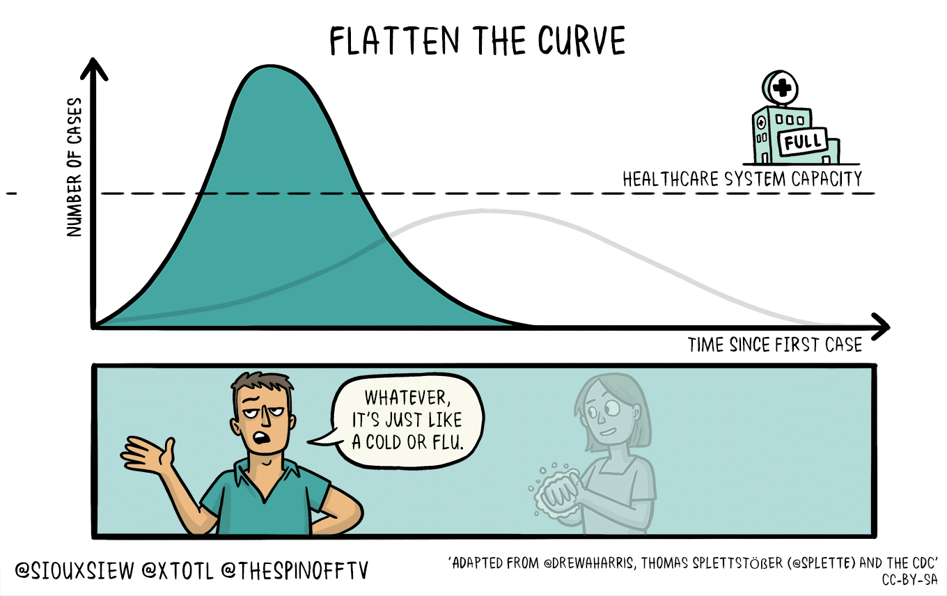
The story of
"Flatten the curve"
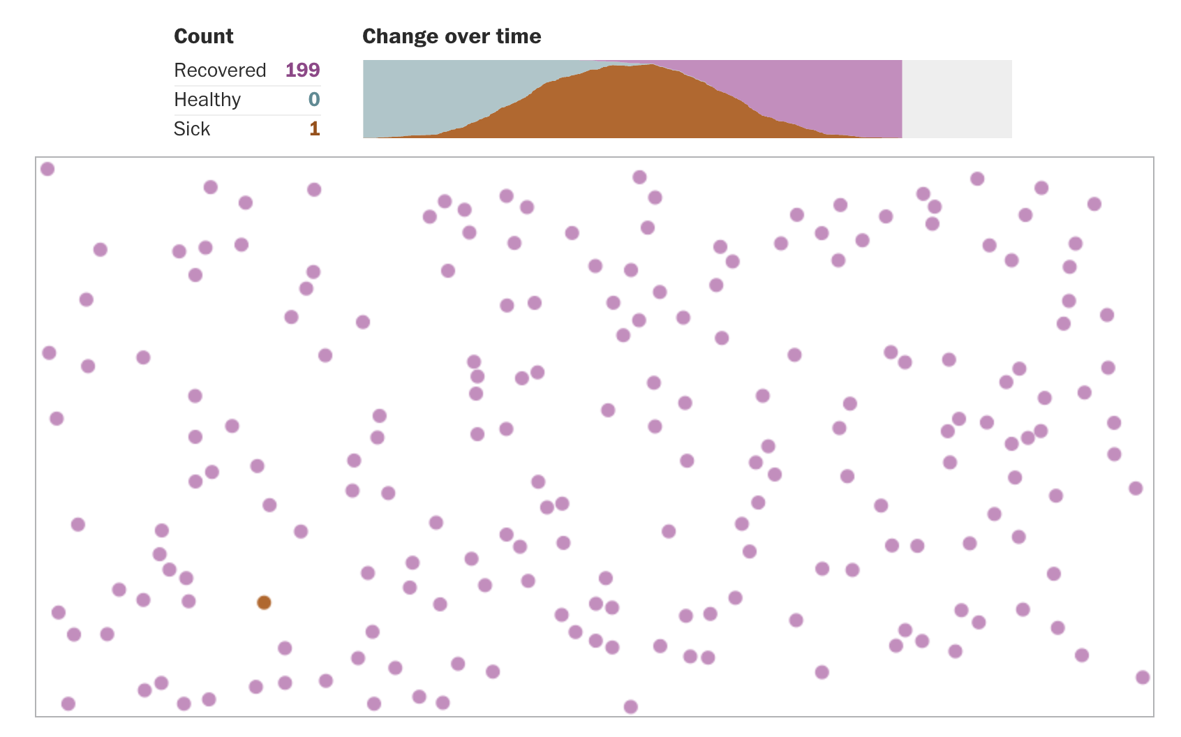
What's in it for me?
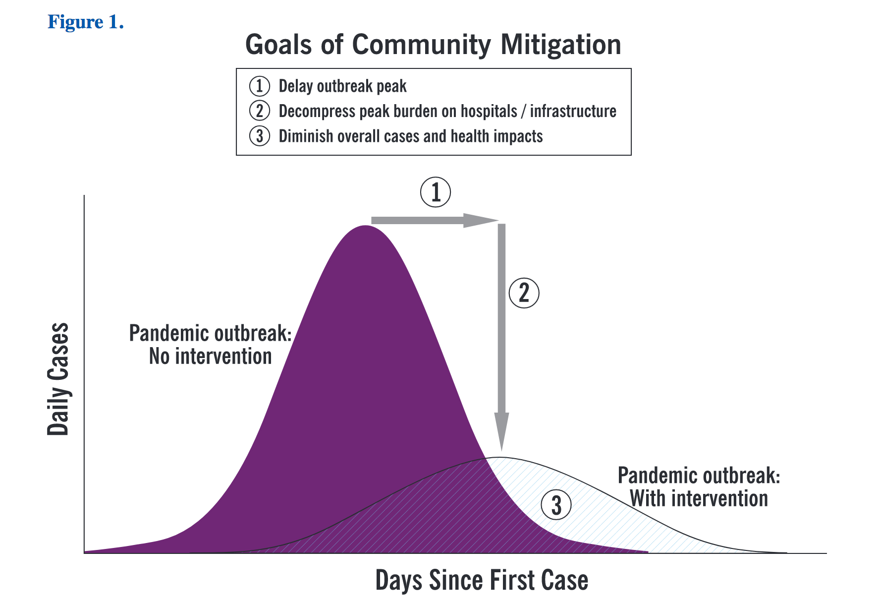
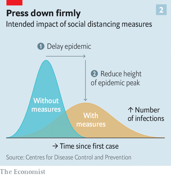
The difficulty with these diagrams is showing uncertainty. Even though it’s a diagram of a concept and not a model from real data, it’s easy for people to interpret it as a precise prediction, as it looks like a chart and we’re used to charts being precise
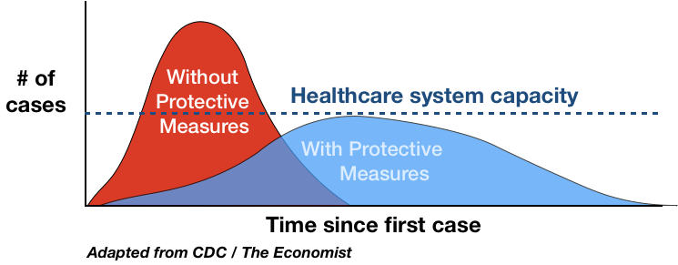
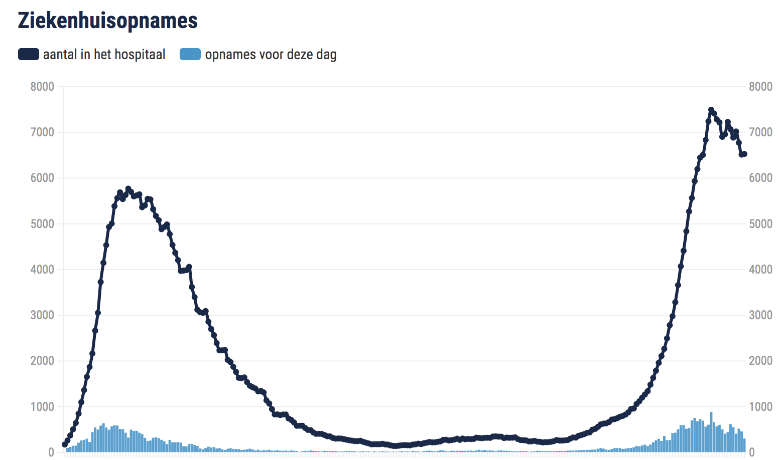
I added an extra line to it. Apparently, that made all of the difference.
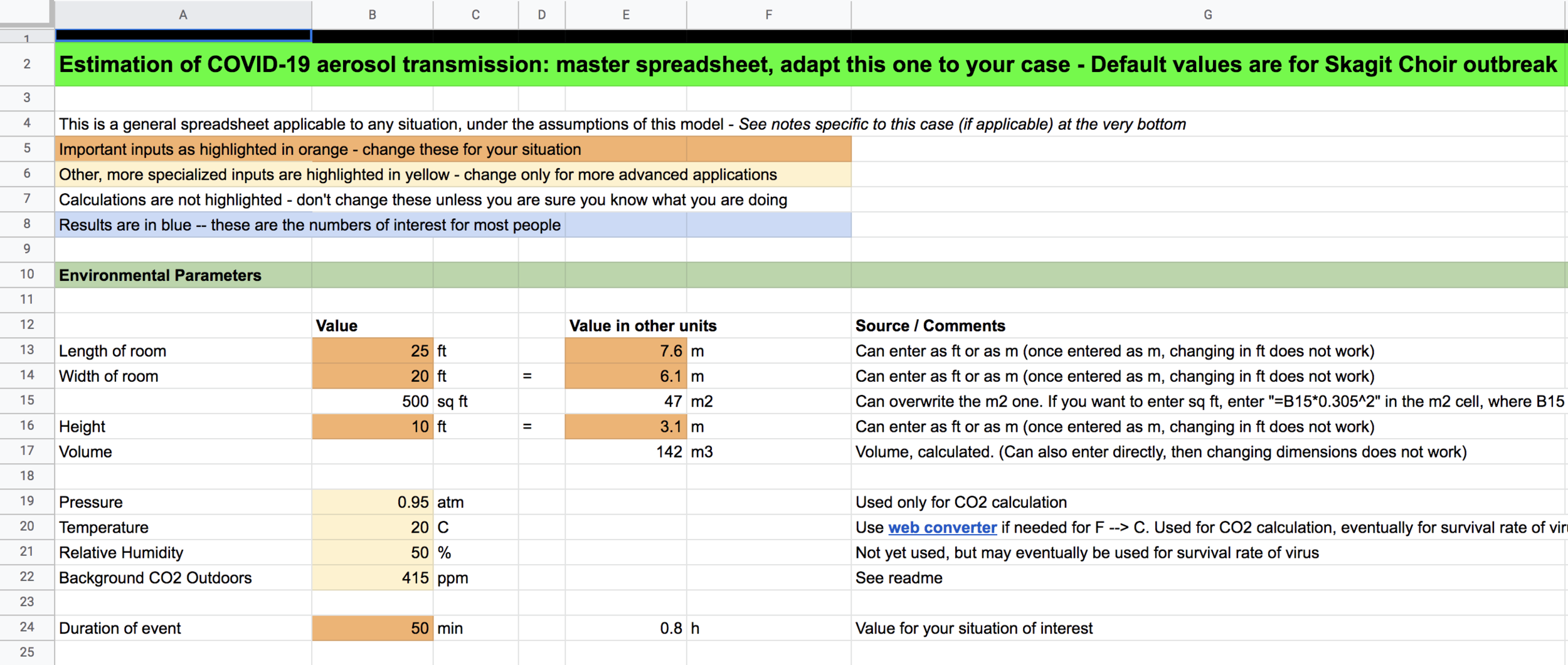
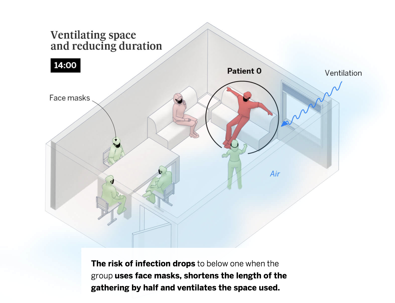
Visualising the black box
of models

(Some) visual teams
Get bigger
Shift from service desk to autonomous content generation
Become really successful
Wrap up
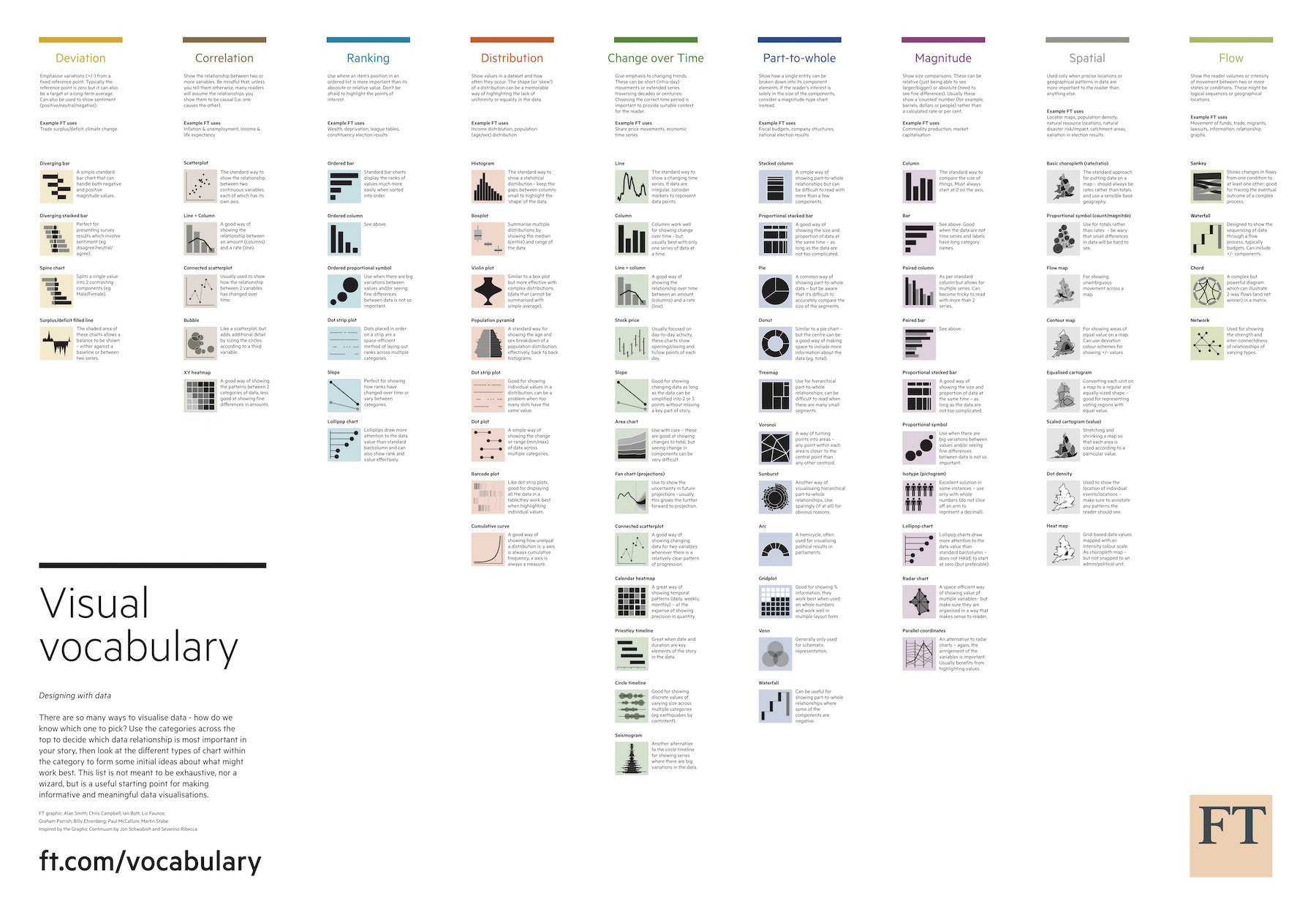
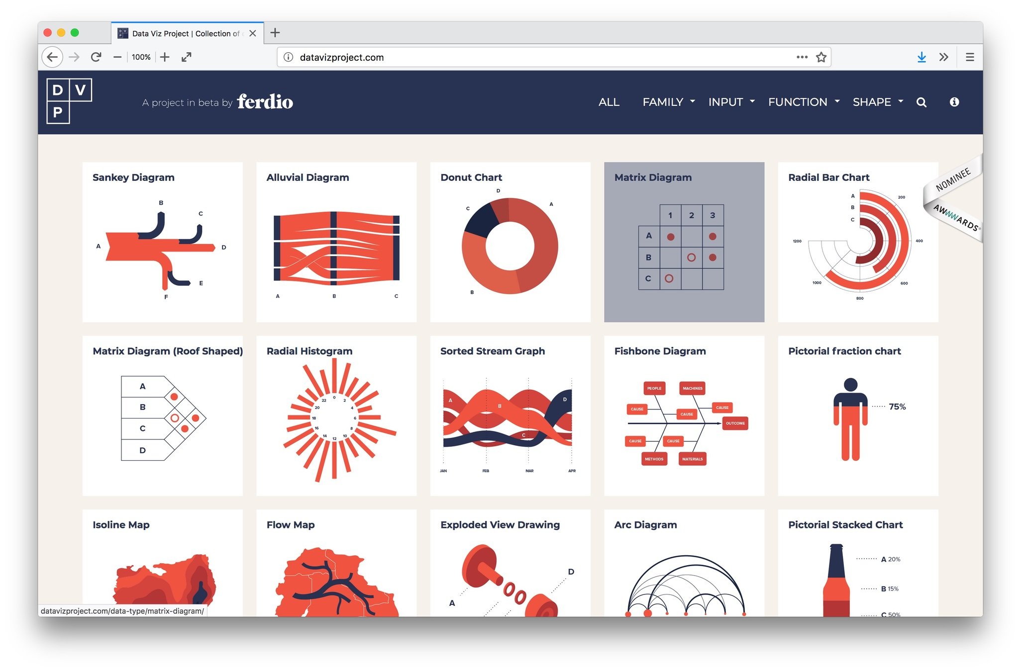
1. Learn the Visual Vocabulary & dataviz 101
2. Focus, tell a story, annotate
3. What does it mean for people?
4. Visualise the black box of models
5. Pivot to dataviz
Thank you!
Dataviz in Scicom
By maartenzam


