DEsn 348
UX 2
1.
enough is enough
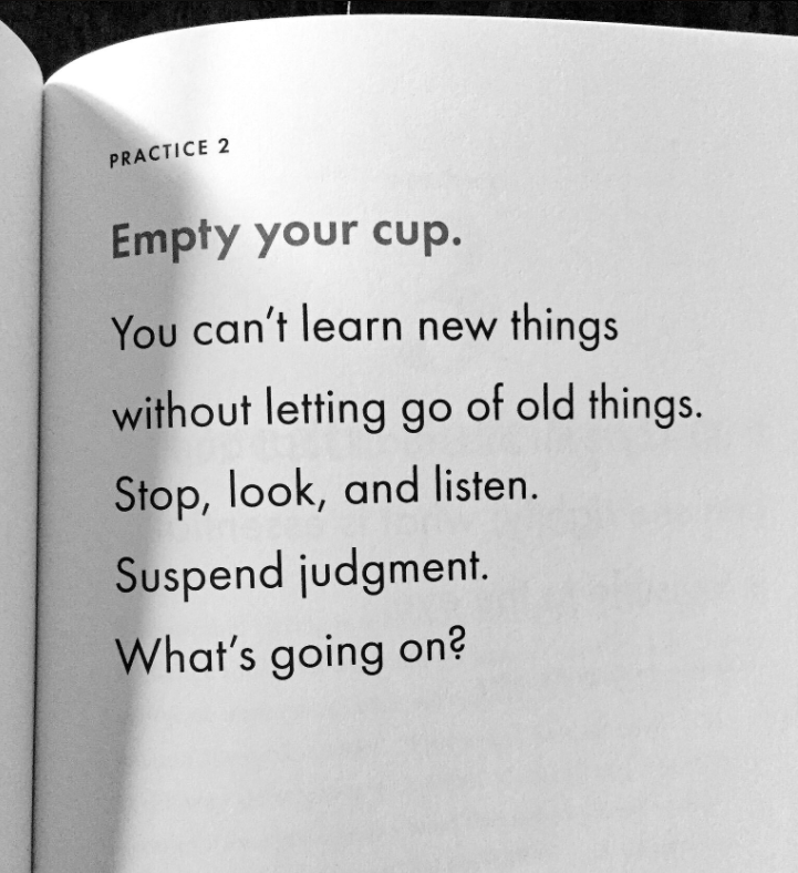
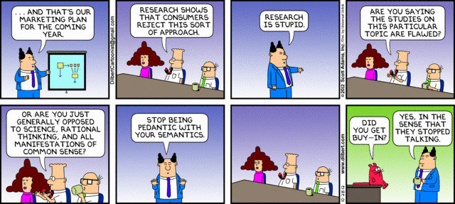
Again.
RESEARCH AS A TOOL
- A tool no different than any Adobe app
- Identifies are you solving the right problem
- Competitive advantage for your clients
- We don't make things "pretty"
- We are not a set of hands waiting for design direction
- We are not told what and how to design
- We are not "special snowflakes waiting for inspiration" - @Monterio
- We are not are tools. Period.
we solve problems.
identify the right problems.

Types of
- Pure research
- Applied research
- Design research
- many other not listed
design research
- Understanding the end user
- Understanding the limitations of humans
- Asking any question, then asking the right questions
- Discovery process of understanding the subject matter.
- A form of applied research to: stay under budget and on time.
...
2.
The Basics
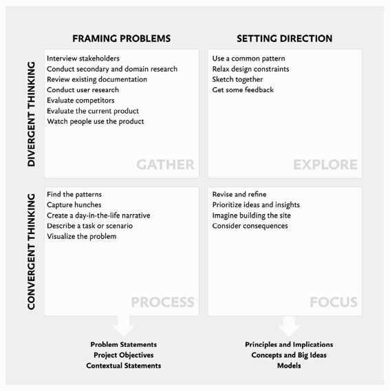
By drilling deep into the problems of customers, the team breaks the tradition of starting a project by jumping to the most obvious solution first
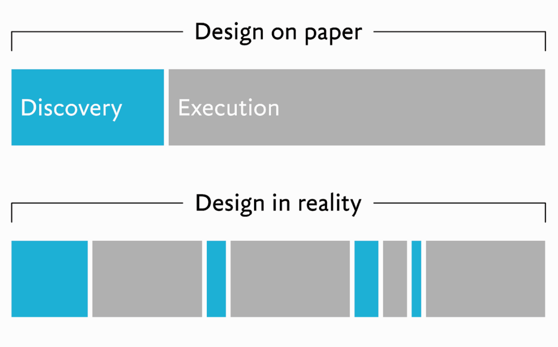
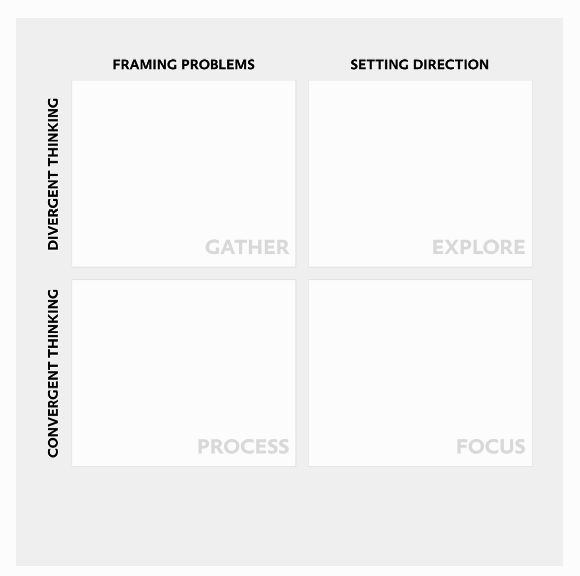
* Gather new information
* Process what you’ve learned
* Explore different approaches
* Focus on a particular approach
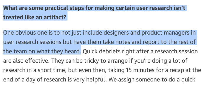
Amy Silvers, Senior product designer and researcher at Nasdaq



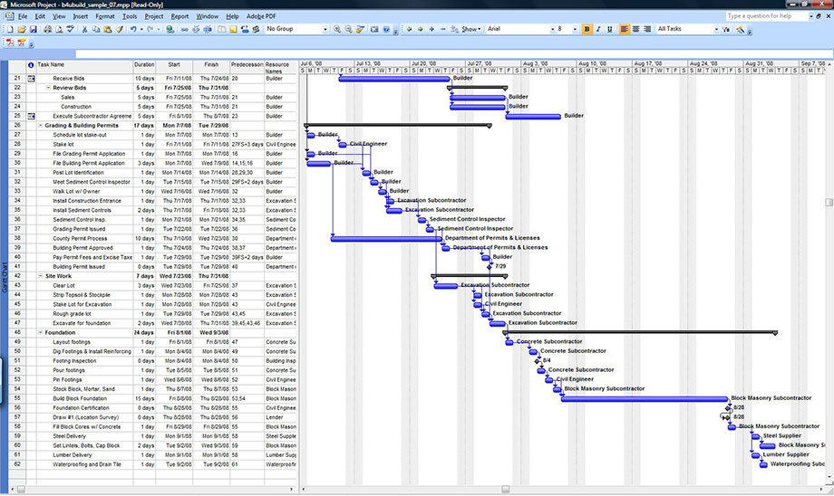
fOR THE Individual
* Be careful of doing too much & also too little.
* Have a process (Chapter 3)
* Be careful of person bias
With Others
* You are not a set of hands. Understand your content.
* Everyone has something different to contribute.
* Does someone on your team, workplace, friend, Instagram follower, etc. know more about this topic? Ask them.
“Being the smart person is more fun than obeying the smart person”
don't be a poser
DON't Be A Poser
* People who are _subject matter experts_(Chapter 4) will point this out
* The intended audience or user will always know more…unless the poster is about _your expertise_.


Be an Actor.
* Christopher Nolan Talking about Heath 'Joker' Ledger Behind the scene
* Act (Design) as if you know the content well
* Research, Analyze, and Understand the content
* Show up and act (Design) when you know the part well
* Diary of the Joker via Too Young to Die: Heath Ledger
Bigger picture. Seeing eye-to-eye. Other references. Sir Francis Bacon?
Why can’t we use same process in Design?
find purpose
* Why are you doing this at all?
* Research is a set of tools. Find the right one.
* What decisions need made? Are you rushing to a decision? Do you have enough information to make a decision.
* “ know what decisions are in play (the purpose) and what you’re asking about (the topic)”
Generative
* Generative research is fancy way of saying “lurking”
* Initial research done sometimes with surveys, e.g. Eastern Website redesign
* Once gathered, look for unmet needs, e.g your Assignments & Projects
* Looking for ideas for additional features or issues
* Research and analysis helps point out useful problems to solve
Descriptive and Explanatory research
* What you do when identified design problem. Stop looking to be told what the problem is. e.g. from a Professor, Client, Boss, etc.
* Do your homework to fully understand the **context**
* Ensure you design for audience not yourself
Move past: “What is a good problem to solve?” to “What is the best way to solve the problem I’ve identified?
Evaluative research
* Getting close to a good solution?
* Begin to define potential solutions
* research you can, and should, do in an ongoing and iterative way as you move through design
An iterative digital process is similar to subtractive stone sculpture, where fidelity is built up over many iterations.

CAsual Research
* People are using it in a certain way. Gif not Jif. Sorry Steve White.
* Be wary of _casal correlation_
* Understanding changes. Continuing discussion not ending it.
* Again, be careful with mixing up causality and correlation
Student A does not like course. Student A must quit school.
...
3.
The Process
In design, you’re solving for user needs and business goals.
In research, you’re solving for a lack of information
1. Define the problem
Problem Statement (The What)
* Verbs over nouns
* Avoid open ended questions
* Exploration is infinite
* How do you know when you’re finished?
* Are you solving the right problems?
identified what you want to find out, you can move on to how.
Recruit Teams Pt. 1
* Practice writing problem statements for an ideal and not-so-ideal team member
* What do you need to know — to move forward?
* Use Trello board
2. select the approach
Identify the Who
* Who: Primary point of contact?
* What: Do they do?
* Who: Do they answer to?
* What: Do they expect?
* Who: Will use this product/service/event/etc.
* What: Do they expect?
Time, money, people will determine an approach
3. Plan and research
Cont. to learn
* See Interview assignment as example
* Again, research helps answer design questions.
* “I have no Design questions”. Then you have no answers either. It’s just a guess
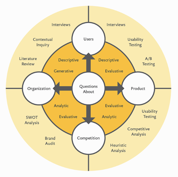
* What types of projects fit where in Fig. 3.1?
you’ll continue to learn more about research itself. Each activity will make you smarter and more efficient. So Much Win.
Recruit Teams Pt. 2
* Ask the right questions to get person best suited to your team
* What do you want to know?
* Create a screener via Typeform survey
human.
centered.
design.
HCI. HCD. UX. UI. etc.
* Expected behaviors must match users. Don’t ask vegans about best steak house.
* Tools & Knowledge: Touch gestures? Off screen swipes? Know your users. InVision will help with this testing.
* Be discretely vague and little-sneaky. “Are you free to work on Sundays?” Answers a lot questions.
Again. Humans **NEED** apply. Users are H-U-M-A-N. Design does not happen in vacuum.
4. Collect data
Recruit Teams Pt. 3
* Everyone complete survey
Materials & Tools
* Will be using later
Literature
* EWU & SCLD Librarians
* Go beyond a Google search. Please.
* PEW Internet
Interviewing
* “extract information from another person”
* “Being a good interviewer requires basic social skills, some practice, and a modicum of self-awareness.”
* Be A Fellow Human.
Recruit Teams Pt. 5
* Review the data
* Now you pick your Top 4 Candidates. These are the “Design Leads” of each team for Project 2
Do This First
* Revisit Step 1 and problem statements
* Ask everyone one the team. POV will indicate a lot. It’s a myth that Designers work completely alone
* Iterate our: Methodology, Process, and Tools. I.e. Atomic Design, Design Phases, and all tools used.
Identify From the Data
* Goals
* Priorities
* Tasks
* Motivations
* Barriers
* Habits
* Relationships
* Tools
* Environment
6. Report & record
Tools
* InVision app for Homework
* Trello boards for Lo-Fi & Hi-Fi
* InVision & Trello for feedback
...
4.
Organizations
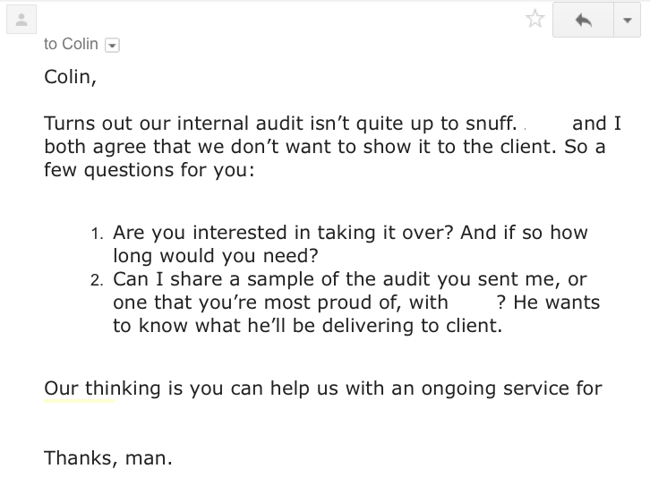
One Person is an Organization.
Ignore salaries, see:
* Job Titles
* Company Size
* Tasks
* Tools
* Process
Vacuum
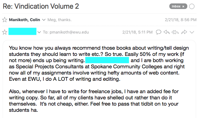
* Get away from the warm glow of your computer. Go Design. Design happens away from your computer. Production happens at it.
* Teams: If you’re designing for anyone other than yourself, a team is no smaller than two people. Get over it.
Design doesn’t happen in the deep, cold vacuum of space”
“Design happens in the warm, sweaty proximity of people with a lot on their minds. People create and join organizations to accomplish greater things more efficiently.
Design is Job.
* Budgets. Timelines. Deliverables. Contracts. Estimates. Invoices. Vendors. Service Providers.
* …and relationships.
* “I wish school was like Industry. Real projects.” - says most students. Be careful what you ask for.
* What became of that class project for a real client?
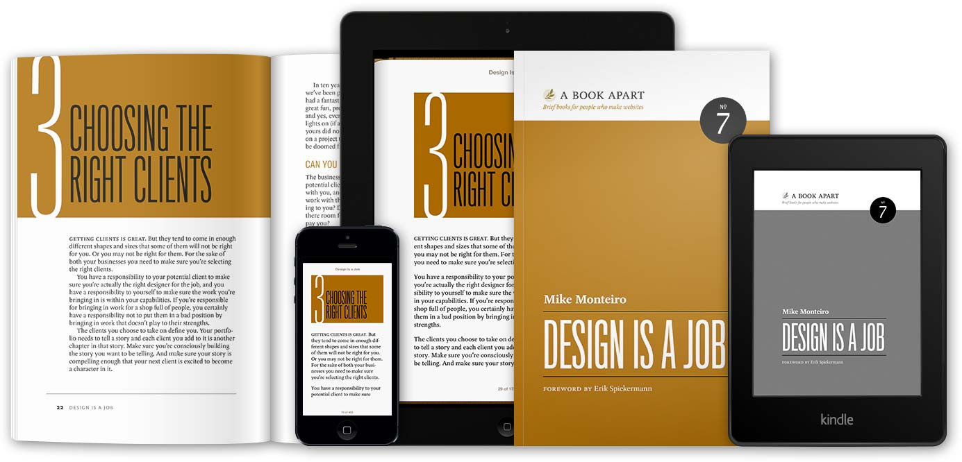
“You’ll be working directly with other individuals, but how you work with them will be more or less successful depending on your understanding of the organization.”
Stakeholders vs. clients
* “Most user-centered design studios interview client stakeholders—people whose jobs or roles will be directly affected by the outcome of the project”
* Who is the stakeholder in this project?
* Executives. Managers. Experts. Staff. Investors. The
Who will lose their job if this goes poorly?

interviewing
* “Asking the same question of different people will reveal crucial differences in motivation and understanding”
* “Asking a lot of questions can also make you sound quite smart”
Fail Fast. Fail Early.
* Get on with it. Stop messing around. You’re too invested in this one idea. Give yourself time to fail early.
* Iterate. Review. Repeat.
* Happy? Does it stand up to your own research?
* Academia is a safe place to fail. So do it.
When I Smile
“They can help you uncover areas of misalignment between a company’s documented strategy and the attitudes and day-to-day decision-making of stakeholders.”
* Hearing the same issues considered by different people
* What Person A expects, is always different than Person B. Even if they are on the same team.
If I can get two people arguing, I have done my job.
Pro Stakeholder tips
1. Designers: Do your job. Don’t ask them about typeface and color. Stop it.
2. Politics: They’ll be disagreements at best. Lawsuits at the worst. Get used to it.
3. Requirements: “If your work doesn’t support the business, you have failed, no matter how good the design.” They want to keep the lights on.
4. Priority: Your work may be killed. Get used to it.
5. Process: Rely on it. You will be derailed often.
6. Buy In: Get it in writing. Sign off on process throughout.
7. Organizational Impact: Employees in the same company make “Caller ID” and also “Caller Blocking”. Who is impacted by your work? Relate this to your projects.
Interview Approaches
* Individual: Best approach to start, then have group interviews near the end. Be objective.
* Group: Who is talking too much? Who is talking to little?
* Email: Avoid if possible. Have you ever put your all into a survey? Exactly.
Interview Structure
* Comfort: Make it easy on them. Really easy. They’re not UX professionals. Low fidelity and fast exercises.
* Sincerity: Show you want to help - genuinely. Good questions, “Snap of fingers what would you want?”. “How can I make your job easier?”.
* Listen: Listen more, than you talk. Again, no one wants to hear how much you know about UX Design patterns.
* Solutions: Get to the root of problem first. Hear their solutions next. Don’t rush to give your answers.
* Practice. Practice. Practice. Go on a blind date.
Stakeholder Analysis
* Define the problem statement
* What are the goals?
* What is a success?
* How will you know it’s done?
* What’s within your scope, budget, and timeline?
* CPC = Contingency Plan is Colin.
Create a clear statement of what you need to accomplish for the project to be considered a success by the organization.
what's NEXT?
...
5.
UI evaluation
More than eye candy. More than visual appeal. More than UI Porn
COLOR
CoLOR (REDUX)
- Colors are difficult to master-- easy to go overboard
- Rend to use competing colors that distract and just feels completely unnatural
- Temper your use of colors by focusing on its utility
- In doubt? Use colors only to draw attention to an element
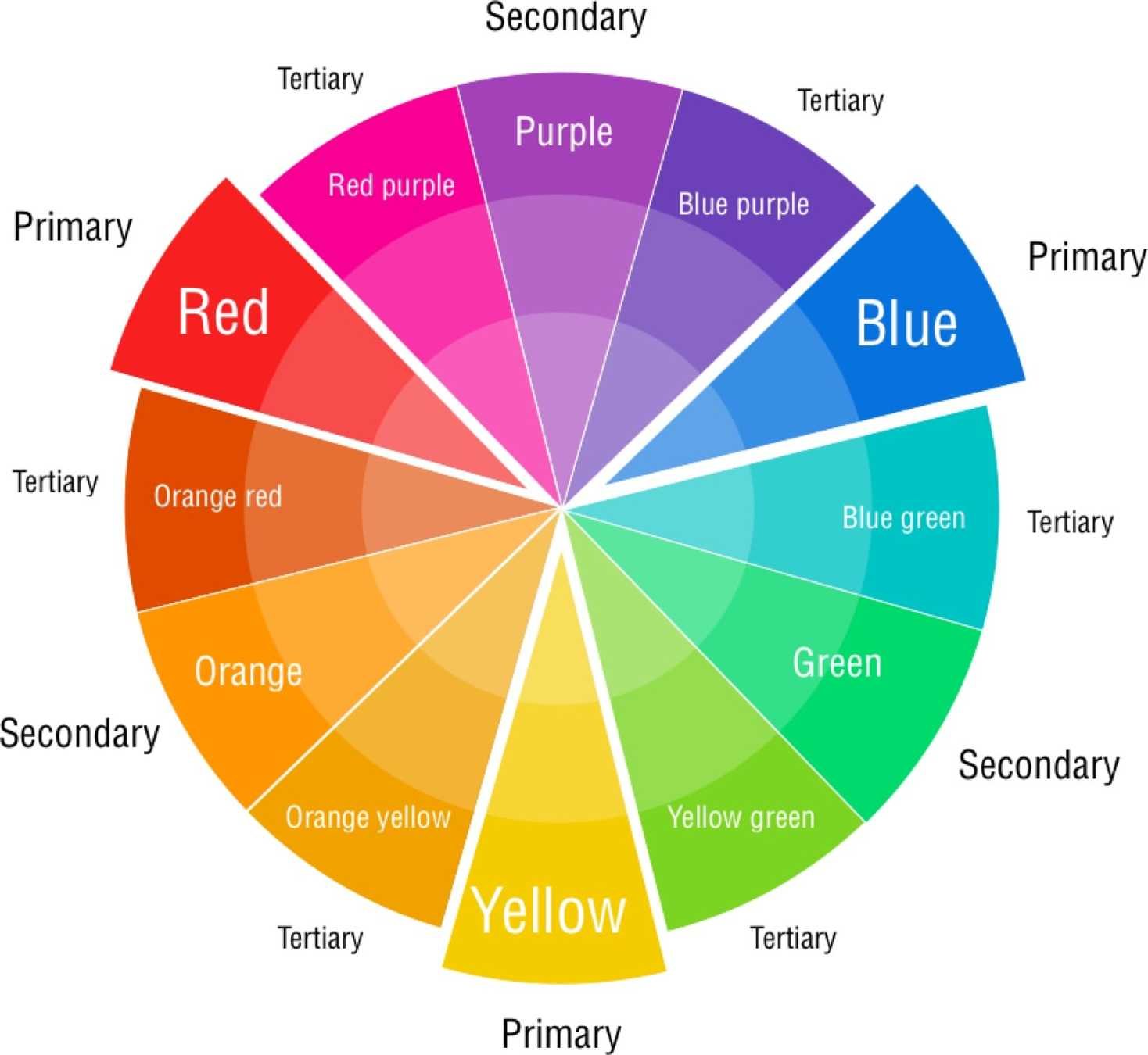
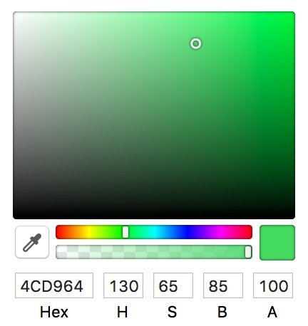
HSBA vs RGB(A)
- Understand the properties relevant to colors
- RGB is popular
- HSB to be a lot easier to manipulate
- Hard to tell how much Red, Green or Blue there is to a color
- Versus more-easily map in my mind how much Hue, Saturation, Brightness, and Alpha
Neurtrality
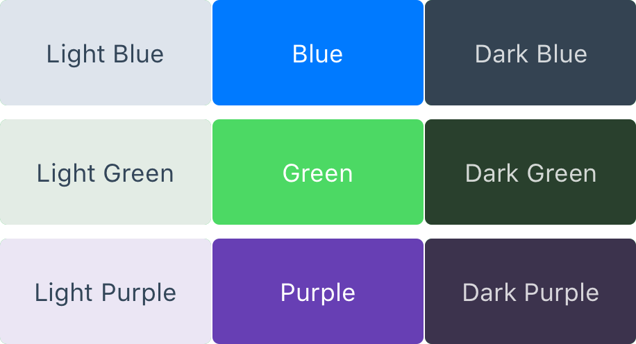
- Important aspect of colors are the neutral tones
- Neutrality kseep your designs from feeling too heavy
- Too many colors mean less usable over a long period of time
- neutral tones defer the user's attention to the content
Contrast
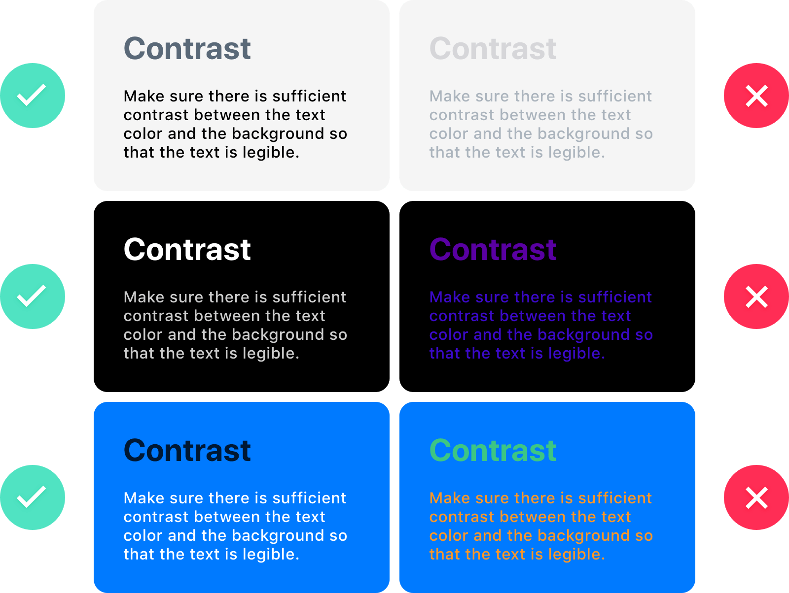
- Colors shouldn’t be in the way of legibility
- Allow comfortable reading and to immersion
- Good contrast, use opposite ends: white against black, light blue against dark blue, high brightness against low brightness
DArk vs light UI
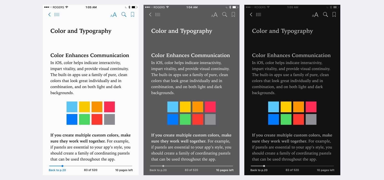
- Determine light or dark -- NOT BOTH
- Again, usability
- Think of iBooks: the user interface automatically switches to Dark mode when the ambient light is low
typography
TL;DR
- Stick to suggested UI fonts
- iOS, Android, Windows, macOS, even Linux has their preferred font
- Use it.
- With experience, you can determine your own
- UI text should usable and invisible
Typography as utility
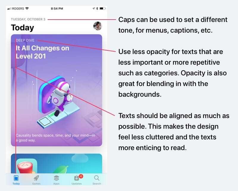
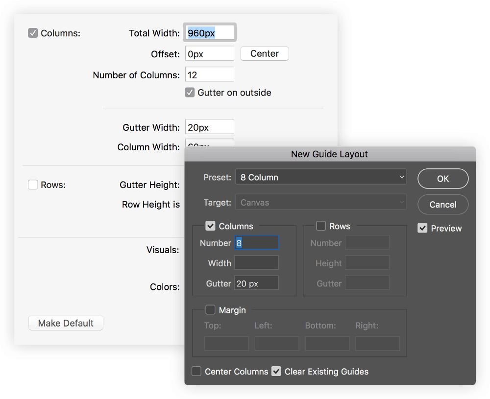
Grid system
Grids
- Grid is scaffold that is for UI
- Layout decisions should be made by designers not by developers or the technology
- Not for "boxy" designs, but consistency and predictability
- Refer to UX 1 Lecture
10 principles (redux)
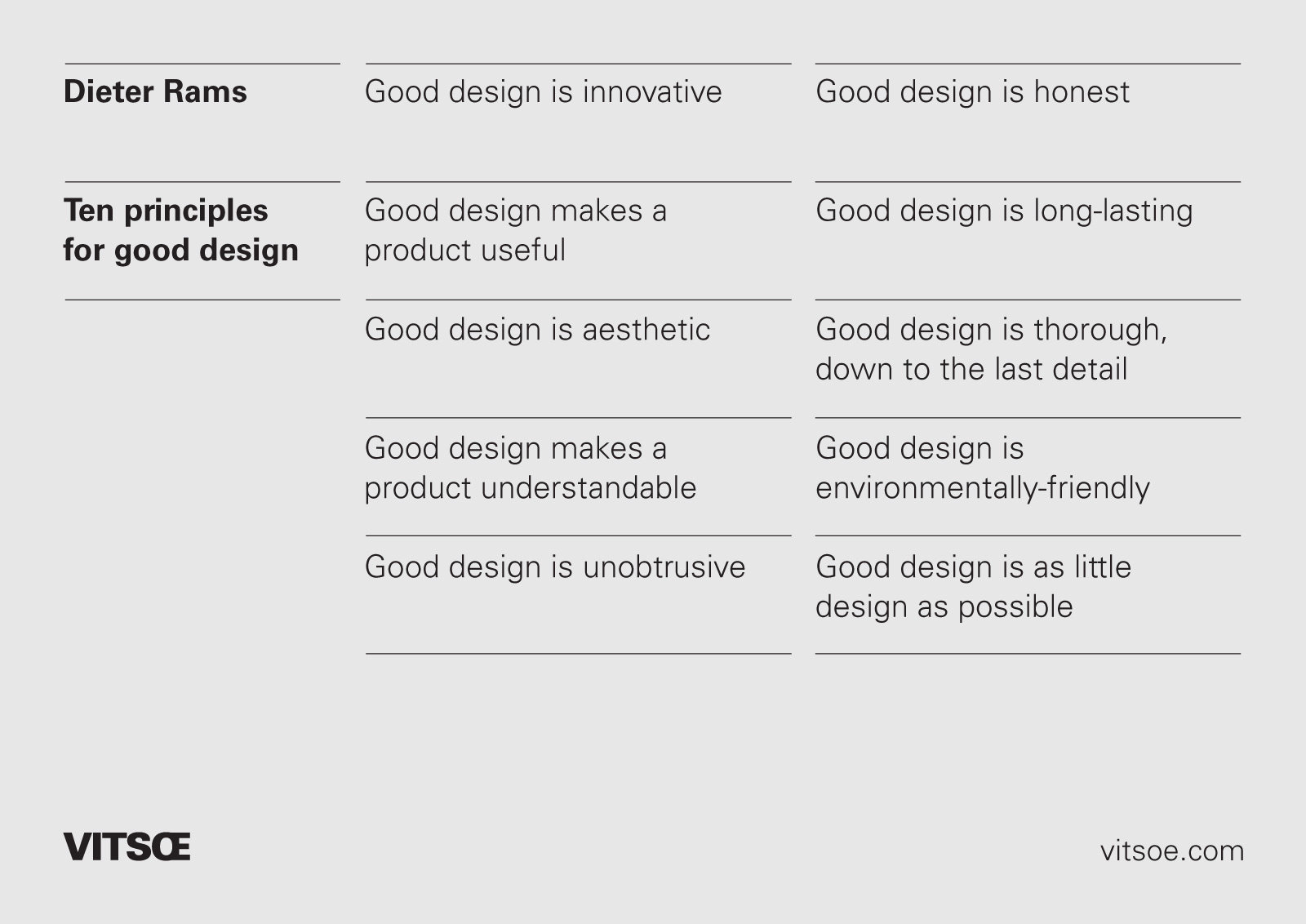
UI support Parts 1-4?
6. Advanced UI techniques
redux foundations
Sketch docs. Lynda. youtube. google.
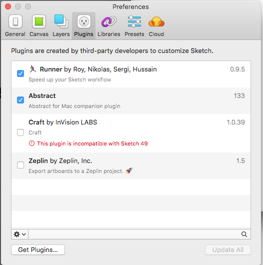
Sketch app From UX 1
- Foundations of Sketch UI
- Artboards, Pages, Layers, Folders
- Tools
- Symbols
- Symbol workflow via Atomic Design
- Nested
- Symbol Overrides
- Exporting Designs
- Sketch plugins
- Libraries
design
with
data
Why Design with DAta
- Real data for better idea of how the interface is going to work
- Make better decisions
- Account for edge cases
- Unseen alignment issues
- For Clients often have a hard time visualizing how a prototype
- Better idea and context, so better feedback/critique
Lorem Ipsum must die.
concepts review
story
Environment
* UX classes were derived from Web classes
* UX topics were apart of Web classes
* E.g.: Personas, Interaction Principles, Design Patterns, Research, and Fireworks or Photoshop
people
* Students earning a VCD degree
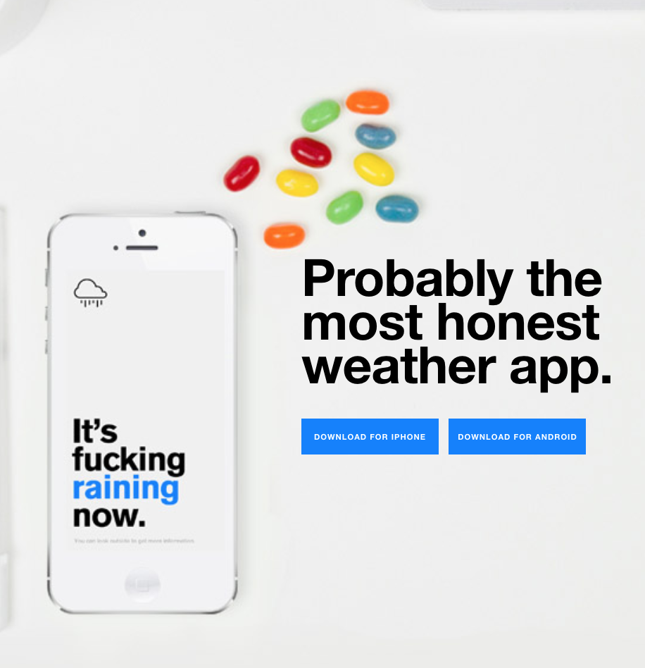
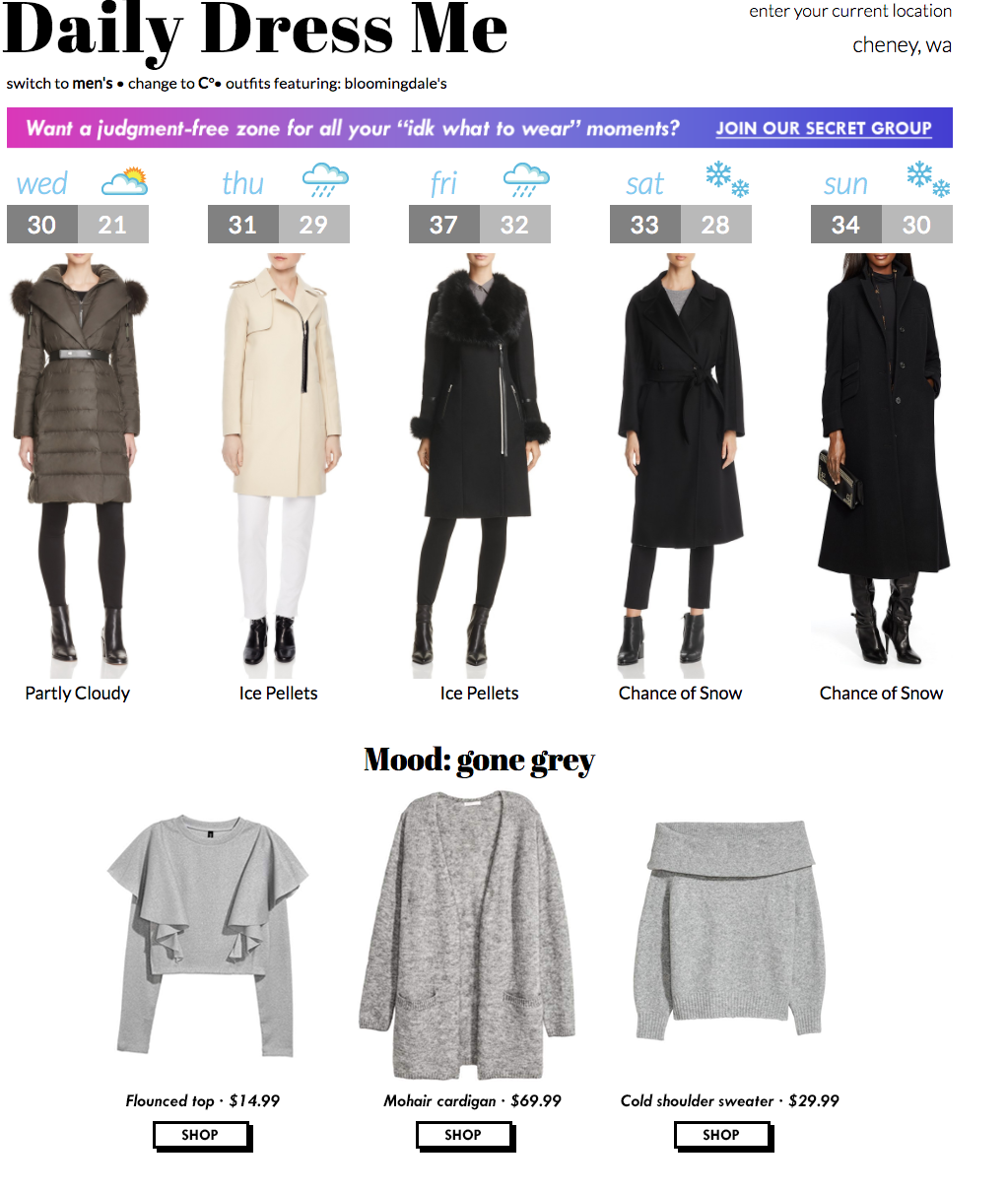
* All Web 2 classes design & developed a Weather Site
* Making an site/app for themselves or someone else
persona
persona
* Who are these students as statistics?
* Demographics are easy. Look it up.
* Better question, what are the stories?

mental model
established thinking
* What are preconceived notions of being a student?
* Do they check the weather now?
* How are weather conditions apart of student life?
I check a website. It's fine.

subjectivity
It's cold.
objectivity
35-45 degrees are classified as cold”
bias & Neutrality
bias
* I'll dress how I like.
neutrality
* I'll dress how the weather is like.
cognition
active & Passive. It's both.
Dictionary:
- the mental action or process of acquiring knowledge and understanding through thought, experience, and the senses.
- a result of this; a perception, sensation, notion, or intuition.

Testing
More than "Like"
* What to test for?
* Environments
* Participants
* Facilitators
* A/B Testing
data fidelity
choose appropiately
* Low Fidelity: lorem ipusm. ‘Block’ font.
* Medium Fidelity:
* High Fidelity: Actual data used
design with data
Lies damn lies and statistics
* metrics as inferences, not canon
* metrics as guides, not destination
* destinations are designed. Repeat this.
Modularity
Tools & Process
* Figma plugins
* Atomic Design Process
* Iterative Design process
people +
Story +
Data
= Experience
ASk better Questions
- Stop the bias
- Get the info w/o upsetting the interviewer
- See how Questions can be re-framed
That's not what I meant.
...but that is what you said.
...
DESN 348 (UX 2)
By Manikoth
DESN 348 (UX 2)
- 1,026


