<Web-Components>


Carlos Cañado


web components

HOW DO
YOU USE
bootstrap?
HOW DO
YOU USE
SEMANTIC UI?
HOW DO
YOU USE
fundation?
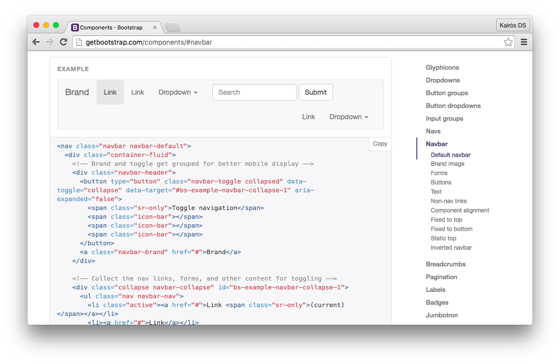
1. go to docs
2. COPY ALL THE THINGs
<nav class="navbar navbar-default">
  <div class="container-fluid">
    <!-- Brand and toggle get grouped for better mobile display -->
    <div class="navbar-header">
      <button type="button" class="navbar-toggle collapsed" data-toggle="collapse" data-target="#bs-example-navbar-collapse-1" aria-expanded="false">
        <span class="sr-only">Toggle navigation</span>
        <span class="icon-bar"></span>
        <span class="icon-bar"></span>
        <span class="icon-bar"></span>
      </button>
      <a class="navbar-brand" href="#">Brand</a>
    </div>

    <!-- Collect the nav links, forms, and other content for toggling -->
    <div class="collapse navbar-collapse" id="bs-example-navbar-collapse-1">
      <ul class="nav navbar-nav">
        <li class="active"><a href="#">Link <span class="sr-only">(current)</span></a></li>
        <li><a href="#">Link</a></li>
        <li class="dropdown">
          <a href="#" class="dropdown-toggle" data-toggle="dropdown" role="button" aria-haspopup="true" aria-expanded="false">Dropdown <span class="caret"></span></a>
          <ul class="dropdown-menu">
            <li><a href="#">Action</a></li>
            <li><a href="#">Another action</a></li>
            <li><a href="#">Something else here</a></li>
            <li role="separator" class="divider"></li>
            <li><a href="#">Separated link</a></li>
            <li role="separator" class="divider"></li>
            <li><a href="#">One more separated link</a></li>
          </ul>
        </li>
      </ul>
      <form class="navbar-form navbar-left" role="search">
        <div class="form-group">
          <input type="text" class="form-control" placeholder="Search">
        </div>
        <button type="submit" class="btn btn-default">Submit</button>
      </form>
      <ul class="nav navbar-nav navbar-right">
        <li><a href="#">Link</a></li>
        <li class="dropdown">
          <a href="#" class="dropdown-toggle" data-toggle="dropdown" role="button" aria-haspopup="true" aria-expanded="false">Dropdown <span class="caret"></span></a>
          <ul class="dropdown-menu">
            <li><a href="#">Action</a></li>
            <li><a href="#">Another action</a></li>
            <li><a href="#">Something else here</a></li>
            <li role="separator" class="divider"></li>
            <li><a href="#">Separated link</a></li>
          </ul>
        </li>
      </ul>
    </div><!-- /.navbar-collapse -->
  </div><!-- /.container-fluid -->
</nav>
3. recive widget
we can do better
2. COPY ALL THE THINGs
<nav class="navbar navbar-default">
  <div class="container-fluid">
    <!-- Brand and toggle get grouped for better mobile display -->
    <div class="navbar-header">
      <button type="button" class="navbar-toggle collapsed" data-toggle="collapse" data-target="#bs-example-navbar-collapse-1" aria-expanded="false">
        <span class="sr-only">Toggle navigation</span>
        <span class="icon-bar"></span>
        <span class="icon-bar"></span>
        <span class="icon-bar"></span>
      </button>
      <a class="navbar-brand" href="#">Brand</a>
    </div>

    <!-- Collect the nav links, forms, and other content for toggling -->
    <div class="collapse navbar-collapse" id="bs-example-navbar-collapse-1">
      <ul class="nav navbar-nav">
        <li class="active"><a href="#">Link <span class="sr-only">(current)</span></a></li>
        <li><a href="#">Link</a></li>
        <li class="dropdown">
          <a href="#" class="dropdown-toggle" data-toggle="dropdown" role="button" aria-haspopup="true" aria-expanded="false">Dropdown <span class="caret"></span></a>
          <ul class="dropdown-menu">
            <li><a href="#">Action</a></li>
            <li><a href="#">Another action</a></li>
            <li><a href="#">Something else here</a></li>
            <li role="separator" class="divider"></li>
            <li><a href="#">Separated link</a></li>
            <li role="separator" class="divider"></li>
            <li><a href="#">One more separated link</a></li>
          </ul>
        </li>
      </ul>
      <form class="navbar-form navbar-left" role="search">
        <div class="form-group">
          <input type="text" class="form-control" placeholder="Search">
        </div>
        <button type="submit" class="btn btn-default">Submit</button>
      </form>
      <ul class="nav navbar-nav navbar-right">
        <li><a href="#">Link</a></li>
        <li class="dropdown">
          <a href="#" class="dropdown-toggle" data-toggle="dropdown" role="button" aria-haspopup="true" aria-expanded="false">Dropdown <span class="caret"></span></a>
          <ul class="dropdown-menu">
            <li><a href="#">Action</a></li>
            <li><a href="#">Another action</a></li>
            <li><a href="#">Something else here</a></li>
            <li role="separator" class="divider"></li>
            <li><a href="#">Separated link</a></li>
          </ul>
        </li>
      </ul>
    </div><!-- /.navbar-collapse -->
  </div><!-- /.container-fluid -->
</nav>
2. use the thing
    <twbs-navbar>
      <a href="#">Home</a>
      <a href="#">About</a>
      <a href="#">Bacon</a>
    </twbs-navbar>
1. Create your own HTML element
2. Scope your styles
3. React with lifecycle callbacks
Not a new concept
Components for the web have been around for a long time, the idea of being able to write reusable and portable code is nothing new.

web components
web component
A web component is a standardised way of creating encapsulated, reusable user interface elements for the web.
- Set of standards that allow us to bundle markup, styles and scripts into custom HTML elements
- Slowly gaining support on browsers - but for now we need a polyfill (webcomponents.js)
- Google as the main driving force
- We have been using them but now we can also create our own
aspiration of any type of component
Extensibility
Composability
reusability
built on nothing more than web standards, this has some huge benefits
interoperability
lifespan
portability
Web Components Resources

Eric Bidelman
Meet the Web Components Family
based on a standart set of W3C Especification
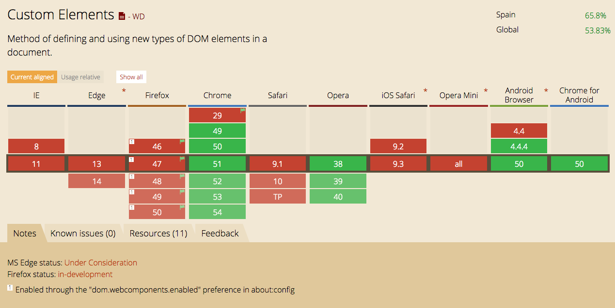
Custom Elements
Shadow DOM
HTML Templates
HTML Imports
a bit of history
<div> soup
Custom Elements
the <div> soup story
Familiar with this kind of code?
<div class="abFed">
    <div class="gTef">
        <div class="ErkF">
            <div class="qcSx">
                <div class="iYrh">
                </div>
            </div>
        </div>
    </div>
</div>
Should not we expect more from the Web Platform?
the <div> soup story
with no soup anymore
<chat-app org="acme">
    <room-list show-lobby="true" />
    <message-list view="detailed">
        <message user="..." text="..." />
        <message user="..." text="..." />
        <message user="..." text="..." />
        <message user="..." text="..." />
    </message-list>
</chat-app>
Sounds better, no?
Custom Elements
Especification to use new types of DOM elements in a document and extend
There are already custom elements shipped with HTML5
<video> <figure> <article> <header> <aside> <nav> ...
one element, one feature / role / function
Custom Elements Allow
- Define new HTML elements.
- Bundle together custom functionality into a single tag.
- Extend other elements.
- Extend the API of other DOM elements.
CODE AHEAD!!
define our own tag
Do you think that will be created?
[ Tag name must have a dash ]
<!-- find a name to your element -->

<my-element></my-element>
apply a style
Is it right? is it solved?
[ pseudo-class :unresolved ]
<style>
    my-element { color: red; }
    :unresolved { border: 1px solid black; }
</style>
register own OUR element
Create with custom prototypes
[ Proto must inherit from HTMLElement ]
var proto = Object.create(
  HTMLElement.prototype
);
var MyEl = document.registerElement(
  'my-element', { prototype: proto }
);
Now we can be imperative
Using JavaScript
<my-element></my-element>             // OR
document.createElement('my-element'); // OR
new MyEl();
Extend existing native elements
This type of element is called a Type Extension Custom Element. It lets you extend native elements APIs with your own properties
document.registerElement('x-super-input', {
  extends: 'input',
  prototype: Object.create(
    HTMLInputElement.prototype, {
      // custom prototype properties
    })
});
hooks: reactive composability
Supported callback functions for custom elements are called lifecycle callbacks
var proto = Object.create(
  HTMLElement.prototype
);
proto.createdCallback = function () {
  this.innerHTML =
    (this.getAttribute('name') || '?');
}
document.registerElement(
  'my-header', {prototype: proto}
);
Custom Elements callbacks
- createdCallback() - Called every time a custom element is created.
- attachedCallback() - Called when the element is attached to the DOM.
- detachedCallback() - Called when the element is removed from the DOM.
- attributeChangedCallback() - Called whenever one of the elements' attributes changes.
Shadow DOM

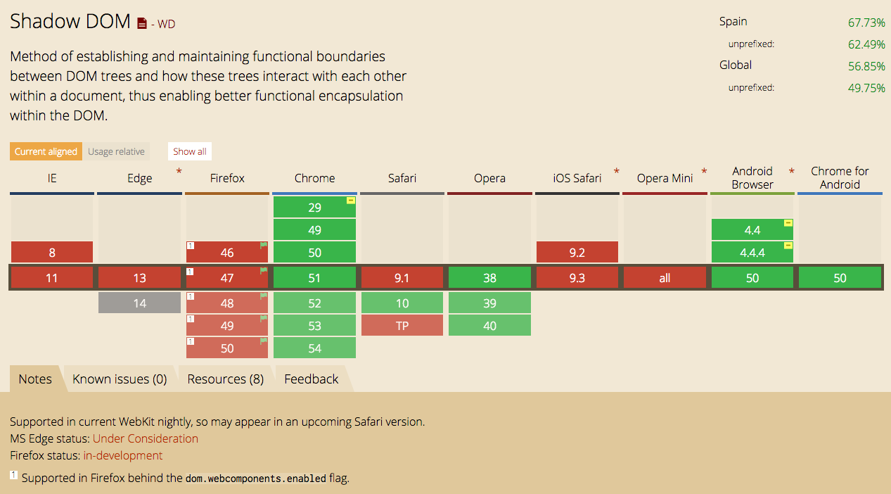
Shadow DOM
- Shadow DOM refers to the browser's ability to include a subtree of DOM elements into the rendering of a document.
- This allows developers to encapsulate their HTML, styles and script into a single component.
Shadow DOM Example
In example, let's consider the audio tag
    <audio src="http://developer.mozilla.org/@api/deki/files/2926/=AudioTest_(1).ogg"
      autoplay="autoplay" controls="controls">
        Your browser does not support the <code>audio</code> element.
    </audio>
Inspecting the element with Shadow Dom activated from dev tools, we can see the HTML markup for all rendered elements, inside the audio's shadow root.

Shadow host
The node that contains all of our shadow DOM
Shadow Root
The first node in the shadow DOM
Shadow Boundary
The barrier that protects our shadow DOM
<audio>
#document-
fragement
<div>
<div>
CODE AHEAD!!
Building the shadow dom
[ createShadowRoot is deprecated but, new API hasn't been standardized and none of the browsers currently support it ]
<div id="host"></div>

<script>
  var host = document.querySelector('#host');
  var root = host.createShadowRoot();
//  host.attachShadow({mode: 'open'});
</script>
Encapsulation
Encapsulation semi-permeably blocks content access and style leakage
  var span = document.createElement('span');

  span.textContent = 'This is Shadow DOM';

  root.appendChild(span);
Style encapsulation
Encapsulation of shadowed content access and style targeting can be breached if a developer explicitly chooses to do so
var span = host.querySelector('span');
// this query will return NULL

div span { color: red; }
/* this style will not be applied */

var span = host.querySelector('::shadow span');
// this query will return the shadowed span
<CONTENT> INSERTION
To show the shadow hosts' content in the presentation layer you have to add the <content> tag.
<content> will cherry pick all content from the shadow host and append it inside the shadow root.
<div class="widget">
  Hello, world!
  <p>This also gets rendered</p>
</div>
<script>
  var host = document.querySelector('.widget');
  var root = host.createShadowRoot();
  root.textContent += 'Im inside yr div!';
  root.textContent += '<content></content>';
</script>
<CONTENT> SELECTORS
Specific content can be taged with the select attribute.
<h3>Last Name:
  <content select=".last-name"></content>
</h3>
<h3>First Name:
  <content select=".first-name"></content>
</h3>
<h3>
  <content select=""></content>
</h3>

<div class="widget">
  Hello World
  <span class="first-name">Rob</span>
  <span class="last-name">Dodson</span>
</div>
Applying styles
- ::shadow pseudo element
- /deep/ combinator, which was replaced with a >>> combinator (or shadow piercing descendant combinator)
- ::content pseudo-element
- :host pseudo-class and :host() functional pseudo-class
- :host-context() functional pseudo-class
The editor's draft of CSS Scoping specification defines the selectors which are related to Shadow DOM. Specifically, it defines the following selectors related to Shadow DOM:
HTML Templates
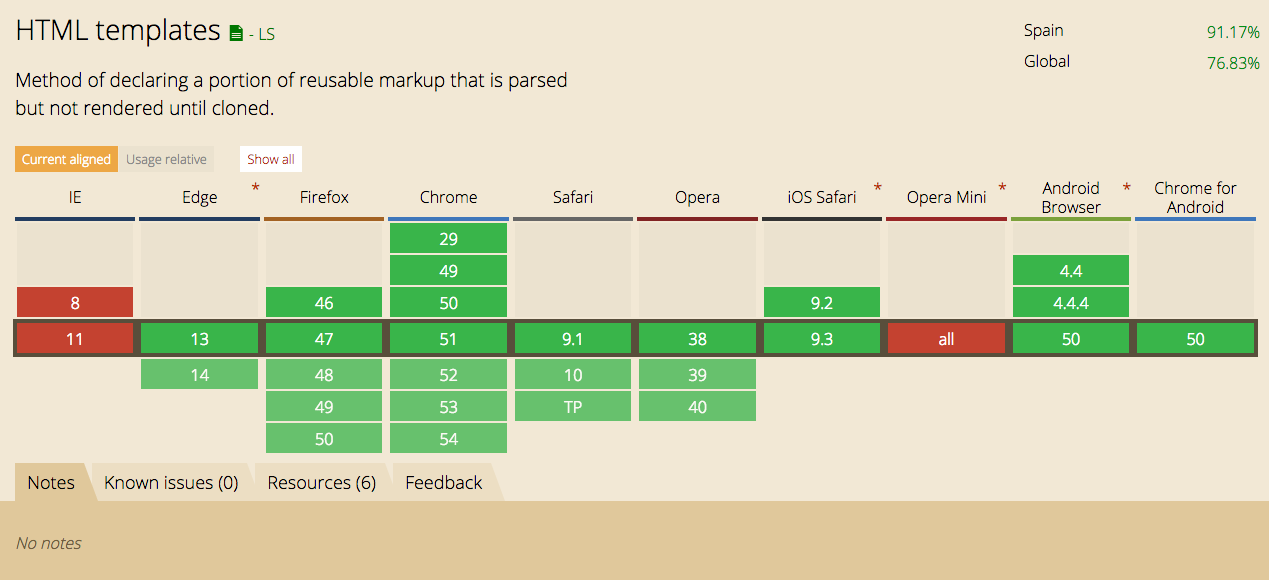
TEMPLATES ARE INERT CHUNKS OF DOM THAT CAN BE REUSED
HTML Templates
Declare fragments
<template> allows to declare HTML fragments
- parsed by browser
- inert at load time, not rendered
- only instantiated at runtime
which means
- <script> won't be executed
- <audio> won't be played
- no request to fetch <img> src
CODE AHEAD!!
Defining templates
Create your own, reusable templates using HTML markup
<template id="tmpl">
  <style>
    ...
  </style>
  <div>
    <h1>Web Components</h1>
    <img src="image.jpeg">
  </div>
</template>
Deep copy and using
Generate copies of your templates
var tmpl = document.querySelector('#tmpl');
var clone = tmpl.content.cloneNode(true);
document.body.appendChild(clone);

// var clone = document.importNode(
  tmpl.content, true
);
This example uses cloneNode() on the template's contents; it could equivalently have used document.importNode(), which does the same thing. The only difference between these two APIs is when the node document is updated: with cloneNode() it is updated when the nodes are appended with appendChild(), with document.importNode() it is updated when the nodes are cloned.
HTML Imports
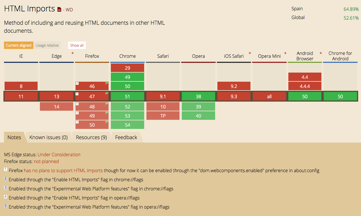
IMPORTS LOAD
EXTERNAL DOCUMENTS INTO YOUR PAGE
Import HTML sub-documents
Fetches included scripts, styles, and templates
<head>
  <link rel="import" href="/path/import.html">
</head>
callbacks
Act on import documents when they arrive, or fail due to an error
<script async>
  function importLoad(event) { }
  function importError(event) { }
</script>

<link rel="import"
      href="file.html"
      onload="importLoad(event)"
      onerror="importError(event)" />
imported resources
Utilize the imported resources when they arrive by accessing the import document attached to the link element
<script async>
function importLoad(event) {
  var doc = event.target.import;
  var tmpl = doc.querySelector('#widget');
  // do something with assets
}
</script>
Access parent document
Access the importing parent document or the imported sub-document via script from within the import sub-document
<!-- assume this is inside imported doc -->
<script>
  var doc =
    document.currentScript.ownerDocument;
  // hook to the imported sub-doc

  var mainDoc = doc;
  // the 'doc' variable is a reference
  // to the parent document that is
  // bringing in the import
</script>
Importing HTML documents
<head>
  <link rel="import" href="warnings.html">
</head>

<body>
  <script>
    var link = document.querySelector('link[rel="import"]');
    var content = link.import;

    // Grab DOM from warning.html's document.
    var el = content.querySelector('.warning');

    document.body.appendChild(el.cloneNode(true));
  </script>
</body>
Web Components Wrapping up

// component.html
<template id="template">
    <style>
        h1 { color: orange; }
    </style>
    <div>
        <h1>Web Components</h1>
        <img src="http://webcomponents.org/img/logo.png">
    </div>
</template>
<script>
    var template = document.getElementById("template");
</script>
<script src="js/component.js"></script>
An example with all the pieces together
// component.js
var myComponent = document.registerElement('my-component', {
    prototype: Object.create(HTMLElement.prototype, {
        createdCallback: {
            value: function() {
               var templateClone = template.content.cloneNode(true);
               var root = this.createShadowRoot()
               root.appendChild(templateClone);
            }
        }
    });
});
// index.html
...
<link rel="import" href="component.html">
</head>
<body>
<my-component>
<h1>This is a Custom Element</h1>
</my-component>
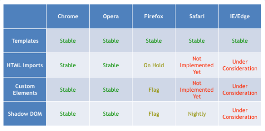
...Native Status
Native browser support is landing, but we'll still need polyfills for the foreseeable future
Polyfills
Piece of code (or plugin) that provides the technology that you, the developer, expect the browser to provide natively. Flattening the API landscape if you will.
There is a list of polyfills ranging from SVG to Android, Canvas for IE (using Silverlight as a bridge) to support <video>, <audio>, etc.
HTML5 Cross browser Polyfills
webcomponents.js is a set of polyfills built on top of the Web Components specifications. It makes it possible for developers to use these standards today across all modern browsers.
Libraries
Polymer
X-Tag
Bosonic
SkateJS
Polymer is a new type of library for the web, built on top of Web Components, and designed to leverage the evolving web platform on modern browsers.
X-Tag is a small JavaScript library, created and supported by Mozilla, that brings Web Components Custom Element capabilities to all modern browsers.
Bosonic is a set of tools that enable you to build Web Components as the spec currently describes, and supporting not-so-modern browsers like IE9.
SkateJS is a superset of the web component specs, with a very small footprint, that enables you to write performant web components using a functional rendering pipeline.
References
Challenge 1: Meme Tag
Description: Build a tag that displays top and bottom text over a meme picture
Requirements:
- The image and top/bottom text should be dynamically configurable via attributes
Extra Credit:
- Leverage a meme API to allow for grabbing meme pics on-demand
Challenge 2: Photo Stack
Description: Build a tag that arranges image elements in an organically uneven stack appearance
Requirements:
- Enable cycling through the stack on click and touch with an animated transition
- Handle new image elements being added dynamically
Extra Credit:
- Allow the order of the photo stacked images to be reversed using a boolean attribute
Challenge 3: Comment Feed
Description: Create a comment feed element that supports custom child elements for comments/replies
Requirements:
- Use custom elements for the main feed element, and the comment/reply elements it contains
- Store the page's comment data so it repopulates the feed on refresh
- Support common actions used in comments/replies: edit, delete, up-vote.
Extra Credit:
- Sync your comment data to a remote source that works regardless of the containing page's domain
Copy of Web Components
By Michael PAMBO OGNANA