CSS Frameworks: Bootstrap
Orson Xu
Spring 2023
Slides credited to Joel Ross
View of the Day
-
Q&A
-
Bootstrap Demo (code together!)
Q&A / Review

Semantic Class Names
Name CSS classes based on the semantic meaning (purpose) of the element they are styling.
<div class="forum-post">...</div>

<nav class="side-nav">...</div>

<img class="avatar-icon">...</div>

<article class="breaking-news">...</article>/* can use descendant selectors for more detail */
.forum-post img { ... }
.side-nav ul a { ... }Modular Class Names
Name CSS classes based on the (single) styling they apply. Combine multiple classes to style elements.
<div class="font-large text-red bg-secondary">...</div>

<img class="small rounded shadow">...</div>
.font-large {
font-size: 2em;
line-height: 1.4em;
}
.bg-secondary { background: #bbb; }
img.small { width: 140px; }
.rounded { border-radius: 50%; }Demo

Link the Framework
<head>
  <!--... other elements here...-->

  <!-- link Bootstrap -->
  <link rel="stylesheet"
        href="https://cdn.jsdelivr.net/npm/bootstrap@5.2.2/dist/css/bootstrap.min.css">

  <!-- link own stylesheets AFTER framework -->
  <link rel="stylesheet" href="css/my-style.css">
</head>
minified CSS file!
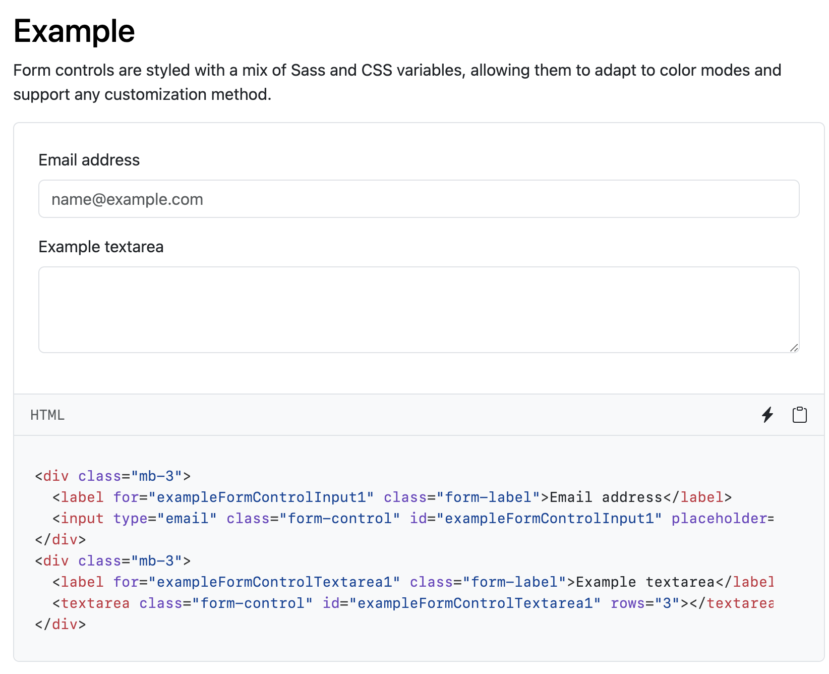
Utility Classes
Bootstrap provides rules that apply to particular classes. Give an element that class in order to style it in a certain way.


Components
Bootstrap provides components that you can easily leverage
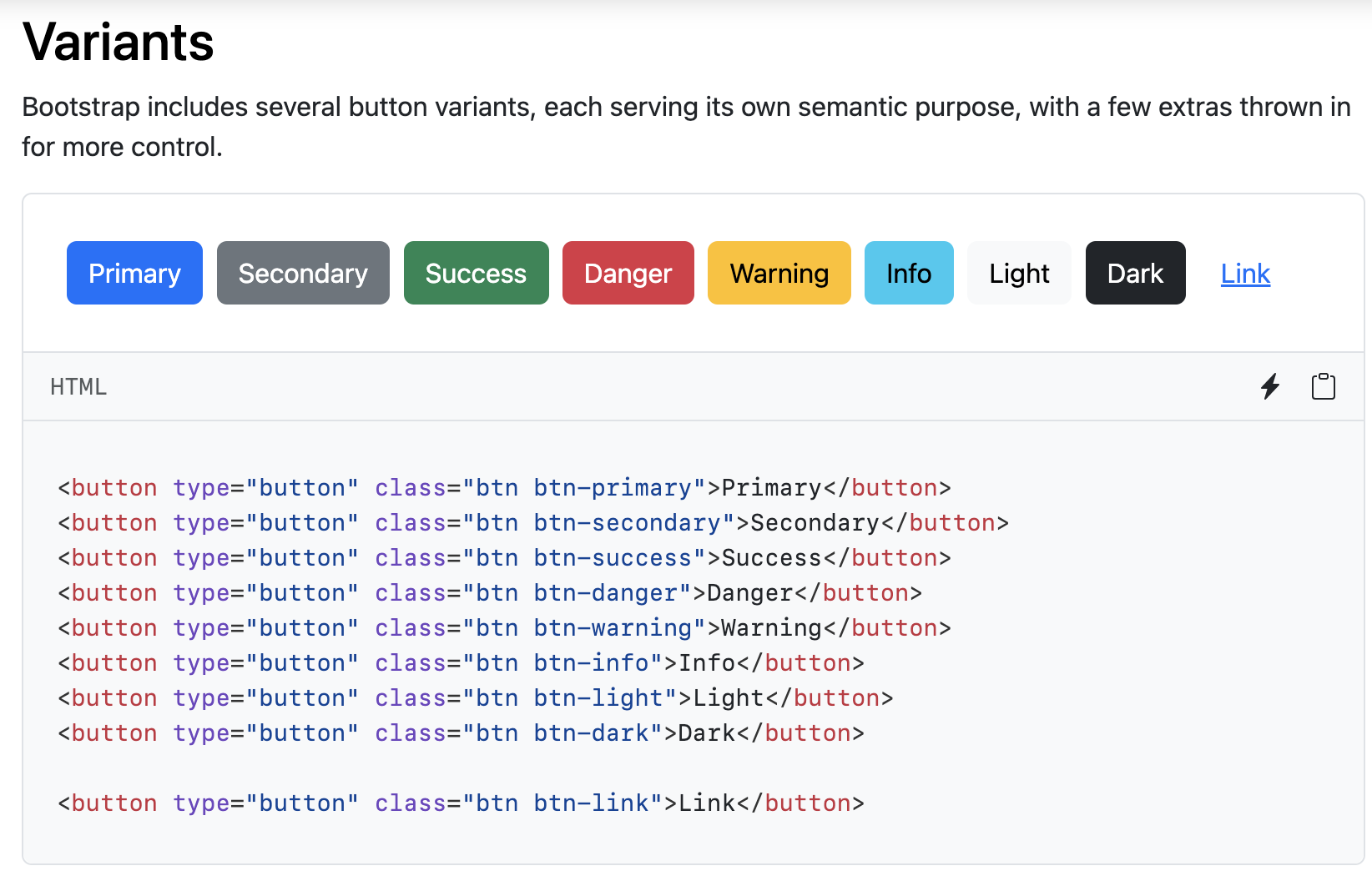
Button
Form
A short break
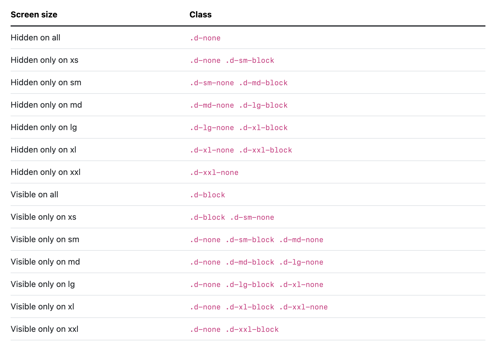
Responsive Utilities
Some Bootstrap utility classes provide ways to simply the responsive design.
Examples: display, padding, margin
Bootstrap Grids

row
row
column
column
column
Grid Columns
There are 12 columns in the grid
Elements can take up many columns
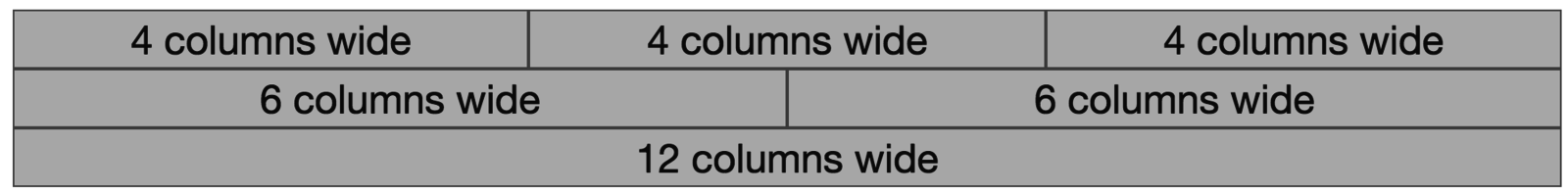
Row 1:

Row 2:
Row 3:
Specify columns based on screen-size

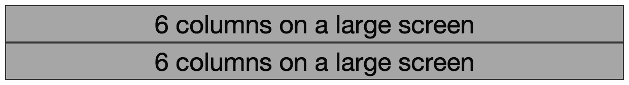
Smaller screen display
A Row:
Interactive Widgets
The Bootstrap framework provides some interactive "widgets" you can use without writing separate JavaScript code, just by using specific HTML attributes.
<!-- include Bootstrap library (before your script!) -->
<!-- copy script tag from the Bootstrap home page -->
<script src="https://cdn.jsdelivr.net/npm/bootstrap@5.2.2/dist/js/bootstrap.bundle.min.js"></script>
Example: Collapsables
As a simple example, you can make an element "collapsable" so that it disappears with a button click!
<button class="btn btn-primary"
        data-bs-toggle="collapse"
        data-bs-target="#collapseExample"
        aria-expanded="false" aria-controls="collapseExample">
   Button with data-bs-target
</button>


<div class="collapse" id="collapseExample">
    Some placeholder content for the collapse component. This panel is
    hidden by default but revealed when the user clicks the toggler.
</div>
aria for screen-readers
Example: NavBar
https://getbootstrap.com/docs/5.3/components/navbar/#toggler
An example of a NavBar with a collapsible "hamburger menu"
You can even copy it over and modify to fit your needs!
Action Items!
-
Read: through Chapter 10
Now is a good time to catch up!
Problem Set 04 due Wednesday
- Project Draft 1 due week from Monday
Next: JavaScript!!
info340b-sp23-bootstrap [wk3-2]
By Orson (Xuhai) Xu


