CSS Properties & Flexbox
Orson Xu
Spring 2023
Slides credited to Joel Ross
View of the Day
-
Admin Stuff
-
Q & A (PollEv)
-
Quick Fonts Demo (code together!)
-
CSS Layouts (PollEv)
-
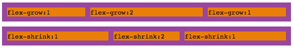
Flexbox Demo (code together!)
Project Proposal
Telling us what you're going to build!
- What are the interactive features (what does it do)?
- Written as simple web page (HTML & CSS)
- All group members need to commit change
- Peer Feedback (though Feedback Fruits)
- How did your teammates help you learn?
- How did your teammates communicate/manage work?
- NOT about how much code someone wrote!
- I plan to release the ("anonymous") comments afterwards

START WORKING ON
PROBLEM SET 03 EARLY!
It's a bigger problem set (3 problems!) and will take you longer than the previous one. Don't put it off and fall behind! Start tonight!
Updating Lecture Code
How do I force "git pull" to overwrite local files?
/* First, update all origin/<branch> refs to latest: */

git fetch --all

/* Backup your current branch (e.g. main): */

git branch backup-main

/* Jump to the latest commit on origin/main and checkout those files: */

git reset --hard origin/main
Q&A / Review

It is also possible to specify an online font that the browser will download and display.
Fonts
Fonts are installed "per computer", so not every computer has the same fonts (which is why you set a default with font-family).
Fonts are installed "per computer", so not every computer has the same fonts (which is why you set a default with font-family).
p {
  font-family: 'Helvetica', 'Arial', sans-serif;
}
Use this font
If first isn't available,
use this
If nothing else,
use this style of font-face
Font Units
All browsers have a "default" font size--generally 16px. We use relative font sizing in case of variations.
Note that units are "measurement units" (think: inches)
| em | relative to the parent font size | By default 2em = 32px But if the parent's font-size was 20px, then 2em = 40px |
| rem | relative to the root (body's) font size of 16px | 2rem = 32px usually |
| % | relative to parent font size or dimension, can use for width or height | if parent width is 300px, then 50% = 150px |
| px | absolute measurement (do not use for fonts) | 16px = 16px |
A short break
Inline vs. Block
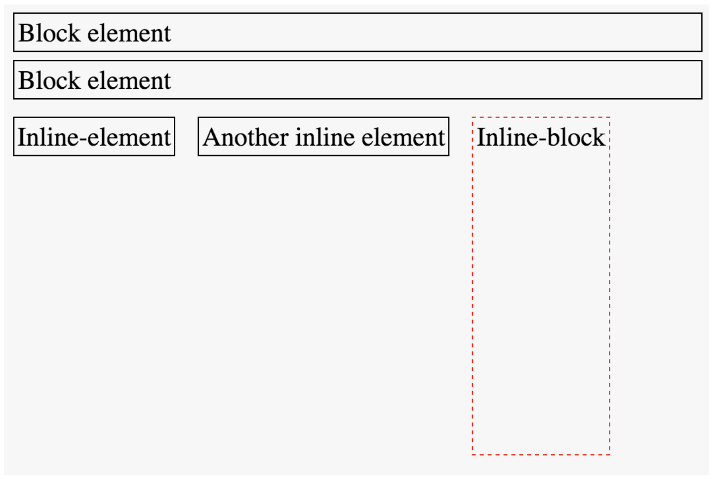
You can use the display property to set whether an element is block or inline (or something else).
Choose elements based on semantics, not appearance!
AVOID USING
float AND position PROPERTIES!
Box Model
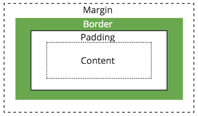
Apply spacing to elements by manipulating the size of their "box".
A short break
Demo: Flexbox
Occam's Razor Principle
Start with the simplest!
Action Items!
-
Read: Chapter 8
-
Project Proposal due Friday!!
-
Problem Set 03 due next week
-
GET STARTED TONIGHT!
-
Next: Responsive Design & Media Queries
Info340b-sp23-css-flexbox [wk2-2]
By Orson (Xuhai) Xu


