Responsive CSS
Orson Xu
Spring 2023
Slides credited to Joel Ross
View of the Day
-
Project Draft 1 overview
-
Q&A
-
Flexbox/etc Review (code together!)
-
Media Queries Demo (code together!)
Project Draft 1
The complete HTML & CSS. A static "screenshot" of what your app will look like.
- Include all of your "pages"!
- Can include just a single example of a "details" page
- May need to copy/paste shared elements (navbars) for now
- Include all sections and components (forms, etc)
- Skip user login forms; we'll provide that through a library
- Be clear what the user will "do" with your app -- where do instructions/etc go?
Project Draft 1
Code requirements:
- Well-written, semantic HTML
-
Significant CSS & styling
- Must include a flexbox or grid (Bootstrap is okay)
-
Accessible
- Check your alts and headings!
-
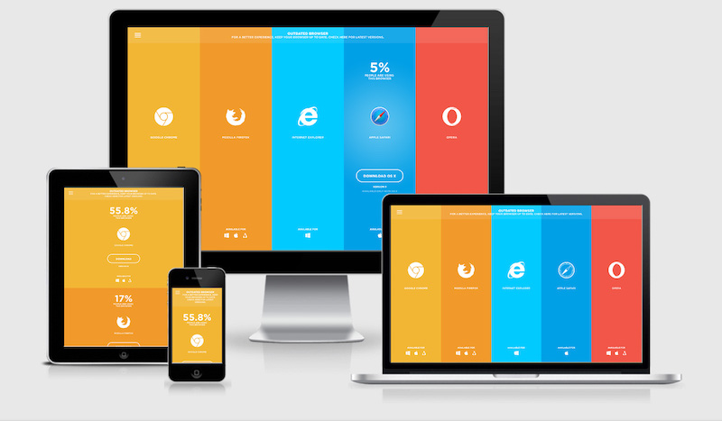
Responsive
- Must include a meaningful media query!
Project Draft 1
Working as a group:
- All group members are responsible for all aspects of the project. Projects are graded as a single piece of work.
- Do not divide up work by language -- everyone needs to contribute to both HTML and CSS
- Everyone needs to check everything. Don't think of it as "Eddy's page" or "Megha's page". It is your group's project
- Must use git to code collaboratively. We will be checking for commits from all group members.
- Each individual needs to demonstrate understanding of the material.
Q&A / Review

Updating Lecture Code
/* First, update all origin/<branch> refs to latest: */

git fetch --all

/* Backup your current branch (e.g. main): */

git branch backup-main

/* Jump to the latest commit on origin/main and checkout those files: */

git reset --hard origin/main
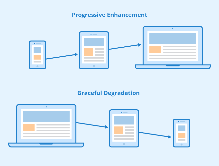
Viewport <meta>
Include the viewport meta element to allow your code to control responsive appearances (rather than the browser).
<head>
  <meta charset="utf-8"> <!-- always need this -->
  <meta name="viewport" content="width=device-width, initial-scale=1, shrink-to-fit=no">

  <!-- more head elements, including <link> ... -->
</head>
Media Queries
/* A Media Query */
@media (min-width: 768px) {
   /* these rules apply ONLY on screens 768px and wider */

   /* a normal CSS rule */
   body {
      font-size: 1.5em;
      background-color: beige;
   }

   /* another CSS rule */
   .mobile-call-icon {
      display: none; /* don't show on large displays */
   }
}
Action Items!
-
Read: through Chapter 9
-
Problem Set 03 due Wednesday
-
Problem Set 04 due next week
Next: CSS Frameworks (Bootstrap)
info340b-sp23-css-responsive [wk3-1]
By Orson (Xuhai) Xu


