Angular animations

Setup

import { NgModule } from '@angular/core';
import { BrowserAnimationsModule } from '@angular/platform-browser/animations';

@NgModule({
  imports: [
    BrowserAnimationsModule
  ],
})
import { NgModule } from '@angular/core';
import { NoopAnimationsModule } from '@angular/platform-browser/animations';

@NgModule({
  imports: [
    NoopAnimationsModule
  ],
})
Angular also comes with NoopAnimationsModule which you can use to disable all animations globally. It is more commonly used for testing to mock the real animation when the animations are either too slow or doesn't play any role in what is being tested.
JS/CSS convention

// Camel Case
style({
  backgroundColor: 'green',
  fontSize: '20px',
});

// Dashed Case
style({
  'background-color': 'green',
  'font-size': '20px',
});
State Change

Angular lets you define a style and transition to be applied when an element’s state changes. Angular provides 3 different states which we could use in our animation code:
-
Wildcard (_)- this is the default or all states of the element, for exampleactive => _represents a state change from active to anything else. -
Void (void)- this is the state when the element is created but not yet part of the DOM, or when the element is removed from the DOM. -
Custom- this can be any custom name to indicate a certain state of the element (example:'active','inactive').
Basic anatomy

-
trigger- accepts a name for the animation trigger and an array of state and transition methods to configure the animation - state - accepts a name for the state and the styles that should be conditionally applied when in specified state
- style - CSS styles to be applied
- transition - specifies the configuration for transitioning between the different states and its direction
- animate - specifies the duration and any additional css animation properties such as easing

import { trigger, state, style, animate, transition } from '@angular/animations';

@Component({
  ...
  animations: [
    trigger('enabledStateChange', [
      state(
        'default',
        style({
          opacity: 1,
        })
      ),
      state(
        'disabled',
        style({
          opacity: 0.5,
        })
      ),
      transition('* => *', animate('300ms ease-out')),
    ])
  ]
})
<div [@enabledStateChange]="stateOfElement">...</div>Demo


Enter & leave

trigger('fadeSlideInOut', [
  transition(':enter', [
    style({ opacity: 0, transform: 'translateY(10px)' }),
    animate('500ms', style({ opacity: 1, transform: 'translateY(0)' })),
  ]),
  transition(':leave', [
    animate('500ms', style({ opacity: 0, transform: 'translateY(10px)' })),
  ]),
]),
<div *ngIf="show" @fadeSlideInOut>...</div>Angular also provides some useful aliases such as :enter and :leave to animate elements entering and leaving the DOM. These aliases are essentially transitions to and from the void state, i.e. void => * and * => void respectively.
Order of Execution

Angular animations happen after what triggers them. For instance, the :enter state change will get called after ngOnInit and the first change detection cycle whereas :leave would happen right after the element ngOnDestroy is called. In addition, each time an animation is triggered, the parent animation will have priority over the children, blocking all child animations from executing unless explicitly stated to execute both. In order to run both animations, the parent animation must query each element containing the child animations and run it using the animateChild method.
Demo


Sequence

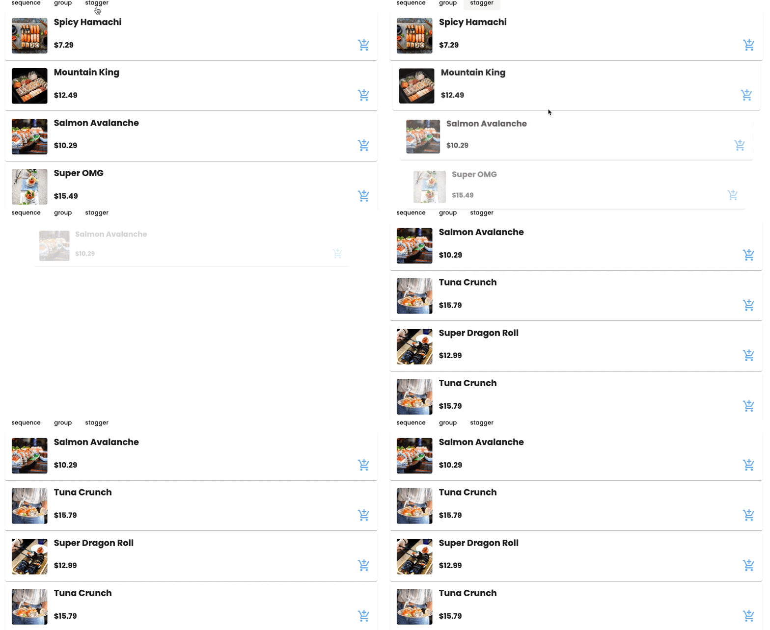
Animations can run both in sequence and in parallel using the functions sequence() and group() respectively. A combination of parallel and sequence can also be used where the animation runs with a cascading delay between the elements. This effect is achieved using stagger().
Running animations sequentially

sequence() lets you run several animation steps in sequence.
animations: [
  trigger(‘fadeInGrow, [
    transition(‘:enter’, [
     query(':enter', [
        style(ExitStyle),
        sequence([
          animate('1500ms ease-in', style({ opacity: 1 })),
          animate('1500ms', style({ transform: 'scale(1)' })),
        ]),
      ]),
    ])
  ])
]
Demo


Run Animations in Parallel

group() lets you run multiple animation steps in parallel.
animations: [
  trigger(‘fadeInGrow, [
    transition(‘:enter’, [
      query(':enter', [
        style(ExitStyle),
        // different eases
        group([
          animate('1000ms ease-in', style({ opacity: 1 })),
          animate('1500ms', style({ transform: 'scale(1)' })),
        ]),
      ]),
    ])
  ])
]
Demo


Run Animations in stagger

stagger() unique is that it takes in an additional parameter timing to specify the delay for the animation’s execution for each element creating a cascading effect.
animations: [
  trigger('fadeGrowStagger', [
    transition(':enter', [
      query(':enter', [
        style(ExitStyle),
        stagger('100ms', [animate('500ms', style(EnterStyle))]),
      ]),
    ]),
    transition(':leave', [
      query(':leave', [
        stagger('100ms', [animate('500ms', style(ExitStyle))]),
      ]),
    ]),
  ]),
]
Demo


Multi-step Animation using Angular Keyframes

Angular’s keyframe function comes with an offset property which accepts decimals ranging from 0 to 1 to specify the steps of our animation. These are identical to the CSS keyframe counterparts of using percentages or to and from properties that we normally use to specify our animation steps.
@keyframes 'fadeSlideGrowKeyframe' {
  30% {
    transform: opacity(1) ’;
  }
  60% {
    transform: ‘translateY(0) ’;
  }
  100% {
    transform: ‘scale(1) ’;
  }
}
Example

trigger('fadeSlideGrowKeyframe', [
  transition(':enter', [
    style({ opacity: 0, transform: 'scale(0.5) translateY(50px)' }),
    animate(
      '500ms',
      keyframes([
        style({ opacity: 1, offset: 0.3 }),
        style({ transform: 'translateY(0)', offset: 0.6 }),
        style({ transform: 'scale(1)', offset: 1 }),
      ])
    ),
  ]),
]);
Demo


Target Multiple Elements (Query)

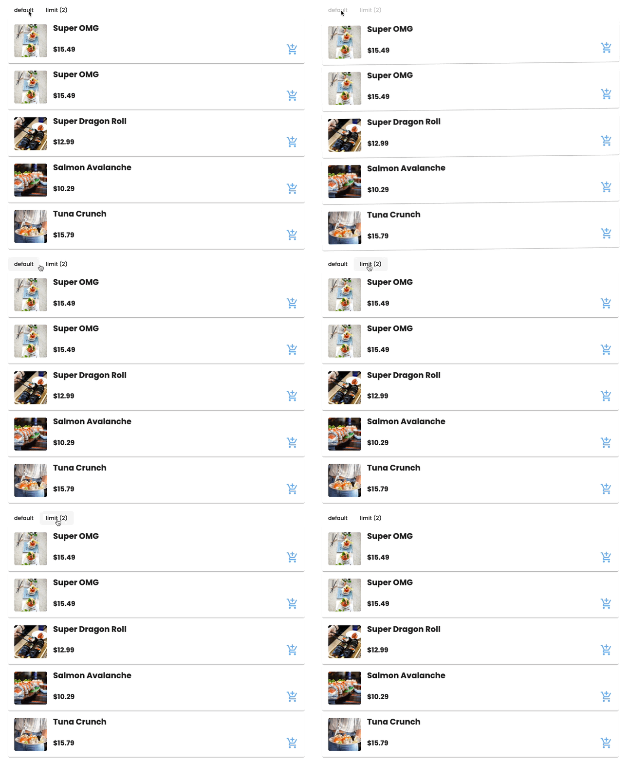
A difference of using query compared to targeting a specific element is where the trigger is applied to. When using query, the animation trigger will be applied to the parent, where the query function will look for elements that meet the query parameters within the parent (including nested children) which can then be used to execute some animation. Out of the box, query accepts the following tokens:
-
:enterand:exit- returns all elements that are inserted or removed -
:animating- returns all elements that are currently animating -
:self- returns current element -
@{animationName}- returns all elements with a matching animation trigger

const ShakeAnimation = [
  style({ transform: 'rotate(0)' }),
  animate('0.1s', style({ transform: 'rotate(2deg)' })),
  animate('0.1s', style({ transform: 'rotate(-2deg)' })),
  animate('0.1s', style({ transform: 'rotate(2deg)' })),
  animate('0.1s', style({ transform: 'rotate(0)' })),
];

export const QueryShake = [
  trigger('queryShake', [
    transition('* => default', [query('.card', ShakeAnimation)]),
  ]),
];
export const QueryShake = [
  trigger('queryShake', [
    transition('* => withLimit', [
      query('.card', ShakeAnimation, {
        limit: 2,
      }),
    ]),
  ]),
];
This is particularly useful if you want to add some animations only to the first few or the last few of a set of dynamic elements (such as elements that are created with *ngFor).
Limiting the Number of Elements Queried

Demo


Animate Children Elements
Angular animation comes with a handy function called animateChild() which as the name suggests, executes the child’s animation. You might be asking why would we need this if we can execute the child’s animation independent of the parent? Let’s say we have a simple container with 2 children, each with its own set of animations (different triggers) with the following structure.
By default, throws an error when zero items are found. Set the optional flag to ignore this error.
<div *ngIf="”isDisplayed”" @container>
  <div @enterExitLeft></div>
  <div @enterExitRight></div>
</div>
export const Container = [
trigger('container', [
transition(':enter, :leave', [
query('@*', animateChild(), { optional: true }),
]),
]),
];
export const EnterExitLeft = [
  trigger('enterExitLeft', [
    transition(':enter', [
      style({ opacity: 0, transform: 'translateX(-200px)' }),
      animate(
        '300ms ease-in',
        style({ opacity: 1, transform: 'translateX(0)' })
      ),
    ]),
    transition(':leave', [
      animate(
        '300ms ease-in',
        style({ opacity: 0, transform: 'translateX(-200px)' })
      ),
    ]),
  ]),
];

export const EnterExitRight = [
  trigger('enterExitRight', [
    transition(':enter', [
      style({ opacity: 0, transform: 'translateX(200px)' }),
      animate(
        '300ms ease-in',
        style({ opacity: 1, transform: 'translateX(0)' })
      ),
    ]),
    transition(':leave', [
      animate(
        '300ms ease-in',
        style({ opacity: 0, transform: 'translateX(200px)' })
      ),
    ]),
  ]),
];
Demo

What the code above does is it tells the parent to find all the children of the element with an animation trigger (anything that starts with @) attached to it, and run the animation as part of the parent’s animation sequence

Disable Animation
This property disables all the animation on the element itself and all the children of the element, including those that are rendered from within a router outlet. Under the hood @.disabled adds/removes .ng-animate-disabled class on the element where it's applied.
<div [@.disabled]="disableAnimationCondition">
  <div [@animate]="expression">Animate</div>
</div>
Toggling the disabled state for the entire application can be done by adding the disabled property through a HostBinding on the top level AppComponent like the snippet below. This will disable all the animations throughout the application, with a few exceptions that will be covered in the following section.
export class AppComponent {
  @HostBinding('@.disabled') private disabled = true;
}
Some gotchas of this property
The disabled property only targets Angular animations, hence animations that are implemented using CSS transitions or keyframe animations won’t be disabled.
Another caveat: it won’t work for elements that are appended to the DOM directly. Some examples of these types of elements are overlays and modals.
constructor( private overlayContainer: OverlayContainer, private renderer:Renderer2 ) {
  const disableAnimations: boolean = true;

  // get overlay container to set property that disables animations
  // Note: how to get the container element might vary depending on what the element is
   const overlayContainerElement: HTMLElement = this.overlayContainer;

  // angular animations renderer hooks up the logic to disable animations into setProperty
  this.renderer.setProperty( overlayContainerElement, "@.disabled", disableAnimations );
}
Attribute Directive and Animation Builder
Unlike building out a custom component with the animations and reusing the components, a directive lets you attach just the behavior to any element in your application, which makes it more flexible if we want to reuse the same animation across different elements or components.

import { Directive, HostListener, ElementRef } from '@angular/core';
import {
  AnimationBuilder,
  AnimationMetadata,
  style,
  animate,
} from '@angular/animations';

@Directive({
  selector: '[appFadeMouseDown]',
})
export class FadeMouseDownDirective {
  @HostListener('mousedown') mouseDown() {
    this.playAnimation(this.getFadeOutAnimation());
  }

  @HostListener('mouseup') mouseUp() {
    this.playAnimation(this.getFadeInAnimation());
  }

  constructor(private builder: AnimationBuilder, private el: ElementRef) {}

  private playAnimation(animationMetaData: AnimationMetadata[]): void {
    const animation = this.builder.build(animationMetaData);
    const player = animation.create(this.el.nativeElement);
    player.play();
  }

  private getFadeInAnimation(): AnimationMetadata[] {
    return [animate('400ms ease-in', style({ opacity: 1 }))];
  }

  private getFadeOutAnimation(): AnimationMetadata[] {
    return [animate('400ms ease-in', style({ opacity: 0.5 }))];
  }
}
Reusing Animations
A lot of times some animations get reused in several places in the application which tend to lead to duplicated animation code in several components. We could abstract our animation code in a few different ways depending on the use case which I will show below to keep our animation code as DRY as possible.

Abstracting the entire animation trigger
You can abstract out your entire trigger into a separate file and use a combination of different triggers in the animations array in the component's decorator by passing in the imported animations.
// fade.animation.ts
export const Fade = trigger('fade', [
  transition(':enter', [
    style({ opacity: 0 }),
    animate('500ms', style({ opacity: 1 })),
  ]),
  transition(':leave', [animate('500ms', style({ opacity: 0 }))]),
]);
import { Fade } from './fade.animation';
@Component({
animations: [Fade],
})
Using the AnimationReferenceMetadata
This approach lets you pass in additional parameters to your animation making it configurable depending on the caller. A limitation to this is that it only works with pre compiled values.
export const Slide = animation([
  style({ transform: 'translate({{x}}px, {{y}}px)' }),
  animate('{{duration}}s', style({ transform: 'translate(0,0)' })),
]);
...
trigger('slide', [
    transition(
        ':enter',
        useAnimation(Slide, {
            params: {
                x: 0,
                y: 50,
                duration: 0.3,
            },
        })
    ),
]),
If you need to be able to pass in run time information, this is where I would recommend using AnimationBuilder and AnimationPlayer instead. There is a great article which covers a workaround that lets you use AnimationBuilder combined with AnimationReferenceMetadata to be able to use dynamic values (with some known limitations).

Third party libraries
Angular animations
By TenantCloud
Angular animations
Angular animations
- 501


