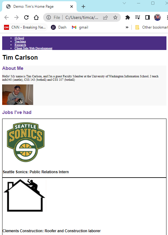


Tim Carlson
I'm a lecturer at University of Washington
# switch to starter branch to get new starter code
git checkout starter

# download new starter code
git pull

# switch back to main branch for coding
git checkout main

# merge in new starter code (use default msg)
git merge starter --no-edit

# code and enjoy!
Get the starter code from the starter branch, but do all of your work on main.
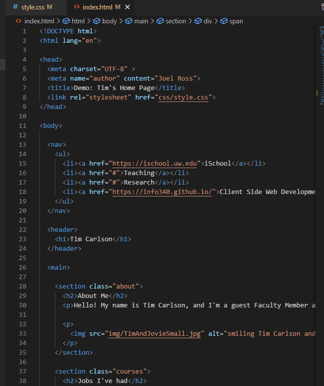
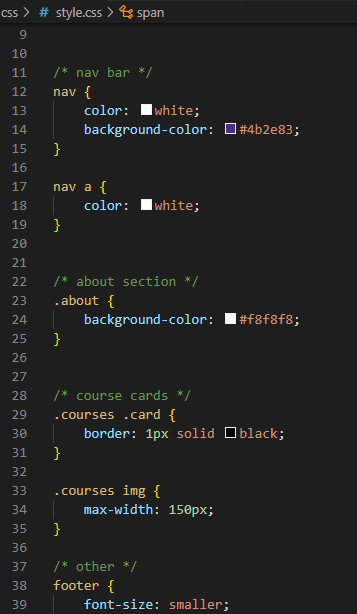
index.html
style.css
ugly web page
All browsers have a "default" font size--generally 16px. We use relative font sizing in case of variations.
Note that units are "measurement units" (think: inches)
| em | relative to the parent font size | By default 2em = 32px But if the parent's font-size was 20px, then 2em = 40px |
| rem | relative to the root (body's) font size of 16px | 2rem = 32px usually |
| % | relative to parent font size or dimension, can use for width or height | if parent width is 300px, then 50% = 150px |
| px | absolute measurement (do not use for fonts) | 16px = 16px |
It is also possible to specify an online font that the browser will download and display.
Fonts are installed "per computer", so not every computer has the same fonts (which is why you set a default with font-family).
Fonts are installed "per computer", so not every computer has the same fonts (which is why you set a default with font-family).
p {
  font-family: 'Helvetica', 'Arial', sans-serif;
}
Use this font
If first isn't available,
use this
If nothing else,
use this style of font-face
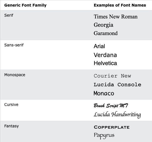
All fonts are categories in 1 of 5 different "categories", each of which has a generic style.
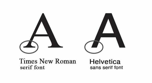
Research (roughly) suggests that sans-serif fonts are easier to read on screens, as well as more accessible for users with e.g., dyslexia.
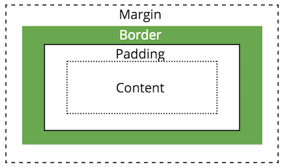
Apply spacing to elements by manipulating the size of their "box".
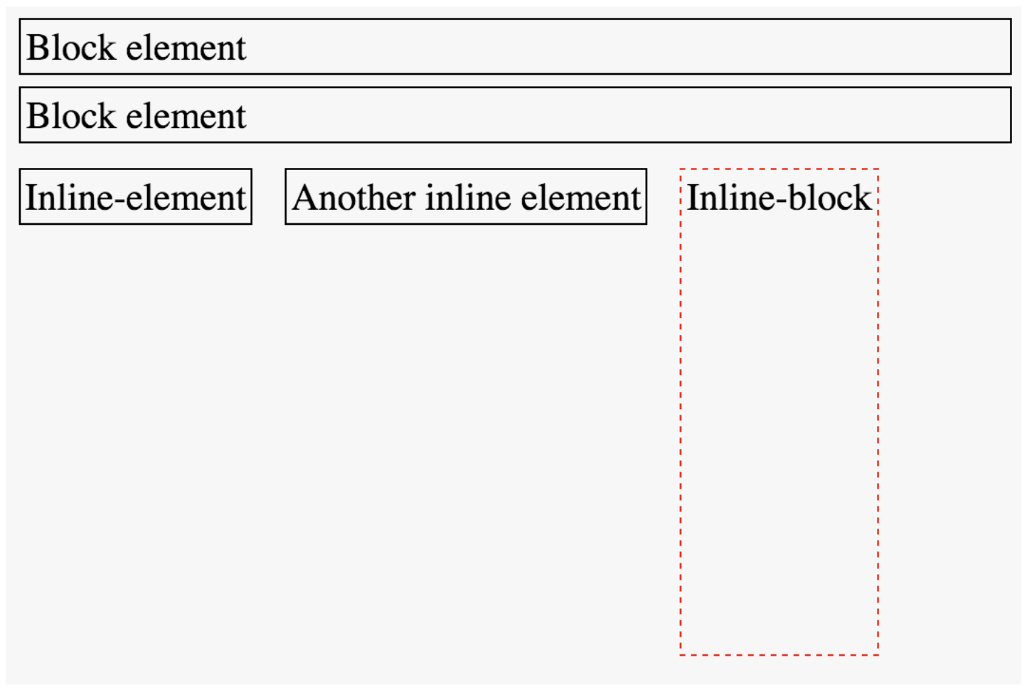
You can customize whether an element is displayed as a block or inline element using the display property.
Choose elements based on their semantics, not their appearance!
/* <li> elements will be inline (an inline list!) */
li {
  display: inline;
}You can use the display property to set whether an element is block or inline (or something else).
Choose elements based on semantics, not appearance!
You can use the position property to adjust where an element appears on the page from its normal layout. You will also need to set position adjustment values top, left, bottom, and/or right
/* position element 20px up and to the right
 * of where it "normally" would be */
img.badge {
  position: relative;
  top: 20px;
  right: 20px;
}A flexbox is an element that allows you to flexibly customize the layout of its children.
An element is made into a flexbox by giving it the display: flex CSS property.
flexbox
child elements
Customize the layout of the flexbox's children by given the flexbox additional CSS properties. For example:
flex-wrap
justify-content
You can also customize the children of the flexbox (the elements that are inside the box) by giving them additional CSS properties. For example:
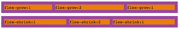
flex-grow
Don't get the flexbox (sometimes called the flex container) mixed up with the child elements (sometimes called the flex items) that are inside of it!
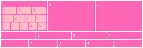
A flexbox can contain other flexboxes inside of it!
That is: a child of a flexbox can itself be a flexbox (specifying how its children are positioned).
But a flexbox only influences its children, not its grandchildren! A flexbox lays out its child boxes; what happens inside those boxes is their own business.
Flexboxes are great solutions for:
Flexboxes are not great solutions for:
Complete task list for Week 3 (all items!)
Read: Chapter 8 AND 9 for next week
Problem Set 03 due Friday
Project Proposal due Friday
Next: Responsive Design; Media Queries; Bootstrap
By Tim Carlson


