
Tim Carlson
I'm a lecturer at University of Washington
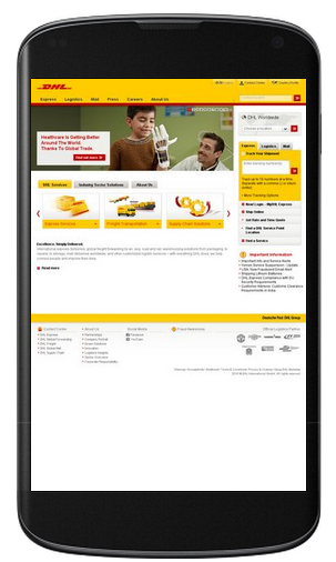
The complete HTML & CSS. A static "screenshot" of what your app will look like.
Code requirements:
Working as a group:
To Install: "npm install -g live-server"
To run: "live-server ."
Layout: e.g., stacking elements rather than having side by side
Media: having small (or no) images to reduce loading times
Fonts: making text large enough to read
Navigation: e.g., using a "hamburger menu" to take less space
Inputs: making sure buttons/icons are large enough to tap
Content: including mobile-specific content (e.g., tel:links)
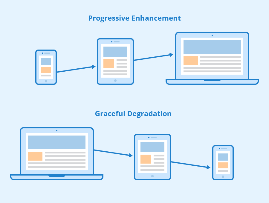
1. maintaining functionality when moving to limited devices (graceful degradation)
2. adding functionality when moving to super-capable devices (progressive enhancement)
1. "normal" styling for desktops/laptops; media queries for mobile
2. "normal" styling for mobiles; media queries for desktops/laptops
1. at the top of the file
2. in the middle of the file
3. at the bottom of the file
1. true
2. false
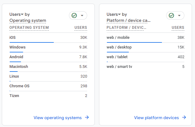
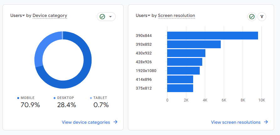
Example: Analytics Report from the app I work on (yesterday)
Notice the percentages of mobile/desktop/tablet
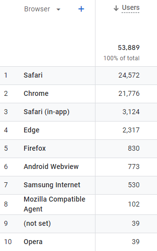
Example: Analytics Reports from the app I work on (yesterday)
Notice broad use of browsers with high percent of chrome and safari
Example: Analytics Reports from the app I work on (yesterday)
Mobile web browsers will do some work on their own to adjust to large web pages by shrinking content to fit
# switch to starter branch to get new starter code
git checkout starter

# download new starter code
git pull

# switch back to main branch for coding
git checkout main

# merge in new starter code (use default msg)
git merge starter --no-edit

# code and enjoy!
Get the starter code from the starter branch, but do all of your work on main.
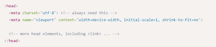
Specifying viewport size and scale keeps the browser from automatically adjusting the size of the screen
Must include the appropriate <meta> element in your HTML
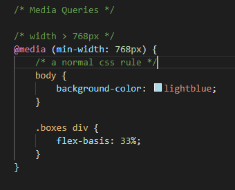
Media Queries conditionally apply CSS rules much like an "if" statement
Applying a condition and rules (selectors and properties) that are applied when the condition is true.
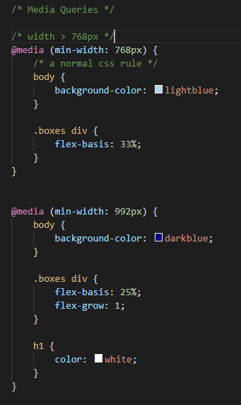
If the width > 768px:
then apply these CSS Rules
You need to put full rules (including selector) inside the media query body
Last rule on page wins thus:
Basic Recommended Structure:
If CSS file is organized by section (header, body, footer). It's okay to modify:
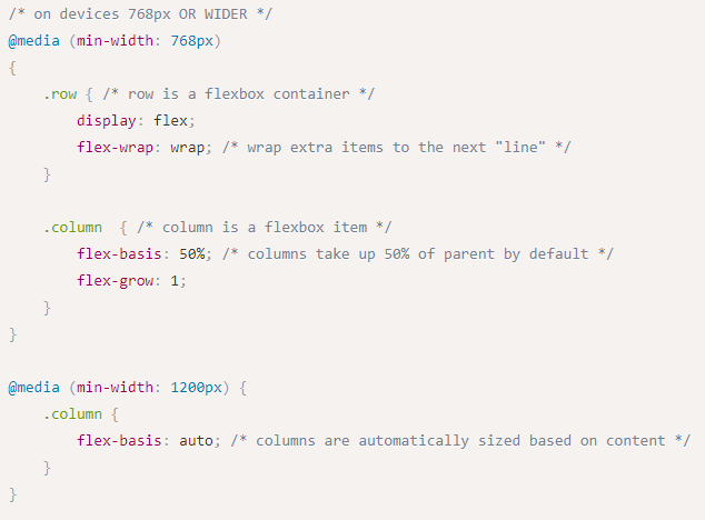
With CSS media query turns to flexbox
block items, stacked by default
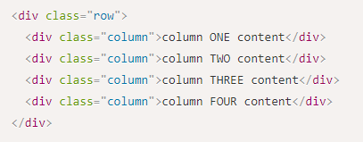
Basic HTML
Will turn to flexbox when width gets larger than 768px
Could add additional conditions:
At 768px it wraps with 2 columns
At 1200px all items will stay on the row if their size is less than with width of the parent
Include the viewport meta element to allow your code to control responsive appearances (rather than the browser).
<head>
  <meta charset="utf-8"> <!-- always need this -->
  <meta name="viewport" content="width=device-width, initial-scale=1, shrink-to-fit=no">

  <!-- more head elements, including <link> ... -->
</head>/* A Media Query */
@media (min-width: 768px) {
/* these rules apply ONLY on screens 768px and wider */
/* a normal CSS rule */
body {
font-size: 1.5em;
background-color: beige;
}
/* another CSS rule */
.mobile-call-icon {
display: none; /* don't show on large displays */
}
}Read: through Chapter 9
Problem Set 03 due Thursday 4/11
Problem Set 04 due next week
Next: CSS Frameworks (Bootstrap)
By Tim Carlson


