


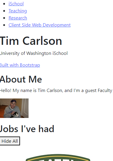


Tim Carlson
I'm a lecturer at University of Washington
# switch to starter branch to get new starter code
git checkout starter

# download new starter code
git pull

# switch back to main branch for coding
git checkout main

# merge in new starter code (use default msg)
git merge starter --no-edit

# code and enjoy!
Get the starter code from the starter branch, but do all of your work on main.
To Install: "npm install -g live-server"
To run: "live-server ."
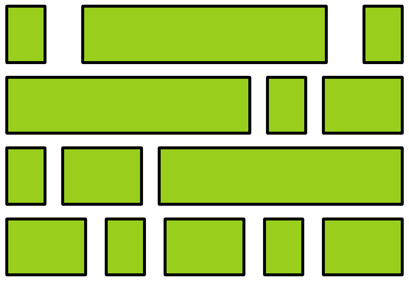
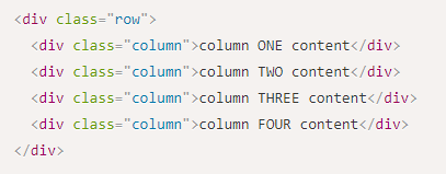
A flexbox is an element that allows you to flexibly customize the layout of its children.
An element is made into a flexbox by giving it the display: flex CSS property.
flexbox
child elements
Customize the layout of the flexbox's children by given the flexbox additional CSS properties. For example:
flex-wrap
justify-content
You can also customize the children of the flexbox (the elements that are inside the box) by giving them additional CSS properties. For example:
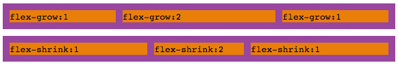
flex-grow
Don't get the flexbox (sometimes called the flex container) mixed up with the child elements (sometimes called the flex items) that are inside of it!
A flexbox can contain other flexboxes inside of it!
That is: a child of a flexbox can itself be a flexbox (specifying how its children are positioned).
But a flexbox only influences its children, not its grandchildren! A flexbox lays out its child boxes; what happens inside those boxes is their own business.
Flexboxes are great solutions for:
Flexboxes are not great solutions for:
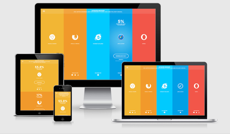
Layout: e.g., stacking elements rather than having side by side
Media: having small (or no) images to reduce loading times
Fonts: making text large enough to read
Navigation: e.g., using a "hamburger menu" to take less space
Inputs: making sure buttons/icons are large enough to tap
Content: including mobile-specific content (e.g., tel:links)
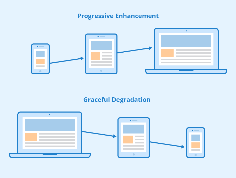
1. maintaining functionality when moving to limited devices (graceful degradation)
2. adding functionality when moving to super-capable devices (progressive enhancement)
1. "normal" styling for desktops/laptops; media queries for mobile
2. "normal" styling for mobiles; media queries for desktops/laptops
1. at the top of the file
2. in the middle of the file
3. at the bottom of the file
1. true
2. false
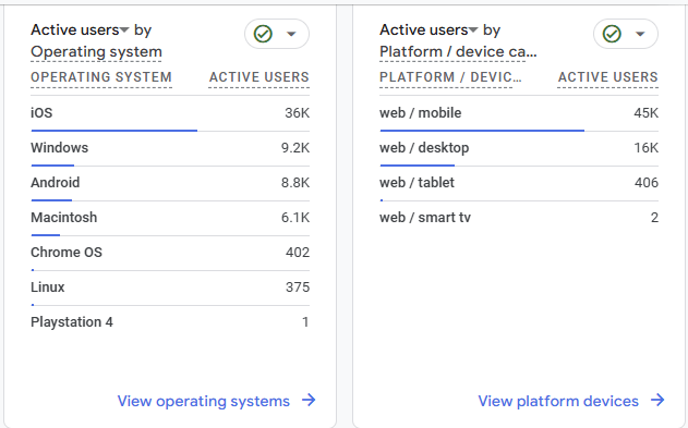
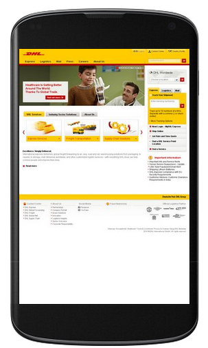
Example: Analytics Report from the app I work on (yesterday)
Notice the percentages of mobile/desktop/tablet
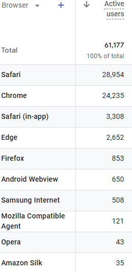
Example: Analytics Reports from the app I work on (yesterday)
Notice broad use of browsers with high percent of chrome and safari
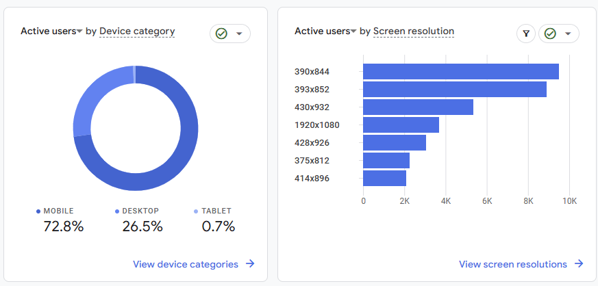
Example: Analytics Reports from the app I work on (yesterday)
Mobile web browsers will do some work on their own to adjust to large web pages by shrinking content to fit
Specifying viewport size and scale keeps the browser from automatically adjusting the size of the screen
Must include the appropriate <meta> element in your HTML
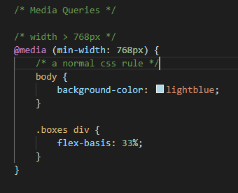
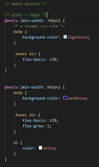
Media Queries conditionally apply CSS rules much like an "if" statement
Applying a condition and rules (selectors and properties) that are applied when the condition is true.
If the width > 768px:
then apply these CSS Rules
You need to put full rules (including selector) inside the media query body
Last rule on page wins thus:
Basic Recommended Structure:
If CSS file is organized by section (header, body, footer). It's okay to modify:
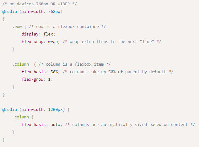
With CSS media query turns to flexbox
block items, stacked by default
Basic HTML
Will turn to flexbox when width gets larger than 768px
Could add additional conditions:
At 768px it wraps with 2 columns
At 1200px all items will stay on the row if their size is less than with width of the parent
/* A Media Query */
@media (min-width: 768px) {
   /* these rules apply ONLY on screens 768px and wider */

   /* a normal CSS rule */
   body {
      font-size: 1.5em;
      background-color: beige;
   }

   /* another CSS rule */
   .mobile-call-icon {
      display: none; /* don't show on large displays */
   }
}A CSS Framework is a collection of CSS rules published and made available for you to use. So rather than writing your own rules, you just use the ones provided to you.
Bootstrap is the oldest and most popular CSS framework. Created by Twitter in 2011.
<head>
  <!--... other elements here...-->

  <!-- link Bootstrap -->
  	<link href="https://cdn.jsdelivr.net/npm/bootstrap@5.3.8/dist/css/bootstrap.min.css" rel="stylesheet" >

  <!-- link own stylesheets AFTER framework -->
  <link rel="stylesheet" href="css/my-style.css">
</head>Add Bootstrap to your page by including a <link> to the CSS file. This is usually loaded from a Content Delivery Network (CDN) site.
minified CSS file!
CDN
Non Minified version
<head>
  <!-- link Bootstrap -->
   <link href="https://cdn.jsdelivr.net/npm/bootstrap@5.3.2/dist/css/bootstrap.min.css"
  		rel="stylesheet" >
  <!-- link own stylesheets AFTER framework -->
  <link rel="stylesheet" href="css/my-style.css">
</head>
Before
After
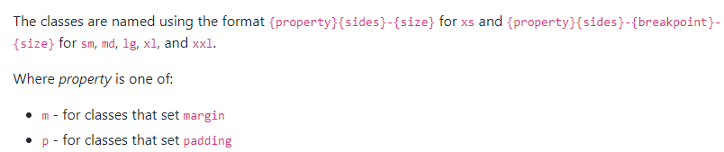
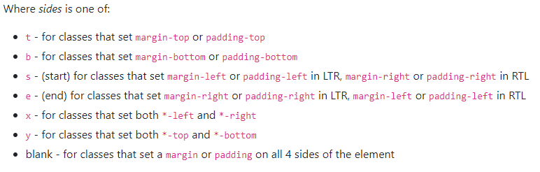
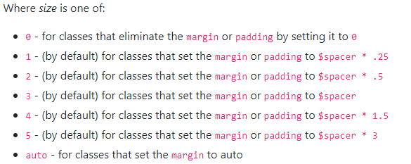
Bootstrap provides rules that apply to particular classes. Give an element that class in order to style it in a certain way.
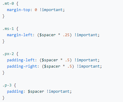
margin top of 0
margin side of 1
padding on left and right of 2
padding of 3
Levels of size range from 0 to 5
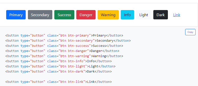
Buttons, Cards, Carousel, Dropdowns, Navbar, Spinners, etc...
Button example
Example:
Syntax
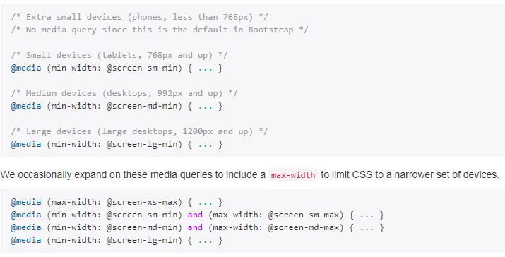
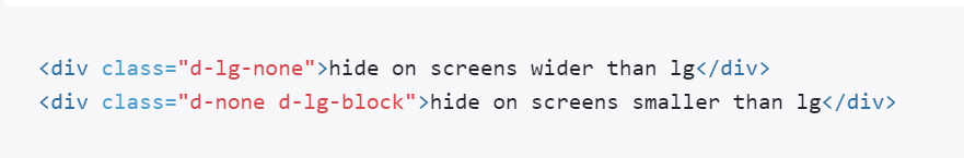
The media queries effect screen widths with the given breakpoint or larger.
We tend to write the responsive utility classes left to right:
<div class =d-none d-sm-block d-md-none">
Within the HTML brackets '<' '>' the order doesn't matter. Bootstrap has the media query ordered in the CSS file smallest to largest.
Make sure to put link your stylesheet further down in the html file than bootstrap to override bootstrap classes
For more utility classes, check the Bootstrap Documentation
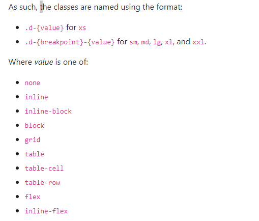
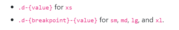
Bootstrap has responsive versions of most utility classes. These class names include a infix indicating at which size (or larger) the styling should apply.
row
row
column
column
column
row
row
column
column
column
row
row
column
column
column
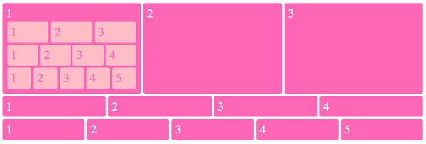
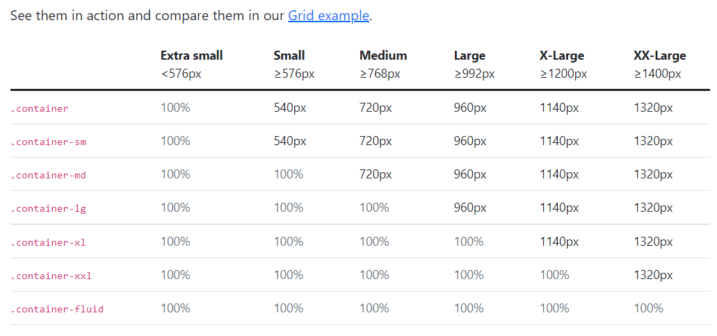
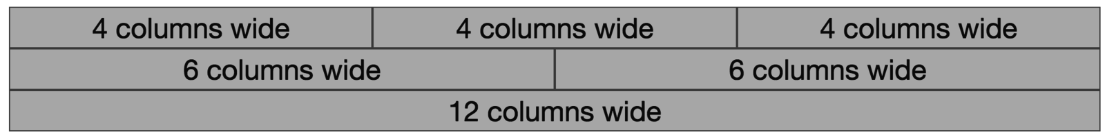
There are 12 columns in the grid
Elements can take up many columns
Row 1:
Row 2:
Row 3:
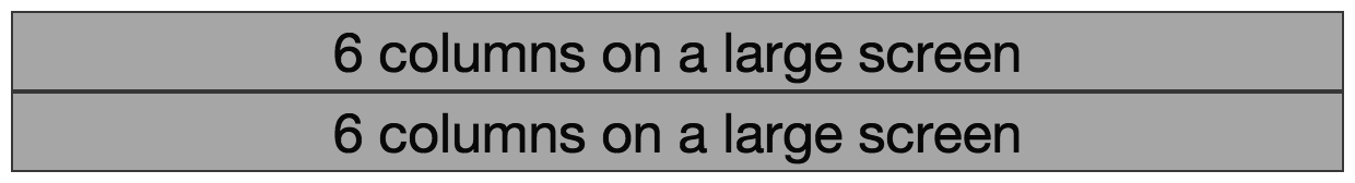
Specify columns based on screen-size
Smaller screen display
A Row:
The Bootstrap framework provides some interactive "widgets" you can use without writing separate JavaScript code, just by using specific HTML attributes.
https://getbootstrap.com/docs/5.3/components
You will need to add Bootstrap's JavaScript code to your page by including a <script> tag in your <head>
<head>
  <!-- include Bootstrap library (before your script!) -->
  <!-- copy script tag from the Bootstrap home page -->
  <script src="https://cdn.jsdelivr.net/npm/bootstrap@5.3.3/dist/js/bootstrap.bundle.min.js"></script>
</head>As a simple example, you can make an element "collapsable" so that it disappears with a button click!
<button class="btn btn-primary"
        data-bs-toggle="collapse"
        data-bs-target="#collapseExample"
        aria-expanded="false" aria-controls="collapseExample">
   Button with data-bs-target
</button>


<div class="collapse" id="collapseExample">
    Some placeholder content for the collapse component. This panel is
    hidden by default but revealed when the user clicks the toggler.
</div>
aria for screen-readers
See https://getbootstrap.com/docs/5.3/components/
navbar/#toggler for an example of a NavBar with a collapsible "hamburger menu"
Complete task list for Week 3 (all items)
You may need to catch up with videos!
There is a lot this week again...
Read: Chapter 10
Problem Set 03 due Wednesday (tonight!)
Problem Set 04 due Sunday
Next: JavaScript!
By Tim Carlson


