
Backgrounds in CSS
Backgrounds in CSS:

- background-color,
colors, and gradients can also be used - background-image,
- background-size,
- background-repeat,
- background-position,
- background-attachment,
- background-origin,
- background-clip
background:
  <background-color>?
/* OR */
  <background-image>
  <background-position> / <background-size>?
  <background-repeat>
  <background-attachment>
  <background-origin>
  <background-clip>
Everything in HTML is a Box. So every CSS rule is applied to a box.
background image:
.demo {
  width: 100px;
  height: 100px;

  background-image: url("https://framerusercontent.com/images/gPrYLwg38BGyWaAHDpE9nIvAa1Y.jpeg");
}
Every image has a certain height, and width at the time of creation.
You can set an image as background of a box. Now your HTML Box may or may not be of similar W, H as of the image.
Aspect Ratio:
the ratio of width to height (width:height OR width/height)
Eg: 16:9, 3:2 etc.
background size:
.demo {
  width: 100px;
  height: 100px;

  background-image: url("https://framerusercontent.com/images/gPrYLwg38BGyWaAHDpE9nIvAa1Y.jpeg");
  background-size: auto; /*width height */;
}
It takes width and height in percentage or below keywords:
- auto - image is added to the box without any changes to its W, H,
- cover - image is stretched or cropped to cover the box,
- contain - image is resized (the AR is preserved) to fit in the box,
background repeat:
.demo {
  width: 100px;
  height: 100px;

  background-image: url("https://framerusercontent.com/images/gPrYLwg38BGyWaAHDpE9nIvAa1Y.jpeg");
  background-size: auto; /*width height */;
  background-repeat: no-repeat; /*horizontal vertical */;
}
D.I.Y
It takes 2 value for horizontal and vertical:
- repeat - image repeats to fill the box
- no-repeat - doesn't repeat
- round - stretches or crops image to fill box
- space - evenly repeats image to fill box, never crops/stretches
background position:
.demo {
  width: 100px;
  height: 100px;

  background-image: url("https://framerusercontent.com/images/gPrYLwg38BGyWaAHDpE9nIvAa1Y.jpeg");
  background-size: auto; /*width height */;
  background-repeat: no-repeat; /*horizontal vertical */;
  background-position: top left; /*x-axis y-axis */;
}
It takes 2 value for x-axis and y-axis:
- x-axis - left, right, center, %age
- y-axis - top, bottom, center, %age
The order wouldn't matter if keywords (left, top) are used.
background attachment:
.demo {
  width: 100px;
  height: 100px;

  background-image: url("https://framerusercontent.com/images/gPrYLwg38BGyWaAHDpE9nIvAa1Y.jpeg");
  background-size: auto; /*width height */;
  background-repeat: no-repeat; /*horizontal vertical */;
  background-position: top left; /*x-axis y-axis */;
  background-attachment: scroll;
}
D.I.Y
It takes 3 value for x-axis and y-axis:
- x-axis - left, right, center, %age
- y-axis - top, bottom, center, %age
The order wouldn't matter if keywords (left, top) are used.
background origin:
.demo {
  width: 100px;
  height: 100px;

  background-image: url("https://framerusercontent.com/images/gPrYLwg38BGyWaAHDpE9nIvAa1Y.jpeg");
  background-size: auto; /*width height */;
  background-repeat: no-repeat; /*horizontal vertical */;
  background-position: top left; /*x-axis y-axis */;
  background-attachment: scroll;
  background-origin: padding-box;
}
D.I.Y
It takes 3 values:
- padding-box- the background is applied till padding.
- border-box- the background is applied till border.
- content-box - the background is applied till content area.
background clip:
.demo {
  width: 100px;
  height: 100px;

  background-image: url("https://framerusercontent.com/images/gPrYLwg38BGyWaAHDpE9nIvAa1Y.jpeg");
  background-size: auto; /*width height */;
  background-repeat: no-repeat; /*horizontal vertical */;
  background-position: top left; /*x-axis y-axis */;
  background-attachment: scroll;
  background-origin: padding-box;
}
D.I.Y
It takes 3 values:
- padding-box- the background is clipped till padding.
- border-box- the background is clipped till border.
- content-box - the background is clipped till content area.
- text - the background is clipped till text.
Complex background image:
#demoBox {
  aspect-ratio: 1/1;
  border: 0.5px solid hsla(0deg, 0%, 60%, 0.5);
  width: 100%;
  border: 1px solid hsla(0deg, 0%, 40%, 0.25);
  padding: 1rem;


  background-image:
    url("https://assets.codepen.io/7518/pngaaa.com-1272986.png"),
    url("https://assets.codepen.io/7518/blob.svg"),
    linear-gradient(hsl(191deg, 40%, 86%), hsla(191deg, 96%, 96%, 0.5));
  background-size: contain, cover, auto;
  background-repeat: no-repeat, no-repeat, no-repeat;
  background-position: 50% 50%, 10% 50%;
  background-origin: padding-box, border-box, content-box;

  /*   background:
   * url("https://assets.codepen.io/7518/pngaaa.com-1272986.png") 50% 50%/contain no-repeat padding-box,
   * url("https://assets.codepen.io/7518/blob.svg") 10% 50% / cover border-box,
   * linear-gradient(hsl(191deg, 40%, 86%), hsla(191deg, 96%, 96%, 0.5) ) 0% 0% / cover no-repeat content-box ; */
}
Box Model In CSS: Margin, Border, Padding & Content

- Margin (Outline and Shadows),
- Border,
- Padding,
- Content
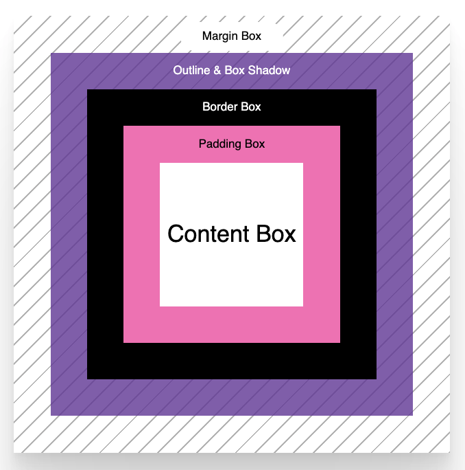
The box model includes:
box-sizing:
- border-box - the width and height of box are applied to content only, padding and border are part of it
- content-box - the width and height of box are applied to content only, padding and border are not part of it
margin and padding in CSS:
.demo {
  width: 100px;
  height: 100px;
  border: 1px solid red;

  margin-top: 5px;
  margin-right: 5px;
  margin-bottom: 5px;
  margin-left: 5px;

  /* margin shorthand */
  margin: 5px 5px 5px 5px;


  padding-top: 5px;
  padding-right: 5px;
  padding-bottom: 5px;
  padding-left: 5px;

  /*   padding shorthand */
  padding: 5px 5px 5px 5px;


}
D.I.Y
CSS In Too Depth
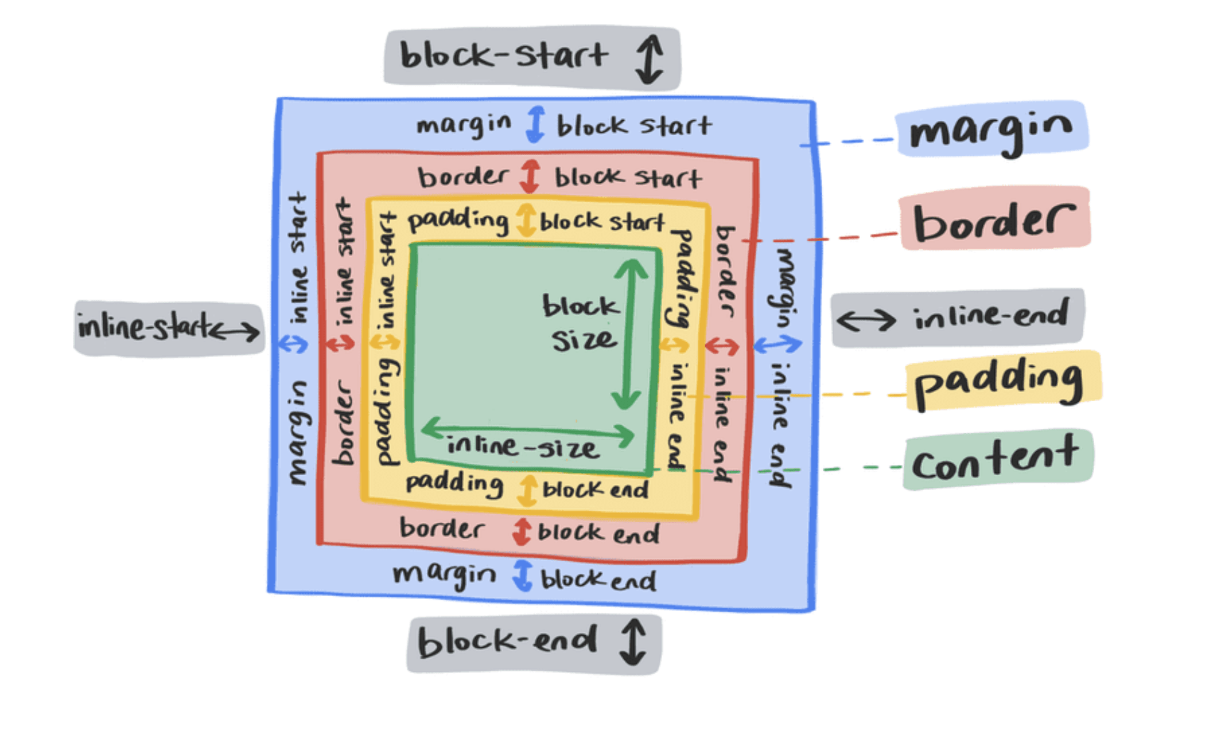
the width is applied on inline side - block flow,
the height is applied on block side - inline flow
W1_D2
By Yash Priyam


