
Flexbox - Flexible Box Layout Model
→ Flexbox is a layout mechanism
- it allows you to arrange the "Content" in the box, along one axis.

→ Flex items move as a group on either one axis.
⟶ but on the other axis items can move individually or as a group.
Flex-box is one dimensional, you can control alignment in one axis, a row or a column, not both.
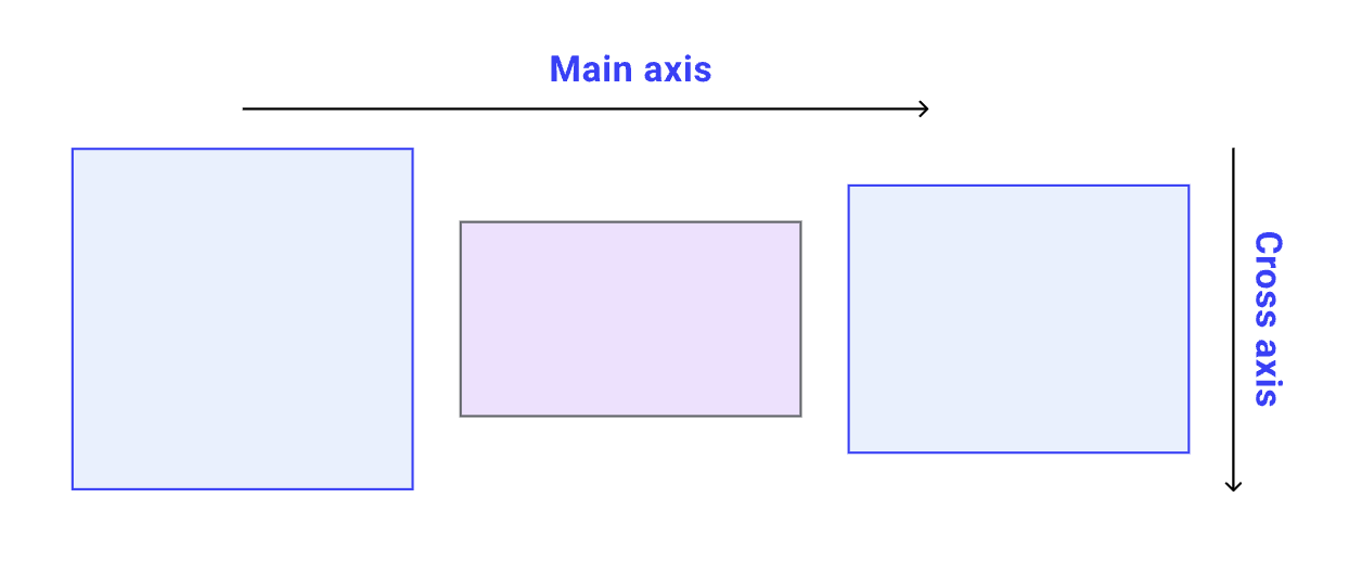
Think of your webpage as a 2-dimensional plain, with 2 axis:
X-axis or Main axis ⟶ (inline flow)
Y-axis or Cross axis ⟶ (block flow)

Flex divides the boxes in the layout in 2 parts:
- the container (parent element, known as “flex container”)
- the children (“flex items”).
Both have different set of properties.
D.I.Y
.flex-container {
  display: flex;

  border: 1px solid black;
  padding: 10px;
  margin: 10px;
}
Starting with Flex
Set the display of the box as "flex".
This box is the flex-container.
This is the box where your "content" is present.
D.I.Y
.flex-container {
  display: flex;
  flex-direction: column; /* row | row-reverse | column | column-reverse */

  border: 1px solid black;
  padding: 10px;
  margin: 10px;
}row: horizontal, left-to-right, default,
column: vertical, top-to-bottom
row-reverse: horizontal, right-to-left
column-reverse: vertical, bottom-to-top
D.I.Y
flex-direction:
Establishes which direction will be regarded as the Main-axis.
.flex-container {
  display: flex;
  flex-direction: column; /* row | row-reverse | column | column-reverse */
  flex-wrap: wrap; /* nowrap | wrap | wrap-reverse */

  border: 1px solid black;
  padding: 10px;
  margin: 10px;
}no-wrap: items will not wrap, default,
wrap: items will wrap, top to bottom,
wrap-reverse: items will wrap, bottom to top,
D.I.Y
flex-wrap:
.flex-container {
  display: flex;
  /*
   * flex-direction: column;  // row | row-reverse | column | column-reverse
   * flex-wrap: wrap; // nowrap | wrap | wrap-reverse
   */
  /*OR*/
  flex-flow: column wrap;

  border: 1px solid black;
  padding: 10px;
  margin: 10px;
}
shorthand for the flex-direction and flex-wrap properties
D.I.Y
flex-flow:
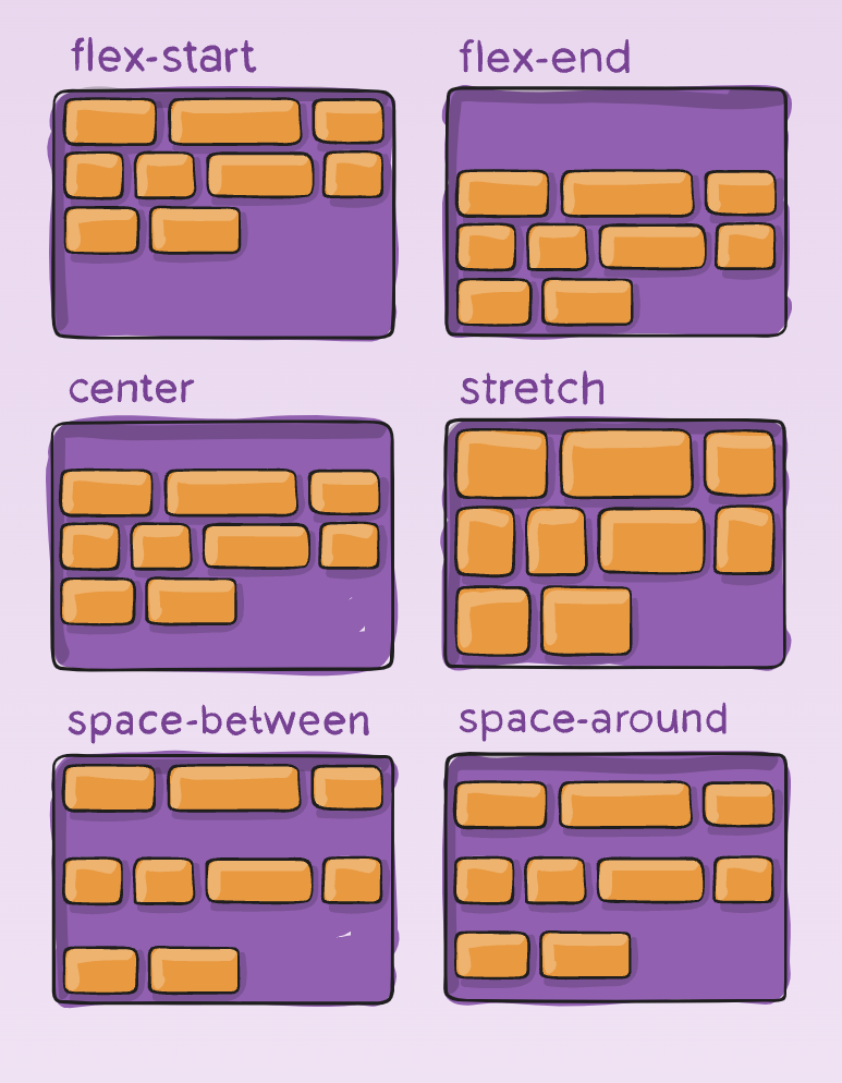
- flex-start:
- flex-end: different from row-reverse
- center:
- space-between:
- space-around: space between 2 items add up, space between edges are equal.
- space-evenly: space between items and edges are equal.
- start, end, left, right:
justify-content
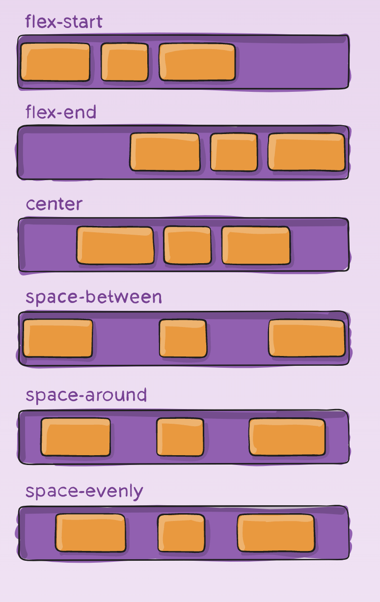
Arranges items along the Main axis
Note: Here we are assuming the main-axis as x-axis
(flex-direction: row;).
D.I.Y
justify-content
- stretch (default): stretch to fill the container
- flex-start / start / self-start: items are placed at the start of the cross axis.
- flex-end / end / self-end: items are placed at the end of the cross axis.
- center: items are centered in the cross-axis
- baseline: items are aligned such as their baselines align.
align-items
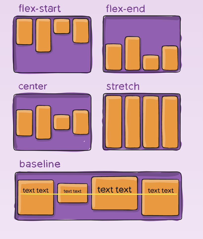
It handles arrangement of items on the cross-axis.
Affects only one line of items, if the items wrap to next line, on the next line also they are arranged as per this rule.
D.I.Y
align-items
- normal (default):
-
flex-start / start:
start honors the writing-mode, -
flex-end / end:
end honors the writing-mode - center: items centered,
- space-between: equal space around items,
- space-around: equal space around each line,
- space-evenly: equal space around items and line,
- stretch: lines stretch to take up the remaining space
align-content
- Works along the cross-axis.
- This property only takes effect on multi-line flexible containers, where flex-wrap is set to either wrap or wrap-reverse).
align-content
D.I.Y
Difference of align-content and align-items
If flex-direction is set to row,
Main-axis is X-axis, inline-flow
justify-content works along X-axis,
align-items works along Y-axis.
Now align-content, will also arrange items on Y-axis, but only those which have been wrapped on the next line.
gap, row-gap, column-gap
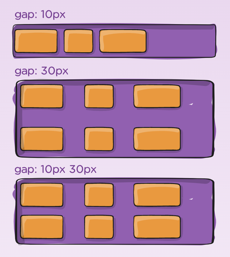
.flex-container {
  display: flex;

  gap: 10px;
  gap: 10px 20px; /* row-gap column gap */
  row-gap: 10px;
  column-gap: 20px;
}
It applies spacing, but only between items not on the outer edges.
gap, row-gap, column-gap
.flex-container {
  display: flex;

  gap: 10px;
  gap: 10px 20px; /* row-gap column gap */
  row-gap: 10px;
  column-gap: 20px;
}
D.I.Y

Flex-items properties
The flex-items properties that apply to the children (flex-items) of the flex container directly.
-
order - (number), default:
0, items along the main-axis, lower to higher order value, - flex-grow - (number), flex-grows by space available,
- flex-shrink - item shrinks if necessary,
- flex-basis - defines size of the item, in any unit,
-
flex - shorthand for
flex-grow flex-shrink flex-basis -
align-self - works exactly like
align-items, for one item.
<img/> tag:
The problem with having background images, with CSS:
- they need to be scaled properly (without losses)
- they need to be styled
Solution:
the HTML's <img> tag
<img
     class="image"
     src="https://framerusercontent.com/images/gPrYLwg38BGyWaAHDpE9nIvAa1Y.jpeg"
     alt="MDN Logo"
/>
D.I.Y
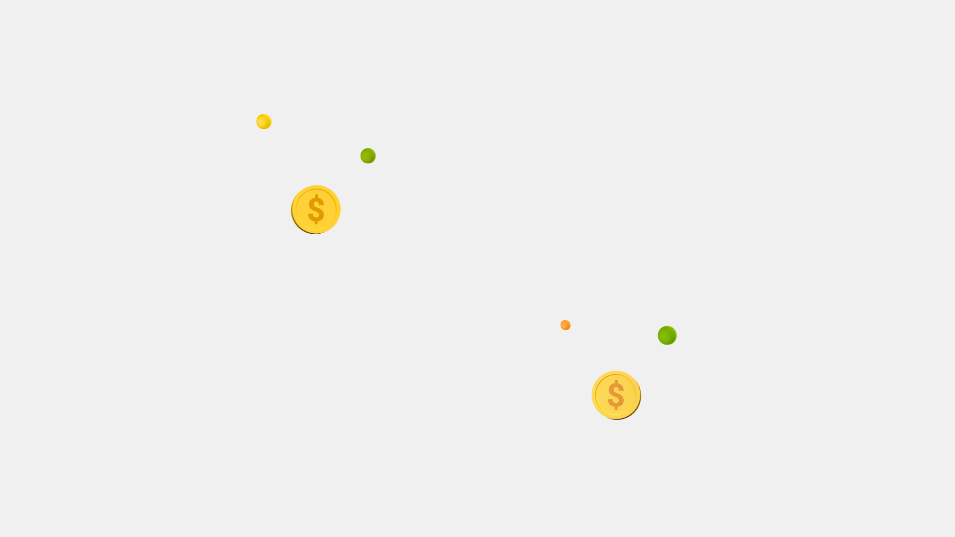
Create the following layout, and add gaps to them.
D.I.Y
Create the following layout, and add gaps to them.
D.I.Y
Create the following layout, and add gaps to them.
D.I.Y
Create the following layout, and add gaps to them.
CSS: Flexbox
By Yash Priyam


