
Grid Layout

Grids in CSS
.container {
  display: grid | inline-grid;
}- grid – generates a block-level grid
- inline-grid – generates an inline-level grid
Grids in CSS
.container {
  grid-template-columns: ...  ...;
  /* e.g.
      1fr 1fr
      minmax(10px, 1fr) 3fr
      repeat(5, 1fr)
      50px auto 100px 1fr
  */
  grid-template-rows: ... ...;
  /* e.g.
      min-content 1fr min-content
      100px 1fr max-content
  */
}
- grid-template-columns:
-
grid-template-rows:
Defines the columns and rows of the grid with a space-separated list of values.
The values represent the track size, and the space between them represents the grid line.
both take either a size value (track size),
OR a "line-name" (grid-line)
Grids in CSS
.container {
  grid-template-columns: [first] 40px [line2] 50px [line3] auto
    [col4-start] 50px [five] 40px [end];

  grid-template-rows: [row1-start] 25% [row1-end] 100px
    [third-line] auto [last-line];
}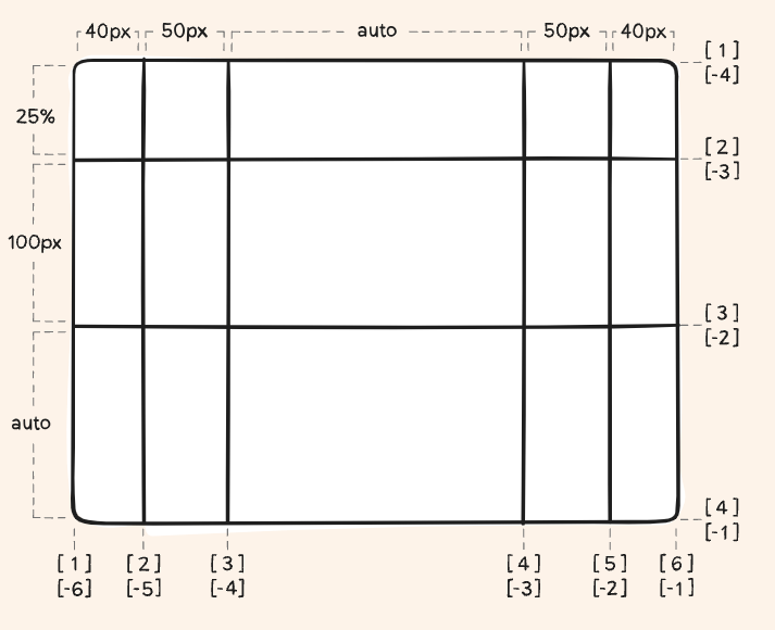
these are grid lines, present at start and end of grid.
Grids in CSS
.container {
  /*     grid-template-columns: 1fr 1fr 1fr; */

/*   grid-template-columns: repeat(3, 80px [col-start]); */
/*   grid-template-columns: 1fr 50px 1fr 1fr; */
/*   grid-template-columns: 1fr 50px 1fr 1fr; */
    grid-template-columns: repeat(5, 1fr);
}
The fr unit allows you to set the size of a track as a fraction of the free space of the grid container.
The repeat function repeats the tracks.
Grids in CSS
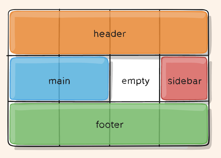
.item-a {
  grid-area: header;
}
.item-b {
  grid-area: main;
}
.item-c {
  grid-area: sidebar;
}
.item-d {
  grid-area: footer;
}

.container {
  display: grid;
  grid-template-areas:
    "header header header header"
    "main main . sidebar"
    "footer footer footer footer";
}

/* Each row in your declaration needs
 * to have the same number of cells. */
grid-template-areas and grid-area:
Defines a grid template by referencing the names of the grid areas which are specified with the grid-area property. Repeating the name of a grid area causes the content to span those cells.
Grids in CSS
Grids in CSS
grid-template:
A shorthand for setting
grid-template-rows,
grid-template-columns, and
grid-template-areas
in a single declaration.
.container {
  grid-template: none | <grid-template-rows> / <grid-template-columns>;
}
.container {
  grid-template-rows: [row1-start] 25px [row1-end row2-start] 25px [row2-end];
  grid-template-columns: auto 50px auto;
  grid-template-areas:
    "header header header"
    "footer footer footer";
}

.container {
  grid-template:
    [row1-start] "header header header" 25px [row1-end]
    [row2-start] "footer footer footer" 25px [row2-end]
    / auto 50px auto;
}
Grids in CSS
column-gap,
row-gap,
gap: A shorthand for row-gap and column-gap,
grid-gap: old for gap,
gutters are only created between the columns/rows, not on the outer edges.
.container {
  grid-template-columns: 100px 50px 100px;
  grid-template-rows: 80px auto 80px;
  column-gap: 10px;
  row-gap: 15px;
}

.container {
  grid-template-columns: 100px 50px 100px;
  grid-template-rows: 80px auto 80px;
  gap: 15px 10px;
}
Grids in CSS
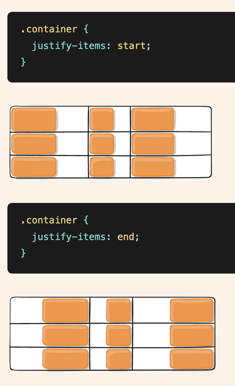
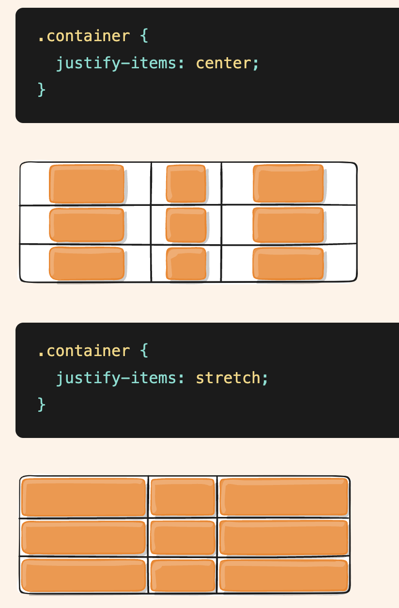
justify-items:
Aligns grid items along the inline (row) axis
Values:
- start – aligns items to be flush with the start edge of their cell
- end – aligns items to be flush with the end edge of their cell
- center – aligns items in the center of their cell
- stretch – fills the whole width of the cell (this is the default)
Grids in CSS
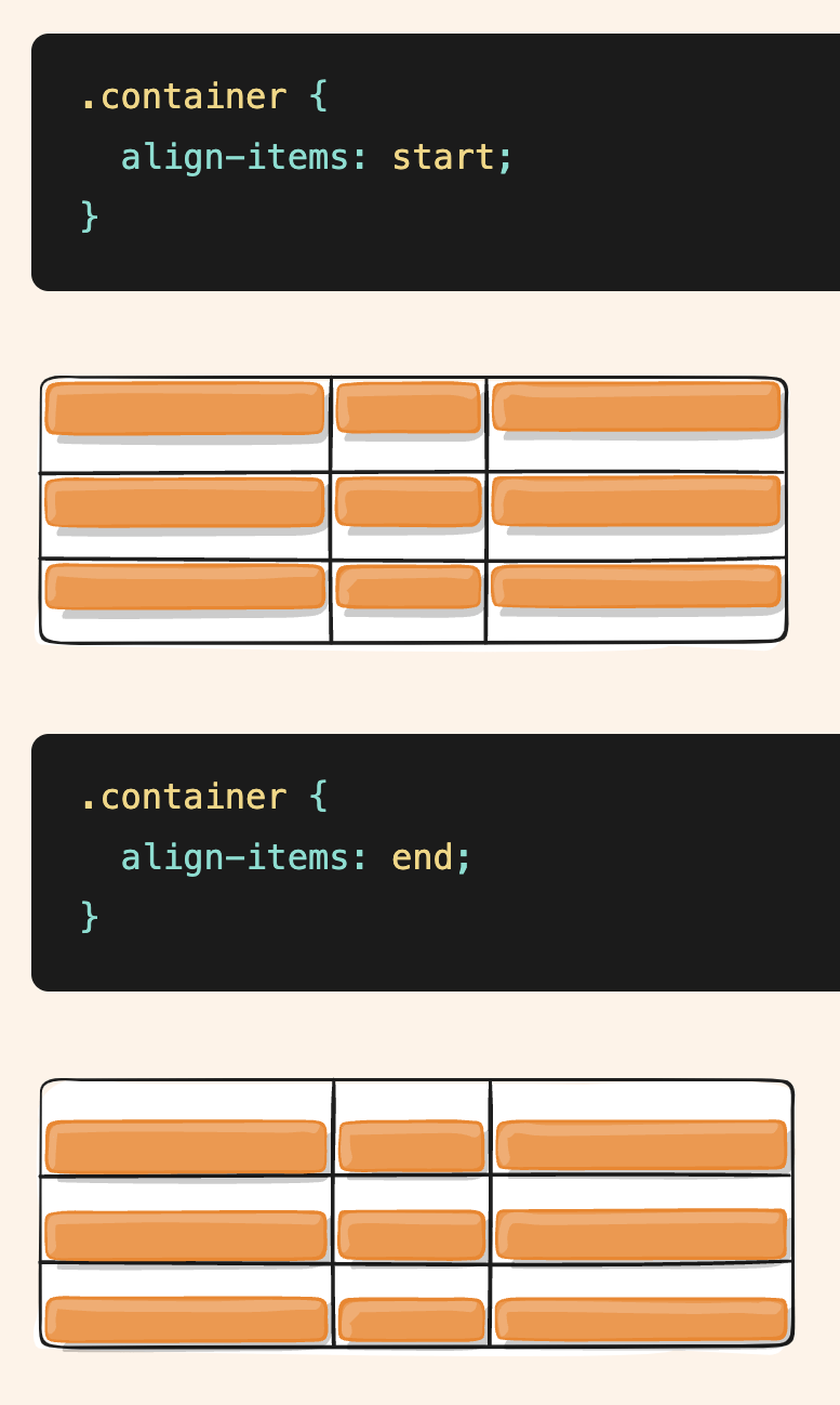
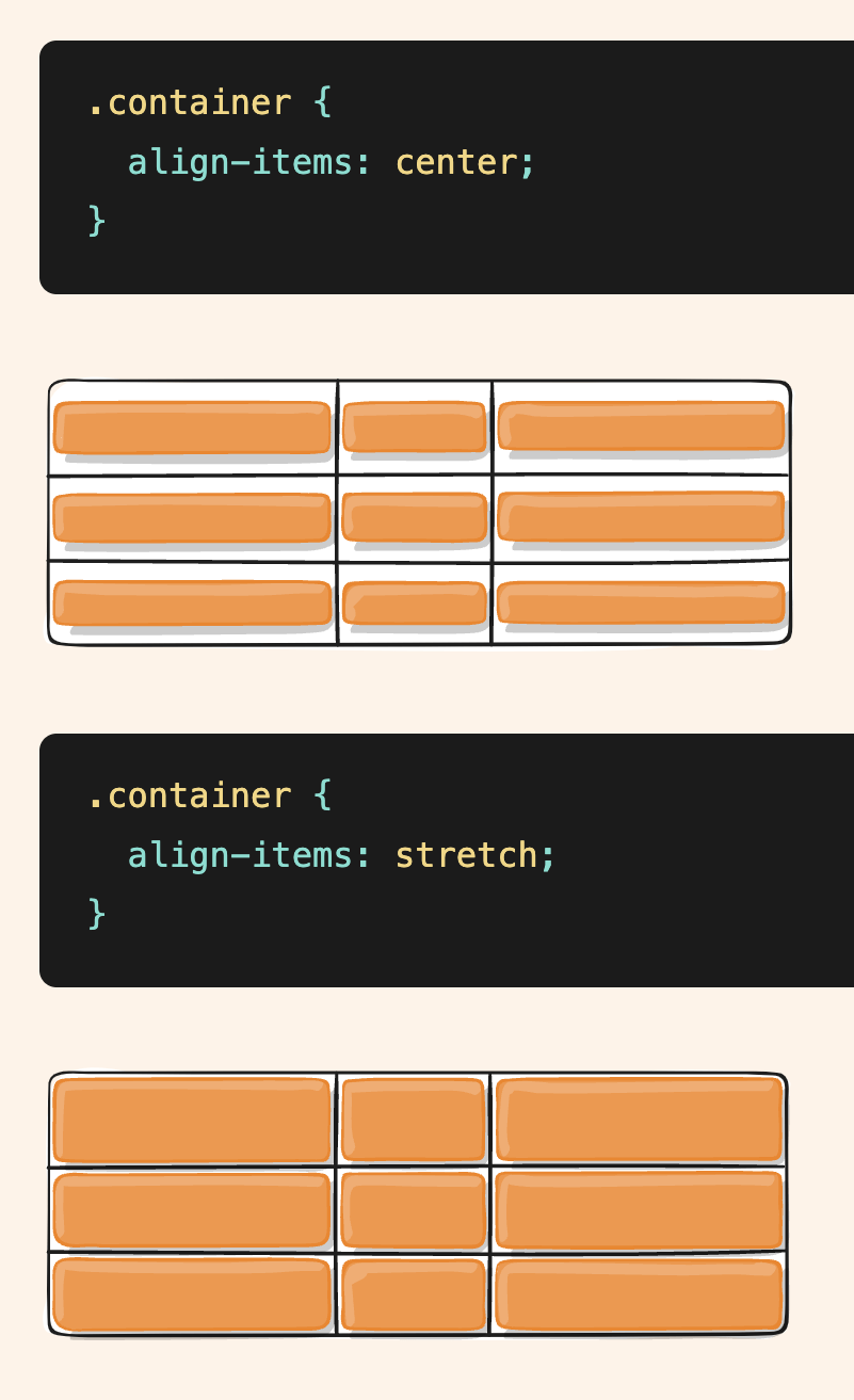
align-items:
Aligns grid items along the block (column) axis
Values:
- stretch – fills the whole height of the cell (this is the default)
- start – aligns items to be flush with the start edge of their cell
- end – aligns items to be flush with the end edge of their cell
- center – aligns items in the center of their cell
- baseline – align items along text baseline.
Grids in CSS
place-items:
sets both the align-items and justify-items properties in a single declaration.
.center {
  display: grid;
  place-items: center;
}
Grids in CSS
justify-content:
aligns the grid along the inline (row) axis
align-content:
aligns the grid along the block (column) axis
place-content
sets both the align-content and justify-content
Sometimes the total size of your grid might be less than the size of its grid container.
- start – aligns the grid to be flush with the start edge of the grid container
- end – aligns the grid to be flush with the end edge of the grid container
- center – aligns the grid in the center of the grid container
- stretch – resizes the grid items to allow the grid to fill the full width of the grid container
- space-around – places an even amount of space between each grid item, with half-sized spaces on the far ends
- space-between – places an even amount of space between each grid item, with no space at the far ends
- space-evenly – places an even amount of space between each grid item, including the far ends
Grids in CSS
Grids in CSS
grid-auto-flow:
If you have grid items that you don’t explicitly place on the grid, the auto-placement algorithm kicks in to automatically place the items. This property controls how the auto-placement algorithm works.
grid-auto-columns,
grid-auto-rows,
Specifies the size of any auto-generated grid tracks
Grids in CSS
grid:
A shorthand for setting all of the following properties in a single declaration:
grid-template-rows,
grid-template-columns,
grid-template-areas,
grid-auto-rows,
grid-auto-columns, and
grid-auto-flow
Grids in CSS
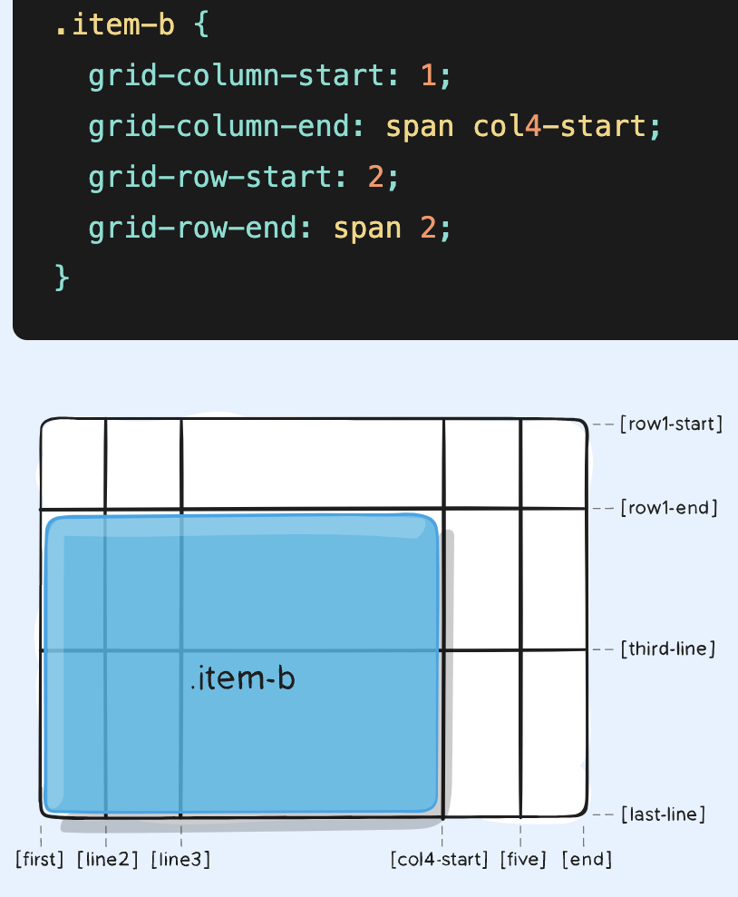
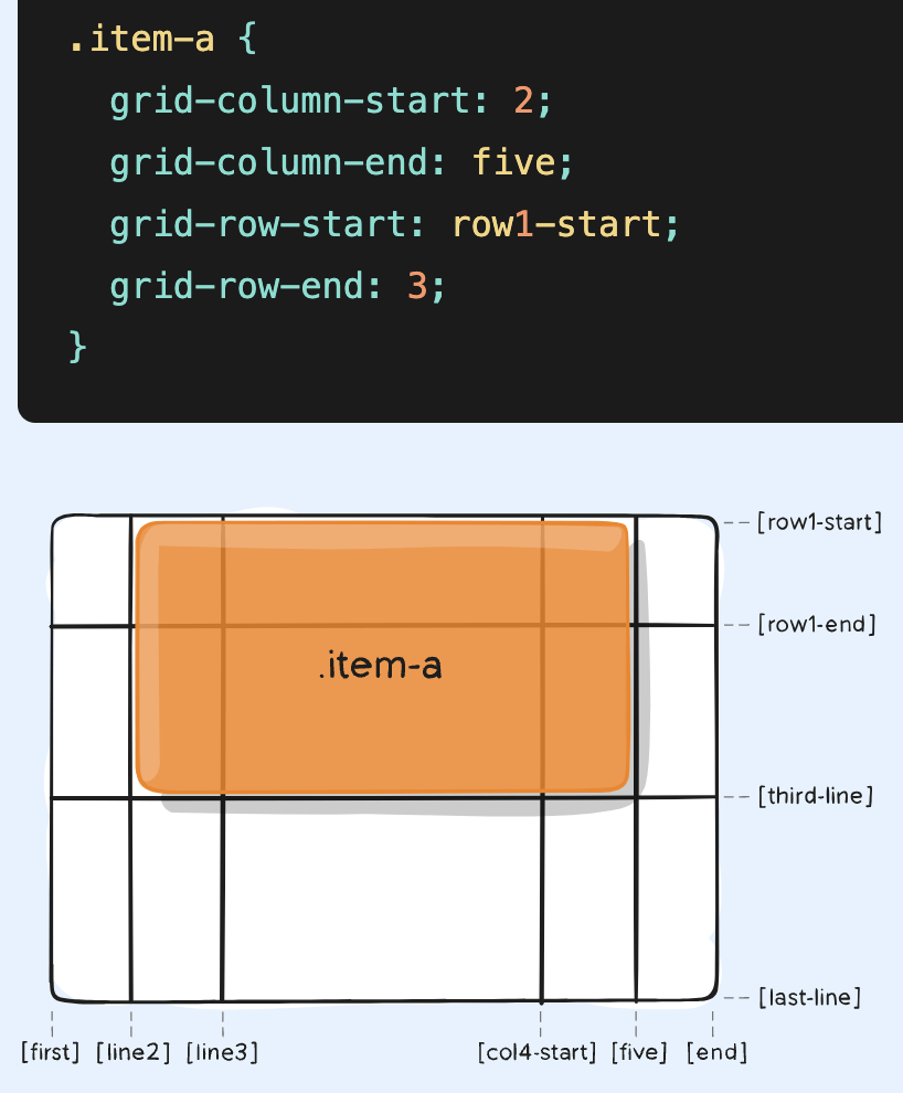
grid-column-start,
grid-column-end,
grid-row-start,
grid-row-end:
Determines a grid item’s location within the grid by referring to specific grid lines.
<line> – can be a number to refer to a numbered grid line, or a name to refer to a named grid line
span <number> – the item will span across the provided number of grid tracks
span <name> – the item will span across until it hits the next line with the provided name
auto – indicates auto-placement, an automatic span, or a default span of one
Grid Items:
grid-column
grid-row:
Shorthand for grid-column-start + grid-column-end, and grid-row-start + grid-row-end, respectively.
Grids in CSS
Grid Items:
justify-self - along the inline (row) axis
align-self - along the block (column) axis
place-self - sets both the align-self and justify-self
W3_D3
By Yash Priyam


