Data Visualisation
The Good, the Bad and the Ugly
Who has already tried to visualize data?
?
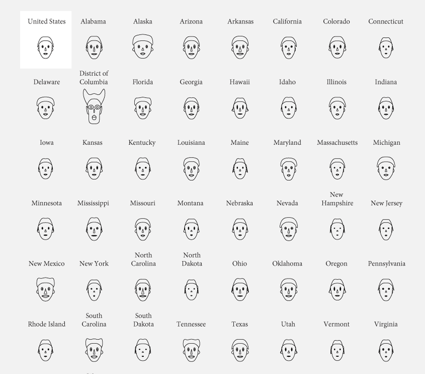
The Face of Crime in the United States

Tell a story
!
or throw it away
How to display data
1
Visual Cues
1
Coordinate System
2
Scale
3
Context
4


Female Speakers at #FOWD London 2015
Source: https://futureofwebdesign.com/london-2015/speakers


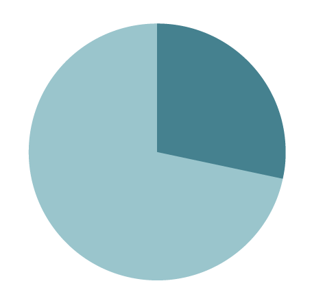
28,6 %
71,4 %
female
male
6 tips for data visualisation on the web
2
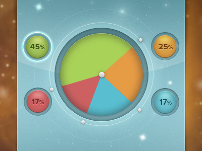
Always check your data
#1

Source: http://flowingdata.com/2009/11/26/fox-news-makes-the-best-pie-chart-ever/
Source: https://dribbble.com/shots/1064667-Circle-Graph
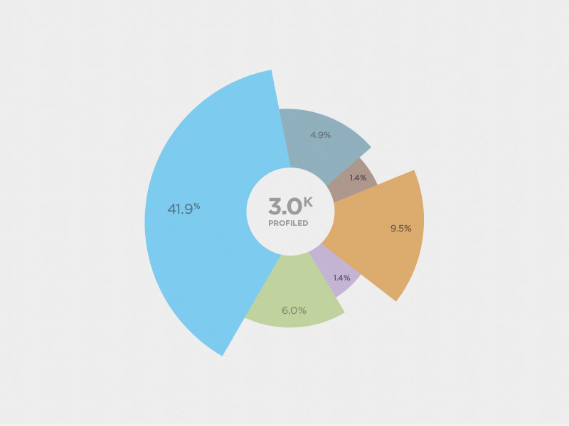
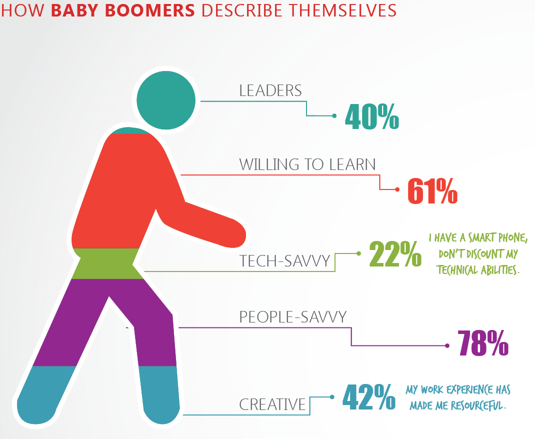
Source: http://viz.wtf/post/59697293967/hes-243-baby-boomer
Don't use 3D effects
#2
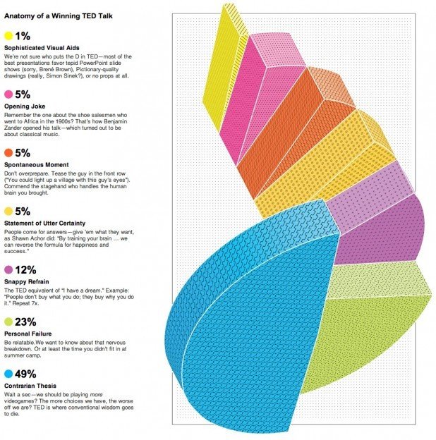
Source: http://viz.wtf/post/60203066686/the-spiral-staircase-courtesy-of-janwillemtulp
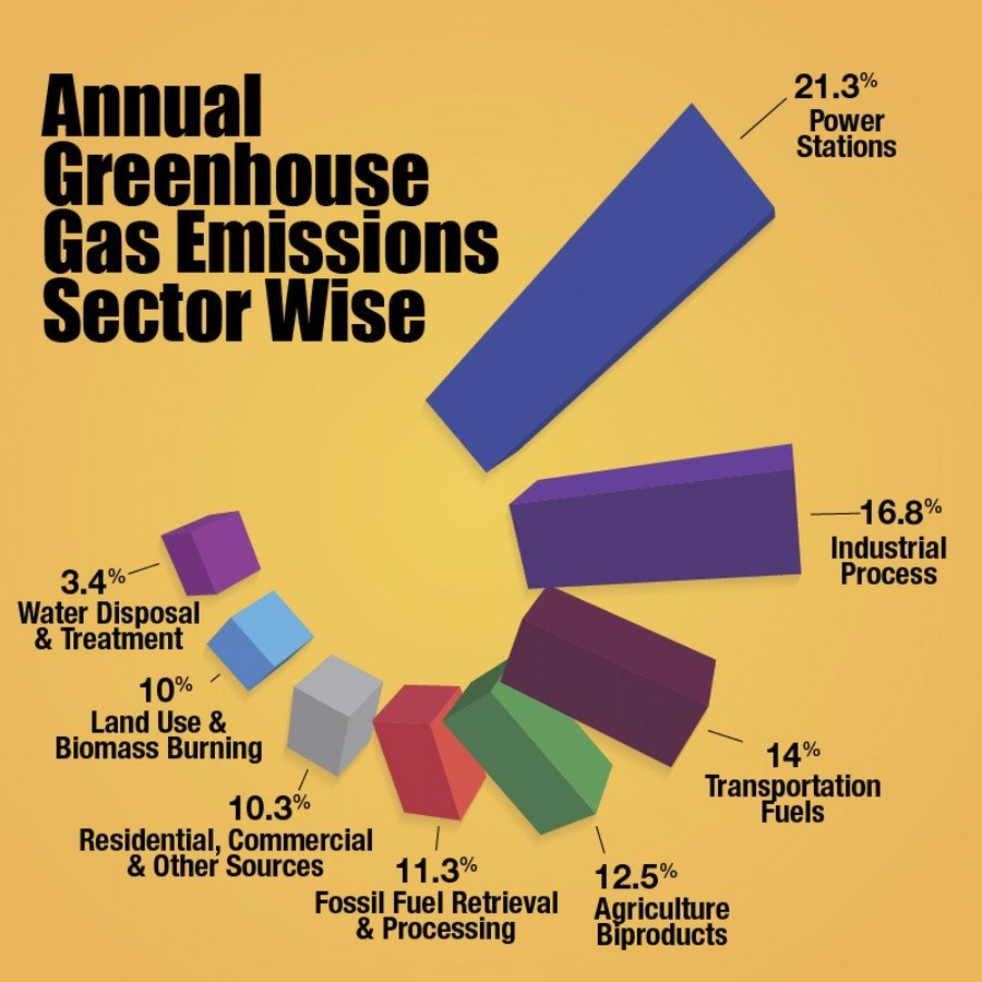
Source: http://visual.ly/annual-greenhouse-gas-emission
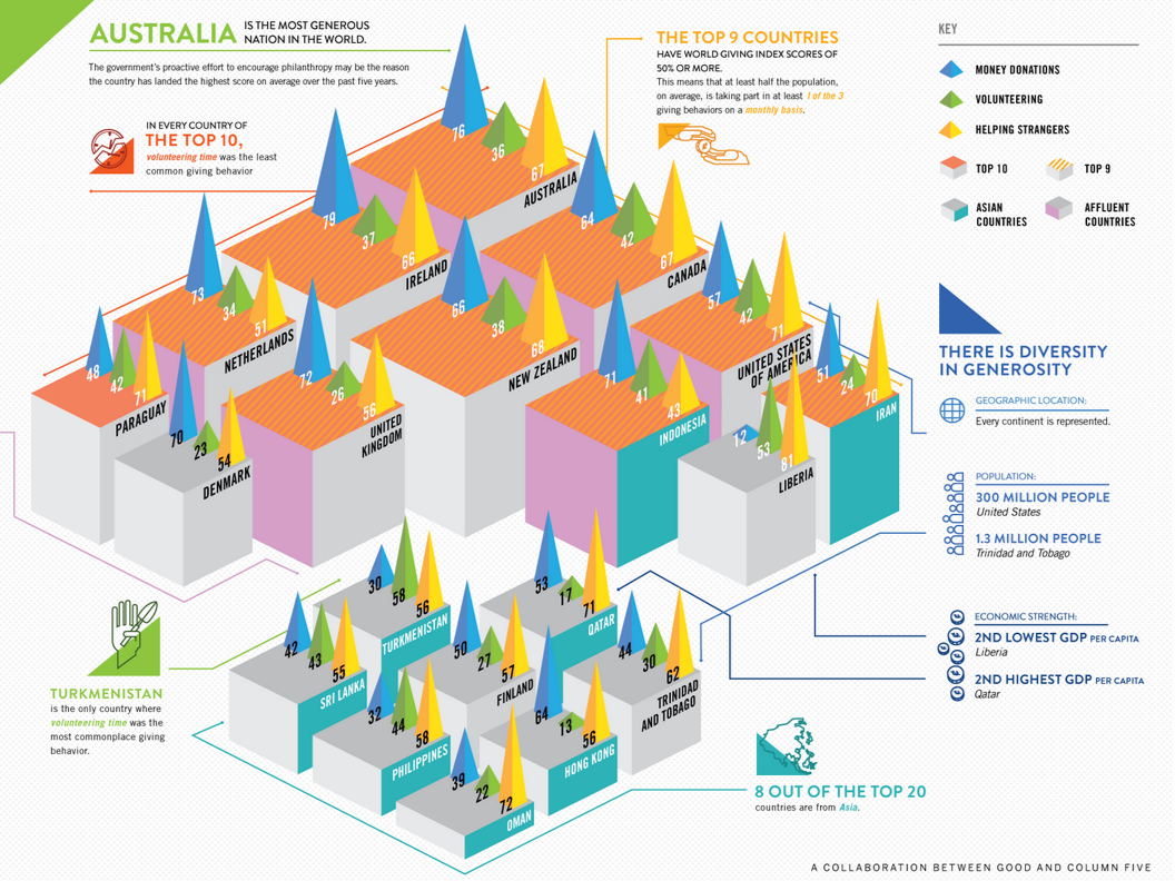
Source: http://magazine.good.is/infographics/infographic-the-20-most-charitable-countries-in-the-world
Keep it simple
#3
Source: http://viz.wtf/image/110748180715
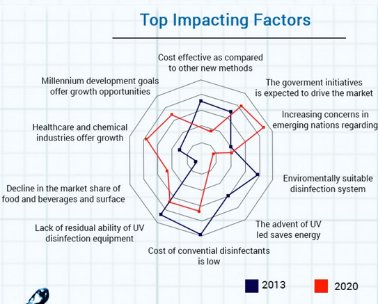
Source: http://visual.ly/global-uv-disinfection-equipment-market-size-share-global-trends-company-profiles-demand-insights
Test your chart - from the beginning
#4
Make your chart explorable
#5
Know your tools
#6
What story?
Serious or funny?
Which benefit?
Target audience?
Will they understand?
?
Thanks you for listening

Happy visualizing!
Data visualization
By Lisa Gringl


