Responsive
WEb Design
101
1. Was ist RWD?
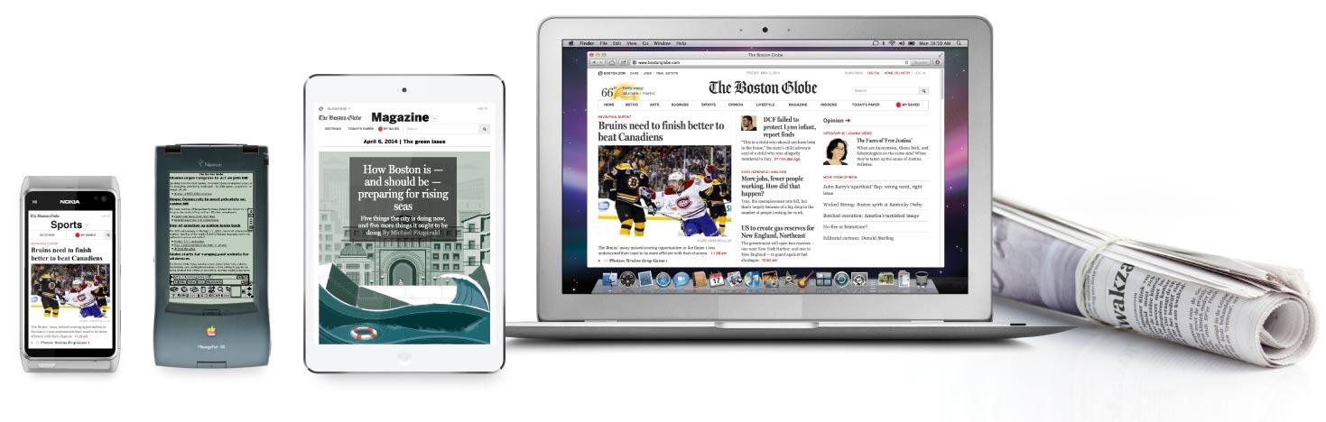
not responsive:
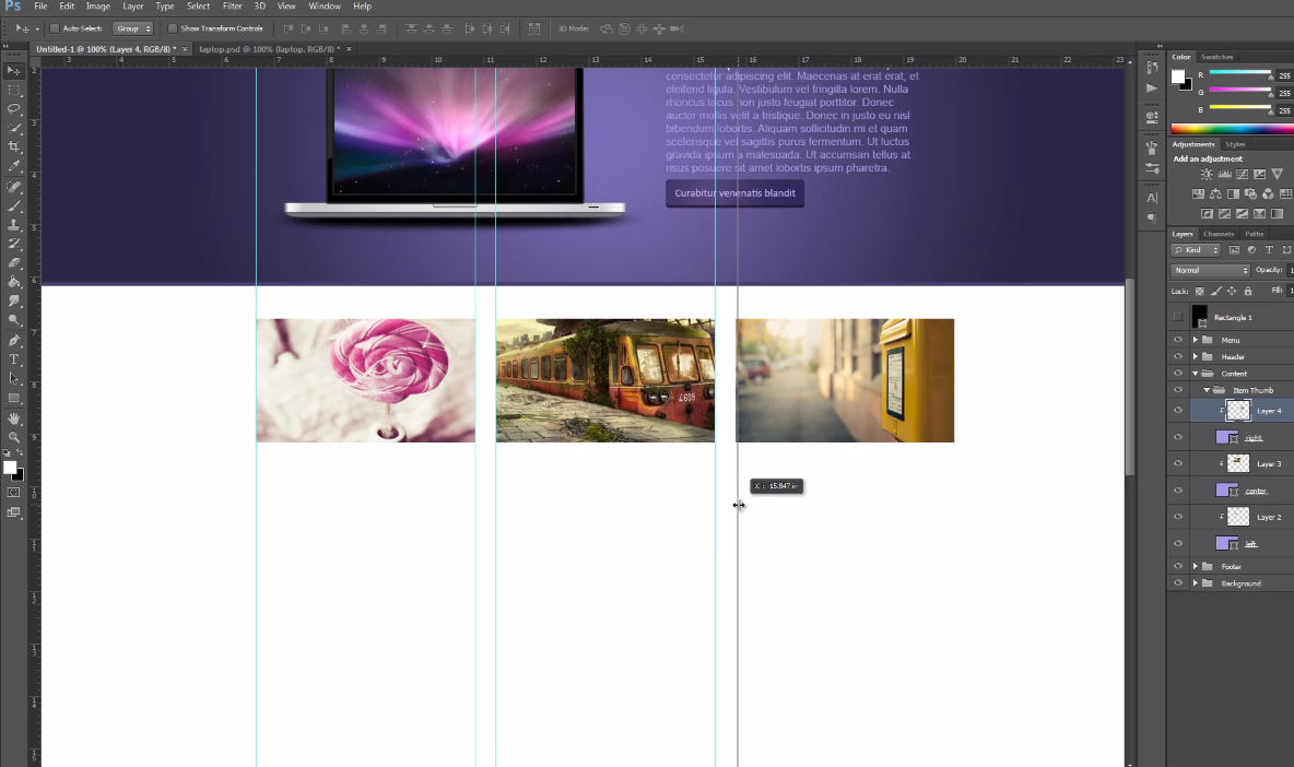
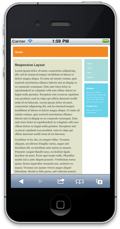
responsive:
demo:
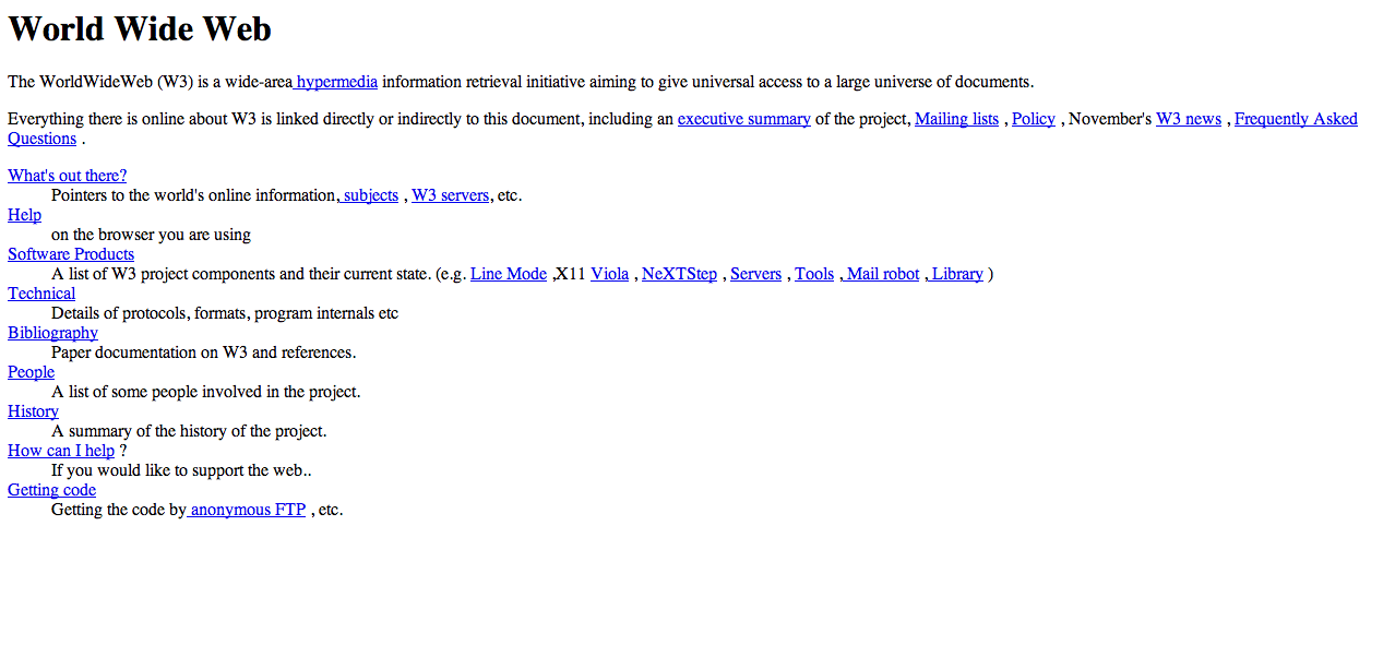
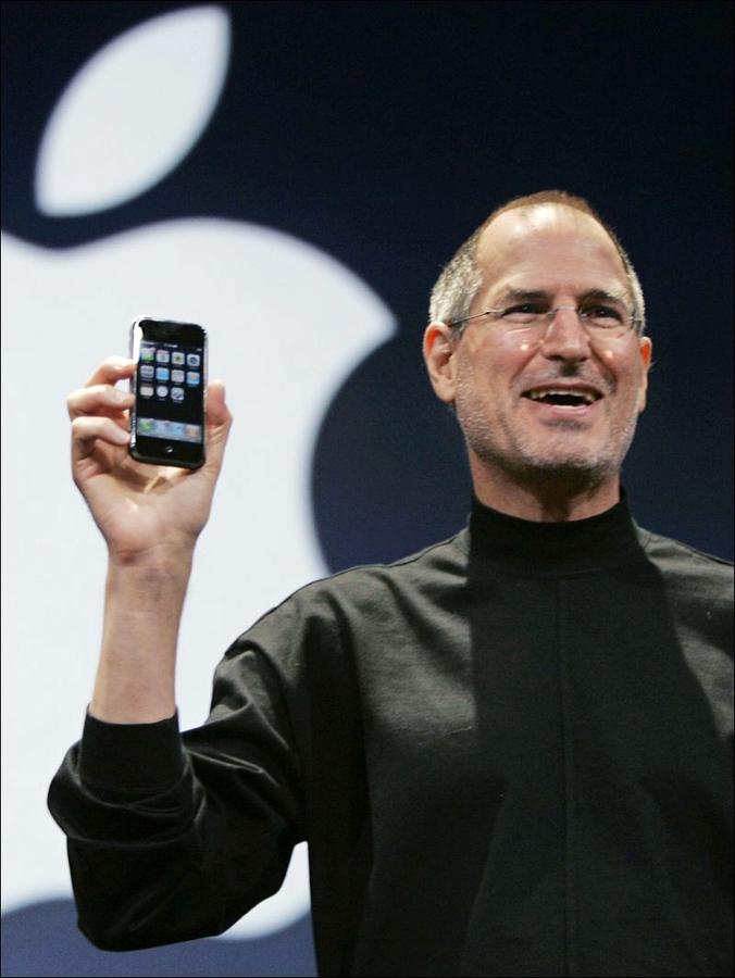
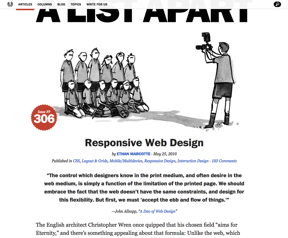
2. Geschichte


3. Bestandteile
Fluid Grids
Media Queries
In em's please!
Flexible Images ( & Video )
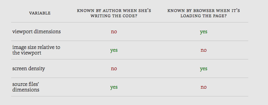
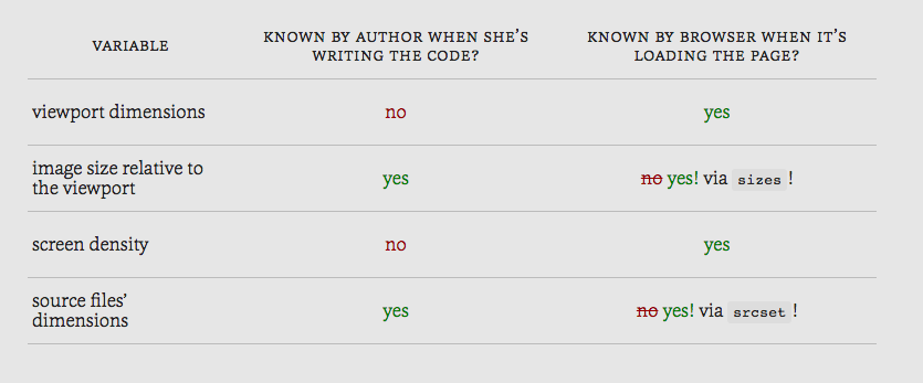
Responsive Images
Schwierigkeiten:
-
SEO
-
Bandbreite
-
Rückwärtskompatibilität
- Art Direction
Lösungen:
- Info an Server, Server entscheidet
-
JavaScript
- srcset
- <picture>
-> polyfill picturefill by Scott Jehl
Srcset & Sizes Erklärt
feature detection
4. Techniken
Relative Einheiten
-
%
- em
- vw
- vh
statt px
"In many ways, every time we use a pixel value in CSS
we’re rasterizing what was a fully-scalable web"
Trent Walton

Flexbox ( & Grid Layout)
-
Unabhängikeit der HTML-Reihenfolge
-
App-like UI's
Mobile first
hinzufügen statt wegnehmen
Breakpoints aufgrund des inhalts


Aspect Ratio
Responsive Darstellung von:
- Youtube- / Vimeo-Videos
- Google Maps
- iFrames
- Sonstige
Typographie
Ziel: 45 bis 75 Zeichen pro Linie
1) CSS (manuell über Media Queries):
Schriftgrösse aufgrund der root font-size mit em
2) CSS (automatisch)
Schriftgrösse aufgrund der Fensterbreite mit vw
3) JavaScript (automatisch)
Schriftgrösse aufgrund der Containerbreite
4) Webcam :-)
Viewport Metatag
<meta name="viewport" content="width=device-width, initial-scale=1">
Media Queries in JavaScript
if (window.matchMedia('(min-width: 45em)').matches) {
// do something...
}
5. links
People
Resources
Responsive Images:
Responsive Typography:
Danke!
Fragen?
Early Nerd - Intro to Responsive Web Design
By pompidou