Branding WiSE
by Robert Mion
How to navigate this presentation
Using the four directional arrows on your keyboard, you can move left, right, down or up. If viewing on your tablet, swipe to advance.
The available directions will be indicated by the directional pad in the bottom right corner.
Please do not skip ahead.
Just follow the arrows.
Where we left off
What are we doing?
- Helping women get a career in IT/STEM
- Showing women the value of such a career
- Promoting IT/STEM through events, scholarships, etc.
What currently exists?
- Core team of volunteers
- Organization website
- Ambition to build a strong brand message
What am I here for?
- Define a clear brand message
- Create a brand identity to speak to that message
- Give an example of that brand in application
Well then. Let's get started, shall we?
Exploring your idea
You suggested using...
- An owl ('wise' character)
- with pink glasses
- Incorporated into the logo
Ta-da!
j.k., obviously.
But seriously...
- WiSE acronym is not the focus, what it stands for is
- If using a character, it must visually tie in to IT/STEM
- We should avoid associations with imagery that de-values or negatively depicts women as objects
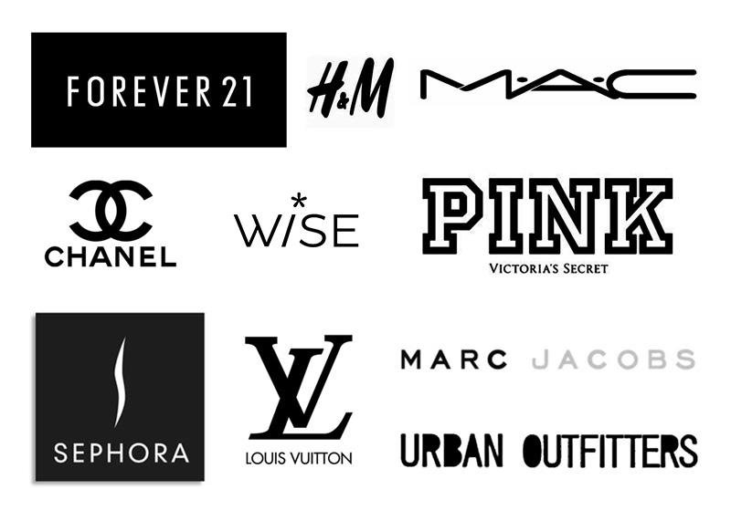
What Women Want
Besides Mel Gibson
9 brands women love
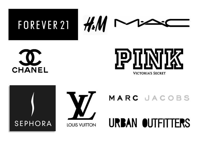
Finding similarities
- Wordmark conveys power, demands attention by being so simply, elegantly designed
- Thin sans-serif typefaces
- Icon, if any, appears centered above wordmark


Why do this research?
- Find brands that women identify with
- Use design elements to capture attention
- Create overlap between WiSE and pop-culture
What's in a logo?
3 main types

Wordmark
Icon
Combination
- Great for businesses with short names
- Great for businesses with long names or visual names
- Best examples require strong sense of design and balance to become timeless
What's best for WiSE?
- Definitely a wordmark, given our short name
- Perhaps a combination if the right icon can be used
- Any visual cue must refer to IT/STEM and the idea of advancement for women in technology, software, engineering fields
Challenge accepted.
Exploring symbols
Common IT/STEM symbols
*
/
<>
+
()
#
@
Asterisk/star - wildcard in programming
slash (forward) - system filepath indicator
brackets - commonly used in web languages
plus - general mathematical symbol
parentheses - programming/math symbol
octothorpe/hash/pound - ID, hashtag
at - twitter handle, email addresses
* / <> + () # @
HTML
Math
Grammar
Narrowing our options
[Press down to proceed]
*
- Asterisk, star, splat
- Symbol used in nearly all STEM/IT fields
- Used as a wildcard character or to denote pointers, repetition or multiplication in computer science
/
- Slash, forward-slash
- Symbol used in nearly all STEM/IT fields
- Used as a path operator in networking, many use cases in programming, mathematics and computer science
Both are great. Can we use them both?
Well, now that you mention it...
* + / =
*
/
a forward-leaning lowercase 'i'
By golly, that's it!
What's 'it'?
- We used relevant universally-recognized symbols to re-create an important part of the WiSE acronym
- It is unique enough to be instantly recognized
- But subtle enough to not detract from the overall name
Ready to see the new logo?
Ta-da!
Why it works
- Clearly states our organization's name in a professional visual form
- Written in thin, sans-serif, similar to popular female brands
- i is a slash, denoting classification of women into a specific IT/STEM group
- Star is perfectly centered over the wordmark, creating inherent balance
- Overall logo conveys a smart, powerful, confident female presence
We're just getting started!
A bold splash of color
Color and women
https://blog.kissmetrics.com/gender-and-color/
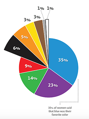
Favorite color
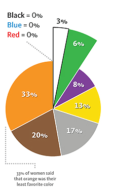
Least Favorite color
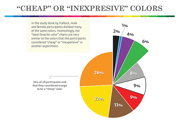
Cheap colors
Some interesting statistics
Summary
- Women like purple, blue, green
- Women hate orange, brown
- Women devalue orange, yellow
So: purple and blue-green work
Drum roll please...
Why neon green?
- Bright color brimming with energy
- Women statistically respond positively to blue-green colors
- Signifies growth, renewal, health, and environment
Why dark purple?
- Perfect complement to neon green in terms of visual contrast
- Favorite color statistically for women
- Signifies spirtuality, romance, and mystery
In summary
The logo is a true mark to symbolize both groups:
- Strong, powerful woman currently working towards a fulfilling career in IT/STEM and passionate about encouraging others to follow her
- Young women looking for female mentors to help guide them to a successful career path, hopefully in the challenging but rewarding field of information technology, science or engineering
Where are we now?
- We have a logo
- We need somewhere to put it and build awareness
- We would like a fun character to be part of our logo that creates an emotional connection with women
- We need to create a campaign with a central theme and compelling visual that ties to our new logo and ultimately embodies our organization's message
Meet Star

Hi, I'm Star!
Who does Star represent?
- Each woman working in IT/STEM today
- Each women pursuing a career in IT/STEM
- Each girl who needs someone to look up to
A part of
How can we use Star to make each of these women feel like they are:

Star on clothes
Here star is stitched into a WiSE shirt as a powerful and proud mark of a woman's IT/STEM career.

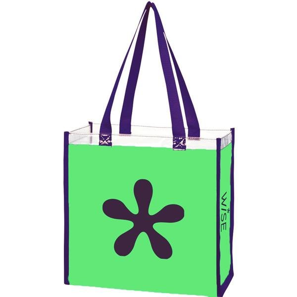
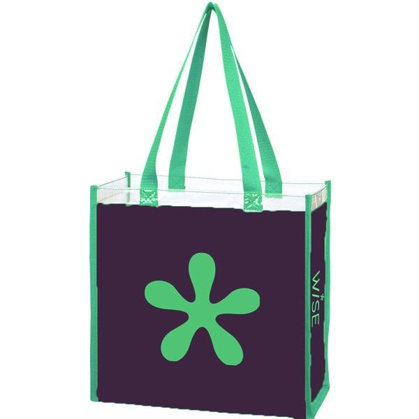
Star on totes
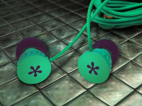
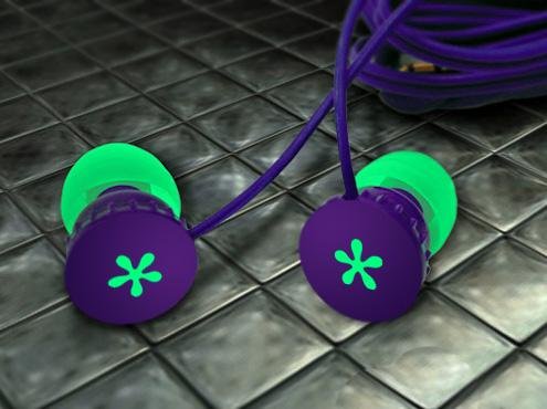
Star on earbuds
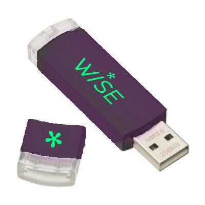
Star on USB
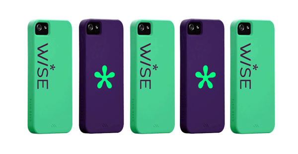
Star on phone cases
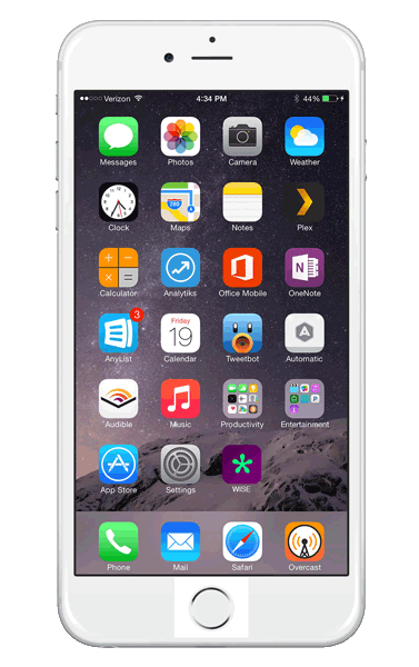
Star in app
Here, star is featured on yet-to-exist but totally viable WiSE app.
Note how the purple background makes Star really pop.
Star and
The way Star is placed within the new logo creates an interesting juxtaposition:
Star appears to be raised up by WiSE, as if she has taken what WiSE taught her and used that to stand tall in the IT/STEM community
Star stands out
...even when she fits in.
In short:
Bye bye!
The ad campaign
Brief
Build awareness of our mission to help advance women in IT, science and engineering with a city-wide poster campaign featuring a bold visual message that is easily relatable to our audience and encourages action to learn more about how to get started.
Message
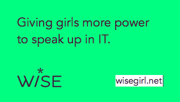
Giving girls more power to speak up in IT
The artwork
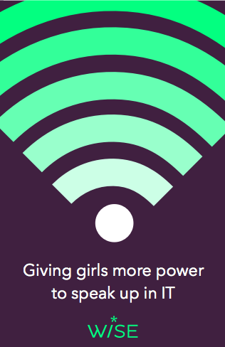
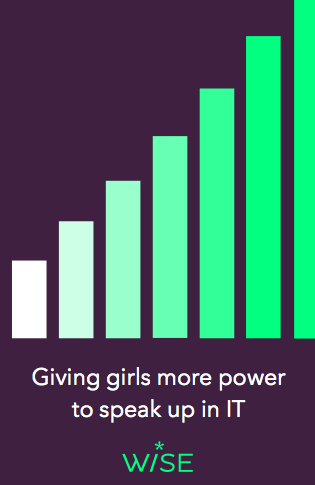
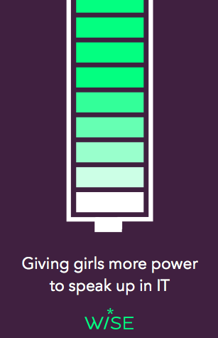
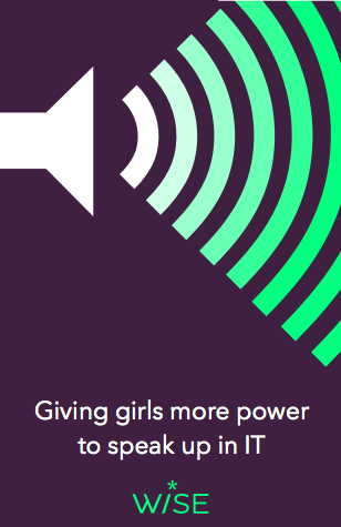
Explanation
Each poster features common mobile technology symbols. However, instead of containing the traditional number of 'bars' or 'notches' to indicate power, those elements appear to go on ad infinitum, thereby amplifying the message of giving girls 'more power' to speak up in IT.
Color gradation is used to symbolize that the more powerful you get, the closer you come to being 'WiSE' and having your voice heard.
Lock-up with IT-ology
Why it is successful
- Letterforms from both logos are similar in weight
- The uniqueness of WiSE logo adds to (and in no way conflicts with) that of IT-ology logo
- Colors contrast each other well and create a strong visual relationship
Something to leave behind at events
Front
Back
Be together. Not the same.
The sign of a great brand identity.
and Android's new tagline.
This is just the beginning
Remember...
The brand will only grow from here.
I'd like your feedback
- Does this brand identity properly reflect the message and core values of WiSE and those involved?
- Given what you just saw, are you confident these brand elements will provide a strong foundation from which to launch a bold educational platform for WiSE?
- Are there any specific items or graphical elements you have strong business-related objectives towards?
Thank you
One last thing...
#workIT

wise
By rmion
wise
Presenting a new identity for Women in Science and Engineering (WISE)