Designing for Readers
A Guide to Modern Web Typography
Andrew Baker
Director of Creative Technology - Cactus
11.03.2015
What is a creative Technology Director?
- digital strategy and creative concepting
- user experience design
- interaction/visual design
- front-end development
- new business & client advocacy
Workshop Outline
1) Introduction
Typography key terms and foundations
A brief history for the web
The current state of web typography
2) Typography in UX
Understanding type hierarchy
3 Principles for more readable type
Common things to avoid
Pairing typefaces in design
3) CSS
Font-properties overview
Building a font scale
@font-face
4) Working session
codepen
An Introduction
Key Terms
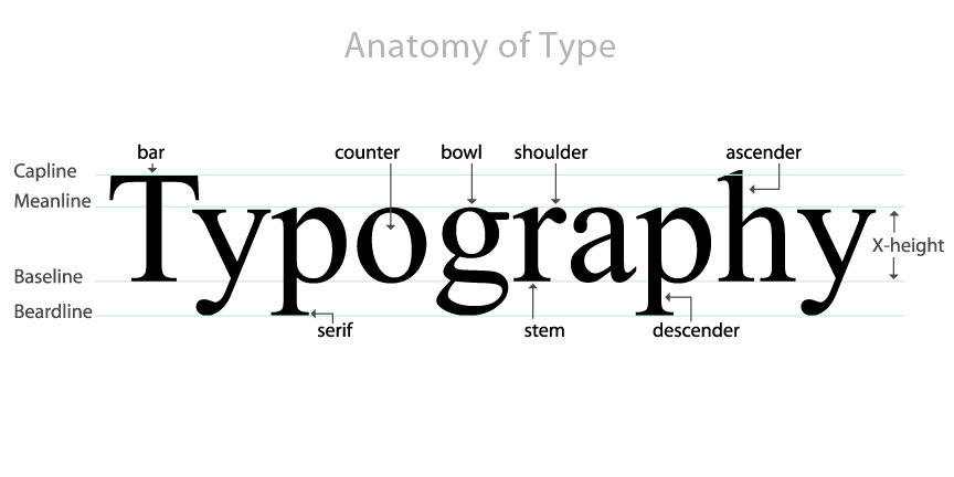
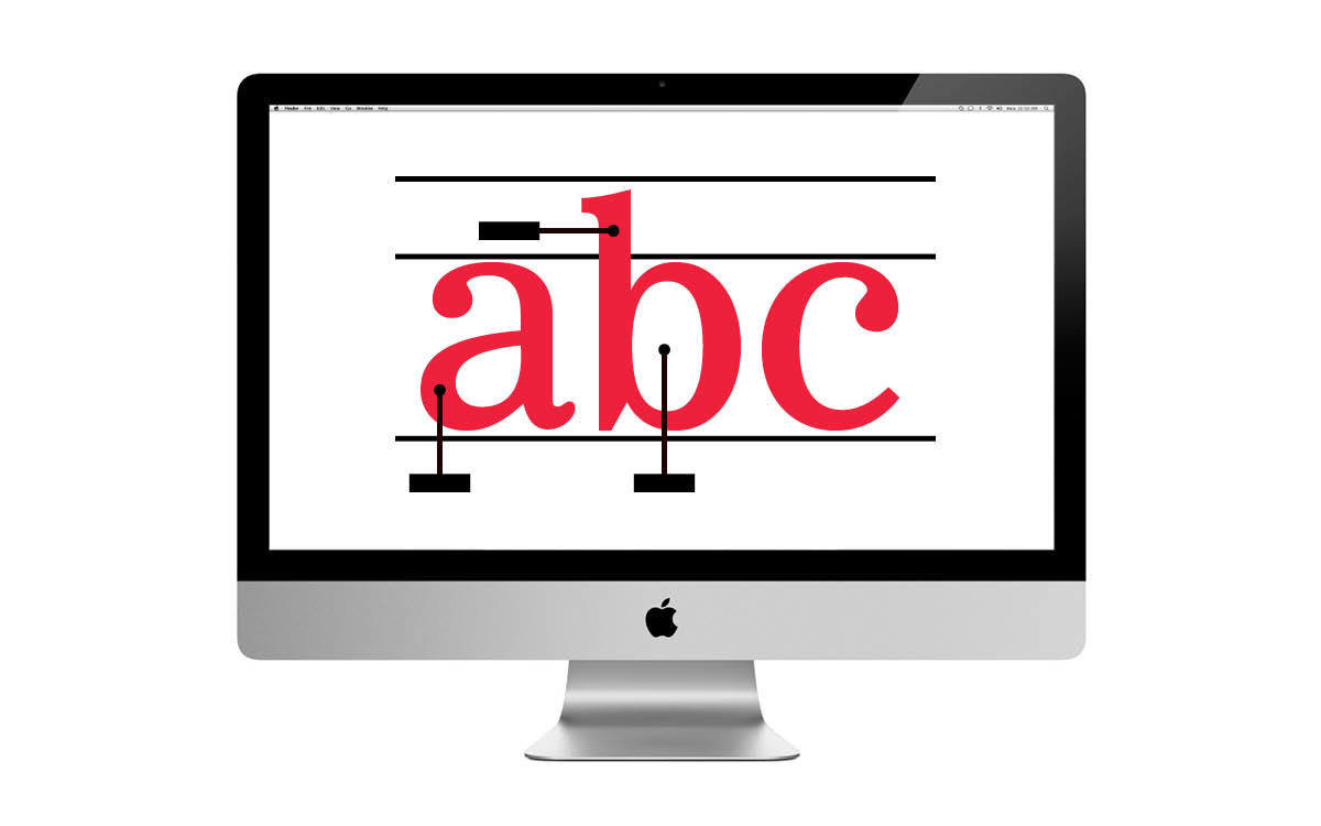
Typefaces vs. fonts
Typeface
A typeface is the design of a type family.
Like every family, type families have names. An example of a type family name is Georgia. Georgia is a type family — a typeface — not a font.
Font
Fonts are every variant of a typeface.
Using the Georgia typeface example, the “Georgia Regular”, “Georgia Italic”, “Georgia Bold”, and “Georgia Bold Italic” in my library are all fonts of the Georgia typeface
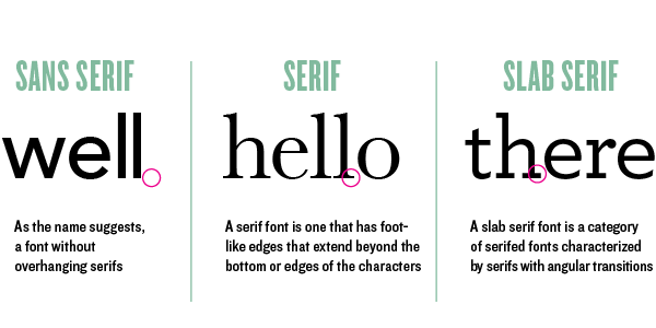
Primary type Classifications
Tracking, Leading, Kerning
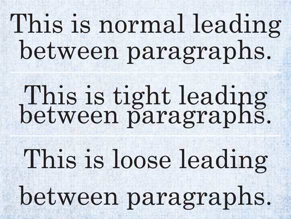
Leading
The distance between the baselines of successive lines or types. Known as line-height in CSS
Tracking
This is the consistent increase or decrease of space between letters uniformly. Known as letter-spacing in CSS
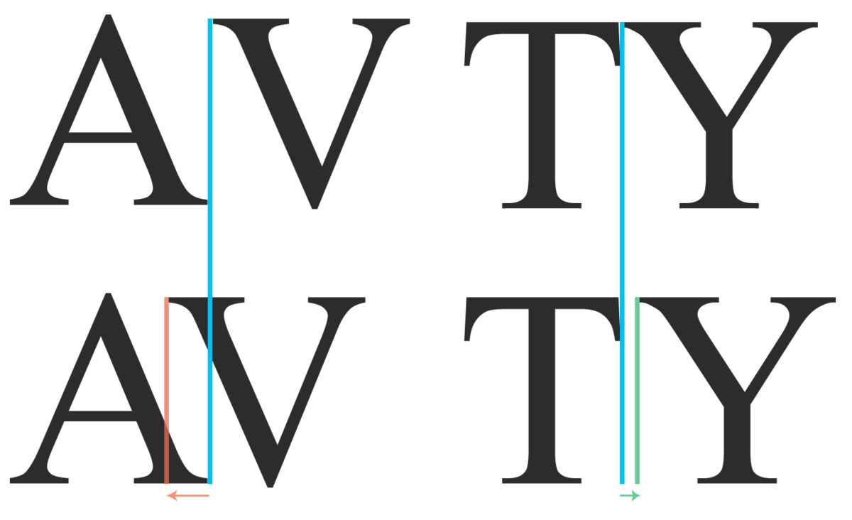
Kerning
Adjusting the space between individual characters in glyphs of varying widths
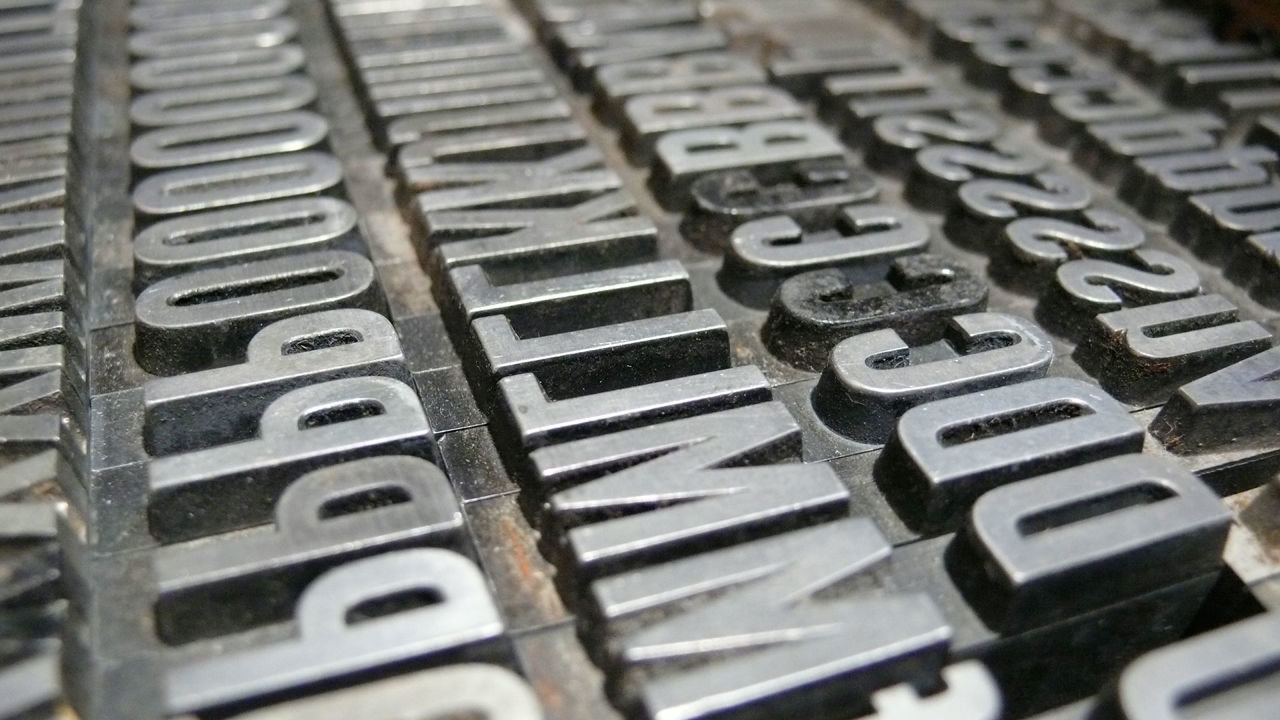
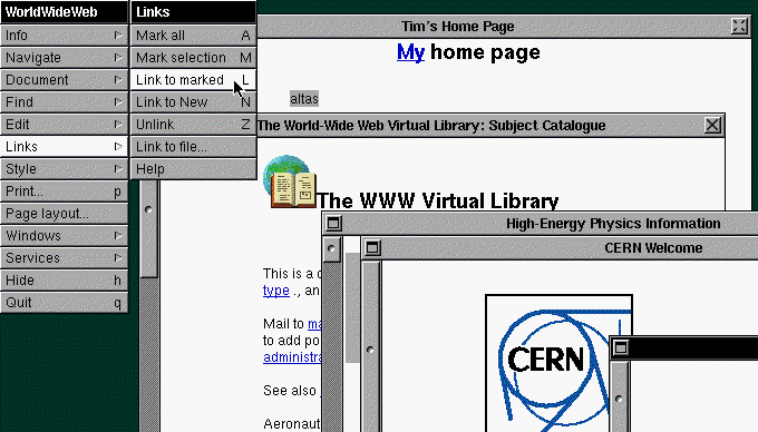
A Brief history of web type
1990 - worldwideweb
The browser determined the font style
A screenshot from Tim-Berner-Lee's WorldWideWeb browser
1995 - <font>
Netscape introduces the <font> tag
sample <font> tag from HTML4
<font size='3' color='red'>This is some text!</font>1996 - 'Core fonts for the web'
Microsoft's project to design a standard pack of fonts for use on the internet
1998 - Font downloading
CSS2 introduces remote font downloading
2008 - Subscription Hosting
CSS3 allows for subscription hosted web fonts
Overview
Typography in UX
WEB DESIGN IS 95% TYPOGRAPHY
- Oliver Reichenstein
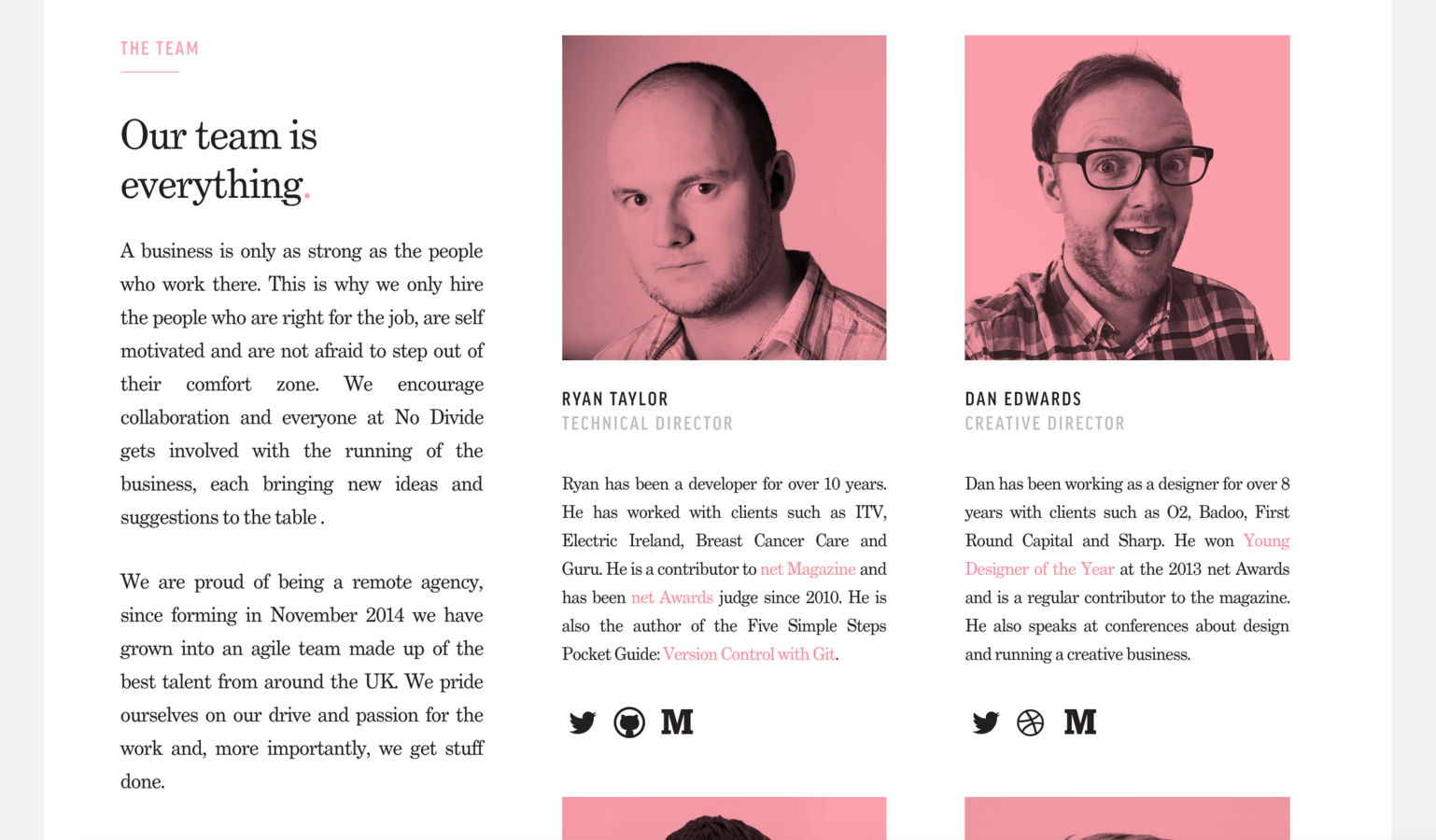
Visual Heirarchy
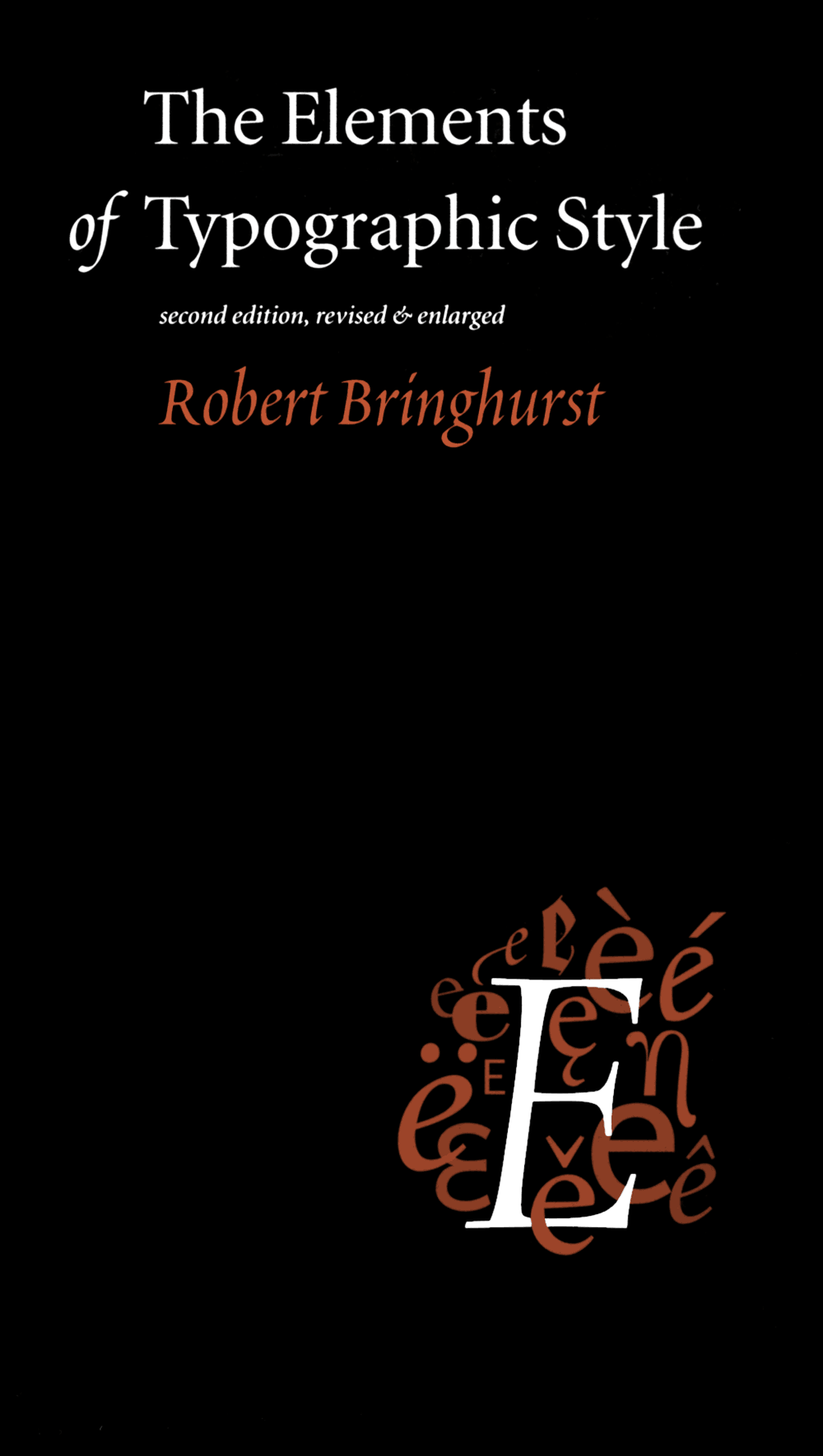
“Typography exists to honor content.”
- Robert Bringhurst: The Elements of Typographic Style
establishing
typographic heirarchy
- size
- weight
- color
- position
- contrasting typeface
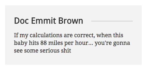
Size
Upcoming ATLAS Event
The multimedia artist and musician, Trimpin will have a residency with ATLAS from Nov 10-14. He will work with ATLAS students on an electronic music composition, explore his creative process and build an installation of a kinetic and interactive sculpture
Weight
Upcoming ATLAS Event
The multimedia artist and musician, Trimpin will have a residency with ATLAS from Nov 10-14. He will work with ATLAS students on an electronic music composition, explore his creative process and build an installation of a kinetic and interactive sculpture
Color
Upcoming ATLAS Event
The multimedia artist and musician, Trimpin will have a residency with ATLAS from Nov 10-14. He will work with ATLAS students on an electronic music composition, explore his creative process and build an installation of a kinetic and interactive sculpture
Position
Upcoming ATLAS Event
The multimedia artist and musician, Trimpin will have a residency with ATLAS from Nov 10-14. He will work with ATLAS students on an electronic music composition, explore his creative process and build an installation of a kinetic and interactive sculpture
Contrasting typeface
Upcoming ATLAS Event
The multimedia artist and musician, Trimpin will have a residency with ATLAS from Nov 10-14. He will work with ATLAS students on an electronic music composition, explore his creative process and build an installation of a kinetic and interactive sculpture
Combination
Upcoming ATLAS Event
The multimedia artist and musician, Trimpin will have a residency with ATLAS from Nov 10-14. He will work with ATLAS students on an electronic music composition, explore his creative process and build an installation of a kinetic and interactive sculpture
Trimpin: Kinetic and Sound Sculpture
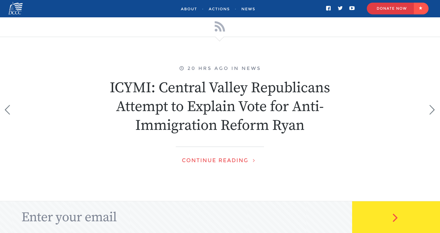
In the wild
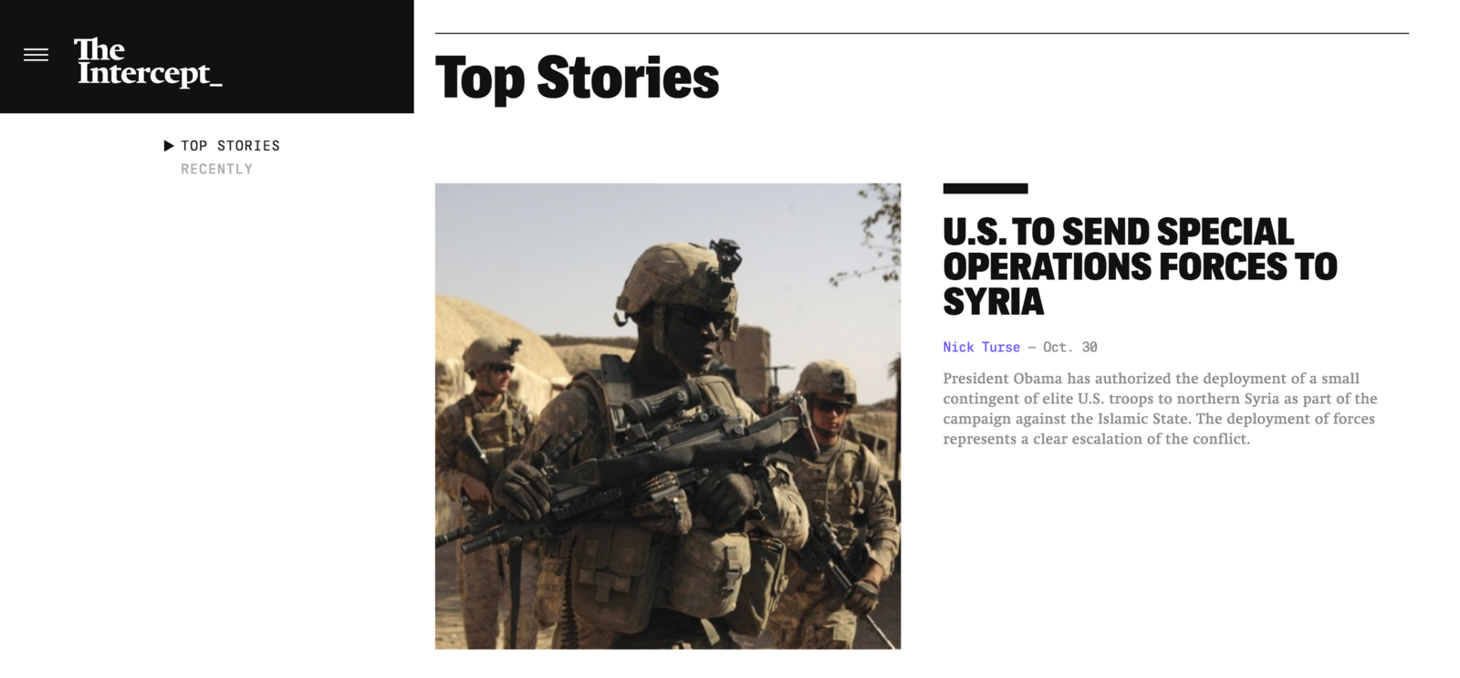
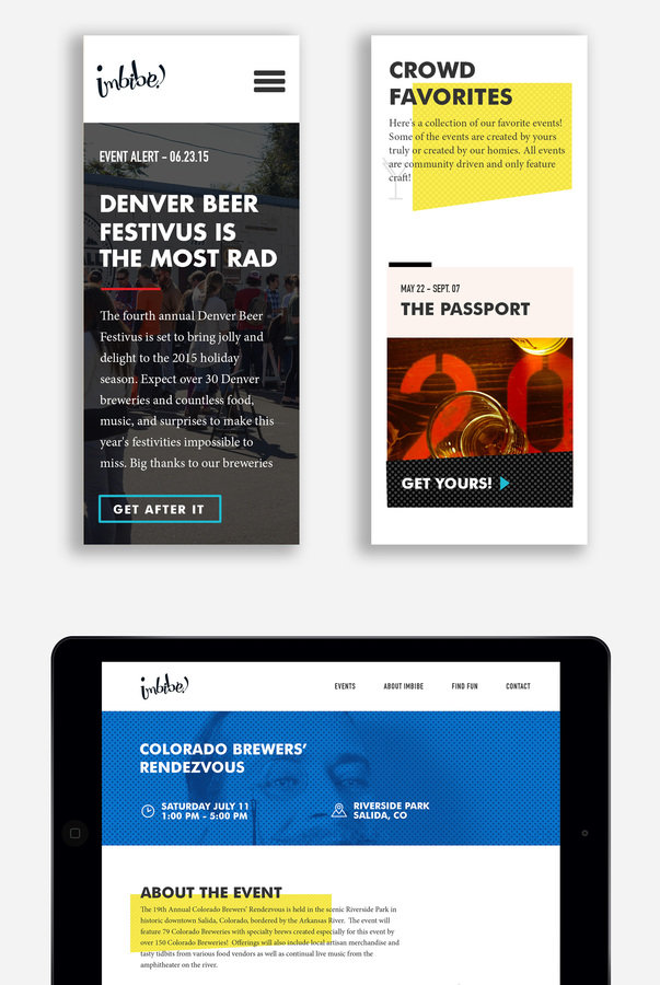
The intercept makes good use of weight, size, color, and typeface to establish clear content heirarchy
THree principles for more readable type
Measure • Punctuation • Contrast
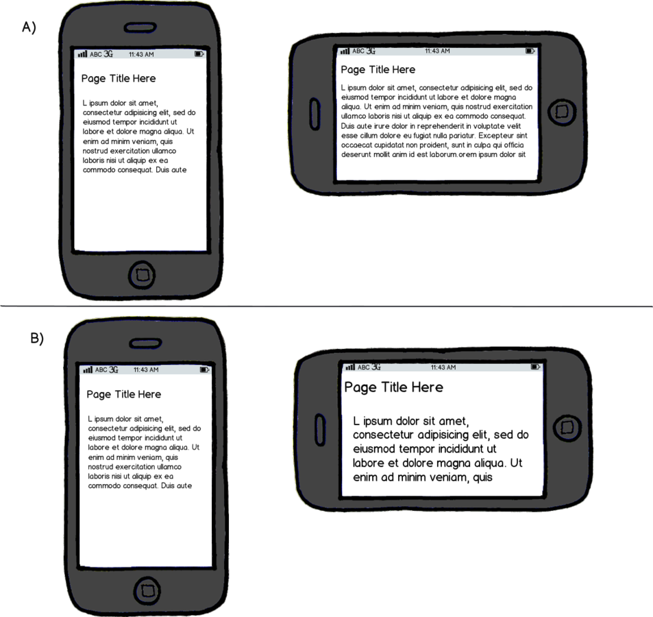
Measure
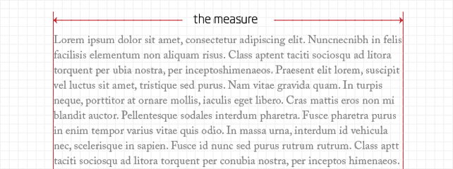
Measure - visualized
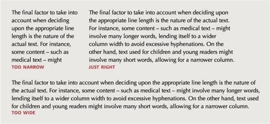
Optimal line lengths are 45 - 75 characters (spaces included)
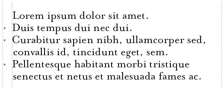
Hanging Punctuation
Hanging Punctuation - Lists
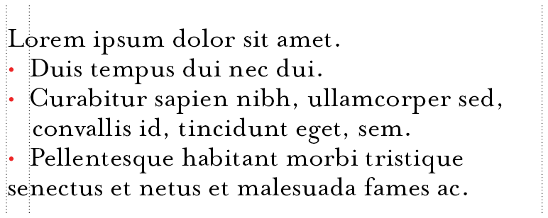
type without hanging bullets destroys the flow of text
text flow is uninterrupted and scanable
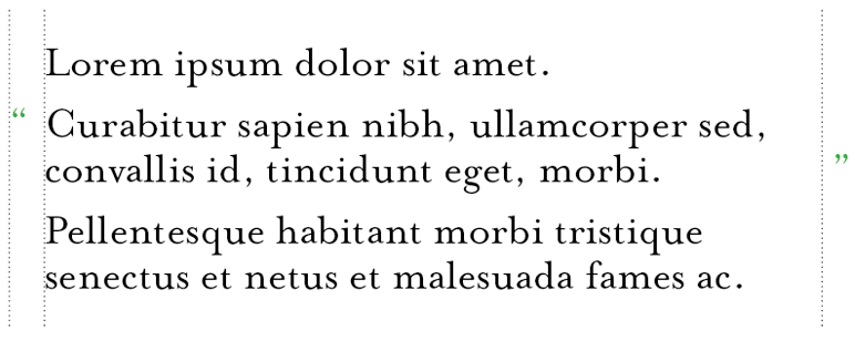
Hanging Punctuation - Quotes
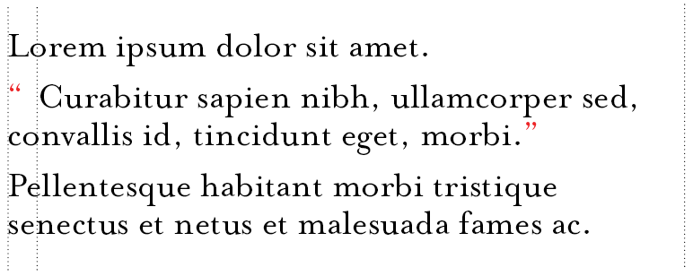
type without hanging quotation marks
text flow is uninterrupted and scanable
Contrast
avoid white type on black backgrounds
dark gray type on light gray background
Upcoming ATLAS Events:
The multimedia artist and musician, Trimpin will have a residency with ATLAS from Nov 10-14. He will work with ATLAS students on an electronic music composition, explore his creative process and build an installation of a kinetic and interactive sculpture.
Upcoming ATLAS Events:
The multimedia artist and musician, Trimpin will have a residency with ATLAS from Nov 10-14. He will work with ATLAS students on an electronic music composition, explore his creative process and build an installation of a kinetic and interactive sculpture.
Common Mistakes
Avoid Small type
small type becomes increasingly hard to read on mobile devices and displays with low resolution.
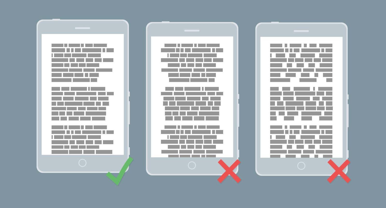
avoid justified or centered text
A rag creates a random shape down the right-hand column that helps the eye relocate its last position, with minimal re-reading
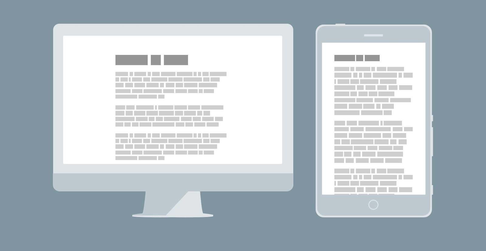
Minimize font-size contrast on mobile
On mobile, substantially less text is visible so contrast becomes overly exaggerated
Minimize your number of typefaces
On mobile, substantially less text is visible so contrast becomes overly exaggerated
Pairing Typefaces
Considerations when pairing for the web
- number of fonts to use
- system fonts vs. @font-face
- purchased vs. free
- CDN vs. self-hosted
Pairing for concordance
Concordant fonts have similar traits (kerning, proportions, cap height, etc.)
fonts from the droid family share tall x-heights (seen in red)
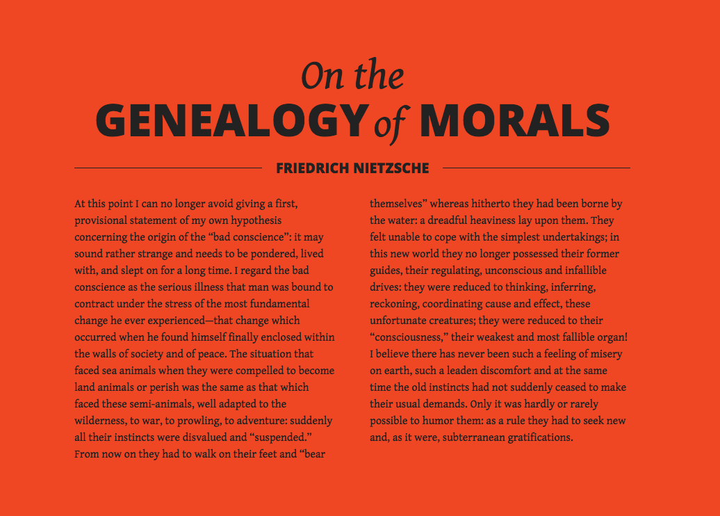
Pairing for contrast
Contrasting fonts can pair well and create hierarchy to draw the user's eye through your page. Contrast can be established through style, size, weight, form and color.
The bold geometric nature of Oswald contrast well with the classic roman features of Vollkorn

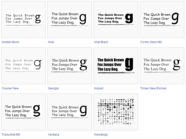
Font pairing inspiration
Google webfonts showcase
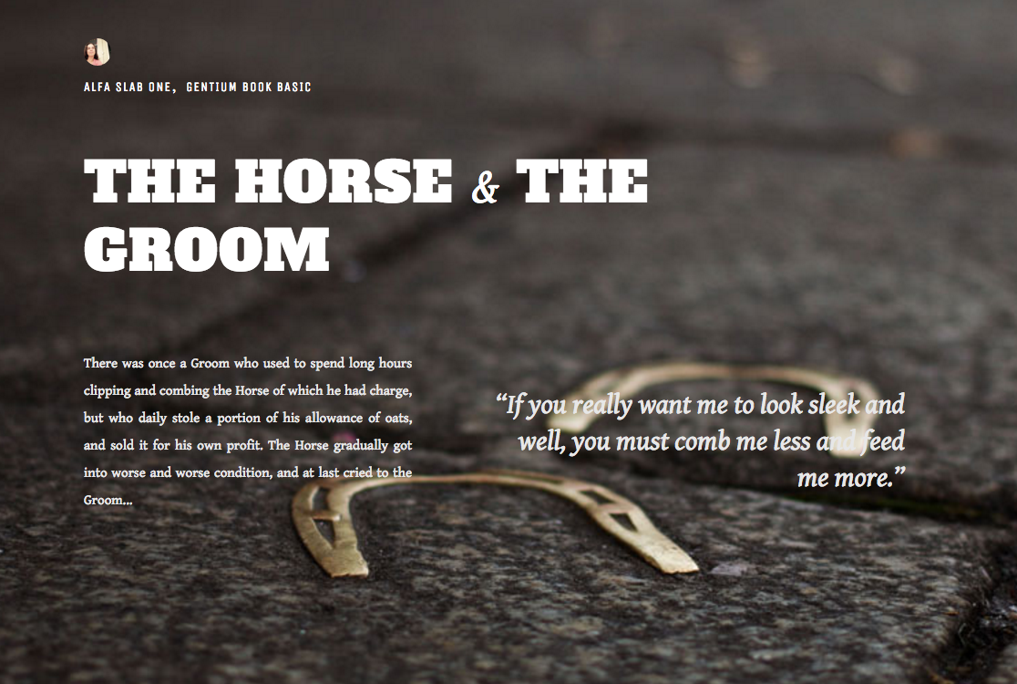
Font pairing inspiration
Aesop's fables via google webfont and unsplash imagery
Font pairing inspiration
Typewolf daily inspiration for web typography
Typography in CSS
Part 1: CSS font properties
font-family
body {
  font-family: "Helvetica Neue", Helvetica, Arial, sans-serif;
}
declares which font—as well as which fallback or substitute fonts—should be used to display text
font-Size
body {
  font-size: 0.85em;
}
provides the ability to set the size of text using common length values, including pixels, em units, percentages, points, or font-size keywords
font-Style
aside {
  font-style: italic;
}
Allows us to change text to italics, or to prevent text from being italicized. Main values are 'normal' and 'italic' but also accepts 'oblique' and 'inherit'
font-Variant
.subhead {
  font-variant: small-caps;
}
Rarely used, but allows us to set text in sub capitals
font-Weight
h4 {
  font-weight: bold;
}
Font-weight allows us to make text bold or thinner than normal. It accepts either a set of keywords or a number if the font being used allows for number designated weights
Keywords: 'normal' 'bold' 'bolder' 'lighter' and 'inherit'
Numeric Values: 100, 200, 300, 400, 500, 600, 700, 800, 900
font-Weight
body {
  line-height: 1.5em;
}
The distance between two lines of text (often referred to as leading) is declared using the line-height property.
Best-practice states that our line-heights should typically equal 1.5 the value of our font-size
Shorthand font properties
html {
  font: italic small-caps bold 14px/22px "Helvetica Neue", Helvetica, Arial, sans-serif;
}
All of the font properties can be combined into one shorthand CSS rule. The order of these property values should be as follows, from left to right: font-style, font-variant, font-weight, font-size, line-height, and font-family.
The only required values when using shorthand are font-family and font-size
Part 2: Sizing
- ems (em)
- rems (rems)
- Pixels (px)
- Points (pt)
- Percent (%)
1em = 12pt = 16px = 100%
Meet the units
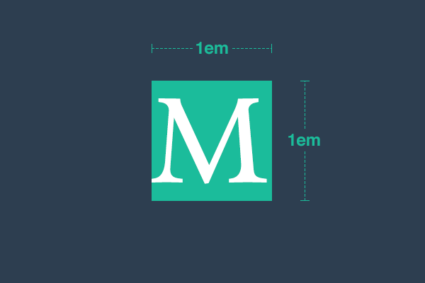
The all important EM
ems are measurement units that inherit and scale relative to their parent font size, similar to the way vector paths scale proportionally
Modular Scale
A sequence of relative numbers that help us to choose font sizes, line heights, margins, and more
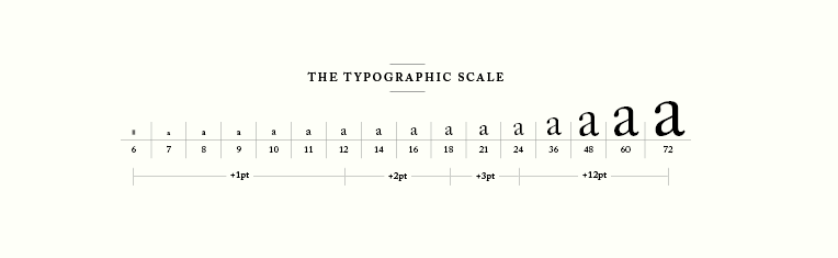
html { font-size: 1em; }

h1 { font-size: 2.074em; }

h2 { font-size: 1.728em; }

h3 { font-size: 1.44em; }

h4 { font-size: 1.2em; }

small { font-size: 0.833em; }

.box { padding: 1.25em; }

@media screen and (min-width: 1400px) {
  html { font-size: 1.25em; }
}
html { font-size: 16px; }
h1 { font-size: 33px; }
h2 { font-size: 28px; }
h3 { font-size: 23px; }
h4 { font-size: 19px; }
small { font-size: 13px; }
.box { padding: 20px; }
@media screen and (min-width: 1400px) {
html { font-size: 20px; }
h1 { font-size: 41px; }
h2 { font-size: 35px; }
h3 { font-size: 29px; }
h4 { font-size: 24px; }
small { font-size: 17px; }
.box { padding: 25px; }
}EM scales by updating one value
px require recalculation for each element
An example
Part 3: webfonts
@font-face
CSS3 feature allowing custom fonts to be loaded on a webpage.
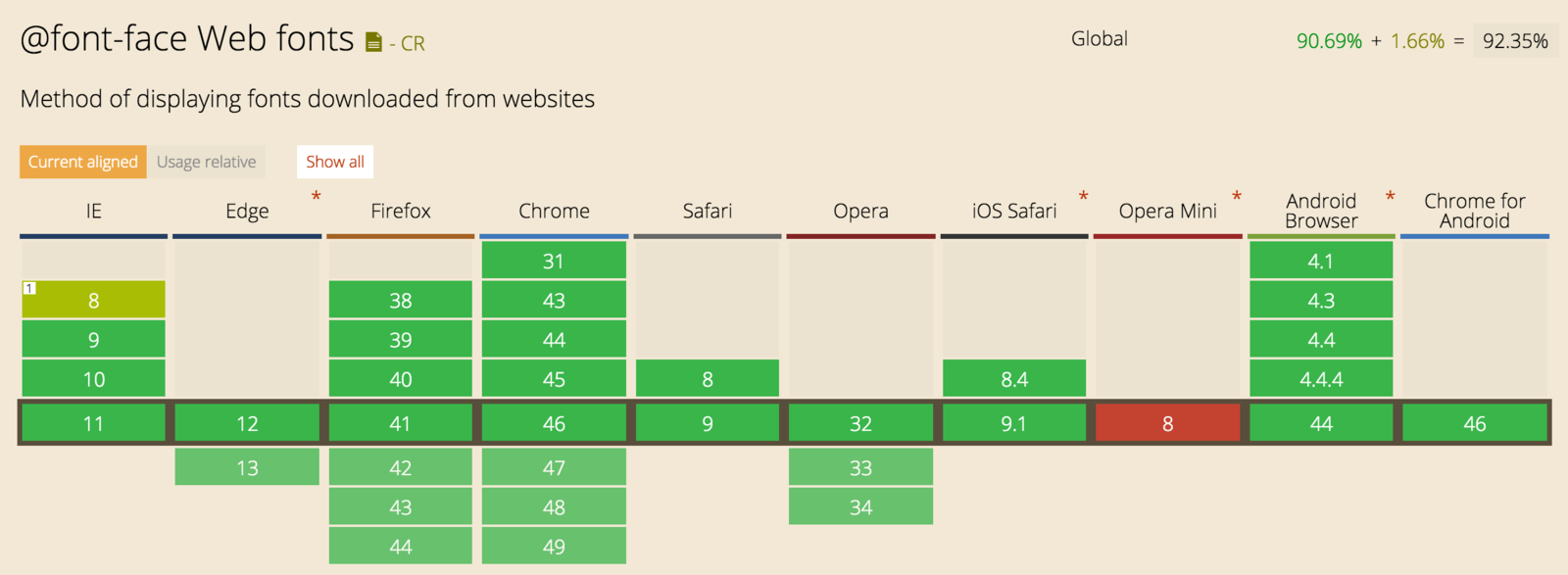
Browser support (deepest)
@font-face {
  font-family: 'MyWebFont';
  src: url('webfont.eot'); /* IE9 Compat Modes */
  src: url('webfont.eot?#iefix') format('embedded-opentype'), /* IE6-IE8 */
       url('webfont.woff2') format('woff2'), /* Super Modern Browsers */
       url('webfont.woff') format('woff'), /* Pretty Modern Browsers */
       url('webfont.ttf')  format('truetype'), /* Safari, Android, iOS */
       url('webfont.svg#svgFontName') format('svg'); /* Legacy iOS */
}

body {
  font-family: 'MyWebFont', Fallback, sans-serif;
}
Browser support (modern)
@font-face {
  font-family: 'MyWebFont';
  src:  url('myfont.woff2') format('woff2'),
        url('myfont.woff') format('woff');
}
@import
@import url(//fonts.googleapis.com/css?family=Oswald);

h1, h2, h3, h4 {
    font-family: 'Oswald', sans-serif;
}Linking to font stylesheet
<link href='//fonts.googleapis.com/css?family=Open+Sans'
rel='stylesheet' type='text/css'>
body {
  font-family: 'Open Sans', sans-serif;
}
HTML inside <head>
CSS
Only download what you will use
<link href='https://fonts.googleapis.com/css?family=Open+Sans:400,300,300italic,400italic,600,600italic,700,700italic,800,800italic' rel='stylesheet' type='text/css'>limit weights and styles - https://www.google.com/fonts#UsePlace:use/Collection:Open+Sans
Web Font options
The largest collection of fonts on the web. Buy web fonts and host them yourself with their self-hosted kit – own your fonts instead of renting.
Another huge selection of fonts. Has fonts that MyFonts doesn’t have like Arnhem.
Web and desktop fonts in a single subscription. Plans start at $5/month.
Doesn’t have the largest selection but has very friendly licensing terms for both desktop and web.
Adobe’s web font hosting service. Free with Creative Cloud, otherwise plans start at $24.99/year. Nice selection of fonts but sadly lacks fonts from the Monotype Imaging library like Avenir and Akzidenz Grotesk.
Hoefler & Co.’s (formerly H&FJ) web font hosting service. Starts at $99/year so it’s a bit more expensive than other services. Their ScreenSmart fonts render beautifully on screen, so the higher price may be worth it.
Another web font hosting service with plans starting from $20/year. Has selections from Font Bureau that you can’t get on other hosting services such as Miller andBenton Sans.
Google’s free web font hosting service. Some excellent options available such asOpen Sans and Source Sans Pro.
Designing for Readers: A Guide to Modern Web Typography.
By Andrew Baker