Presented by Aditya Thakur
Introduction to CSS Animations
@keyframes and Animations
The main component of CSS animations is @keyframes, the CSS rule where animation is created.
To make CSS animations work, you need to bind the @keyframes to a selector.
The @keyframes
- Name: (of our choice)
- Stages: 0%-100%; from (equal to 0%) and to (equal to 100%).
- CSS styles: the style that you would like to apply for each stage.
Here we'll set the animation stages. Our @keyframes properties are:
For example:
@keyframes fade {
  0% {
    opacity: 1;
  }
  100% {
    opacity: 0;
  }
}
The code above will apply a transition to the opacity of an element, from opacity: 1 to opacity: 0. Each of the approaches above will achieve the same end result.
The Animation
The animation property is used to call @keyframes inside a CSS selector. Animation can have multiple properties:
- animation-name: @keyframes name (remember we chose fade).
- animation-duration: the timeframe length.
- animation-timing-function: sets the animation speed.
- animation-delay: the delay before our animation will start.
- animation-iteration-count: how many times it will iterate.
- animation-direction: gives you the ability to change the loop direction.
- animation-fill-mode: specifies which styles will be applied to the element when our animation is finished.
For example:
.element {
  animation-name: fade;
  animation-duration: 4s;
  animation-delay: 1s;
  animation-iteration-count: infinite;
  animation-timing-function: linear;
  animation-direction: alternate;
}
or shorthand:
.element {
  animation: fade 2s 1s infinite linear alternate;
}
Adding Vendor Prefixes
The standard prefixes apply:
- Chrome & Safari: -webkit-
- Firefox: -moz-
- Opera: -o-
- Internet Explorer: -ms-
An animation property using vendor prefixes will look like:
.element {
    -webkit-animation: fade 4s 1s infinite linear alternate;
    -moz-animation: fade 4s 1s infinite linear alternate;
    -ms-animation: fade 4s 1s infinite linear alternate;
    -o-animation: fade 4s 1s infinite linear alternate;
    animation: fade 4s 1s infinite linear alternate;
}
alongside with @keyframes:
@-webkit-keyframes fade { /* your style */ }
@-moz-keyframes fade { /* your style */ }
@-ms-keyframes fade { /* your style */ }
@-o-keyframes fade { /* your style */ }
@keyframes fade { /* your style */ }
Multiple Animations
You can add multiple animations using a comma separator.
@keyframes fade {
  to {
    opacity: 0;
  }
}
@keyframes rotate {
  to {
    transform: rotate(180deg);
  }
}


.element {
  animation: fade 2s 1s infinite linear alternate,
             rotate 2s 1s infinite linear alternate;
}
Square to Circle Tutorial
Let’s create a simple shape transition; a square to circle animation using the above principles. We will have five stages in total and for each stage we will define a border-radius, a rotation and a different background color to our element.
Basic Element
First, let’s create the markup, an element to animate.
<div></div>Then, using an element selector (div {}), add default styling to the div:
div {
  width: 200px;
  height: 200px;
  background-color: coral;
}
Declaring the Keyframes
Now let’s prepare @keyframes, which we'll call square-to-circle, and the five stages
@keyframes square-to-circle {
  0%{}
  25%{}
  50%{}
  75%{}
  100%{}
}
Let's begin by adding the border-radius for each corner of the square:
@keyframes square-to-circle {
  0%  {
    border-radius:0 0 0 0;
  }
  25%  {
    border-radius:50% 0 0 0;
  }
  50%  {
    border-radius:50% 50% 0 0;
  }
  75%  {
    border-radius:50% 50% 50% 0;
  }
  100% {
    border-radius:50%;
  }
}
Additionally we can declare a different background-color and rotation for each stage.
@keyframes square-to-circle {
  0%  {
    border-radius:0 0 0 0;
    background:coral;
    transform:rotate(0deg);
  }
  25%  {
    border-radius:50% 0 0 0;
    background:darksalmon;
    transform:rotate(45deg);
  }
  50%  {
    border-radius:50% 50% 0 0;
    background:indianred;
    transform:rotate(90deg);
  }
  75%  {
    border-radius:50% 50% 50% 0;
    background:lightcoral;
    transform:rotate(135deg);
  }
  100% {
    border-radius:50%;
    background:darksalmon;
    transform:rotate(180deg);
  }
}
Apply the Animation
div {
  width: 200px;
  height: 200px;
  background-color: coral;
  animation: square-to-circle 2s 1s infinite alternate;
}
One Last Thing
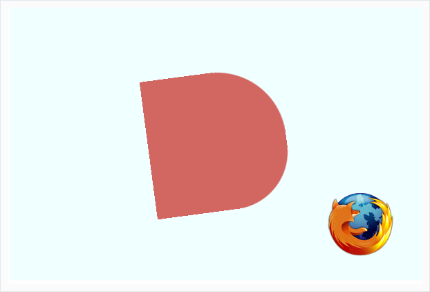
All works well in modern browsers, but Firefox renders transforming objects poorly. Take a look at these jagged lines:

Add the following transparent outline to your div and Firefox will render things perfectly!
div {
    ...
    ...
    ...
    outline: 1px solid transparent;
}
That's it! We've used CSS Animation syntax to create a simple, repeating animation.
Conclusion
THANK YOU!
Hopefully something was learned!!
INTRODUCTION TO
By aditya thakur
INTRODUCTION TO
- 442